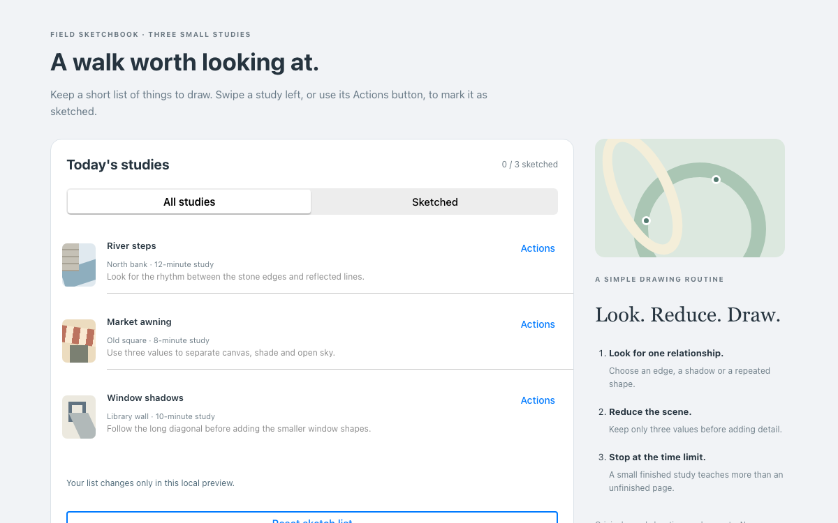
01 Flowbite デザインシステムのインターフェースプレビュー 3つのパッキングカテゴリーを開き、持ち物をチェックして、標準のドロワーでローカルメモを作成します。
Flowbite 4.0.2 の Accordion および Drawer クラス、デフォルトテーマと Tailwind CSS 4.3.3。·
実装リファレンス 02
Flowbite デザインシステムのデザインリファレンス Flowbite 4.0.2 のデフォルトテーマと Tailwind CSS 4.3.3。以下の名前付きエイリアスは実際のFlowbiteテーマ変数で、参照先のカラースケールには Tailwind のものを使用しています。パッキングのイラストとアプリケーションの余白設定は独自に作成したものです。
デフォルトの意味的なテキストとステータスの役割 ソース 名前 / ルール 値 / 設定 用途 --color-bodyvar(--color-gray-600)通常の説明テキスト。 --color-body-subtlevar(--color-gray-500)補足説明。 --color-headingvar(--color-gray-900)見出しと強調度の高いラベル。 --color-fg-brandvar(--color-blue-700)ブランドカラーの前景色。 --color-fg-successvar(--color-emerald-700)成功を示す前景色。 --color-fg-dangervar(--color-rose-700)エラーを示す前景色。 --color-fg-warningvar(--color-orange-900)警告を示す前景色。 --color-fg-disabledvar(--color-gray-400)無効状態の前景色。
名前 / ルール 値 / 設定 用途 --color-neutral-primaryvar(--color-white)カードとドロワーの背景。 --color-neutral-secondaryvar(--color-gray-50)ページの背景。 --color-neutral-tertiaryvar(--color-gray-100)進捗トラック。 --color-brandvar(--color-blue-700)主要アクションとパッキング済みの進捗。 --color-brand-softvar(--color-blue-100)フォーカスリングまたはブランドカラーの淡い背景。 --color-brand-softervar(--color-blue-50)開いたアコーディオンとイラストの背景。 --color-brand-strongvar(--color-blue-800)アクションのホバー状態。 --color-defaultvar(--color-gray-200)標準コンポーネントのボーダー。 --color-success-softvar(--color-emerald-50)ローカル結果の背景。
名前 / ルール 値 / 設定 用途 --font-sans'Inter', 'ui-sans-serif', 'system-ui', '-apple-system', 'system-ui', 'Segoe UI', 'Roboto', 'Helvetica Neue', 'Arial', 'Noto Sans', 'sans-serif', 'Apple Color Emoji', 'Segoe UI Emoji', 'Segoe UI Symbol', 'Noto Color Emoji'Interを優先するUIフォントスタック。プレビューでは利用可能なシステムフォントにフォールバックし、外部フォントは使用しません。 --font-mono'ui-monospace', 'SFMono-Regular', 'Menlo', 'Monaco', 'Consolas', 'Liberation Mono', 'Courier New', 'monospace'コードスタック。 --radius-xxs2px2ピクセルの角丸。 --radius-xs4px4ピクセルの角丸。 --radius-sm6px6ピクセルの角丸。 --radius8px8ピクセルの角丸。 --radius-base12pxrounded-baseで使用する12ピクセルのパネル角丸。 --radius-lg16px16ピクセルの角丸。 --default-border-width1px1ピクセルのボーダー。 --leading-520px行高20ピクセル。 --leading-624px行高24ピクセル。
サンプルで使用するTailwindのレイアウト値 ソース 名前 / ルール 値 / 設定 用途 p-6 / md:p-101.5rem / 2.5remTailwindのデフォルトの4分の1rem間隔単位によるページのパディング。 gap-82rem梱包カテゴリーと進捗サマリーの間隔。 md breakpoint48rem2列に切り替えます。 text-sm / text-xl / text-3xl0.875rem / 1.25rem / 1.875rem本文、セクションタイトル、ページタイトルのユーティリティクラス。 w-96 / max-w-full24rem / 100%ドロワーの幅はモバイルのビューポート内に収まります。
03 Flowbite デザインシステム完全ガイド 実際のインターフェースで、このデザインシステムを選び、適用し、レビューするための実践ガイドです。
DESIGN-flowbite.md 詳しいガイダンス、実装の出発点、ソースへのリンクをまとめています。
ガイドをダウンロード Flowbite デザインシステム4:名前付きデフォルトテーマを追加 Flowbite Four に名前付きのデフォルトテーマを追加 このサンプルでは、バージョン指定のない古い青とグレーのコード断片集ではなく、Flowbite 4.0.2を使用しています。デフォルトテーマでは、color-body、color-heading、color-brand、color-neutral-primaryなどのセマンティックエイリアスが定義されています。このページでは、Flowbite Tailwindプラグインを適用する前にテーマをインポートし、text-headingやbg-brandなどの対応するクラスを使用します。
エイリアスはTailwindのカラースケールを参照します。たとえば、通常のブランドアクションはblue-700を参照し、より強調度の高いホバー状態ではblue-800を参照します。この仕様ではそれらの参照を維持しているため、セマンティックな役割とプリミティブな色の値を区別できます。梱包イラストでは同じブランドの役割を再利用していますが、Flowbiteの公式イラストではありません。
関連する仕様を確認する
Flowbiteデザインシステムのテーマ設定とTailwindのレイアウトを組み合わせる テーマのジオメトリと Tailwind のレイアウトが連携 デフォルトテーマのradius-baseは12ピクセルで、メインコンテナ、ドロワーのコントロール、結果通知にrounded-baseを使用します。また、2、4、6、8、16ピクセルの角丸も個別に定義されています。コピーしたコンポーネントで新しいセマンティッククラス名を使う場合は、テーマのインポートが重要です。
指定されたフォントスタックではInterが先頭に指定されていますが、この自己完結型プレビューではリモートフォントをダウンロードしません。利用可能なシステムフォントにフォールバックします。ページの余白にはTailwindのユーティリティを使用しています。p-6は1.5rem、gap-8は2rem、デスクトップ向けのp-10は2.5remです。これらのレイアウトユーティリティを、独自に作成したFlowbiteのスペーシングスケールとして提示しているわけではありません。
関連する仕様を確認する
Flowbiteデザインシステム:1つのAccordionインスタンスで3つのカテゴリを管理 1つのアコーディオンインスタンスで3つのカテゴリーを管理 JavaScriptは項目の配列を使ってAccordionを生成します。各項目には固定のID、トリガー要素、対象パネルがあり、Paperカテゴリが最初に開きます。alwaysOpenはfalseのため、Toolsを開くとPaperは閉じます。カスタムのactiveClassesとinactiveClassesには、デフォルトテーマのセマンティックな前景色と界面表面の名前を使用します。
classはパネルの表示状態を制御し、トリガーのaria-expandedを更新します。マークアップにはaria-controlsと、それに対応するパネルIDが指定されています。パネルを折りたたんでもチェックボックス入力はドキュメント内に残るため、カテゴリを切り替えてもチェック状態は保持されます。セクションを折りたたむ操作は表示状態を変えるものであり、ユーザーの準備作業をリセットするものではありません。
関連する仕様を確認する
Flowbiteデザインシステム:進捗は実際のチェックボックスから算出 進捗は実際のチェックボックスから算出 6つの実際のチェックボックスで、ワークショップに必要な資材を管理します。チェック済みの数、次の項目、未完了項目のテキストは、現在のチェック状態からアプリケーションが算出します。プログレスバーの幅とaria-valuenowも同じ数に基づいて更新されるため、別個のカウンターとチェックリストの数が食い違うことはありません。
ドローイングシートとトレーシングペーパーは準備方法が異なるため、別々の項目にしています。カッティングマットは共用の作業スペースを示し、弱粘着テープには壁面への注意書きを添えています。こうした具体的な情報によって、カテゴリを開いたときに役立つ内容になっています。Accordionは、ありきたりな文章を繰り返し隠すだけのものではありません。
Paperを開き、ドローイングシートを準備済みにします。 Toolsを開いて鉛筆とマーカーを準備済みにしてから、Paperに戻ります。 両方の項目が選択されたままで、概要に6項目中2項目と表示されることを確認します。 関連する仕様を確認する
Flowbiteデザインシステム:1つのDrawerインスタンスで表示と背景を管理 ドロワーインスタンスで表示とバックドロップを管理 資材パネルは、placementをright、backdropをtrue、bodyScrollingをfalseにしてnew Drawerで初期化します。パネルを開くとshowを呼び出し、閉じるときはhideを呼び出します。ネイティブのFlowbite実装が、位置とトランジションのクラス、背景、表示状態の属性を適用します。このページでは、同じパネルに対して2つ目のdata属性初期化を併用せず、意図的にJavaScriptのAPIを使用しています。
ドロワーの幅は24remで、max-w-fullも指定しているため、狭いビューポートでも使いやすくなっています。パネル内のコンテンツは縦方向にスクロールできます。ページ自体の高さはコンテンツに応じて決まり、ドロワーのh-screenは固定オーバーレイとして意図的に使用しています。埋め込みページに最小高さが循環する問題は生じません。
関連する仕様を確認する
Flowbiteデザインシステム:ドロワーのライフサイクルにフォーカス管理を追加 ドロワーのライフサイクルにフォーカス管理を追加 onShowコールバックで背景のmain要素をinertにし、「準備担当者」入力欄にフォーカスを移します。onHideではinertを解除し、「資材準備メモ」にフォーカスを戻します。小さなkeydownハンドラーによって、TabとShift+Tabのフォーカスをパネル内の最初と最後のコントロールの間で循環させます。こうした追加処理は完全なソースコードに記載されており、スタイル用クラスが提供すると仮定しているわけではありません。
FlowbiteはドロワーのEscapeキー操作に対応しています。この例のコールバックにより、どの方法で閉じても背景が再び操作可能になります。パネルにはaria-labelledbyでラベルを設定し、閉じるコントロールには明示的なアクセシブル名を付けています。実際のアプリケーションでは、ライブラリ名だけでアクセシビリティが保証されると考えず、独自のポータルやルーティングも含めて動作を検証してください。
関連する仕様を確認する
Flowbiteデザインシステム:担当者を検証し、ローカルのテキストだけを保存 担当者を検証し、ローカルテキストのみを保存 「準備担当者」は必須項目で、最小文字数と最大文字数を指定しています。送信ハンドラーでも名前の前後の空白を取り除き、空白だけの入力を拒否します。「セッションメモ」は任意で、240文字まで入力できます。ドロワーを開くと未完了項目の概要が更新されるため、以前の準備状況ではなく現在のチェックリストを反映します。
保存するとドロワーが閉じ、担当者、準備済みの項目数、任意のメモを含むローカルの通知が表示されます。メールは送信されず、共有ドキュメントも作成されません。ユーザーが入力した文字列はtextContentで設定します。チェックリストを編集すると、以前の件数に基づく通知が誤解を招かないよう、古い結果通知を消去します。
関連する仕様を確認する
Flowbiteデザインシステム:JavaScriptライブラリが生成するクラスを含める JavaScriptライブラリが生成するクラスを含める Tailwindの入力ファイルでは、デフォルトのFlowbiteテーマをインポートし、flowbite/pluginを登録します。明示的なsourceディレクティブでHTML、アプリケーションモジュール、FlowbiteのESMライブラリを対象にします。最後の指定は重要です。ライブラリが実行時に追加するクラスも、最初のHTMLに直接記述されていなくても、生成されるスタイルシートに含める必要があります。
バンドルではflowbiteからAccordionとDrawerをインポートします。提供されている例では、マークアップの生成後に各インスタンスを一度だけ初期化します。ビューをマウントおよびアンマウントするフレームワークアプリケーションでは、イベントリスナーの重複を避けるため、ライフサイクルのセットアップとインスタンスのクリーンアップを組み合わせてください。このローカルページではマウントは1回だけで、クライアントサイドのルート遷移もありません。
関連する仕様を確認する
Flowbiteデザインシステム:実装の範囲が明確な準備ガイド 実装の範囲が明確なパッキング補助ツール このフィールドガイドでは、情報量の多いAccordion、保持されるチェックボックスの状態、オーバーレイを使った操作フローを紹介します。架空の在庫データや、実在しない調達結果は含まれていません。6つの資材はすべてワークショップ準備用のサンプル項目で、保存したメモはページを表示している間だけメモリに保持されます。
デフォルトのセマンティックテーマ、コンポーネントクラス、JavaScriptの動作はFlowbiteが提供し、ワークショップの内容、オリジナルのイラスト、フォーカス管理の追加処理はアプリケーションコードで実装しています。この区分により、読者は役立つ構成をコピーしながら、ライブラリが実際に担う責任も理解できます。
パネルの表示制御には、状態を持つFlowbiteのインスタンスを使用します。 チェックリストのデータとそこから算出する進捗は、アプリケーションのロジックで管理します。 実際の購入や共有データの永続化には、明示的なバックエンド連携を使用します。 関連する仕様を確認する
Flowbiteデザインシステムのコンポーネント例 準備ガイドとドロワーのマークアップ セマンティックなテーマクラス、実際のチェックボックスコントロール、連動するアコーディオンパネル。
html コードをコピー
<main id="page" class="mx-auto max-w-5xl p-6 md:p-10 text-body"><header class="mb-8 flex flex-wrap items-start justify-between gap-4"><div><p class="text-xs font-semibold tracking-widest text-fg-brand">FLOWBITE · FIELD GUIDE</p><h1 class="mt-3 text-3xl font-semibold tracking-tight text-heading">Pack for a day of making.</h1><p class="mt-3 max-w-xl text-sm leading-6">A workshop packing guide with grouped instructions and a local materials note.</p></div><button id="open-note" class="rounded-base bg-brand px-5 py-3 text-sm font-medium text-white hover:bg-brand-strong focus:ring-4 focus:ring-brand-soft">Prepare materials note</button></header><div class="grid gap-8 md:grid-cols-[1.4fr_1fr]"><section aria-label="Packing categories"><div id="packing-accordion" class="overflow-hidden rounded-base border border-default"><h2><button id="paper-trigger" type="button" class="category-trigger" aria-expanded="true" aria-controls="paper-panel"><span><b>01</b> Paper & surfaces</span><span aria-hidden="true">⌄</span></button></h2><div id="paper-panel" aria-labelledby="paper-trigger"><div class="category-body"><p>Choose stocks before the session. Keep one sheet untouched as a reference.</p><label><input type="checkbox" data-item="Drawing sheets" class="check"> <span><strong>Drawing sheets</strong><small>12 × A3 sheets, 120–160 gsm</small></span></label><label><input type="checkbox" data-item="Tracing paper" class="check"> <span><strong>Tracing paper</strong><small>6 sheets for overlays and revisions</small></span></label></div></div><h2><button id="tools-trigger" type="button" class="category-trigger" aria-expanded="false" aria-controls="tools-panel"><span><b>02</b> Tools & marks</span><span aria-hidden="true">⌄</span></button></h2><div id="tools-panel" class="hidden" aria-labelledby="tools-trigger"><div class="category-body"><p>Test every marker. Put cutting tools in a separate protective sleeve.</p><label><input type="checkbox" data-item="Pencils and markers" class="check"> <span><strong>Pencils and markers</strong><small>2B pencils, one broad and one fine marker</small></span></label><label><input type="checkbox" data-item="Ruler and cutting mat" class="check"> <span><strong>Ruler and cutting mat</strong><small>One shared station per four people</small></span></label></div></div><h2><button id="space-trigger" type="button" class="category-trigger" aria-expanded="false" aria-controls="space-panel"><span><b>03</b> Shared space</span><span aria-hidden="true">⌄</span></button></h2><div id="space-panel" class="hidden" aria-labelledby="space-trigger"><div class="category-body"><p>Make wall space usable and document ideas before taking them down.</p><label><input type="checkbox" data-item="Low-tack tape" class="check"> <span><strong>Low-tack tape</strong><small>Test on a hidden part of the wall first</small></span></label><label><input type="checkbox" data-item="Documentation cards" class="check"> <span><strong>Documentation cards</strong><small>One title and author card per final piece</small></span></label></div></div></div></section><aside class="rounded-base border border-default bg-neutral-primary p-6"><div class="kit-art" aria-hidden="true"><i></i><i></i><i></i><em class="bg-brand-medium"></em></div><p class="mt-5 text-xs tracking-widest text-fg-brand font-semibold">WORKSHOP KIT</p><h2 class="mt-2 text-xl font-semibold text-heading">Six things, one shared table.</h2><p class="mt-3 text-sm leading-6">Check items as you pack. Opening another category keeps your choices.</p><div class="mt-6 flex items-center justify-between text-sm"><span>Packed</span><output id="count" class="font-semibold text-heading">0 of 6</output></div><div class="mt-2 h-2 rounded-full bg-neutral-tertiary" role="progressbar" aria-label="Packing progress" aria-valuemin="0" aria-valuemax="6" aria-valuenow="0"><div id="bar" class="h-2 rounded-full bg-brand" style="width:0%"></div></div><p id="next-item" class="mt-4 text-sm text-body-subtle">Next: Drawing sheets</p><button id="clear" class="mt-5 text-sm font-medium text-fg-brand underline underline-offset-4">Clear packed items</button></aside></div><p id="result" class="mt-6 rounded-base bg-success-soft p-4 text-sm text-fg-success" role="status" hidden></p></main><aside id="materials-drawer" tabindex="-1" aria-labelledby="drawer-title" class="fixed right-0 top-0 z-40 h-screen w-96 max-w-full translate-x-full overflow-y-auto border-l border-default bg-neutral-primary p-6"><div class="flex items-center justify-between gap-4"><h2 id="drawer-title" class="text-xl font-semibold text-heading">Materials note</h2><button id="close-note" class="rounded-base border border-default px-3 py-2 text-sm" aria-label="Close materials note">Close</button></div><p class="mt-4 text-sm leading-6 text-body">Record who is preparing the kit and which items still need attention.</p><form id="note-form" class="mt-6"><label for="owner" class="mb-2 block text-sm font-medium text-heading">Prepared by</label><input id="owner" class="mb-5 block w-full rounded-base border border-default bg-neutral-secondary p-3 text-sm text-heading focus:border-brand focus:ring-brand" required minlength="2" maxlength="60" placeholder="Your name"><label for="note" class="mb-2 block text-sm font-medium text-heading">Session note</label><textarea id="note" rows="4" maxlength="240" class="block w-full rounded-base border border-default bg-neutral-secondary p-3 text-sm text-heading focus:border-brand focus:ring-brand" placeholder="For example: bring the shared cutting mat."></textarea><p id="remaining" class="mt-5 text-sm leading-6 text-body"></p><button type="submit" class="mt-6 w-full rounded-base bg-brand px-5 py-3 text-sm font-medium text-white hover:bg-brand-strong">Save local note</button><p class="mt-3 text-xs leading-5 text-body-subtle">No email, purchase or shared document is created.</p></form></aside>
コードリファレンス
ボタンはaria-controlsを通じてパネルIDと関連付けられています。 ドロワーのラベルには見出しが使用されています。 プログレスバーには、視覚的に確認できるユーザーに表示される数と同じ数が示されます。 ネイティブのFlowbiteインスタンスとローカル状態 Accordion/Drawerの初期化に加え、アプリケーション固有のチェックリストとフォーカス管理。
JavaScript コードをコピー
import {Accordion,Drawer} from 'flowbite';
const q=s=>document.querySelector(s),drawerEl=q('#materials-drawer'),page=q('#page');
const accordion=new Accordion(q('#packing-accordion'),['paper','tools','space'].map((id,i)=>({id,triggerEl:q(`#${id}-trigger`),targetEl:q(`#${id}-panel`),active:i===0})),{alwaysOpen:false,activeClasses:'bg-brand-softer text-fg-brand',inactiveClasses:'bg-neutral-primary text-heading'});
const drawer=new Drawer(drawerEl,{placement:'right',backdrop:true,bodyScrolling:false,onShow(){page.inert=true;q('#owner').focus();},onHide(){page.inert=false;q('#open-note').focus();}});
const boxes=[...document.querySelectorAll('[data-item]')];
function refresh(){let packed=boxes.filter(x=>x.checked),left=boxes.filter(x=>!x.checked);q('#count').value=`${packed.length} of 6`;q('#bar').style.width=`${packed.length/6*100}%`;q('[role="progressbar"]').setAttribute('aria-valuenow',packed.length);q('#next-item').textContent=left.length?`Next: ${left[0].dataset.item}`:'Everything on the list is packed.';q('#remaining').textContent=left.length?`Still needed: ${left.map(x=>x.dataset.item).join(', ')}.`:'All six materials are packed.';q('#result').hidden=true;}
boxes.forEach(x=>x.addEventListener('change',refresh));q('#clear').onclick=()=>{boxes.forEach(x=>x.checked=false);refresh();};q('#open-note').onclick=()=>{refresh();drawer.show();};q('#close-note').onclick=()=>drawer.hide();drawerEl.addEventListener('keydown',e=>{if(e.key==='Tab'){let els=[...drawerEl.querySelectorAll('button,input,textarea')],first=els[0],last=els.at(-1);if(e.shiftKey&&document.activeElement===first){e.preventDefault();last.focus();}else if(!e.shiftKey&&document.activeElement===last){e.preventDefault();first.focus();}}});q('#note-form').onsubmit=e=>{e.preventDefault();const owner=q('#owner');if(owner.value.trim().length<2){owner.setCustomValidity('Enter at least two non-space characters.');owner.reportValidity();return;}drawer.hide();q('#result').hidden=false;q('#result').textContent=`Local note prepared by ${owner.value.trim()}: ${boxes.filter(x=>x.checked).length} of 6 items packed. ${q('#note').value.trim()||'No extra note.'}`;};q('#owner').oninput=()=>q('#owner').setCustomValidity('');refresh();
コードリファレンス
1つのAccordionインスタンスですべてのカテゴリーを制御します。 ドロワーのライフサイクルコールバックにより、背景を操作不可にし、フォーカスを元の位置に戻します。 フォーカスループは、アプリケーション側で明示的に追加されています。 オリジナルの梱包イラストと補足用のCSS ネイティブユーティリティを取り巻くアプリケーションのレイアウト詳細。
CSS コードをコピー
body{margin:0;background:var(--color-neutral-secondary);font-family:var(--font-sans)}.category-trigger{display:flex;align-items:center;justify-content:space-between;gap:16px;padding:20px;width:100%;text-align:left;font-size:15px;font-weight:600;border-bottom:1px solid var(--color-default)}.category-trigger b{font-size:11px;opacity:.6;margin-right:12px}.category-trigger:focus-visible{outline:3px solid var(--color-brand);outline-offset:-3px}.category-body{padding:20px;background:var(--color-neutral-primary);font-size:14px;line-height:1.7;border-bottom:1px solid var(--color-default)}.category-body p{margin-bottom:20px}.category-body label{display:flex;align-items:flex-start;gap:12px;margin:16px 0;cursor:pointer}.category-body small{display:block;font-size:12px;color:var(--color-body-subtle);margin-top:4px}.check{width:18px;height:18px;border:1px solid var(--color-default);border-radius:4px;margin-top:3px;color:var(--color-brand)}.kit-art{height:160px;background:var(--color-brand-softer);border-radius:var(--radius-base);position:relative;overflow:hidden}.kit-art i{position:absolute;width:110px;height:95px;background:#fff;border:1px solid var(--color-brand-medium);top:35px;left:20%;transform:rotate(-12deg)}.kit-art i:nth-child(2){left:35%;transform:rotate(10deg);background:var(--color-brand-soft)}.kit-art i:nth-child(3){width:8px;height:120px;left:70%;top:20px;transform:rotate(25deg);background:var(--color-brand)}.kit-art em{position:absolute;width:95px;height:22px;background:var(--color-brand-medium);bottom:20px;left:20%;transform:rotate(-20deg)}[hidden]{display:none!important}button{cursor:pointer}button:focus-visible{outline:3px solid var(--color-brand);outline-offset:3px}@media(max-width:600px){.category-trigger,.category-body{padding:16px}}
コードリファレンス
紙、鉛筆、定規の図形は、オリジナルの装飾的なCSSです。 index.htmlの全体 上記のスタイルシートのビルド結果と、インタラクションのソース一式を合わせて使用します。
html コードをコピー
<!doctype html>
<html lang="en"><head><meta charset="utf-8"><meta name="viewport" content="width=device-width,initial-scale=1"><title>Flowbite specimen</title><link rel="stylesheet" href="output.css"><link rel="stylesheet" href="style.css"></head><body>
<main id="page" class="mx-auto max-w-5xl p-6 md:p-10 text-body"><header class="mb-8 flex flex-wrap items-start justify-between gap-4"><div><p class="text-xs font-semibold tracking-widest text-fg-brand">FLOWBITE · FIELD GUIDE</p><h1 class="mt-3 text-3xl font-semibold tracking-tight text-heading">Pack for a day of making.</h1><p class="mt-3 max-w-xl text-sm leading-6">A workshop packing guide with grouped instructions and a local materials note.</p></div><button id="open-note" class="rounded-base bg-brand px-5 py-3 text-sm font-medium text-white hover:bg-brand-strong focus:ring-4 focus:ring-brand-soft">Prepare materials note</button></header><div class="grid gap-8 md:grid-cols-[1.4fr_1fr]"><section aria-label="Packing categories"><div id="packing-accordion" class="overflow-hidden rounded-base border border-default"><h2><button id="paper-trigger" type="button" class="category-trigger" aria-expanded="true" aria-controls="paper-panel"><span><b>01</b> Paper & surfaces</span><span aria-hidden="true">⌄</span></button></h2><div id="paper-panel" aria-labelledby="paper-trigger"><div class="category-body"><p>Choose stocks before the session. Keep one sheet untouched as a reference.</p><label><input type="checkbox" data-item="Drawing sheets" class="check"> <span><strong>Drawing sheets</strong><small>12 × A3 sheets, 120–160 gsm</small></span></label><label><input type="checkbox" data-item="Tracing paper" class="check"> <span><strong>Tracing paper</strong><small>6 sheets for overlays and revisions</small></span></label></div></div><h2><button id="tools-trigger" type="button" class="category-trigger" aria-expanded="false" aria-controls="tools-panel"><span><b>02</b> Tools & marks</span><span aria-hidden="true">⌄</span></button></h2><div id="tools-panel" class="hidden" aria-labelledby="tools-trigger"><div class="category-body"><p>Test every marker. Put cutting tools in a separate protective sleeve.</p><label><input type="checkbox" data-item="Pencils and markers" class="check"> <span><strong>Pencils and markers</strong><small>2B pencils, one broad and one fine marker</small></span></label><label><input type="checkbox" data-item="Ruler and cutting mat" class="check"> <span><strong>Ruler and cutting mat</strong><small>One shared station per four people</small></span></label></div></div><h2><button id="space-trigger" type="button" class="category-trigger" aria-expanded="false" aria-controls="space-panel"><span><b>03</b> Shared space</span><span aria-hidden="true">⌄</span></button></h2><div id="space-panel" class="hidden" aria-labelledby="space-trigger"><div class="category-body"><p>Make wall space usable and document ideas before taking them down.</p><label><input type="checkbox" data-item="Low-tack tape" class="check"> <span><strong>Low-tack tape</strong><small>Test on a hidden part of the wall first</small></span></label><label><input type="checkbox" data-item="Documentation cards" class="check"> <span><strong>Documentation cards</strong><small>One title and author card per final piece</small></span></label></div></div></div></section><aside class="rounded-base border border-default bg-neutral-primary p-6"><div class="kit-art" aria-hidden="true"><i></i><i></i><i></i><em class="bg-brand-medium"></em></div><p class="mt-5 text-xs tracking-widest text-fg-brand font-semibold">WORKSHOP KIT</p><h2 class="mt-2 text-xl font-semibold text-heading">Six things, one shared table.</h2><p class="mt-3 text-sm leading-6">Check items as you pack. Opening another category keeps your choices.</p><div class="mt-6 flex items-center justify-between text-sm"><span>Packed</span><output id="count" class="font-semibold text-heading">0 of 6</output></div><div class="mt-2 h-2 rounded-full bg-neutral-tertiary" role="progressbar" aria-label="Packing progress" aria-valuemin="0" aria-valuemax="6" aria-valuenow="0"><div id="bar" class="h-2 rounded-full bg-brand" style="width:0%"></div></div><p id="next-item" class="mt-4 text-sm text-body-subtle">Next: Drawing sheets</p><button id="clear" class="mt-5 text-sm font-medium text-fg-brand underline underline-offset-4">Clear packed items</button></aside></div><p id="result" class="mt-6 rounded-base bg-success-soft p-4 text-sm text-fg-success" role="status" hidden></p></main><aside id="materials-drawer" tabindex="-1" aria-labelledby="drawer-title" class="fixed right-0 top-0 z-40 h-screen w-96 max-w-full translate-x-full overflow-y-auto border-l border-default bg-neutral-primary p-6"><div class="flex items-center justify-between gap-4"><h2 id="drawer-title" class="text-xl font-semibold text-heading">Materials note</h2><button id="close-note" class="rounded-base border border-default px-3 py-2 text-sm" aria-label="Close materials note">Close</button></div><p class="mt-4 text-sm leading-6 text-body">Record who is preparing the kit and which items still need attention.</p><form id="note-form" class="mt-6"><label for="owner" class="mb-2 block text-sm font-medium text-heading">Prepared by</label><input id="owner" class="mb-5 block w-full rounded-base border border-default bg-neutral-secondary p-3 text-sm text-heading focus:border-brand focus:ring-brand" required minlength="2" maxlength="60" placeholder="Your name"><label for="note" class="mb-2 block text-sm font-medium text-heading">Session note</label><textarea id="note" rows="4" maxlength="240" class="block w-full rounded-base border border-default bg-neutral-secondary p-3 text-sm text-heading focus:border-brand focus:ring-brand" placeholder="For example: bring the shared cutting mat."></textarea><p id="remaining" class="mt-5 text-sm leading-6 text-body"></p><button type="submit" class="mt-6 w-full rounded-base bg-brand px-5 py-3 text-sm font-medium text-white hover:bg-brand-strong">Save local note</button><p class="mt-3 text-xs leading-5 text-body-subtle">No email, purchase or shared document is created.</p></form></aside>

<script src="bundle.js" defer></script></body></html>
コードリファレンス
提供されたインタラクションをmain.jsとして保存し、セットアップ手順に従ってbundle.jsにコンパイルしてください。 ビューポートとネイティブのアセット読み込みを含みます。 04
FlowbiteデザインシステムのAIエージェント設定 実装の出発点 Tailwind CSS 4.3.3でFlowbite 4.0.2の動作を確認済みです。node_modules内のソースパスは、input.cssの実際の場所に合わせて変更してください。リモートフォントは不要です。
CSS サンプルをコピー
/* npm install [email protected] */
/* npm install -D [email protected] @tailwindcss/[email protected] esbuild */
/* input.css, next to body.html and main.js: */
@import "tailwindcss" source(none);
@import "flowbite/src/themes/default";
@plugin "flowbite/plugin";
@source "./body.html";
@source "./main.js";
@source "./node_modules/flowbite/lib/esm";
/* npx @tailwindcss/cli -i input.css -o output.css --minify */
/* npx esbuild main.js --bundle --format=iife --outfile=bundle.js */
/* index.html: link output.css then style.css; include the supplied markup. */
/* Load bundle.js with defer, or after the markup. */
あなたのプロジェクト向けプロンプト AI エージェント用プロンプト プロンプトをコピー
Tailwindのソース検出、ネイティブのAccordionとDrawerの初期化を含む、Flowbite 4.0.2のワークショップ向け梱包ガイドをそのまま使用してください。カテゴリーごとの持ち物とチェックリストの状態をガイドに連動させ、ローカルの梱包メモを記録する前に担当者情報を検証してください。ドロワーのキーボードフォーカス、背景の操作不可処理、閉じる動作を維持してください。オリジナルのイラストCSSは、ライブラリのセマンティックテーマとは分けてください。このローカルな梱包フローに、サービスチケットや外部への送信機能を追加しないでください。 05
Flowbiteデザインシステムのソースと適用範囲 デフォルトテーマのFlowbite 4.0.2。梱包内容、装飾アートワーク、フォーカス機能の拡張はオリジナルです。持ち物のメモはローカルに保存されます。