营销软件 · 新资源

Emplifi Soul 设计系统.

阅读 Soul 的数据表规范,了解其 6 像素间距、分层配色角色和紧凑的 Inter 字体。比较批量选择、缺失数据表示和汇总行,然后查看经过核实的私有 React 包入口。

OpenDesign 指南7 个章节44 条参考条目原始应用指南
01

Emplifi Soul 设计系统界面预览

试用全选、不确定选择、排序、批量审核和取消操作。

可选择内容的审核表格打开完整示例
对 Soul 设计指导与已验证浅色模式令牌的独立 HTML/CSS 解读。使用系统字体回退;不包含私有 React 资源。· 实现参考
02

Emplifi Soul 设计系统设计参考

Soul 公开设计文档和官方 Storybook 实时版本。以下是命名的浅色模式基础值,并不表示每个文档页面和软件包版本的状态都相同。预览使用系统字体作为本地回退。

层级模型

来源
名称 / 规则值 / 配置用途
--color-layer-level-0#f3f3f5 浅色模式表面层级。
--color-layer-level-1#ffffff 浅色模式表面层级。
--color-layer-level-2#f3f3f5 浅色模式表面层级。
--color-layer-level-3#e7e7e7 浅色模式表面层级。
--color-on-layer-primary#24242b 正文。
--color-on-layer-secondary#505057 辅助性文本。
Dark level 0 / level 1#111114 / #24242b深色表面会随层级加深而变亮。

操作与表格颜色

来源
名称 / 规则值 / 配置用途
--color-button-primary#0c4bff 主按钮背景。
--color-on-layer-interactive#003beb 交互文本。
--color-border-focus-ring#003beb 焦点环。
--color-table-row-odd#ffffff 奇数行及表格页眉/页脚。
--color-table-row-even#f9f9fa 偶数行。
--color-table-row-hover#d5efff 扫描反馈。
--color-layer-main-navigation#111114 仅用于主导航。

间距与圆角

来源
名称 / 规则值 / 配置用途
--space-13pxFoundation 间距。
--space-26pxFoundation 间距。
--space-39pxFoundation 间距。
--space-412pxFoundation 间距。
--space-518pxFoundation 间距。
--space-624pxFoundation 间距。
--space-730pxFoundation 间距。
--space-836pxFoundation 间距。
--space-948pxFoundation 间距。
Default control height36px紧凑选项为 30px;请勿与间距比例混淆。

圆角层级

来源
名称 / 规则值 / 配置用途
--border-radius-small2px轻微柔化。
--border-radius-medium6px默认元素。
--border-radius-large8px容器。
--border-radius-full50%圆形。
--border-radius-pill999px胶囊形。

字体样式

来源
名称 / 规则值 / 配置用途
headline-1500 · 30px / 42px页面主标题。
headline-2500 · 20px / 30px区块标题。
headline-3500 · 16px / 24px子区块标题。
paragraph-regular400 · 13px / 18px正文(中等)。
Button label600 · 13px / 18px句首字母大写。
Table numeralsTabular numbers对齐可比较的数值。

React Button API

来源
名称 / 规则值 / 配置用途
Package@sbks/ds-button私有范围;Button 是一个命名导出。
variantBUTTON_VARIANT.LIGHT default由枚举支持;在 TypeScript 中请使用导出的枚举常量,不要使用原始字符串。
sizeBUTTON_SIZE.MEDIUM defaultMedium 为基础样式。
isLoadingfalse加载效果。
isSelectedfalse选中外观。
isAppliedfalse目前仅支持 invisible 变体的视觉样式。
onClickMouse event handler连接本地应用状态。
badgestring | number已应用选择的信息。
themeInherited; light fallback不要假定深色表面会自动改变所有后代元素。
03

Emplifi Soul 设计系统完整指南

实用指南,介绍如何为真实界面选择、应用和评审此系统。

DESIGN-emplifi-soul.md

完整指导、实现起点和源代码链接。

下载指南

Emplifi Soul 设计系统:设计指导与实现状态

不要根据组件名称推断软件包

Soul 是 Emplifi 的设计系统。其公开设计参考和 Storybook 可供查阅,但官方快速入门要求访问私有 npm 范围。浏览器中的示例由 HTML/CSS 独立实现;其中不包含 Soul React。表格行为是对设计指导的解读,而其公开页面仍将 React 标记为计划中。

摘自本 OpenDesign 指南

所提供的 React 示例有意采用语义化表格和真正的 Soul Button 控件。它实现了可运行的应用状态,但不声称存在未记录的 DataTable 导出。公开可读的文档并不意味着可以访问软件包或重新分发私有资源。

阅读配套规范

Emplifi Soul 设计系统:不止于行选择的数据表规范

表头、汇总与缺失值

Soul 的表格指导区分表头、行、单元格和可选汇总栏。数值右对齐,文本内容左对齐。汇总栏可以展示总计或平均值,因此标签应明确说明运算方式,而不是只显示一个来历不明的数字。

当某项度量不适用时,例如图片没有视频时长,请使用 N/A。破折号表示数据不可用或未知。这两种情况都不应转换为零,否则会改变汇总结果及其所依据比较的含义。

  • 当前示例实现了排序和可选行,但不包含汇总计算。
  • 展开行和缺失数据说明是文档中记录的扩展点;预览并未模拟这些功能。
  • 设计参考将 React 表格标记为计划中,因此所提供的代码自行编写表格标记,而不是臆造 Soul DataTable 导入项。

阅读配套规范

批量模式会改变可用操作

Soul 会将批量操作栏放在集合下方,并在批量选择启用时隐藏各行的单独操作。表头复选框有选中、未选中和不确定三种状态。一次只能按一列排序。

示例中的三条记录均为本地数据,且都在选择范围内。覆盖范围列表头会提示排序方向;重新排序后,已选 ID 仍会保留。未来添加的行级操作应遵循文档中对批量模式的限制,避免与批量操作栏争用。

阅读配套规范

Emplifi Soul 设计系统:用中性色层构建深度

克制的 CX 工作区

Soul 的浅色模式交替使用灰色和白色界面表面,而深色层则逐层变亮。示例采用灰色页面、白色表格表面和紧凑的深色导航栏。颜色用于表达不同角色,而不是装饰每一行。

交互蓝仅用于审核操作和已选控件。原帖中的小型插图带有装饰性色彩,用于区分内容主题,而不赋予这些主题并不存在的成功或危险含义。

阅读配套规范

Emplifi Soul 设计系统:紧凑排版,层级依然清晰

以 Inter 为主字体

Soul 的界面统一使用 Inter,阿拉伯文本使用 Noto Sans Arabic,代码使用 Noto Sans Mono。由于预览未包含这些字体文件,因此使用系统字体。测量值仍依据已发布的配方。

主标题采用 30/42,正文系统采用 13/18。表格数字使用等宽数字形式。表格不采用夸张的营销展示字体,帖子标题也以易读文本呈现,而非嵌入图片中的标签。

阅读配套规范

Emplifi Soul 设计系统:六像素节奏与容器圆角

让密集控件井然有序

基础间距单位为 6 px。12、18、24 和 36 px 等数值用于建立更大的间距关系;3 和 9 px 则用于紧凑的组件内部,不作为默认页面边距。文档规定,内容内边距在视口宽度不超过 1559 px 时为 24 px,在 1560 px 及以上时为 36 px。

Soul 将间距数值与组件的 T 恤尺码区分开来。medium 控件并不等于 --space-6。示例采用 36 px 控件、6 px 元素圆角和 8 px 容器圆角。

阅读配套规范

Emplifi Soul 设计系统:用强调样式说明下一步操作

仅突出一个主要审核操作

Soul 的 primary 变体用于突出最重要的操作。light 和 ghost 变体用于辅助操作;invisible 控件则可降低密集工具栏的视觉负担。预览中只有批量审核操作使用实心 primary 样式。

取消选择会清除已选行,但不会更改审核标签。审核操作只更改本地审核状态,并明确提示内容尚未发布。控件文本使用句式大小写。

阅读配套规范

Emplifi Soul 设计系统:有选择地加载私有库

Foundation CSS 应在组合组件之前引入

官方入口从 @sbks/ds-design-library 导入 variables.css 和 default-styles.css。其 Sass 入口提供 mixin;它与全局 CSS 相互独立。Button 来自 @sbks/ds-button。

实际的 Button API 包含 isLoading、isSelected、isApplied 和 badge。需要使用枚举的属性必须在 TypeScript 中传入该库导出的枚举常量。此示例使用已验证的默认 LIGHT 变体,不猜测枚举的导入路径。

  1. 请通过官方快速入门完成授权的私有作用域接入和构建加载器配置。
  2. 在应用入口中仅导入一次基础 CSS,并配置所选字体资源。
  3. 挂载提供的受控表格示例,然后测试选择、取消和本地审核,再连接任何发布工作流。

阅读配套规范

Emplifi Soul 设计系统组件示例

完整的独立交互示例

将完整文档保存为 index.html,然后在浏览器中打开。独立的 HTML/CSS 对 Soul 设计指南和已验证浅色模式令牌的诠释。使用系统字体作为后备;不包含私有 React 资源。

html
<!doctype html><html lang="en"><meta charset="utf-8"><meta name="viewport" content="width=device-width, initial-scale=1"><title>Content review</title><style>:root{--color-layer-level-0:#f3f3f5;--color-layer-level-1:#fff;--color-on-layer-primary:#24242b;--color-on-layer-secondary:#505057;--color-button-primary:#0c4bff;--space-2:6px;--space-4:12px;--space-6:24px;--border-radius-medium:6px;--border-radius-large:8px}*{box-sizing:border-box}body{margin:0;background:var(--color-layer-level-0);color:var(--color-on-layer-primary);font:13px/18px system-ui}nav{padding:15px 24px;background:#111114;color:#f9f9fa;font-size:13px;display:flex;justify-content:space-between;gap:24px}main{padding:24px}header{display:flex;align-items:flex-start;justify-content:space-between;gap:18px;margin-bottom:24px}h1{font-size:30px;font-weight:500;line-height:42px;margin:0}p{color:#505057;margin:6px 0}small{font-size:11px}.surface{background:white;border:1px solid #ddd;border-radius:8px;overflow:hidden}.bar{padding:18px 24px;border-bottom:1px solid #ddd;display:flex;justify-content:space-between;gap:12px}table{width:100%;border-collapse:collapse;table-layout:fixed}caption{text-align:left;padding:12px 24px;background:#f9f9fa;font-size:11px;color:#505057}th,td{padding:16px 12px;text-align:left;border-bottom:1px solid #e7e7e7;font-weight:400}thead th{font-size:11px;font-weight:600;padding-top:12px;padding-bottom:12px}th:first-child,td:first-child{width:44px;text-align:center}.title{width:46%}.reach{width:15%;text-align:right;font-variant-numeric:tabular-nums}tbody tr:nth-child(even){background:#f9f9fa}tbody tr:hover{background:#d5efff}input{accent-color:#003beb;width:16px;height:16px;cursor:pointer}input:focus-visible,button:focus-visible{outline:2px solid #003beb;outline-offset:3px}button{font:600 13px/18px system-ui;border:1px solid #ccc;background:white;padding:8px 12px;border-radius:6px;min-height:36px;cursor:pointer;color:inherit}button:hover{background:#f3f3f5}#sort{border:0;background:transparent;padding:0;min-height:28px;color:#003beb}#apply{background:#0c4bff;color:white;border-color:#0c4bff}#apply:hover{background:#003beb}.name{display:flex;align-items:center;gap:12px}.art{width:52px;height:52px;flex:0 0 52px;border-radius:6px;position:relative;overflow:hidden}.field{background:#d4e5d3}.field:before{content:'';position:absolute;width:65px;height:65px;border-radius:50%;background:#7ca77a;left:15px;top:20px}.field:after{content:'';position:absolute;width:16px;height:16px;border-radius:50%;background:#fff1c5;left:8px;top:8px}.studio{background:#e6daee}.studio:before{content:'';position:absolute;width:20px;height:36px;background:#a089b2;left:8px;top:16px;transform:rotate(-14deg)}.studio:after{content:'';position:absolute;width:20px;height:28px;background:#c3abc9;left:30px;top:24px;transform:rotate(12deg)}.guide{background:#f4e4c9}.guide:before{content:'';position:absolute;width:26px;height:38px;background:#fff;left:13px;top:9px;transform:rotate(8deg);border:1px solid #c9ad7c}.name strong{font-weight:600;display:block}.name small{color:#505057}.state{font-size:11px;color:#505057}#bulk{display:flex;align-items:center;justify-content:space-between;gap:12px;padding:12px 24px;background:#f3f3f5;border-top:1px solid #ccc}#bulk[hidden]{display:none}.actions{display:flex;gap:6px}#status{margin:18px 0;min-height:18px}footer{padding:0 24px 20px;color:#505057;font-size:11px}@media(min-width:1560px){main{padding:36px}}@media(max-width:600px){main{padding:18px}.bar{padding:12px}.channel{display:none}.title{width:57%}.reach{width:22%}.state{display:block;margin-top:4px}th,td{padding:12px 6px}.art{width:36px;height:42px;flex-basis:36px}.name{gap:6px}#bulk{padding:12px;flex-direction:column;align-items:stretch}.actions{flex-wrap:wrap}header{flex-direction:column;gap:8px}h1{font-size:27px}.bar small{max-width:140px;text-align:right}nav{padding:14px 18px}}</style><nav><strong>Soul / Content workspace</strong><span>Demo collection</span></nav><main><header><div><h1>Content review</h1><p>A final editorial check before your team publishes.</p></div><small>3 fictional drafts · No publishing connection</small></header><section class="surface" aria-label="Content drafts"><div class="bar"><strong>Draft collection</strong><small>Select items to review together</small></div><table><caption>Local sample data. Reach values are illustrative.</caption><thead><tr><th scope="col"><input id="all" type="checkbox" aria-label="Select all drafts"></th><th scope="col" class="title">Content</th><th scope="col" class="channel">Channel</th><th scope="col" class="reach" id="reach-head" aria-sort="none"><button id="sort">Reach ↕</button></th></tr></thead><tbody id="rows"></tbody></table><div id="bulk" hidden><span id="count"></span><div class="actions"><button id="apply">Mark as reviewed</button><button id="cancel">Cancel selection</button></div></div></section><p id="status" role="status">Select a draft to begin. All changes stay in this example.</p></main><footer>Independent Soul interpretation · verified light-mode tokens · system font fallback</footer><script>let items=[{id:'field',title:'A morning in the field',channel:'Instagram',reach:2480},{id:'studio',title:'Inside the studio',channel:'Facebook',reach:1860},{id:'guide',title:'Care guide: summer edition',channel:'Instagram',reach:3210}],selected=new Set(),reviewed=new Set(),direction=0;const rows=document.querySelector('#rows'),all=document.querySelector('#all'),bulk=document.querySelector('#bulk'),status=document.querySelector('#status');function render(){rows.innerHTML=items.map(i=>`<tr><td><input type="checkbox" data-id="${i.id}" aria-label="Select ${i.title}" ${selected.has(i.id)?'checked':''}></td><th scope="row"><div class="name"><div class="art ${i.id}" aria-hidden="true"></div><div><strong>${i.title}</strong><span class="state">${reviewed.has(i.id)?'Reviewed locally':'Not reviewed'}</span></div></div></th><td class="channel">${i.channel}</td><td class="reach">${i.reach.toLocaleString('en-US')}</td></tr>`).join('');rows.querySelectorAll('input').forEach(x=>x.onchange=()=>{x.checked?selected.add(x.dataset.id):selected.delete(x.dataset.id);sync()});sync()}function sync(){all.checked=selected.size===items.length;all.indeterminate=selected.size>0&&selected.size<items.length;bulk.hidden=!selected.size;document.querySelector('#count').textContent=selected.size+' selected'}all.onchange=()=>{selected=all.checked?new Set(items.map(i=>i.id)):new Set();render()};document.querySelector('#cancel').onclick=()=>{selected.clear();render();all.focus()};document.querySelector('#apply').onclick=()=>{let n=selected.size;selected.forEach(x=>reviewed.add(x));selected.clear();render();status.textContent=n+(n===1?' draft':' drafts')+' reviewed locally. Nothing published.';all.focus()};document.querySelector('#sort').onclick=()=>{direction=direction===1?-1:1;items.sort((a,b)=>(a.reach-b.reach)*direction);document.querySelector('#reach-head').setAttribute('aria-sort',direction===1?'ascending':'descending');document.querySelector('#sort').textContent='Reach '+(direction===1?'↑':'↓');render()};render();</script></html>

代码参考

  • 表格直接在 HTML 中实现选择和排序。它并未声称存在私有 Soul DataTable 导出;React 示例使用已验证的 Button 导出,并搭配应用自有的表格。
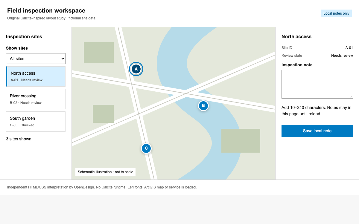
带有实际 Soul 按钮的可选审核表格

使用原生语义化表格和受控复选框,并组合文档中说明的 Button 导出。表格由应用代码实现,并非杜撰的 Soul DataTable 组件。

tsx
// ContentReview.tsx — inside a configured, authorized Soul application
import React, { useState } from 'react';
import { Button } from '@sbks/ds-button';
import '@sbks/ds-design-library/dist/css/variables.css';
import '@sbks/ds-design-library/dist/css/default-styles.css';

const posts = [
  { id: 'field', title: 'A morning in the field', channel: 'Instagram' },
  { id: 'studio', title: 'Inside the studio', channel: 'Facebook' },
  { id: 'guide', title: 'Care guide: summer edition', channel: 'Instagram' }
];
export default function ContentReview() {
  const [selected, setSelected] = useState<string[]>([]);
  const [reviewed, setReviewed] = useState<string[]>([]);
  const [message, setMessage] = useState('');
  const toggle = (id: string) => setSelected(previous =>
    previous.includes(id) ? previous.filter(x => x !== id) : [...previous, id]);
  const review = () => {
    setReviewed(previous => [...new Set([...previous, ...selected])]);
    setMessage(`${selected.length} items reviewed locally. Nothing published.`);
    setSelected([]);
  };
  return <section aria-labelledby="review-title">
    <h1 id="review-title">Content review</h1>
    <table style={{ width: '100%', borderCollapse: 'collapse' }}>
      <caption>Fictional content drafts</caption>
      <thead><tr><th scope="col">Select</th><th scope="col">Content</th>
        <th scope="col">Channel</th><th scope="col">Review</th></tr></thead>
      <tbody>{posts.map(post => <tr key={post.id}>
        <td><input type="checkbox" aria-label={`Select ${post.title}`}
          checked={selected.includes(post.id)} onChange={() => toggle(post.id)} /></td>
        <th scope="row">{post.title}</th><td>{post.channel}</td>
        <td>{reviewed.includes(post.id) ? 'Reviewed locally' : 'Not reviewed'}</td>
      </tr>)}</tbody>
    </table>
    {selected.length > 0 && <div aria-label="Bulk actions"
      style={{ display: 'flex', gap: 'var(--space-2)', marginTop: 'var(--space-6)' }}>
      <Button onClick={review}>Mark {selected.length} as reviewed</Button>
      <Button onClick={() => setSelected([])}>Cancel selection</Button>
    </div>}
    <p role="status">{message}</p>
  </section>;
}

代码参考

  • Button 的默认值为 LIGHT。此示例不会猜测枚举导出位置,也不会杜撰 DataTable 属性。
  • 请先安装并配置私有设计库和按钮包。导入路径已在官方 Storybook 中验证。
  • 批量审核只更新本地状态,不会发布任何内容。
04

Emplifi Soul 设计系统 Agent 配置

实现起点

官方快速入门需要访问私有 npm、Emplifi 仓库和 VPN。它支持 React 18/19 和 Webpack 4/5,并需配置 Sass 和 SVG loader。请按照链接中的内部作用域接入指南操作,不要期待能从公共 registry 获取这些包。独立预览无需任何这些私有资源。

bash / tsx
# For authorized Emplifi environments with the private @sbks scope configured:
npm i -D @sbks/ds-design-library @sbks/ds-button

// Application entry:
import "@sbks/ds-design-library/dist/css/variables.css";
import "@sbks/ds-design-library/dist/css/default-styles.css";

// Optional SCSS file:
@use "@sbks/ds-design-library/dist/sass/main.scss" as *;

适用于你项目的提示词

Agent 提示词
创建一个 Emplifi Soul 内容审核界面,使用已验证的层级/颜色/间距变量、13/18 正文排版、6px 控件圆角和 8px 容器圆角。使用语义化可选表格,确保 ID 稳定、全选支持不确定状态,并且一次只按一列排序。对于已获授权的应用,使用实际的 @sbks/ds-button 导出和基础 CSS;切勿杜撰公共 DataTable 包。
05

Emplifi Soul 设计系统来源与范围

Soul 是 Emplifi 的设计系统。其公开设计参考和 Storybook 可供查阅,但官方快速入门要求访问私有 npm 范围。浏览器中的示例由 HTML/CSS 独立实现;其中不包含 Soul React。表格行为是对设计指导的解读,而其公开页面仍将 React 标记为计划中。