企业软件 · 新资源

Semi Design 设计系统.

创建顺序式工作区设置,采用 Semi 推荐的基础 Steps、受控 Input 和 Switch、真实主题令牌,并明确选择使用 React 18 还是 React 19 程序包。

OpenDesign 指南8 个章节38 条参考条目原始应用指南
01

Semi Design 设计系统界面预览

验证名称、选择摘要偏好、返回之前的步骤,并检查最终的本地配置。

工作区设置向导打开完整示例
离线解读 HTML 的 Semi 主题比例,以及 Steps/Input/Switch 的行为。原生 React 示例另行提供。· 实现参考
02

Semi Design 设计系统设计参考

Semi 官方文档和默认主题 SCSS 快照。$ 名称是编译时 Sass 常量;--semi-* 名称是运行时 CSS 变量。应用工作流数据为原创内容。

间距与控件尺寸

来源
名称 / 规则值 / 配置用途
$height-control-small / default / large24 / 32 / 40px已发布的控件高度。
$spacing-super-tight2px最紧凑的间距。
$spacing-extra-tight4px非常紧凑的间距。
$spacing-tight8px紧凑间距。
$spacing-base-tight12px紧凑的分组间距。
$spacing-base16px默认间距。
$spacing-base-loose20px更宽松的分组间距。
$spacing-loose24px区块间距。
$spacing-extra-loose32px较大的间隔。
$spacing-super-loose40px此组中最大的命名间距。

排版组合

来源
名称 / 规则值 / 配置用途
font-size-small mixin12 / 16px字号取自 variables.scss,行高取自 mixin。
font-size-regular mixin14 / 20px正文文本。
font-size-header-6 mixin16 / 22px小标题。
font-size-header-4 mixin20 / 28px区块标题。
font-size-header-3 mixin24 / 32px页面标题选项。
font-size-header-1 mixin32 / 44px最大的命名标题字号。

主题角色映射

来源
名称 / 规则值 / 配置用途
--semi-color-primaryrgba(var(--semi-blue-5),1)浅色调色板解析为 rgb(0,100,250)。
--semi-color-primary-hoverrgba(var(--semi-blue-6),1)浅色调色板解析为 rgb(0,98,214)。
--semi-color-text-0rgba(var(--semi-grey-9),1)浅色主题的主要文本解析为 rgb(28,31,35)。
--semi-color-text-2Grey 9 at .62 opacity in light mode次级文本;深色主题使用不同的不透明度。
--semi-color-fill-0Grey 8 at .05 opacity in light mode柔和填充会根据其所在界面表面进行调整。
--semi-border-radius-small3px常用控件。
--semi-border-radius-medium6px菜单及类似界面表面。
--semi-border-radius-large12px大型容器角色。
--semi-border-radius-full9999px胶囊形样式。

Steps 约定

来源
名称 / 规则值 / 配置用途
type="basic"Recommended simple step bar文档中已弃用较早的默认样式。
currentZero-based number从 0 开始。
statuswait / process / finish / error / warning当前步骤的状态。
type="nav"Non-interactive navigation appearance不能用作可点击向导的捷径。
onChange(index)Index includes initial offset由应用决定是否允许导航。

Input 和 Switch

来源
名称 / 规则值 / 配置用途
Input onChange(value,event)第一个参数是新值。
Input validateStatusdefault / error / warning仅控制视觉样式,不会验证业务数据。
Input compositionBoolean, false by default启用后,延迟到 IME 确认时再触发 onChange。
Input aria-describedbyDescription ID关联帮助文本和错误文本。

Switch 和按钮变体

来源
名称 / 规则值 / 配置用途
Switch checkedControlled Boolean在父组件状态中保存此偏好。
Switch onChange(checked,event)直接使用布尔值。
Switch aria-labelMeaningful state label描述偏好,而不是开关的视觉状态。
Switch size="small"No checkedText / uncheckedText treatment将较长的标签放在开关外部。
03

Semi Design 设计系统完整指南

实用指南,介绍如何为真实界面选择、应用和评审此系统。

DESIGN-semi-design.md

完整指导、实现起点和源代码链接。

下载指南

Semi Design 设计系统:为实际的 React 主版本选择对应的软件包

后缀会改变集成方式

Semi 当前的 Quick Start 将 React 19 软件包与早期 React 版本使用的软件包区分开来。本示例明确选择 React 18 和 @douyinfe/semi-ui。若要改用 React 19,必须按文档选择依赖并使用 @douyinfe/semi-ui-19 导入路径。

摘自本 OpenDesign 指南

受支持的打包工具会从组件 JavaScript 中加载相关的 CSS。自定义前缀、主题编译或 CSS 分层等编译时更改,需要单独考虑工具配置。不要将基础导入示例说成无需配置即可支持所有主题自定义。

阅读配套规范

Semi Design 设计系统:具名 Sass 比例让密度一目了然

使用已发布的 24、32 和 40px 控件高度

Semi 的三个控件高度常量为 24、32 和 40px。其间距名称覆盖 2 至 40px,且递增幅度并不均匀。向导中的默认字段可以使用 12px 的帮助文本间距,并与下一个区块保持 24px 的间隔,无需另创一套间距体系。

这些值是 Sass 常量,不会自动成为运行时变量。示例页面 CSS 使用的是这些值解析后的尺寸。开发者若想在运行时调整布局主题,而非重新构建样式表,就需要注意这一区别。

阅读配套规范

Semi Design 设计系统:使用真实的字号与行高组合

正文与标题的排版节奏各不相同

常规 mixin 将 14px 字号与 20px 行高配对;小号 mixin 将 12px 字号与 16px 行高配对。三级标题为 24/32,一级标题为 32/44。较短的向导标题可以使用前者,将后者留给层级更高的页面标题。

源字体系列以 Inter 开头,后接平台字体和 CJK 回退字体。离线预览使用系统中可用的字体栈,不代表已下载特定字体。步骤栏在窄视口中换行时,也要确保步骤名称简短且含义清晰。

阅读配套规范

Semi Design 设计系统:主题角色与调色板通道各自独立

在应用 CSS 中使用解析后的角色

主角色会将调色板通道变量包装在 rgba 中。对于普通颜色属性,使用 --semi-color-primary 即可;单独使用原始的 --semi-blue-5 通道列表并不是完整的 CSS 颜色。浅色和深色调色板会改变这些通道值。

文本角色也会使用透明度。次要文本并非随意选用一个更浅的十六进制颜色,禁用文本也不应用于重要帮助信息。向导会让完成提示保持中性,因为准备配置并不代表已创建可用账户。

阅读配套规范

Semi Design 设计系统:基础步骤用于显示进度,而非允许跳过验证

由应用负责管理步骤切换规则

对于简单的步骤条,Semi 建议使用 type="basic"。current 从零开始;当前步骤可以设置为 process、error 或其他受支持的状态。文档已将旧版默认外观标记为弃用。

此示例通过“继续”和“上一步”控件有意控制步骤切换。它没有将每个步骤的点击事件都绑定到 setCurrent,否则用户可能在名称为空时直接进入“检查”。文档中另有说明的 nav 外观不可交互,不应将其误认为向导导航。

  1. 离开第一步前,请先验证名称。
  2. 向后导航时,保留所选的每周摘要布尔值。
  3. 在“检查”步骤中显示完整设置。
  4. 准备本地配置,但不要声称账户或订阅已创建。

阅读配套规范

Semi Design 设计系统:视觉验证不会验证值本身

正确使用值优先的回调

Semi Input 会先传入值,再传入事件作为 onChange 参数。因此,示例可以直接传入 setName。validateStatus 只会改变外观;检查名称是否为空属于应用逻辑,并且需要向用户提供清晰说明。

对于会触发实时查询的文本输入,可以等到输入法编辑确认后再调用回调。工作区名称字段不会执行实时查询,因此示例省略了这一可选行为,而不是将其当作通用要求。

阅读配套规范

Semi Design 设计系统:开关旁的偏好说明应清晰易懂

在父组件中管理状态

Switch 使用 checked 属性,并通过 onChange 以布尔值作为首个参数。标签应说明偏好内容,例如“每周摘要”;周围的文本则应解释该设置的含义。较长的选中和未选中状态文案应放在控件外部,小尺寸开关不支持在内部显示这类文案。

  • 使用清晰的可访问名称,明确指出对应的偏好设置。
  • 在向导步骤之间切换时保留偏好值。
  • 在检查页面上以普通文本呈现最终值。

阅读配套规范

Semi Design 设计系统:Button 的 type 和 theme 各有不同作用

语义角色与视觉样式

Semi Button 的 type 用于选择 primary 或 danger 等角色;theme 则用于选择视觉样式:light、solid、borderless 或 outline。示例将 solid 样式用于 primary“继续”操作,并为“上一步”操作采用更克制的样式,而不是滥用 danger 来增强按钮的醒目程度。

离线示例会在步骤切换时将焦点移至新步骤的标题,验证失败时则将焦点移回无效字段。其移动端布局和键盘操作顺序经过独立测试,与经源码验证的原生 React 示例相互独立。

阅读配套规范

Semi Design 设计系统组件示例

完整的独立交互示例

将完整文档保存为 index.html 并在浏览器中打开。这是对 Semi theme 比例以及 Steps/Input/Switch 行为的离线 HTML 解读。原生 React 示例另行提供。

html
<!doctype html><html lang="en"><meta charset="utf-8"><meta name="viewport" content="width=device-width,initial-scale=1"><title>Semi workspace setup interpretation</title><style>
*{box-sizing:border-box}body{margin:0;background:#f5f6f8;color:#1c1f23;font:14px/20px Inter,system-ui,sans-serif}button,input{font:inherit}button{cursor:pointer;min-height:32px;border:0;border-radius:3px;padding:6px 16px;background:rgba(46,50,56,.05);color:inherit}button.primary{background:#0064fa;color:white}button.primary:hover{background:#0062d6}button:focus-visible,input:focus-visible{outline:2px solid #0064fa;outline-offset:3px}header{padding:20px 32px;border-bottom:1px solid rgba(28,31,35,.08);background:white;display:flex;justify-content:space-between;gap:16px}header strong{font-size:16px}header span,.muted{color:#63656a}main{max-width:950px;margin:32px auto;padding:0 24px}h1{font-size:24px;line-height:32px;font-weight:600;margin:0 0 8px}h2{font-size:20px;line-height:28px;font-weight:600;margin:0 0 12px}p{margin:0 0 16px}.card{background:white;border:1px solid rgba(28,31,35,.08);border-radius:12px;overflow:hidden;margin-top:24px}.steps{padding:24px;display:flex;list-style:none;margin:0;border-bottom:1px solid rgba(28,31,35,.08);gap:12px}.steps li{flex:1;display:flex;align-items:center;gap:8px;color:#63656a;font-size:12px}.steps b{height:24px;width:24px;border-radius:50%;display:grid;place-items:center;background:#eee;flex-shrink:0}.steps [aria-current]{color:#0064fa}.steps [aria-current] b{background:#0064fa;color:white}.steps .done b{background:#eaf5ff;color:#0064fa}.workspace{display:grid;grid-template-columns:1fr 240px;min-height:300px}.panel{padding:32px}.illustration{background:#eaf5ff;display:flex;flex-direction:column;justify-content:center;padding:24px;gap:12px}.mini{background:white;box-shadow:0 6px 20px #0064fa12;border-radius:6px;padding:16px;transform:rotate(-3deg)}.mini i{display:block;height:8px;background:#eaf5ff;width:80%;margin:8px 0;border-radius:3px}.mini i:first-child{background:#0064fa;width:36%}.mini i:nth-child(3){width:55%}.mini:last-child{transform:rotate(4deg);margin-left:20px}.mini span{font-size:12px;color:#63656a}.form-label{display:block;font-weight:600;margin:20px 0 8px}input[type=text]{height:32px;background:rgba(46,50,56,.05);border:1px solid transparent;border-radius:3px;padding:5px 12px;width:100%}input[aria-invalid=true]{border-color:#d52515}.error{color:#b21b13;min-height:20px;font-size:12px;margin:8px 0}.preference{border:1px solid #eee;border-radius:6px;padding:16px;display:flex;align-items:center;justify-content:space-between;gap:20px}.preference p{margin:4px 0 0;font-size:12px}.toggle{appearance:none;width:40px;height:24px;border-radius:999px;background:#bbb;position:relative;cursor:pointer;flex-shrink:0}.toggle:checked{background:#0064fa}.toggle:before{content:'';position:absolute;left:3px;top:3px;background:white;border-radius:50%;width:18px;height:18px}.toggle:checked:before{left:19px}footer{display:flex;justify-content:space-between;padding:20px 32px;border-top:1px solid rgba(28,31,35,.08)}dl{margin:20px 0}dt{color:#63656a;font-size:12px}dd{margin:4px 0 20px;font-size:16px;font-weight:600;overflow-wrap:anywhere}#result{margin-top:16px;border-radius:6px;background:#eaf5ff;padding:16px}#result:empty{display:none}.boundary{font-size:12px;margin-top:20px;color:#63656a}h2:focus{outline:none}@media(max-width:600px){header{padding:16px}header span{display:none}main{margin:24px auto;padding:0 16px}.workspace{grid-template-columns:1fr}.illustration{display:none}.steps{padding:16px;gap:8px}.steps li{flex-direction:column;align-items:flex-start;gap:4px}.panel{padding:24px 20px}footer{padding:16px 20px;gap:12px}footer button{padding:6px 12px}}
</style><header><strong>◒ Workspace</strong><span>Configuration studio</span></header><main><h1>Make room for your team</h1><p class="muted">Three steps to prepare a workspace configuration.</p><div class="card"><ol class="steps" aria-label="Setup progress"><li><b>1</b>Name workspace</li><li><b>2</b>Choose updates</li><li><b>3</b>Review settings</li></ol><div class="workspace"><section class="panel" id="panel"></section><aside class="illustration" aria-hidden="true"><div class="mini"><i></i><i></i><i></i><span>A place for shared ideas</span></div><div class="mini"><i></i><i></i><i></i><span>Updates on your terms</span></div></aside></div><footer><button id="previous">Previous</button><button class="primary" id="next">Continue</button></footer></div><div id="result" role="status"></div><p class="boundary">Independent HTML interpretation of Semi’s theme and components. This example stores a draft only in memory; it does not create an account.</p></main><script>
let step=0,name='',digest=true;const panel=document.querySelector('#panel'),next=document.querySelector('#next'),previous=document.querySelector('#previous'),result=document.querySelector('#result');function render(focus=false){document.querySelectorAll('.steps li').forEach((el,i)=>{el.className=i<step?'done':'';el.removeAttribute('aria-current');if(i===step)el.setAttribute('aria-current','step')});previous.style.visibility=step?'visible':'hidden';next.textContent=step===2?'Prepare configuration':'Continue';if(step===0){panel.innerHTML='<h2 tabindex="-1">Name your workspace</h2><p class="muted">Choose a name your team will recognize.</p><label class="form-label" for="name">Workspace name</label><input id="name" type="text" placeholder="e.g. Studio North" autocomplete="organization" aria-describedby="help error"><p id="error" class="error" role="alert"></p><p id="help" class="muted">You can revisit this step before preparing the configuration.</p>';let input=document.querySelector('#name');input.value=name;input.oninput=()=>{name=input.value;input.removeAttribute('aria-invalid');document.querySelector('#error').textContent='';result.textContent=''};input.onkeydown=e=>{if(e.key==='Enter')next.click()}}else if(step===1){panel.innerHTML='<h2 tabindex="-1">Choose your updates</h2><p class="muted">Keep the weekly digest in your configuration, or switch it off.</p><label class="preference"><span><strong>Weekly digest</strong><p class="muted">A weekly summary of workspace activity.</p></span><input class="toggle" type="checkbox" role="switch" aria-label="Weekly digest" id="digest"></label>';let input=document.querySelector('#digest');input.checked=digest;input.onchange=()=>{digest=input.checked;result.textContent=''}}else{panel.innerHTML='<h2 tabindex="-1">Review settings</h2><p class="muted">Check the draft before preparing it.</p><dl><dt>Workspace name</dt><dd id="review-name"></dd><dt>Weekly digest</dt><dd id="review-digest"></dd></dl>';document.querySelector('#review-name').textContent=name.trim();document.querySelector('#review-digest').textContent=digest?'Enabled':'Disabled'}if(focus)panel.querySelector('h2').focus()}
next.onclick=()=>{if(step===0&&!name.trim()){document.querySelector('#error').textContent='Enter a workspace name.';let input=document.querySelector('#name');input.setAttribute('aria-invalid','true');input.focus();return}if(step<2){step++;render(true)}else result.textContent='Configuration prepared locally: '+name.trim()+' · Weekly digest '+(digest?'enabled':'disabled')+'. No account created.'};previous.onclick=()=>{step=Math.max(0,step-1);result.textContent='';render(true)};render();
</script></html>

代码参考

  • 点击“继续”前会验证工作区名称。本文档对步骤进行解读;单独的 React 条目则说明了 React 18 与 19 之间的包边界。
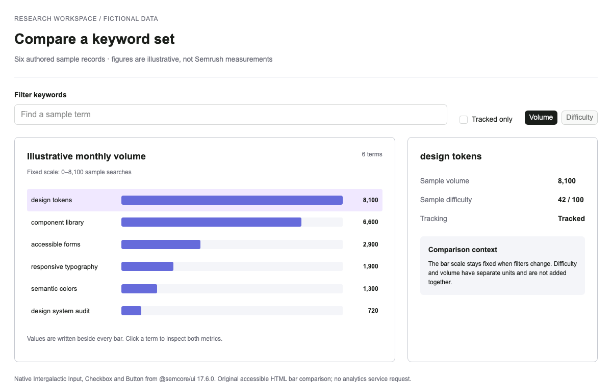
经过验证的三步配置向导

Basic Steps 用于跟踪当前进度;Input 和 Switch 会在页面切换时保留值。“继续”会验证名称,最后一个操作仅用于准备本地配置。

jsx
// React 18 example. React 19 uses @douyinfe/semi-ui-19 instead.
// npm install react@18 react-dom@18 @douyinfe/semi-ui
import React,{useState} from 'react';
import {createRoot} from 'react-dom/client';
import {Steps,Input,Switch,Button} from '@douyinfe/semi-ui';
function WorkspaceSetup(){
 const [current,setCurrent]=useState(0),[name,setName]=useState('');
 const [digest,setDigest]=useState(true),[error,setError]=useState('');
 const [prepared,setPrepared]=useState(false);
 function next(){
  if(current===0&&!name.trim()){setError('Enter a workspace name.');return;}
  setError('');setCurrent(n=>Math.min(2,n+1));
 }
 return <main style={{maxWidth:760,margin:'auto',padding:24,color:'var(--semi-color-text-0)'}}>
  <h1>Workspace setup</h1>
  <Steps type="basic" current={current} status={error?'error':'process'}>
   <Steps.Step title="Name workspace"/>
   <Steps.Step title="Choose updates"/>
   <Steps.Step title="Review settings"/>
  </Steps>
  <section style={{padding:'24px 0'}}>
   {current===0&&<><label htmlFor="workspace-name">Workspace name</label>
    <Input id="workspace-name" value={name} onChange={setName}
      validateStatus={error?'error':'default'} aria-invalid={!!error} aria-describedby="error" />
    <p id="error" role="alert">{error}</p></>}
   {current===1&&<><h2>Weekly digest</h2><p>Include a weekly activity summary in the local configuration.</p>
    <Switch checked={digest} onChange={setDigest} aria-label="Weekly digest"/></>}
   {current===2&&<><h2>Review your draft</h2><dl><dt>Workspace</dt><dd>{name}</dd>
    <dt>Weekly digest</dt><dd>{digest?'Enabled':'Disabled'}</dd></dl>
    <p>No workspace or notification subscription is created.</p></>}
  </section>
  {current>0&&<Button onClick={()=>{setCurrent(n=>n-1);setPrepared(false);}}>Previous</Button>}
  {current<2 ? <Button theme="solid" type="primary" onClick={next}>Continue</Button> :
    <Button theme="solid" type="primary" onClick={()=>setPrepared(true)}>Prepare configuration</Button>}
  <p role="status">{prepared?'Configuration prepared locally. No account created.':''}</p>
 </main>;
}
createRoot(document.getElementById('root')).render(<WorkspaceSetup />);

代码参考

  • React 18 示例有意安装 @douyinfe/semi-ui;React 19 则需要《快速开始》中说明的 -19 包。
  • 在受支持的打包工具中,Semi 组件 JavaScript 会导入其关联的 CSS;默认设置无需添加并不存在的全局样式表步骤。
  • 嵌入式 HTML 示例明确处理了焦点移动;在产品中使用原生组件时,也应实现相同行为。
04

Semi Design 设计系统 Agent 设置

实现起点

选择一个依赖分支。示例使用 React 18。当前《快速开始》说明,在 Vite/Webpack/Rspack 中,组件 JavaScript 会导入其关联的 CSS;编译主题还需要额外的工具。

bash
npm install react@18 react-dom@18 @douyinfe/semi-ui
# For a React 19 application instead:
# npm install react@19 react-dom@19 @douyinfe/semi-ui-19

适用于你项目的提示词

Agent 提示词
使用 Semi 基础 Steps,搭配受控的 Input 和 Switch。根据已安装的 React 主版本选择对应的 React package。前进前先验证,上一步时保留数据,并呈现最终的本地配置,不要虚构账号创建结果。
05

Semi Design 设计系统:来源与范围

独立的 OpenDesign 参考示例。原创工作区样例;不会创建账号或订阅通知。