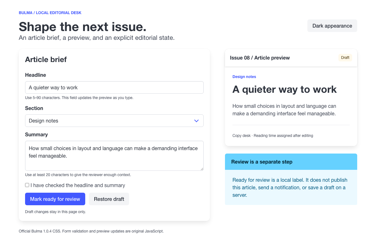
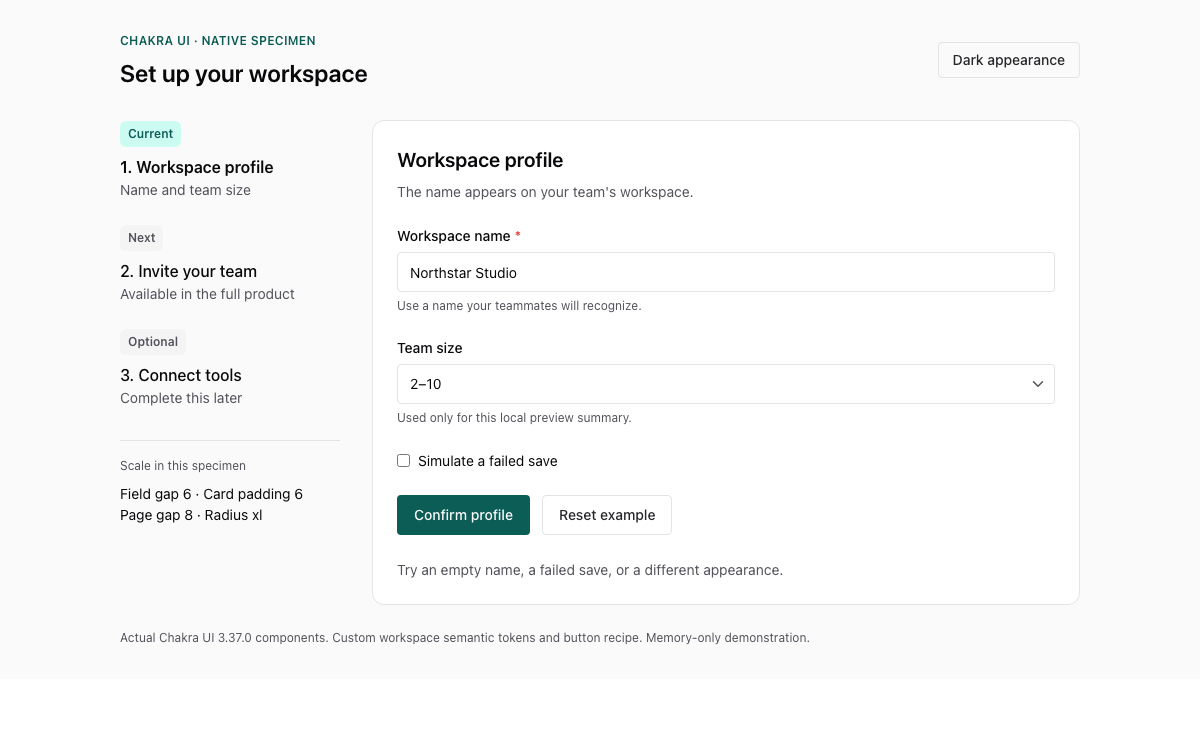
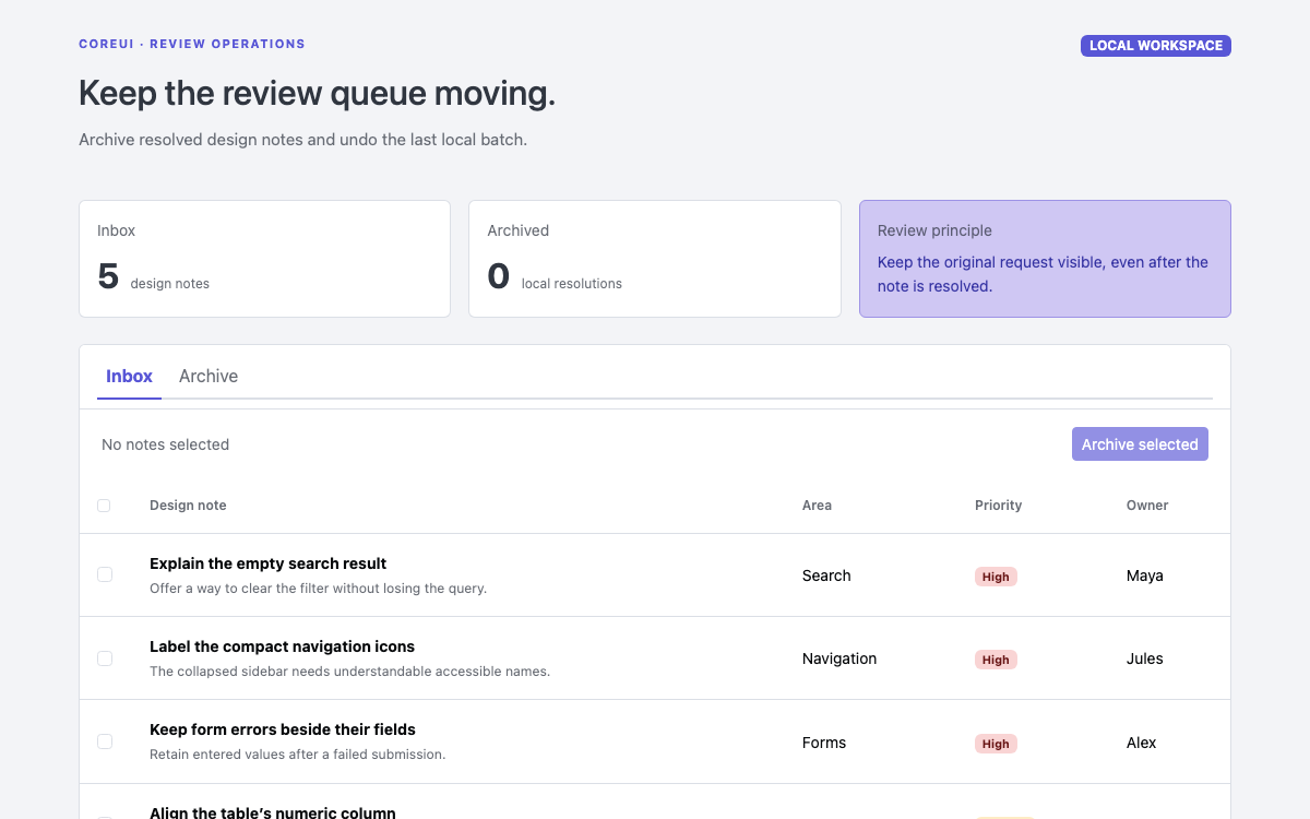
Use Bootstrap 5.3.8 through its actual spacing scale, semantic colors, responsive grid and component APIs. Try a working reservation form, error summary, table filter, modal and color-mode switch, then reuse the documented code.
Native Bootstrap 5.3.8 CSS and JavaScript, served locally. Reservation data and application behavior are original examples. · Implementation reference
02
Bootstrap Design System Design Reference
Bootstrap 5.3.8 default compiled CSS and the 5.3 documentation. Values are defaults, not mandatory brand rules. Rem-to-pixel comparisons assume a 16px root; responsive font sizes can vary below the large-screen endpoint. The surrounding OpenDesign page retains its own typography.
Bootstrap Design System Choose Bootstrap’s CSS and JavaScript Responsibilities
One stylesheet, optional component behavior
Bootstrap’s compiled stylesheet supplies the grid, typography, utilities and component appearance. The JavaScript bundle adds interactive plugins such as Modal, Collapse and Dropdown. A styled button does not require JavaScript; a data-bs-toggle modal trigger does. The working preview loads the matching 5.3.8 stylesheet and bundle locally so that its controls demonstrate those real contracts.
The reservation table filtering, error summary and local row insertion are application code. Keeping that distinction visible makes it possible to replace the fictional records with a service without attributing booking behavior to Bootstrap itself.
CSS: layout, typography, buttons, fields, tables and state styling.
Bootstrap JavaScript: modal opening, backdrop, Escape and focus behavior.
Application JavaScript: validation messages, record filtering and local data updates.
Use the compiled CSS for a quick start or a product that can accept the standard utility set. Use the Sass source when changing theme maps, utility generation or the grid at build time. Runtime CSS custom properties are useful for component-level customization, but changing a root color variable does not rebuild every precompiled variant.
Bootstrap Design System Apply Semantic Colors and Color Modes
Pair a status surface with its foreground
The reservation badges use bg-primary-subtle with text-primary-emphasis. These are paired semantic roles, so the foreground and background both adapt when data-bs-theme changes. A raw blue background plus an arbitrary gray text color loses that relationship. Reserved, In use and Draft also remain written labels; color is not their sole meaning.
For one custom action, override its local --bs-btn-* properties. Set hover and active values as well as the resting background. The example below is an application variant, not a Bootstrap default. Keep this class on the target button so that it does not silently alter every primary action in an unrelated part of the page.
Bootstrap Design System Use the Actual Typography Scale
Separate document semantics from visual size
The preview’s main title is an h1 with the h3 class: it remains the page’s main heading but uses the smaller visual scale appropriate to a tool. Section headings are h2 elements with h5 styling. Bootstrap provides both element defaults and equivalent heading classes, which allows this distinction without skipping document levels.
Default body text is 1rem with a 1.5 line-height. h1 through h4 scale responsively before reaching the values in the reference table. A screenshot at one width therefore does not define the entire type scale. Use the compiled styles or the documented Sass behavior rather than copying a measured pixel size from a single viewport.
text-body-secondary follows the body color mode. It is suitable for supporting record information such as the owner name beneath an equipment title. The small class reduces size relative to its context; using it on every field label would make the form harder to scan. Keep labels at the normal form scale and reserve compact text for hints and metadata.
Bootstrap Design System Compose With Spacing Utilities and the Grid
Use the scale instead of arbitrary gaps
p-3 means 1rem of padding; p-4 means 1.5rem, and p-5 jumps to 3rem. The labels are scale keys rather than literal pixel counts. The preview uses p-3 p-md-4 so that its outer padding grows at 768px, while mb-3 separates field groups by 1rem. This is a concrete policy for this example, not a new official spacing scale.
Bootstrap Design System Build Fields With Explicit Relationships
Connect labels, hints and feedback
form-label styles a real label; its for value must match the input id. form-control styles text-like inputs, while form-select styles a select. The preview uses aria-describedby for hint and error IDs and required for the actual constraint. The class names do not create those semantic relationships automatically.
On submit, the example checks each field, sets is-invalid and aria-invalid, builds text links to the failed fields and focuses the summary. Correcting a field updates its state without clearing other answers. This application layer is essential: the Bootstrap validation documentation warns that its custom visual feedback alone is not fully exposed to assistive technology.
Inspect the actual constraint result before marking the field invalid.
Keep the error text associated with the field and expose the invalid state.
Place focus on a useful summary or the first invalid field after submission.
Bootstrap Design System Present and Filter Records Without Losing Meaning
Use the table component for comparable data
The table has column headers, row headers and a caption. table-hover provides a hover treatment but does not turn rows into buttons. Filtering changes the hidden state of matching rows and updates an aria-live result count. The displayed status remains text inside a badge, so the meaning survives a color-mode change.
table-responsive provides horizontal scrolling when a wide table cannot fit. Avoid placing a dropdown that must escape the clipped area inside this wrapper without checking it. The example keeps its filter above the table. On mobile, only the data region may scroll horizontally; the page itself should stay within the viewport.
Bootstrap Design System Review the Selection With the Modal API
Open only after the form is valid
The interactive example creates or reuses the Bootstrap Modal instance and calls show only when validation succeeds. This prevents the review layer from covering errors that need attention. Its text is populated from the current values; choosing Edit details closes the modal while retaining the form.
javascript
const element = document.getElementById("review-modal");
const modal = bootstrap.Modal.getOrCreateInstance(element);
// Run after validation and after populating the review text.
modal.show();
element.addEventListener("hidden.bs.modal", () => {
  document.querySelector("#reservation button[type=submit]").focus();
});
Bootstrap controls its backdrop and transition. Use its methods and events instead of toggling display manually, which can leave focus or the backdrop inconsistent. Confirming in this demonstration adds a local table row and closes the modal; it does not call a reservation service. The success message states exactly that local outcome.
Bootstrap Design System Integrate and Extend This Bootstrap Example
Load one matching CSS and JavaScript release
The embedded specimen loads locally stored Bootstrap 5.3.8 CSS and bundle files. Its data attributes and Modal API are from that release. In a Vite application, import the compiled CSS and the required plugin as shown in the setup section. Avoid loading the bundle and initializing a second copy of the same plugin through another wrapper.
A complete Bootstrap 5.3.8 page with its stylesheet, modal runtime, validation, filters and local confirmation. Save this file as index.html and serve the folder using the command below. The pinned CDN dependencies require a network connection.
html
<!doctype html><html lang="en" data-bs-theme="light"><head><meta charset="utf-8"><meta name="viewport" content="width=device-width,initial-scale=1"><title>Bootstrap equipment reservations — OpenDesign example</title><link rel="stylesheet" href="https://cdn.jsdelivr.net/npm/[email protected]/dist/css/bootstrap.min.css"><style>body{margin:0}main{max-width:1120px;margin:auto}.demo-stat{font-variant-numeric:tabular-nums}.table td,.table th{vertical-align:middle}.table caption{font-size:.875rem}.demo-status:empty{display:none}@media(max-width:575px){.table th,.table td{font-size:.8125rem;padding:.65rem .4rem}.demo-mobile-hide{display:none}}@media(prefers-reduced-motion:reduce){*{scroll-behavior:auto!important}}</style></head><body>
<header class="border-bottom bg-body-tertiary px-3 px-md-4 py-3 d-flex align-items-center justify-content-between gap-3"><div><strong>Studio inventory</strong><span class="badge text-bg-primary ms-2">Bootstrap 5.3.8</span></div><button id="theme" type="button" class="btn btn-outline-secondary btn-sm" aria-pressed="false">Dark mode</button></header>
<main class="p-3 p-md-4"><div class="d-flex align-items-start justify-content-between gap-3 mb-4"><div><p class="text-body-secondary small mb-1">EQUIPMENT / RESERVATIONS</p><h1 class="h3 mb-2">Keep the next shoot ready.</h1><p class="text-body-secondary mb-0">Check equipment, create a local reservation and review its details.</p></div><span class="badge rounded-pill text-primary-emphasis bg-primary-subtle border border-primary-subtle demo-mobile-hide">Interactive example</span></div>
<div class="row g-3 mb-4"><div class="col-4"><div class="border rounded p-3"><div class="text-body-secondary small">Equipment</div><strong class="fs-3 demo-stat">12</strong></div></div><div class="col-4"><div class="border rounded p-3"><div class="text-body-secondary small">Reservations</div><strong id="count" class="fs-3 demo-stat">3</strong></div></div><div class="col-4"><div class="border rounded p-3"><div class="text-body-secondary small">Available</div><strong class="fs-3 demo-stat">8</strong></div></div></div>
<div class="row g-4"><section class="col-lg-7" aria-labelledby="list-title"><div class="d-flex align-items-center justify-content-between gap-3 mb-3"><h2 id="list-title" class="h5 m-0">Reservation list</h2><div><label for="filter" class="visually-hidden">Filter reservations by status</label><select class="form-select form-select-sm" id="filter"><option value="all">All statuses</option><option value="Reserved">Reserved</option><option value="In use">In use</option><option value="Draft">Draft</option></select></div></div><div class="table-responsive border rounded"><table class="table table-hover mb-0"><caption class="px-3">Fictional records. New entries stay in this browser tab.</caption><thead class="table-light"><tr><th scope="col">Equipment</th><th scope="col">Date</th><th scope="col">Status</th></tr></thead><tbody id="rows"><tr data-status="Reserved"><th scope="row" class="fw-medium">Camera kit A<div class="small fw-normal text-body-secondary">Mia Chen</div></th><td>10 Oct</td><td><span class="badge text-primary-emphasis bg-primary-subtle">Reserved</span></td></tr><tr data-status="In use"><th scope="row" class="fw-medium">Lighting studio<div class="small fw-normal text-body-secondary">Alex Kim</div></th><td>10 Oct</td><td><span class="badge text-success-emphasis bg-success-subtle">In use</span></td></tr><tr data-status="Draft"><th scope="row" class="fw-medium">Audio recorder<div class="small fw-normal text-body-secondary">Jules Davis</div></th><td>11 Oct</td><td><span class="badge text-secondary-emphasis bg-secondary-subtle">Draft</span></td></tr></tbody></table></div><p id="empty" class="alert alert-info mt-3" hidden>No reservations match this status.</p><p id="results" class="small text-body-secondary mt-2" aria-live="polite">3 reservations shown</p><div class="alert alert-primary mt-4 mb-0"><strong>Try the system</strong><p class="small mb-0 mt-1">Switch color mode, filter the table, submit an empty form, then review a complete reservation in a Bootstrap modal.</p></div></section>
<section class="col-lg-5" aria-labelledby="form-title"><div class="card"><div class="card-body p-3 p-md-4"><h2 id="form-title" class="h5 mb-3">New reservation</h2><form id="reservation" novalidate><div id="error-summary" class="alert alert-danger" tabindex="-1" role="alert" hidden><strong>Check the reservation details.</strong><ul class="mb-0 mt-2" id="error-links"></ul></div><div class="mb-3"><label class="form-label" for="equipment">Equipment</label><select class="form-select" id="equipment" aria-describedby="equipment-error" required><option value="">Choose equipment</option><option>Camera kit A</option><option>Lighting studio</option><option>Audio recorder</option></select><div id="equipment-error" class="invalid-feedback">Choose equipment for this reservation.</div></div><div class="mb-3"><label class="form-label" for="owner">Reserved by</label><input class="form-control" id="owner" autocomplete="name" aria-describedby="owner-hint owner-error" required><div class="form-text" id="owner-hint">Use a fictional name for this example.</div><div class="invalid-feedback" id="owner-error">Enter the name of the person reserving equipment.</div></div><div class="mb-3"><label class="form-label" for="date">Reservation date</label><input class="form-control" id="date" type="date" aria-describedby="date-error" required><div class="invalid-feedback" id="date-error">Choose a reservation date.</div></div><button type="submit" class="btn btn-primary w-100">Review reservation</button></form><p class="small text-body-secondary mt-3 mb-0">This example validates input locally. It does not reserve real equipment.</p></div></div></section></div><div id="notice" class="alert alert-success mt-4 demo-status" role="status" hidden></div></main>
<div class="modal fade" id="review-modal" tabindex="-1" aria-labelledby="review-title" aria-hidden="true"><div class="modal-dialog modal-dialog-centered"><div class="modal-content"><div class="modal-header"><h2 class="modal-title fs-5" id="review-title">Review reservation</h2><button type="button" class="btn-close" data-bs-dismiss="modal" aria-label="Close review"></button></div><div class="modal-body"><dl class="row mb-0"><dt class="col-4">Equipment</dt><dd class="col-8" id="review-equipment"></dd><dt class="col-4">Reserved by</dt><dd class="col-8" id="review-owner"></dd><dt class="col-4">Date</dt><dd class="col-8" id="review-date"></dd></dl><p class="small text-body-secondary mt-3 mb-0">Confirming adds a row to this local example only.</p></div><div class="modal-footer"><button class="btn btn-outline-secondary" data-bs-dismiss="modal" type="button">Edit details</button><button class="btn btn-primary" id="confirm" type="button">Add to example</button></div></div></div></div>
<script src="https://cdn.jsdelivr.net/npm/[email protected]/dist/js/bootstrap.bundle.min.js"></script><script>
const $=id=>document.getElementById(id);const fields=['equipment','owner','date'];const review=bootstrap.Modal.getOrCreateInstance($('review-modal'));
$('theme').onclick=()=>{const dark=document.documentElement.dataset.bsTheme!=='dark';document.documentElement.dataset.bsTheme=dark?'dark':'light';$('theme').setAttribute('aria-pressed',String(dark));$('theme').textContent=dark?'Light mode':'Dark mode'};
function filter(){let count=0;for(const row of $('rows').rows){row.hidden=$('filter').value!=='all'&&row.dataset.status!==$('filter').value;if(!row.hidden)count++}$('empty').hidden=count>0;$('results').textContent=count+' reservations shown'}$('filter').onchange=filter;
function validateField(id){const el=$(id),invalid=!el.checkValidity();el.classList.toggle('is-invalid',invalid);el.setAttribute('aria-invalid',String(invalid));return !invalid}
$('reservation').onsubmit=e=>{e.preventDefault();const invalid=fields.filter(id=>!validateField(id));$('error-links').replaceChildren();$('error-summary').hidden=invalid.length===0;if(invalid.length){for(const id of invalid){const li=document.createElement('li'),a=document.createElement('a');a.href='#'+id;a.className='alert-link';a.textContent=$(id+'-error').textContent;a.onclick=e=>{e.preventDefault();$(id).focus()};li.append(a);$('error-links').append(li)}$('error-summary').focus();return}for(const id of fields)$('review-'+id).textContent=$(id).value;review.show()};
for(const id of fields)$(id).addEventListener('input',()=>{if($(id).getAttribute('aria-invalid')==='true')validateField(id)});
$('review-modal').addEventListener('hidden.bs.modal',()=>$('reservation').querySelector('button').focus());
$('confirm').onclick=()=>{const row=document.createElement('tr');row.dataset.status='Reserved';const name=document.createElement('th');name.scope='row';name.className='fw-medium';name.textContent=$('equipment').value;const owner=document.createElement('div');owner.className='small fw-normal text-body-secondary';owner.textContent=$('owner').value;name.append(owner);const date=document.createElement('td');date.textContent=$('date').value;const state=document.createElement('td'),badge=document.createElement('span');badge.className='badge text-primary-emphasis bg-primary-subtle';badge.textContent='Reserved';state.append(badge);row.append(name,date,state);$('rows').prepend(row);$('count').textContent=$('rows').rows.length;$('filter').value='all';filter();review.hide();$('notice').hidden=false;$('notice').textContent='Reservation added to this local example. No data was sent.';$('reservation').reset();for(const id of fields){$(id).classList.remove('is-invalid');$(id).removeAttribute('aria-invalid')}};
</script></body></html>
No service receives the form. Confirmed reservations exist only in this page session.
The local preview vendors the same pinned CSS and JavaScript; this copy uses their public CDN URLs.
Field label, hint and explicit error state
This self-contained field composition uses Bootstrap styling and a real validation result. The page example adds an error summary with focusable links for its three fields. A red border alone does not communicate the correction.
.is-invalid can be set explicitly without .was-validated.
aria-describedby connects hint and error text; aria-invalid expresses the current state.
The documentation warns that custom visual validation alone does not expose enough information to assistive technology.
A native review modal with a clear label
The modal uses Bootstrap’s actual plugin, backdrop, Escape handling and focus management. Put the title inside modal-header, the review in modal-body and continuation actions in modal-footer.
Load the matching Bootstrap JavaScript bundle once.
The data API opens a static example; the working reservation form uses Modal.getOrCreateInstance after valid input.
Use shown.bs.modal for behavior that must wait until the opening transition completes.
A responsive list and form composition
The inventory list takes seven columns and the form five at the lg breakpoint. Below lg both sections stack. g-4 gives the composition a 1.5rem gutter. The columns describe width; semantic sections and headings describe the content.
The same grid can use col-md-* if the content genuinely fits earlier.
Use the breakpoint table above rather than media queries with CSS variables; var() cannot supply a media-query threshold.
04
Bootstrap Design System Agent Setup
Implementation Starting Point
No build step is required for this complete HTML example. It imports Bootstrap 5.3.8 from the pinned CDN URLs shown in the file. The shorter examples below isolate individual patterns from this working page.
sh
# Save the complete index.html from Component Examples in a new folder.
# Serve that folder with Python 3:
python3 -m http.server 8000
# Open http://localhost:8000/ in a browser.
A Prompt for Your Project
Agent Prompt
Implement an equipment reservation interface using Bootstrap 5.3.8 and this guide. Use a row g-4 with col-lg-7 and col-lg-5, p-3 p-md-4 spacing, theme-aware body and subtle/emphasis color roles, a semantic table and labeled form controls. Validate with explicit errors and an error summary before opening the native Bootstrap Modal. Keep inputs when editing; add records only to local demo state unless a real API is supplied. Support data-bs-theme light/dark and keyboard dismissal. Do not replace the given scale with arbitrary values.
05
Bootstrap Design System Sources and Scope
OpenDesign’s Bootstrap 5.3.8 application guide and runnable native-component specimen. Reference values come from the linked Bootstrap documentation and the pinned compiled CSS. Reservation records, layout composition and validation summary are original application code; no real reservation is submitted.