Radix Themes
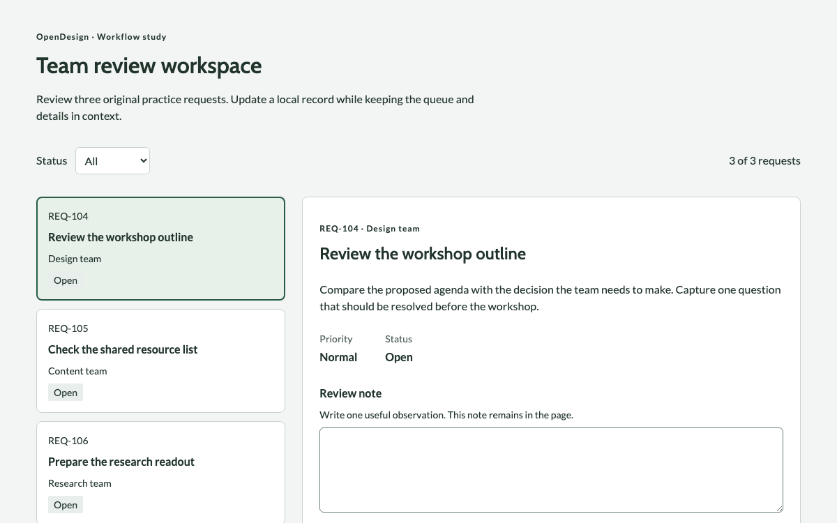
A practical product-interface reference: themeable colors, a nine-step type and spacing scale, component states, and a complete agent guide.
Explore palettes, typography, components, layout, and complete design guides. Compare a visual direction, read its rules, and bring the right reference into your next project.
A practical product-interface reference: themeable colors, a nine-step type and spacing scale, component states, and a complete agent guide.

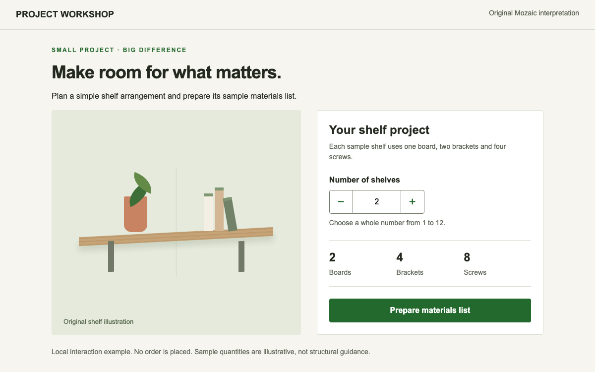
Build a practical quantity-control composition with Mozaic’s 16px magic unit, matched 48px controls, real SCSS imports and BEM classes. The shelf planner makes bounds, typed errors and a local materials summary observable.

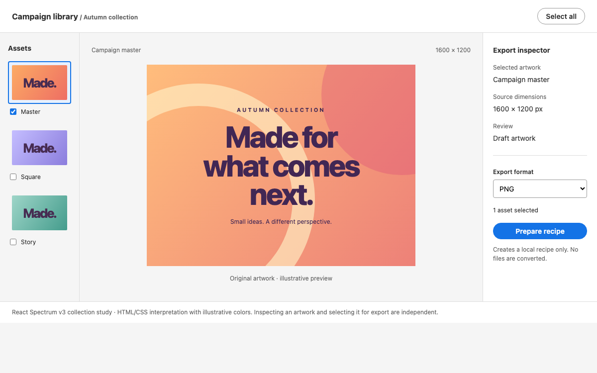
Study React Spectrum v3 through a selectable creative-asset table and an export-preset inspector. Understand Provider themes and input scale, supported style props, keyed collections, and the boundary between v3 and the newer Spectrum 2 implementation.

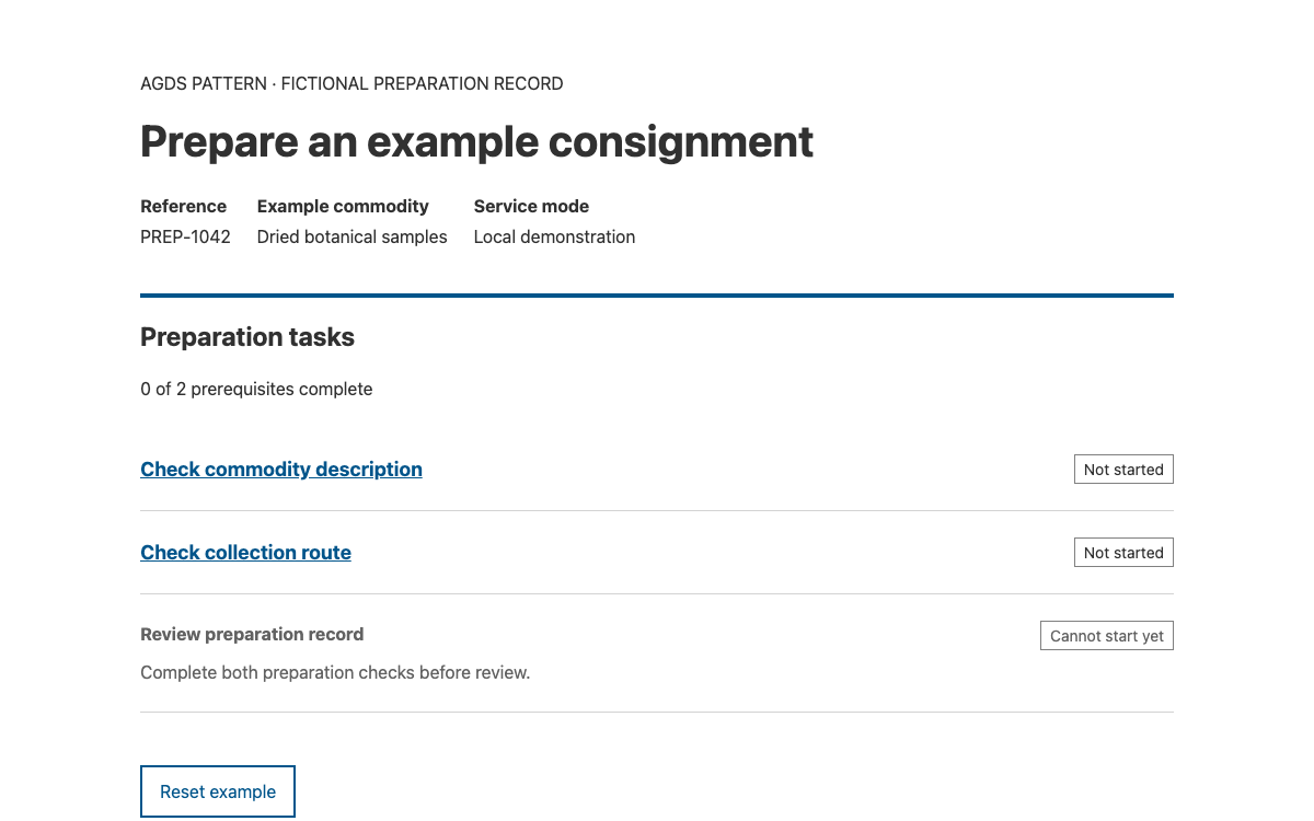
Build longer service transactions with AgDS’s concrete spacing, responsive props and TaskList status model. Try a preparation workflow whose review step unlocks only when prerequisites are complete.

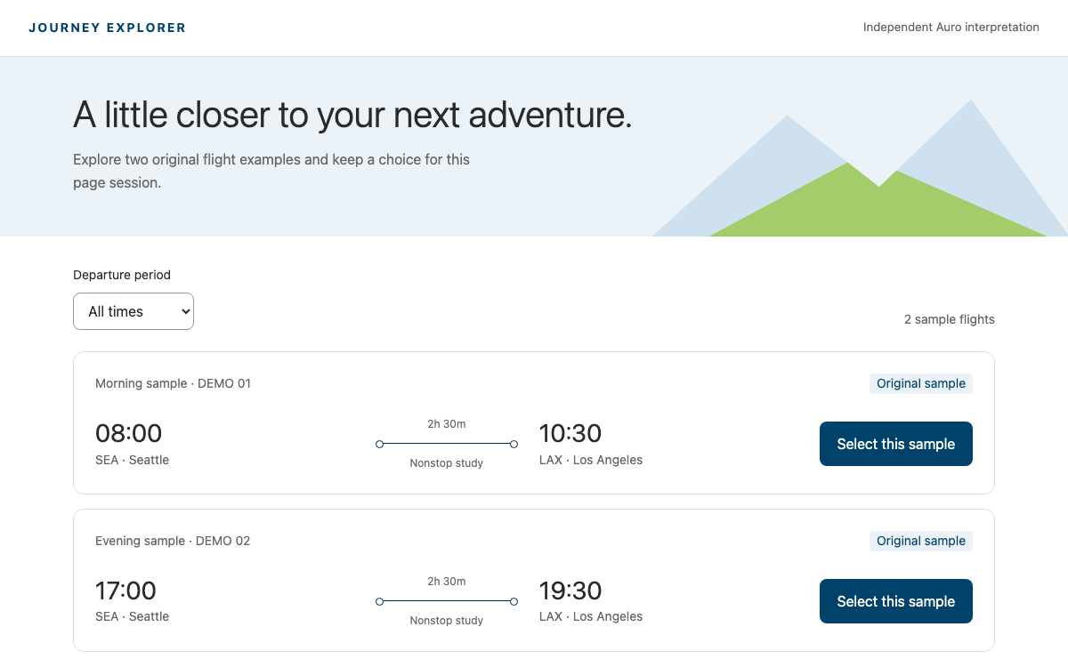
Explore Auro’s Alaska theme through real semantic color and type tokens, class-based typography and the native flight component. Two original flight records demonstrate local filtering and selection without representing airline inventory or booking.

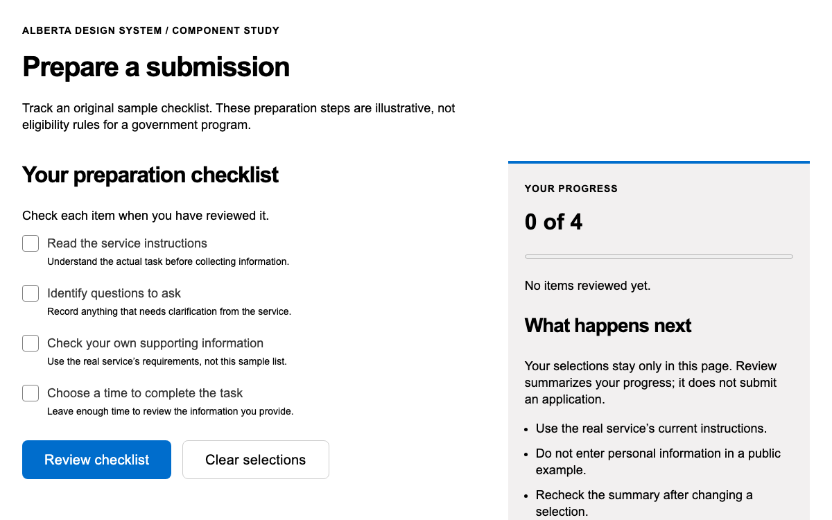
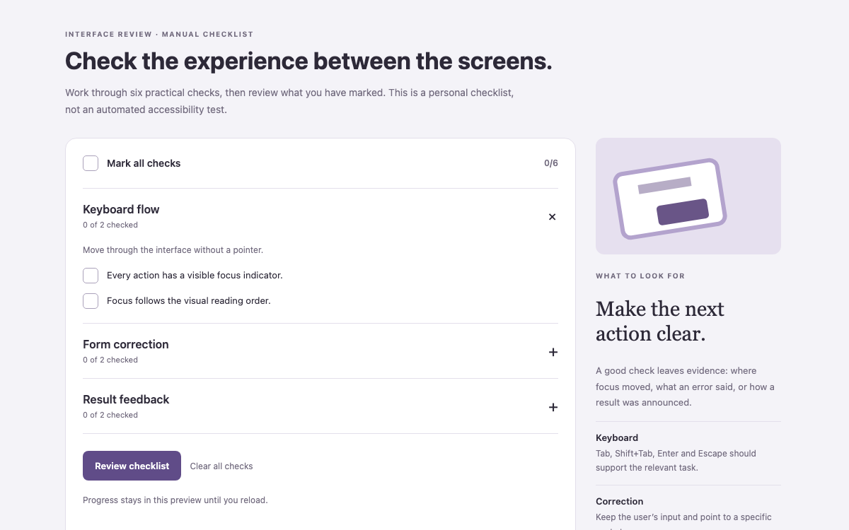
Use Alberta’s native web components and published design tokens to build a complete preparation checklist with accessible choices, derived progress and honest review feedback.

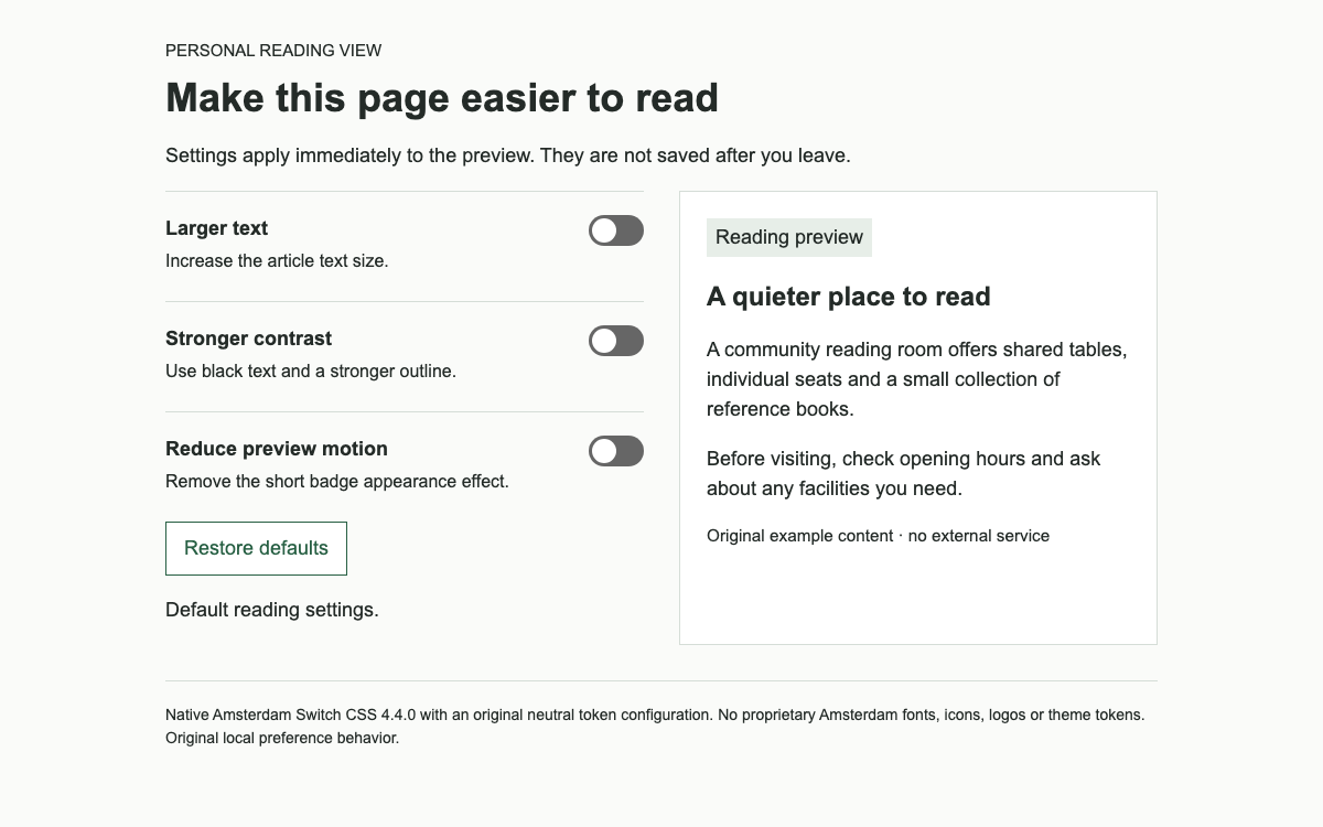
Use Amsterdam’s real open-source Switch contract with a complete neutral theme, accessible labels and immediate reading preferences.

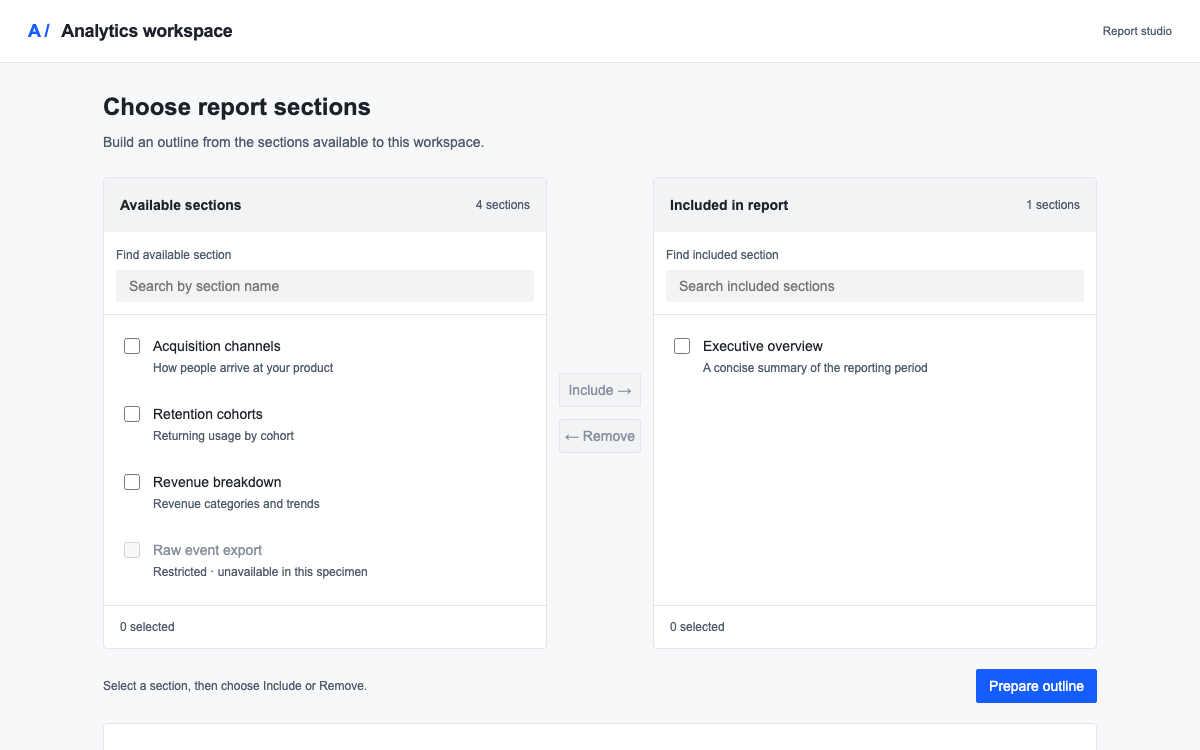
Build a report-section selector with Arco’s controlled Transfer component. Explore its actual spacing and size scales, CSS variable conventions, semantic surfaces, and the distinction between selecting rows and moving them.

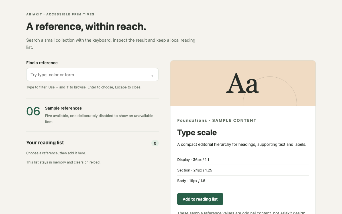
Ariakit supplies unstyled React components with explicit shared state and composable accessible parts. Its combobox separates typed input from committed selection, making it useful for search-driven pickers; the reference finder below demonstrates that distinction with grouped and unavailable results.

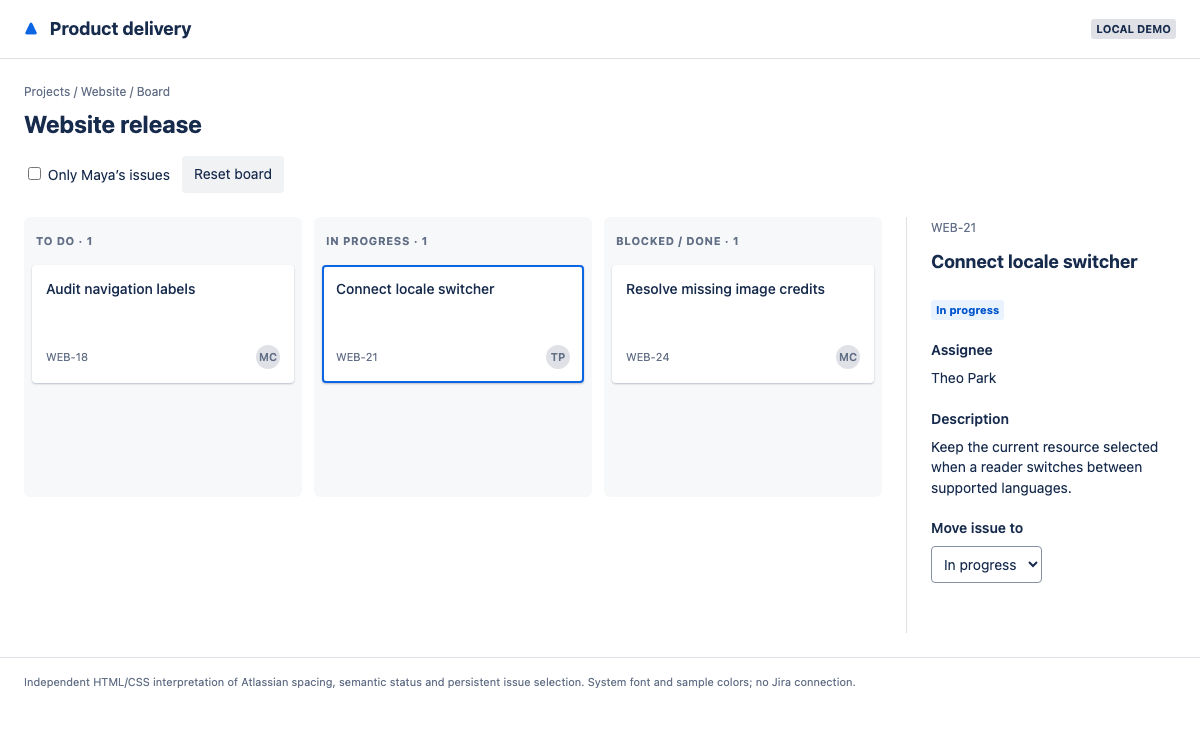
Build an issue-planning board with semantic Atlassian tokens, an eight-pixel spacing scale, real Button, Lozenge and Toggle APIs, and the required Compiled styling setup. Inspect an issue, filter the board, and move a local work item without confusing selection with status.

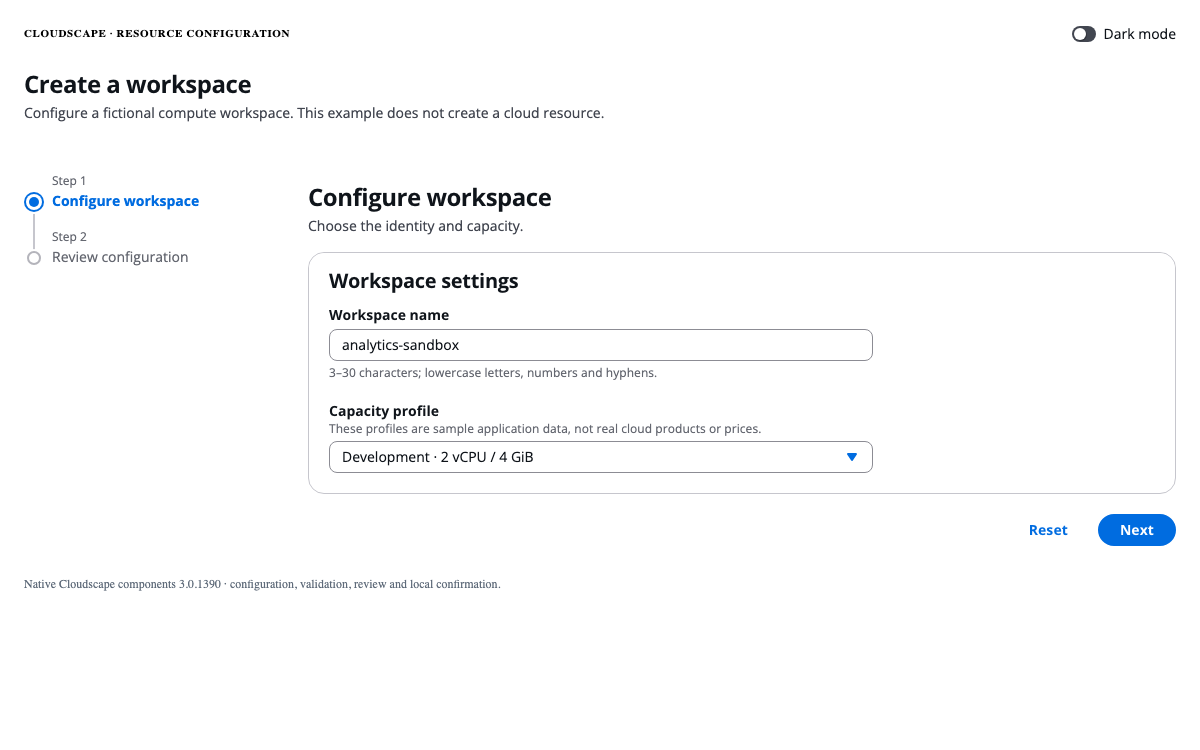
A Cloudscape configuration guide with real visual-refresh tokens, density-aware spacing, controlled form APIs, and a working two-step resource wizard.
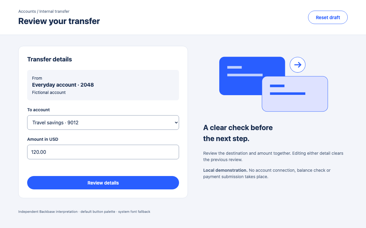
Build a branded banking review flow with Backbase’s Angular modules, semantic theme export, and explicit review states. Compare web APIs with separately documented native dimensions.

Bits UI provides headless Svelte components that compose through native parts and Svelte 5 state. The example combines a derived mixed-state checkbox, independently expanded accordion sections and a portal-based review dialog, with the complete styling configuration included.

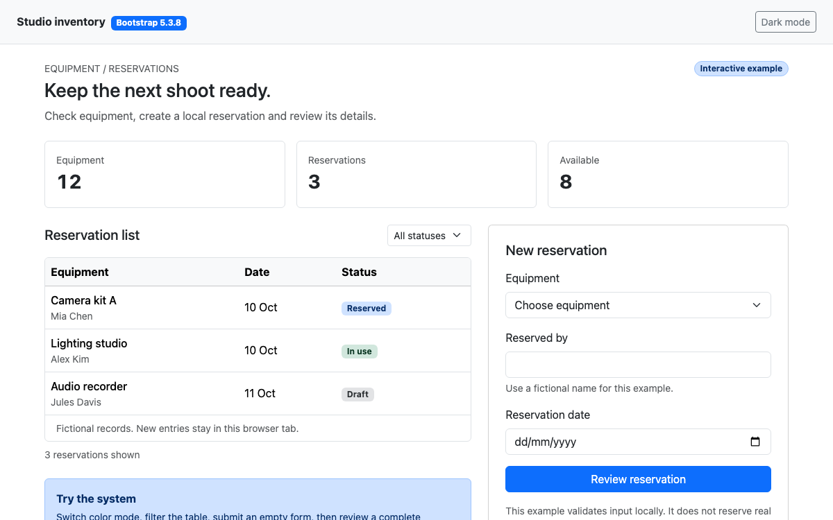
Use Bootstrap 5.3.8 through its actual spacing scale, semantic colors, responsive grid and component APIs. Try a working reservation form, error summary, table filter, modal and color-mode switch, then reuse the documented code.

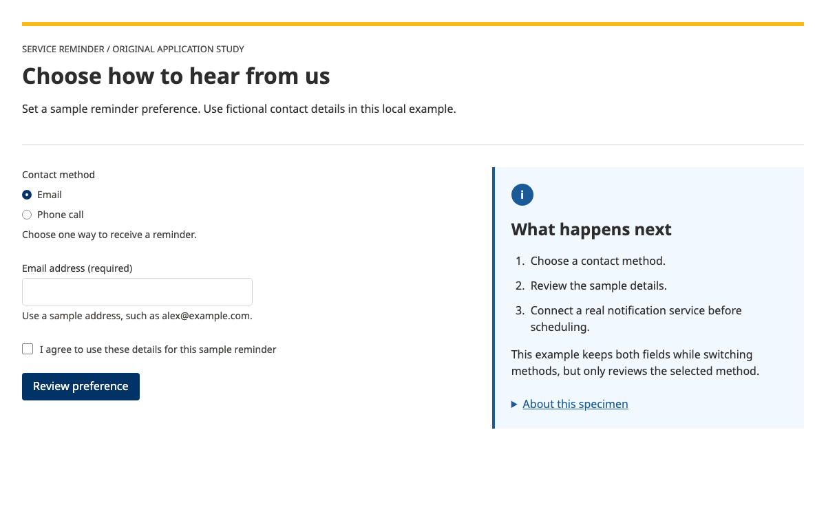
Build a B.C.-style reminder preference form with real semantic tokens, native React Aria controls, conditional contact fields and complete validation behavior.

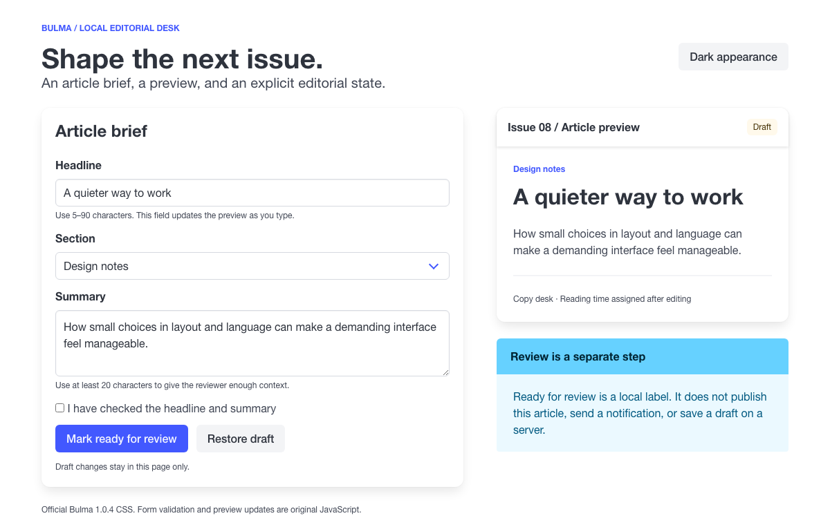
Build an editorial desk with Bulma’s real field/control structure, responsive columns, semantic color modifiers, and CSS variables, with complete validation code.

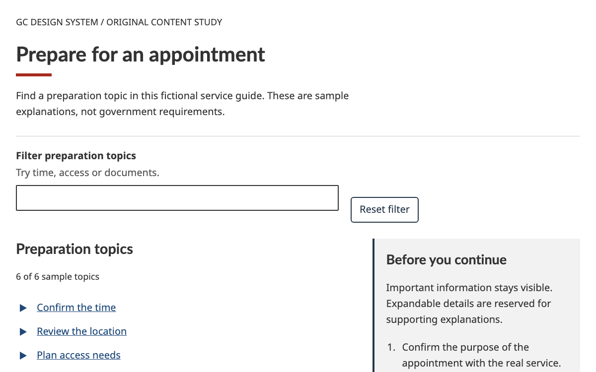
Explore GC Design System typography, semantic tokens and native web components through a complete searchable preparation guide with disclosure and empty-state behavior.
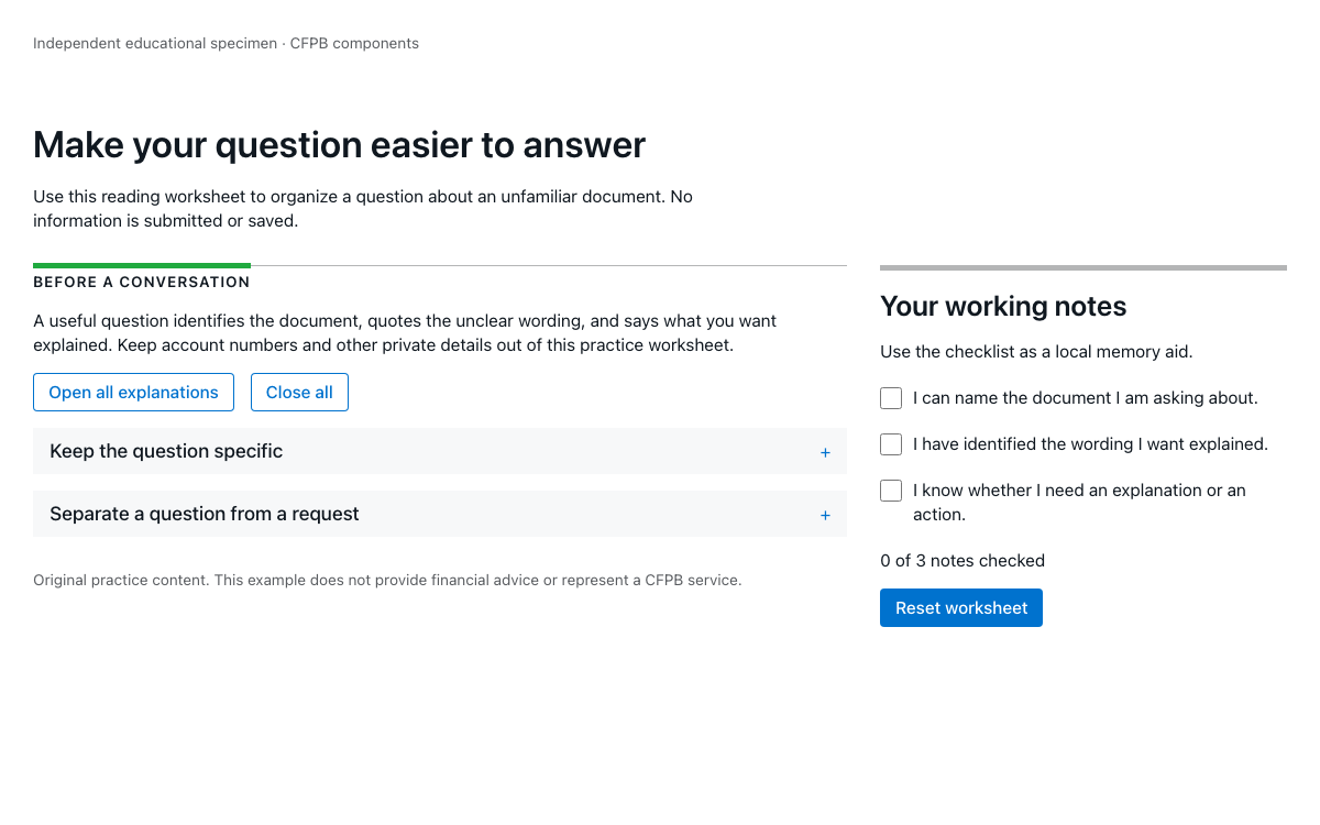
Implement CFPB’s editorial grid, current typography and native Expandables with a working reading worksheet, verified package APIs, and explicit identity boundaries.

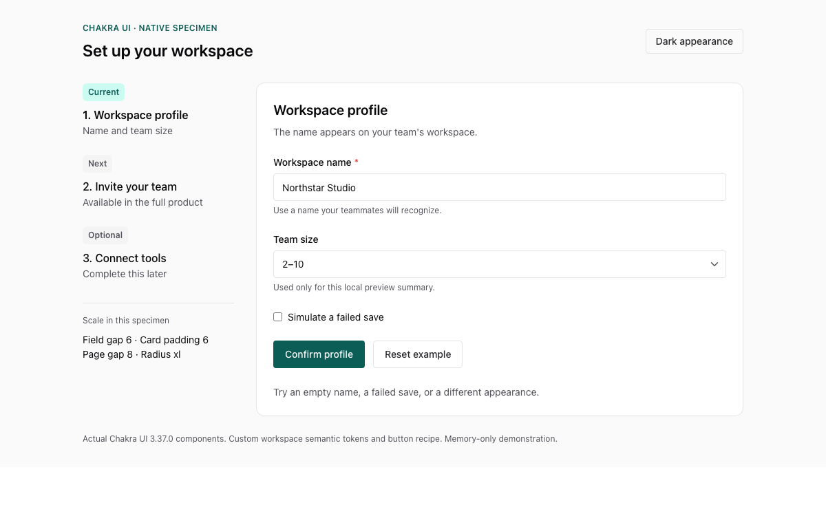
A Chakra UI v3 reference for tokens, semantic color roles, recipes, and compound form components. Inspect the actual spacing and type scales, then try a native workspace-profile form with validation, a failed-save simulation, and light/dark appearance.

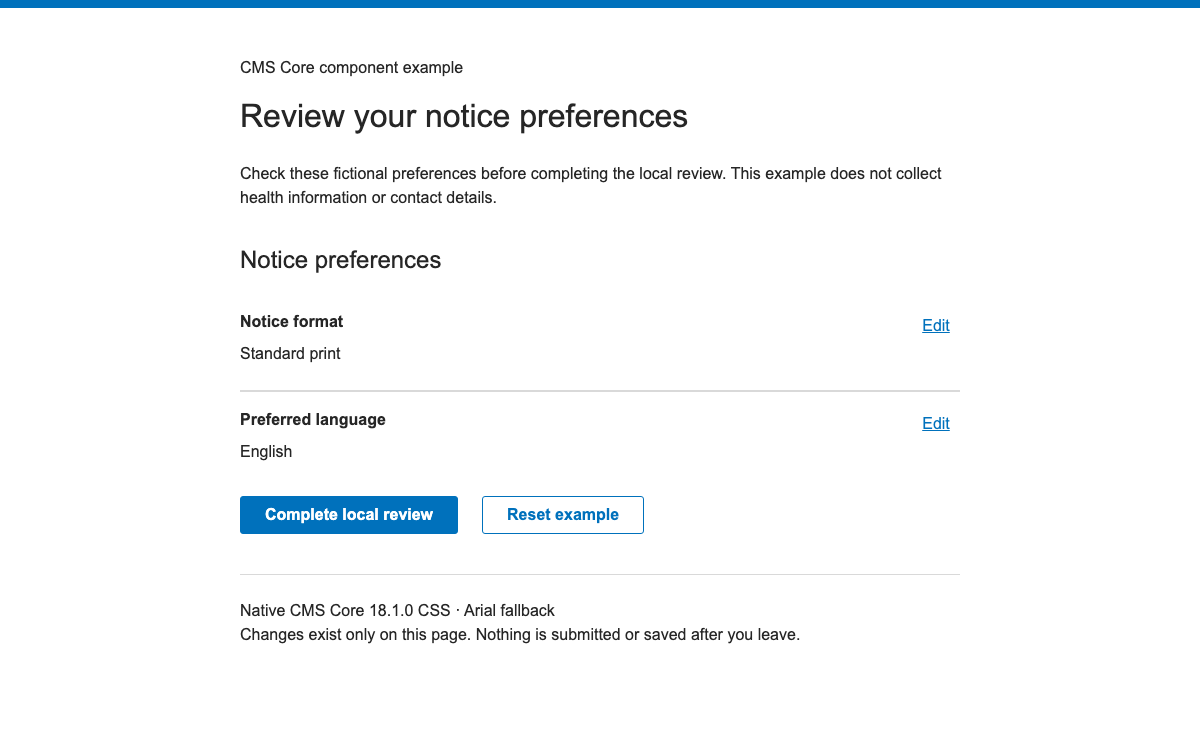
Implement CMS Core with versioned theme variables, real Review component APIs, and a working edit-and-review flow that preserves user answers and focus.

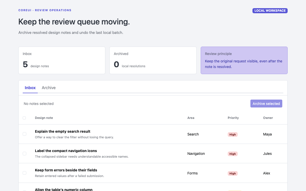
A CoreUI review queue built with real 5.9 theme variables, native tabs, checkbox batch selection and a persistent toast that can undo the last local archive operation.

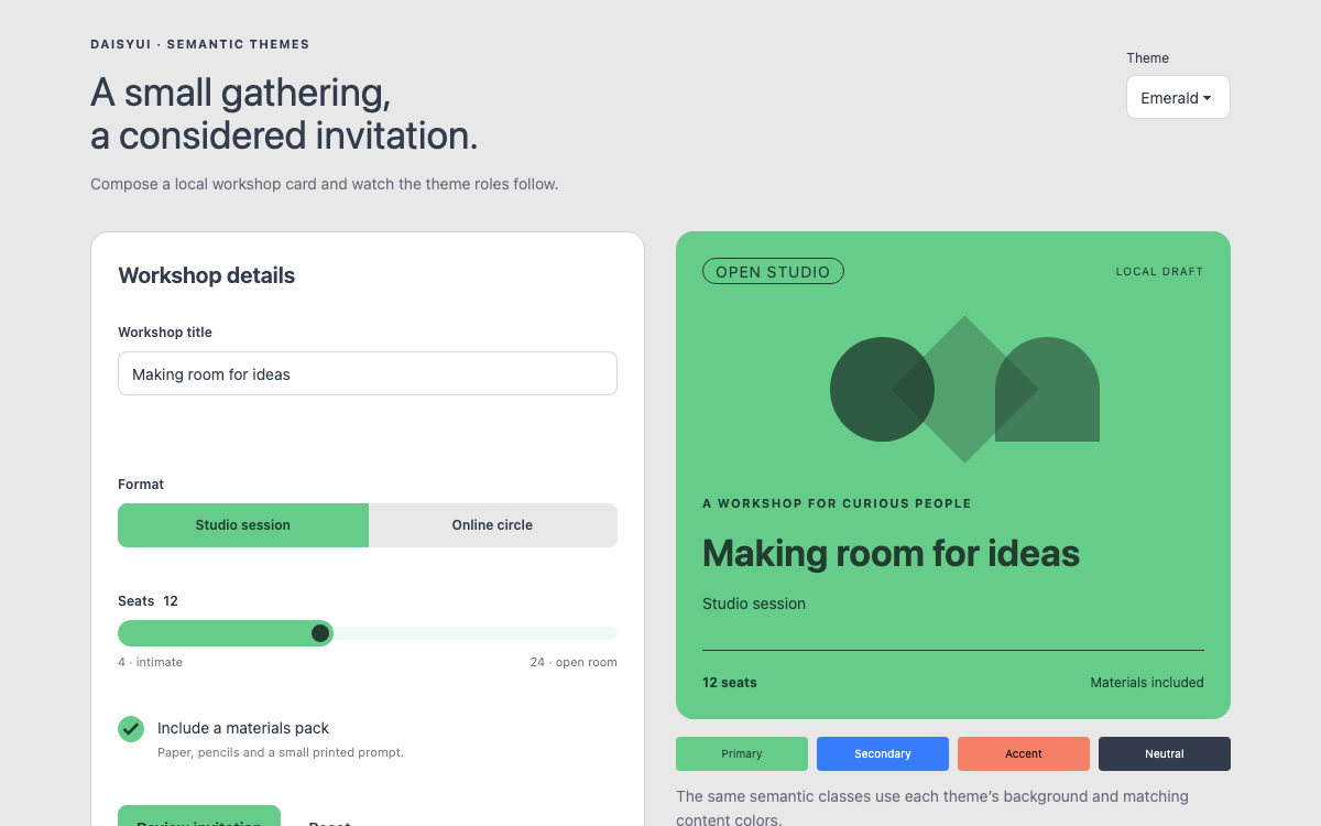
A CSS-native invitation studio that demonstrates daisyUI 5 semantic themes, paired content colors, radio-button joins, range controls, browser validation and a real dialog review step.

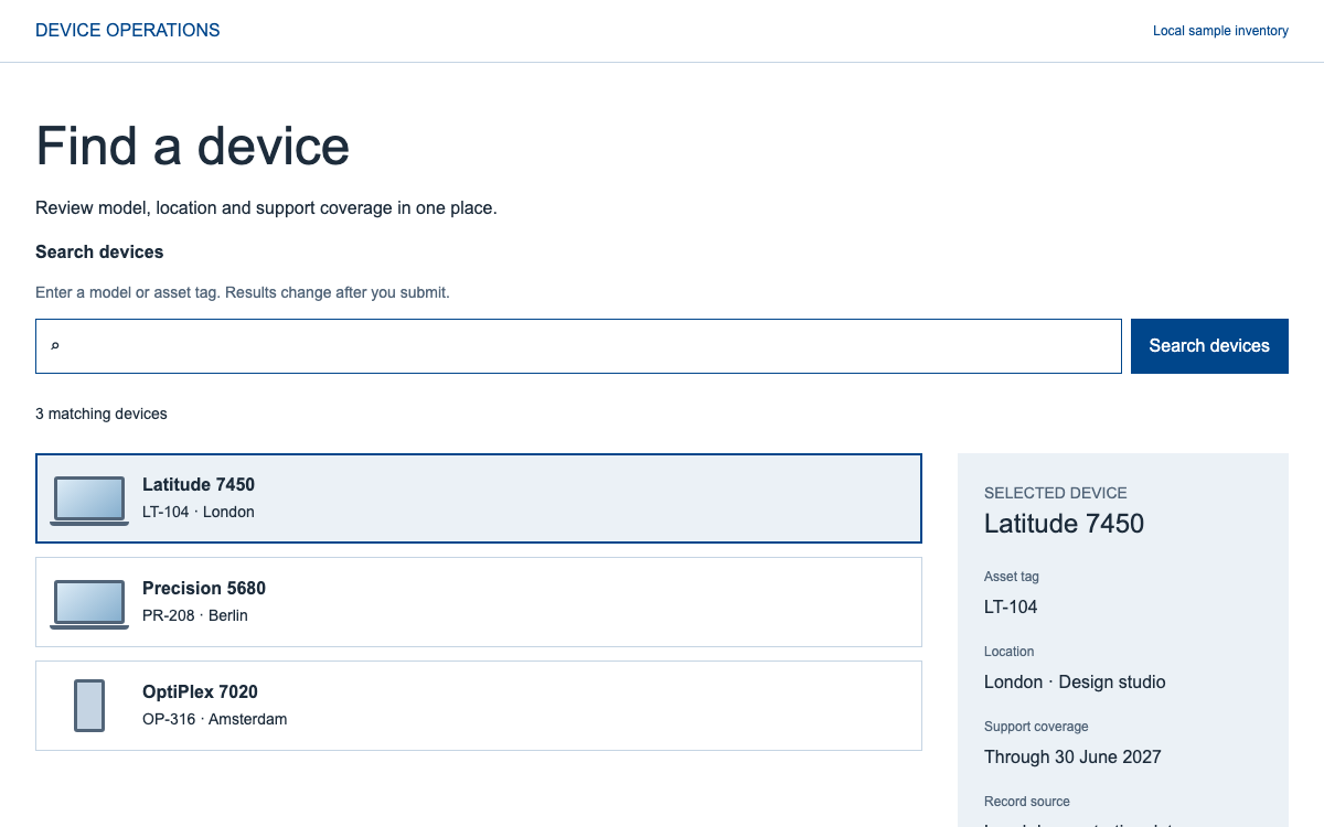
Build a scoped device search with DDS v3: semantic colors, a responsive typography ramp, token spacing, and an InputGroup composition whose filtering behavior belongs to the application.

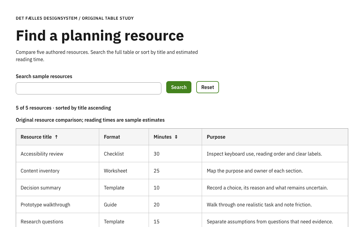
Explore Denmark’s DKFDS theme, actual Sass scales and accessible table patterns through a complete resource comparison with numeric sorting, submitted search and empty-state recovery.

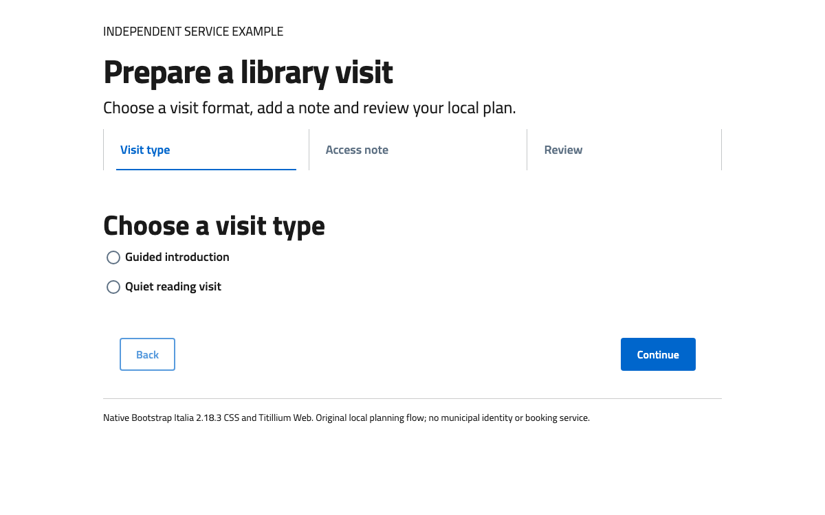
Implement a readable service sequence with Bootstrap Italia’s real typography, responsive Stepper structure and recoverable local form state.

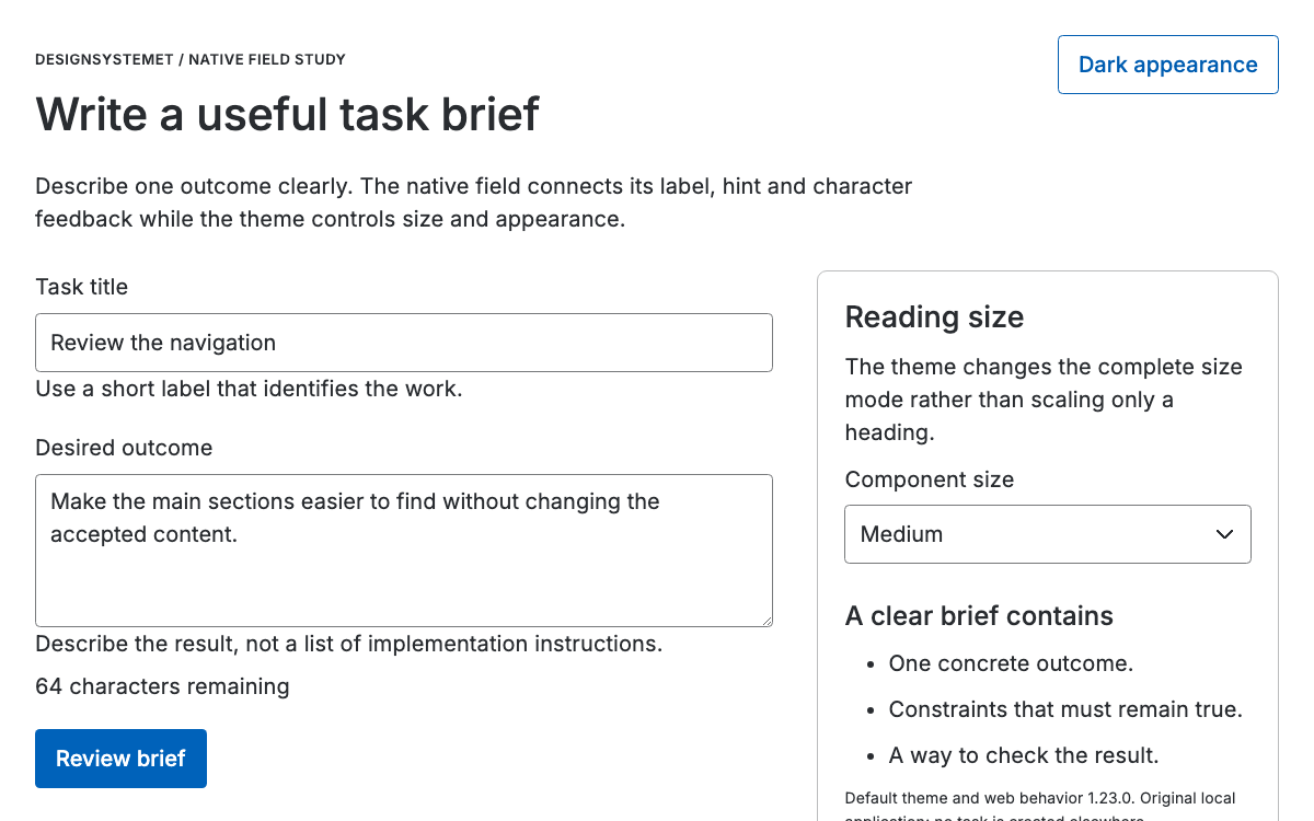
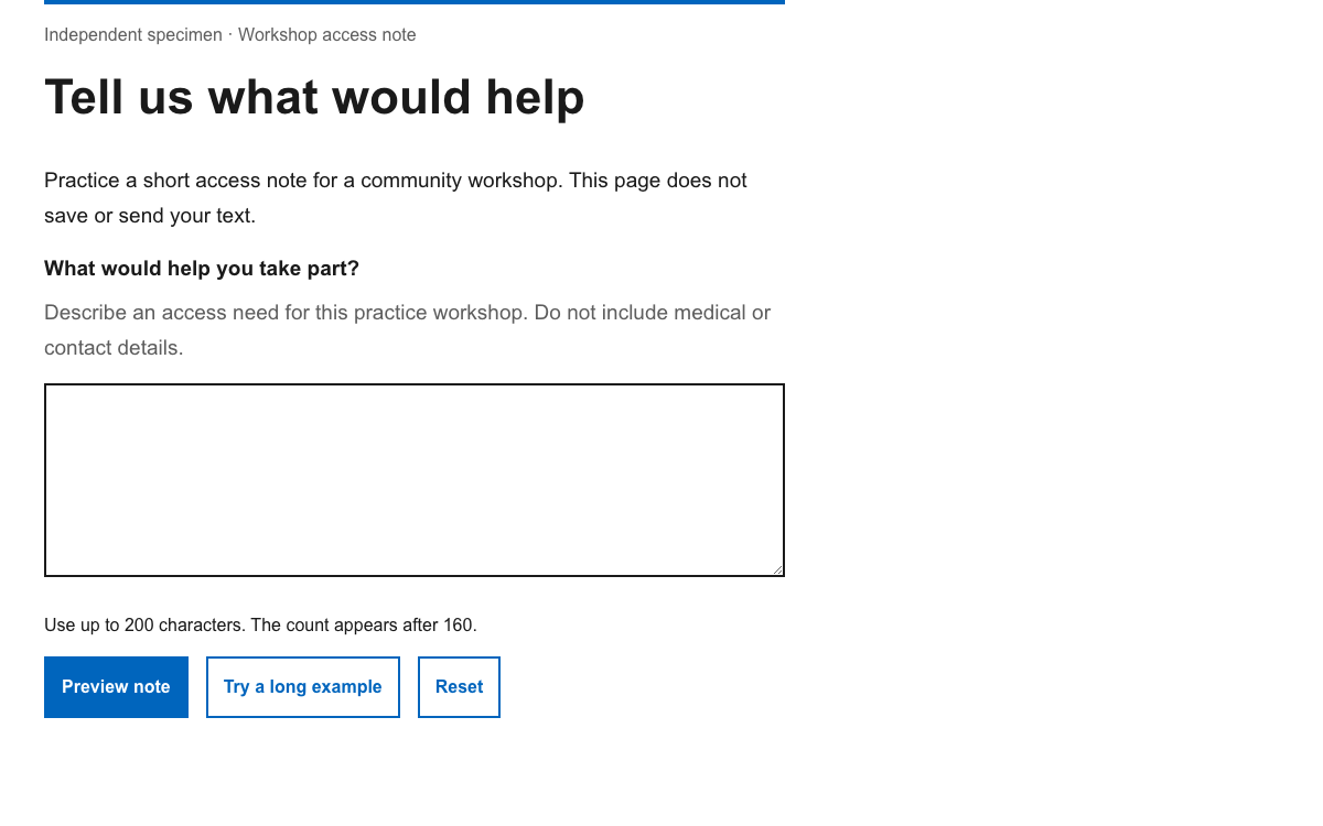
Explore Designsystemet’s real theme roles, size modes and native field behavior through a complete task-brief editor with character feedback and preserved presentation state.

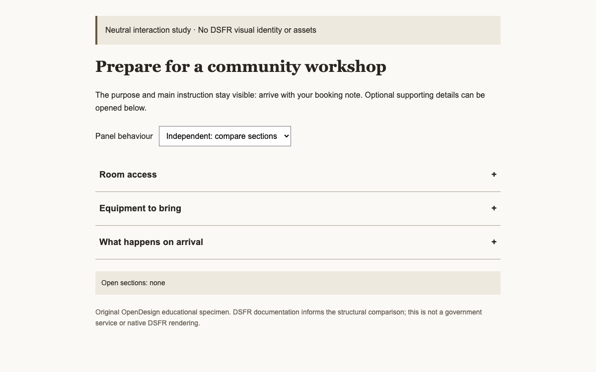
Understand the French State system’s concrete typography, grid and accordion API within its institutional scope. Compare linked and independent disclosure behaviour in a clearly neutral educational specimen.

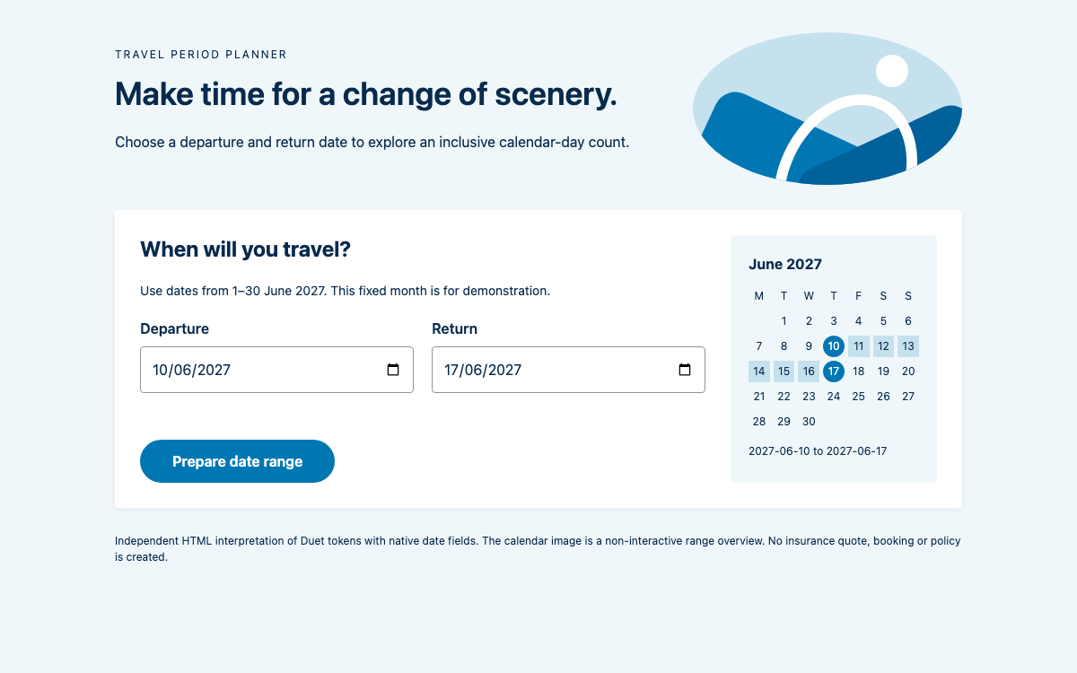
Study Duet’s LocalTapiola color and spacing scales through a date-range workflow, with ISO date values, explicit range validation, component focus methods and the separate open-source picker boundary.

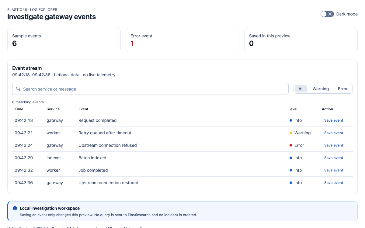
Build an Elastic UI log explorer with verified Borealis scales, native table and search controls, severity filtering, local saved events, and complete React source.

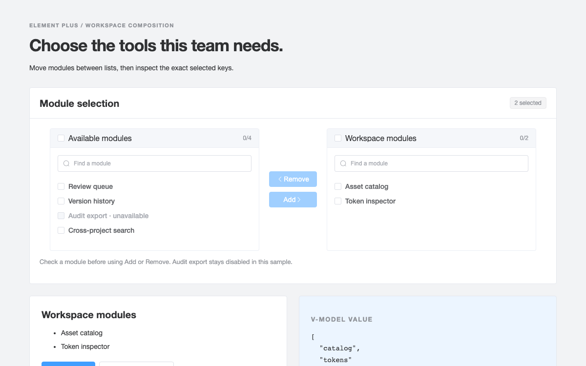
Use Element Plus’s real Transfer model, filters and disabled options to build a module-selection workbench, backed by verified colors, type sizes and control dimensions.

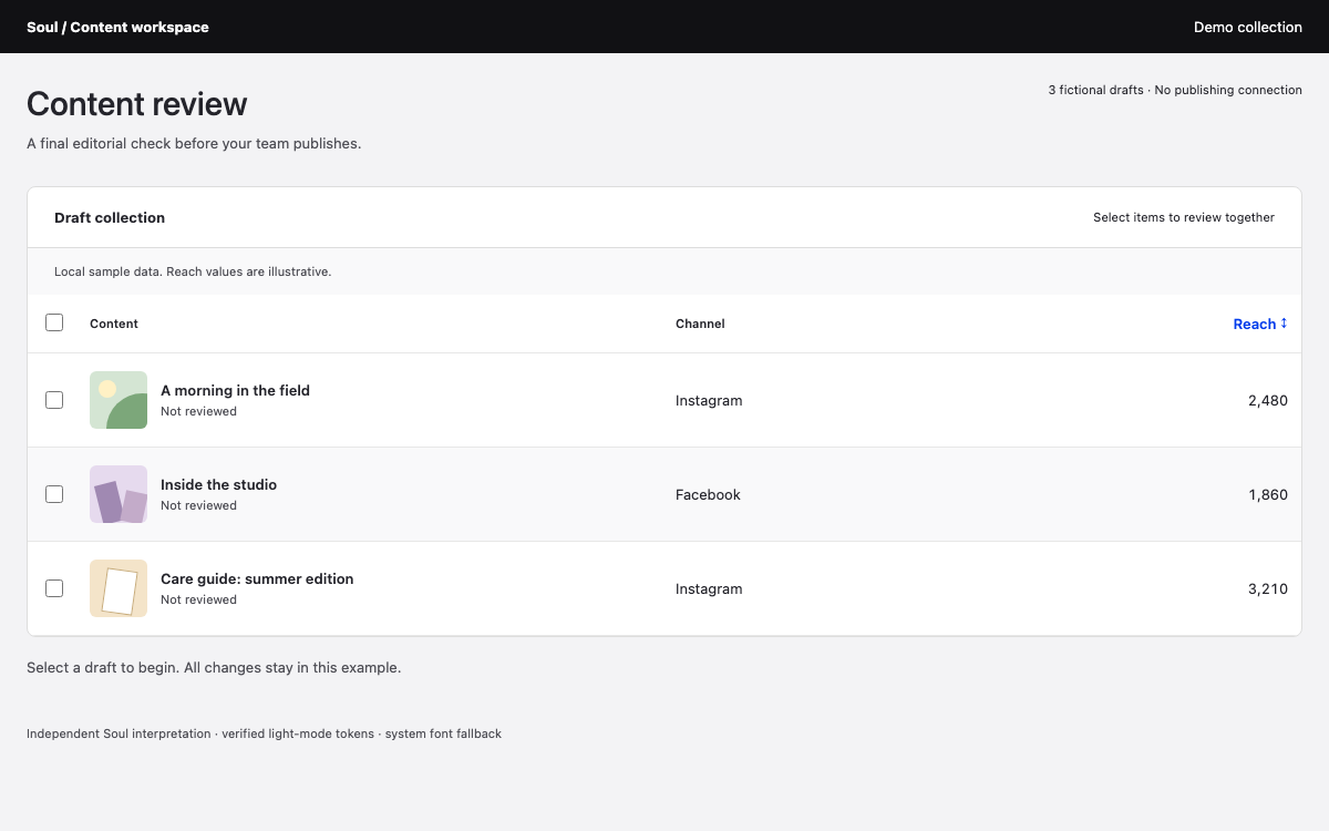
Read Soul’s data-table contract alongside its six-pixel spacing, layered color roles and compact Inter type. Compare bulk selection, missing-data notation and summary rows, then inspect the verified private React package entry points.
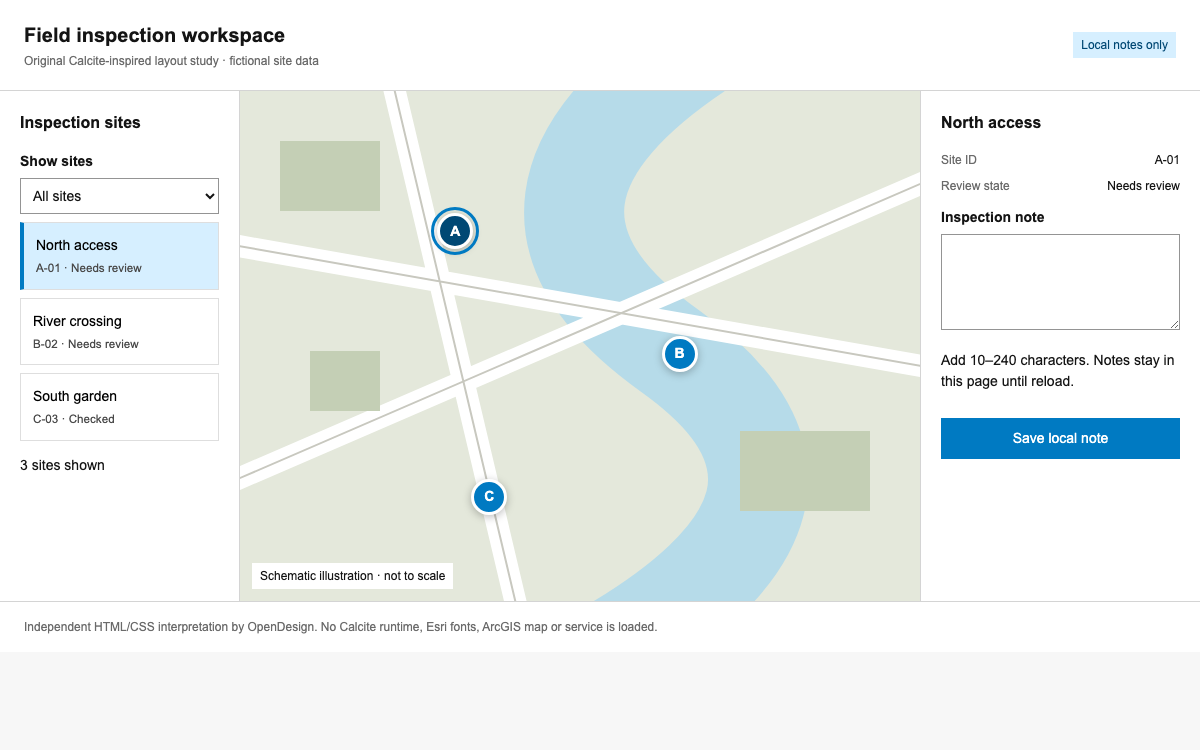
A practical Calcite reference for focused spatial tools: semantic surfaces and blue actions, compact inspection panels, real input APIs, and a complete local site-review specimen.

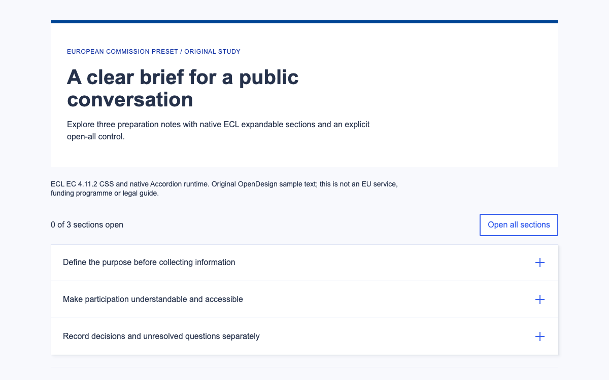
Inspect Europa’s EC color, type and spacing roles through a complete native accordion brief, including keyboard operation, open-all behavior and readable no-JavaScript fallback.

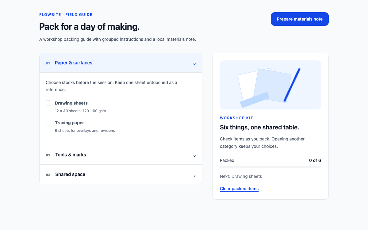
A native Flowbite 4 accordion and drawer composition, with verified semantic theme aliases, a persistent packing checklist and an accessible local materials-note workflow.

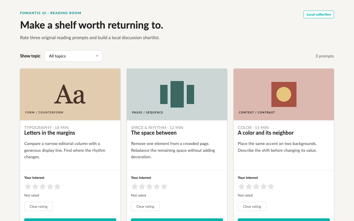
A native Fomantic UI reading shelf with verified compiled theme values, jQuery dropdown and rating modules, explicit keyboard support and a persistent local shortlist.

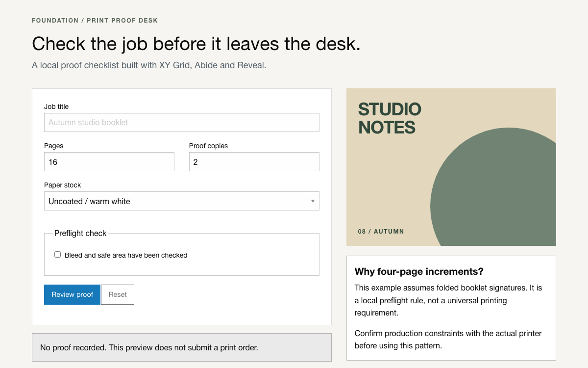
A working Foundation proof desk using XY Grid, Abide custom validators, Reveal confirmation, actual Sass settings, and complete local integration code.

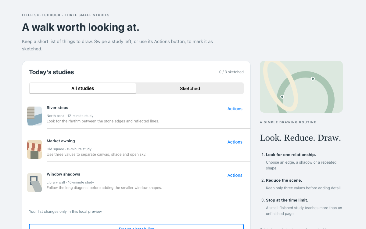
A native Framework7 sketchbook with real swipeout actions, explicit iOS theme values, a keyboard-accessible action opener and a filtered list that retains completed studies until reset.

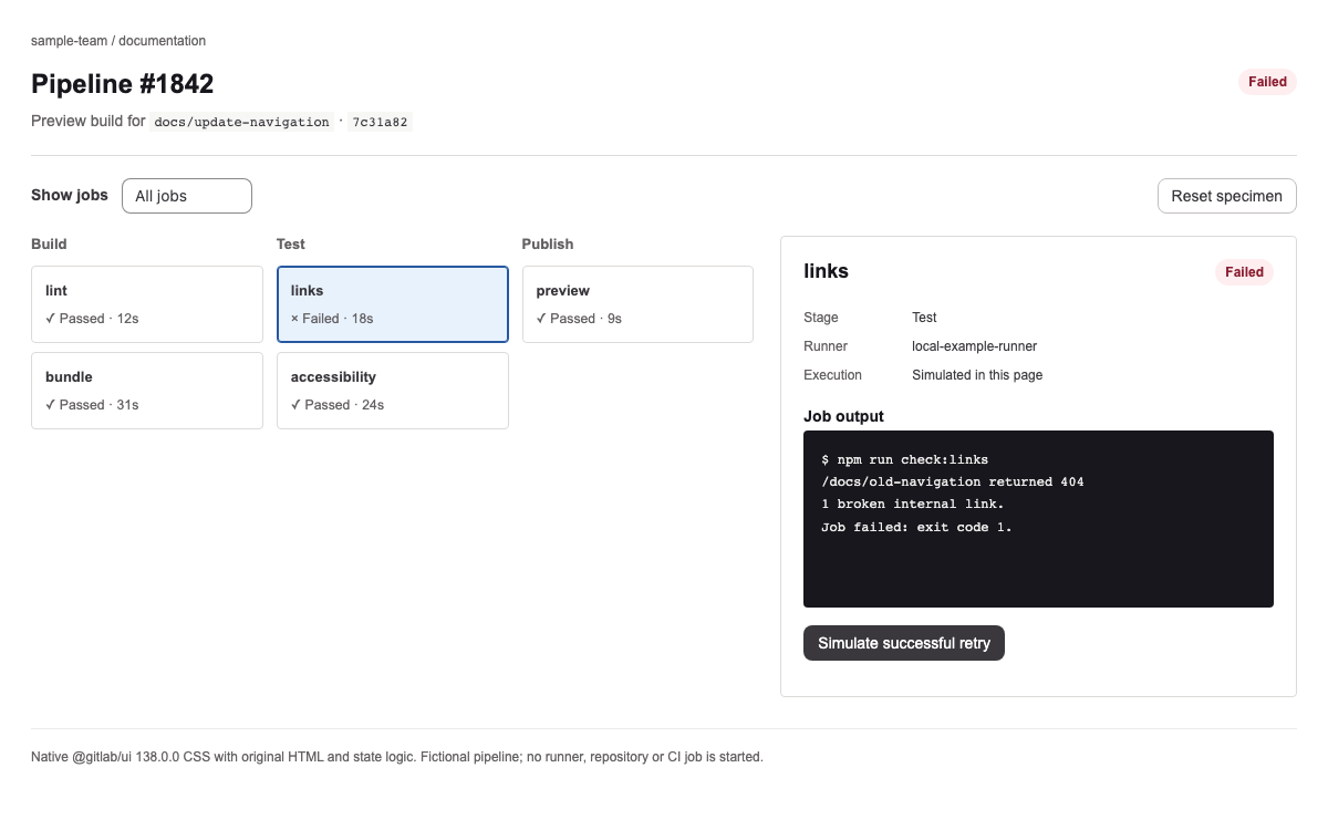
A Pajamas guide for technical workflows: actual semantic tokens, fluid type and spacing, a staged pipeline inspector, readable failure output and an explicitly local retry simulation.
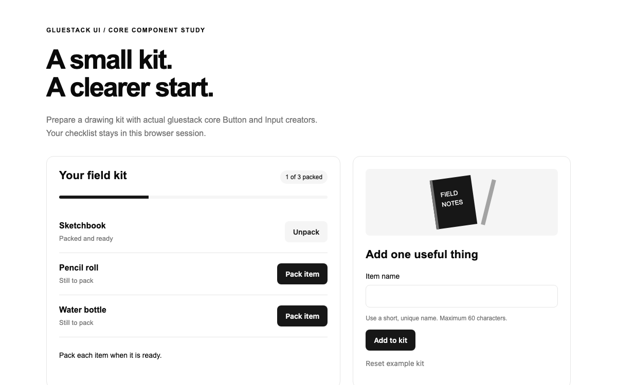
Build a field-kit checklist with gluestack’s real core Button and Input creators, explicit v5 semantic colors and complete React Native Web source. Inspect validation, keyboard actions, stable item identity and locally derived packing progress.

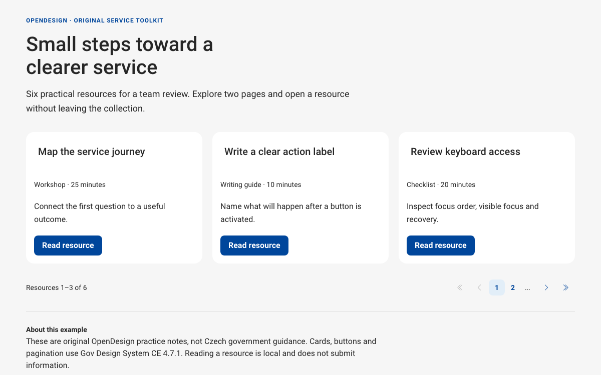
Explore Gov Design System CE’s real color roles, card slots and native pagination through a complete six-resource reading toolkit with explicit focus and page state.

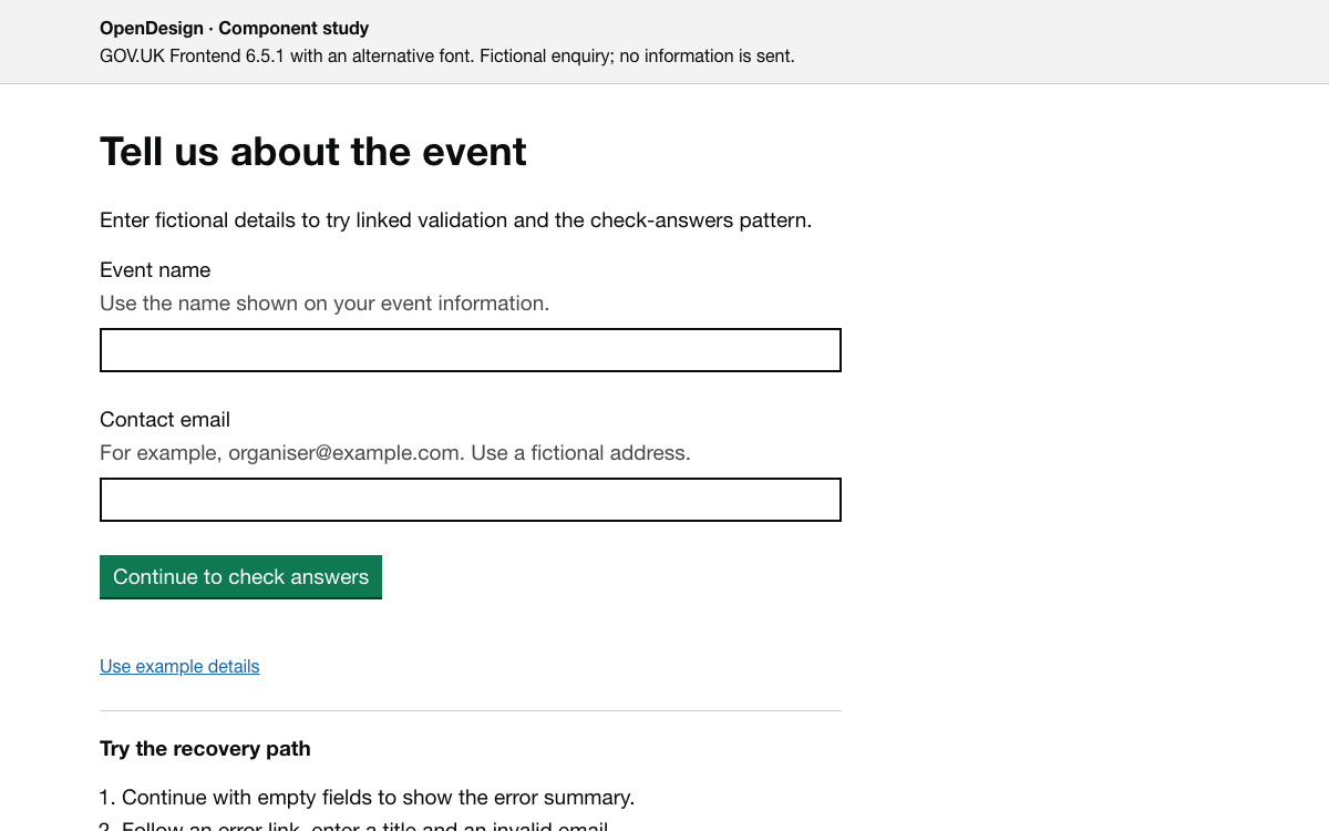
Build a GOV.UK-style question and check-answers journey with the current v6 type scale, responsive spacing, functional colours, linked validation and concrete Frontend integration.

Understand HarvardSites as an editorial platform: compare site styles, choose documented font pairings, and assemble university pages from purpose-built content components.

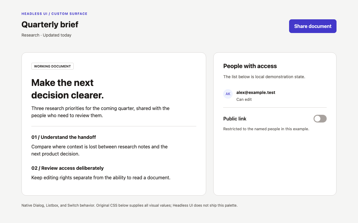
Headless UI provides unstyled React interaction components for dialogs, listboxes and switches. This guide focuses on composing their native focus, selection and popup behavior with ordinary CSS, using a document-sharing flow as the working example.
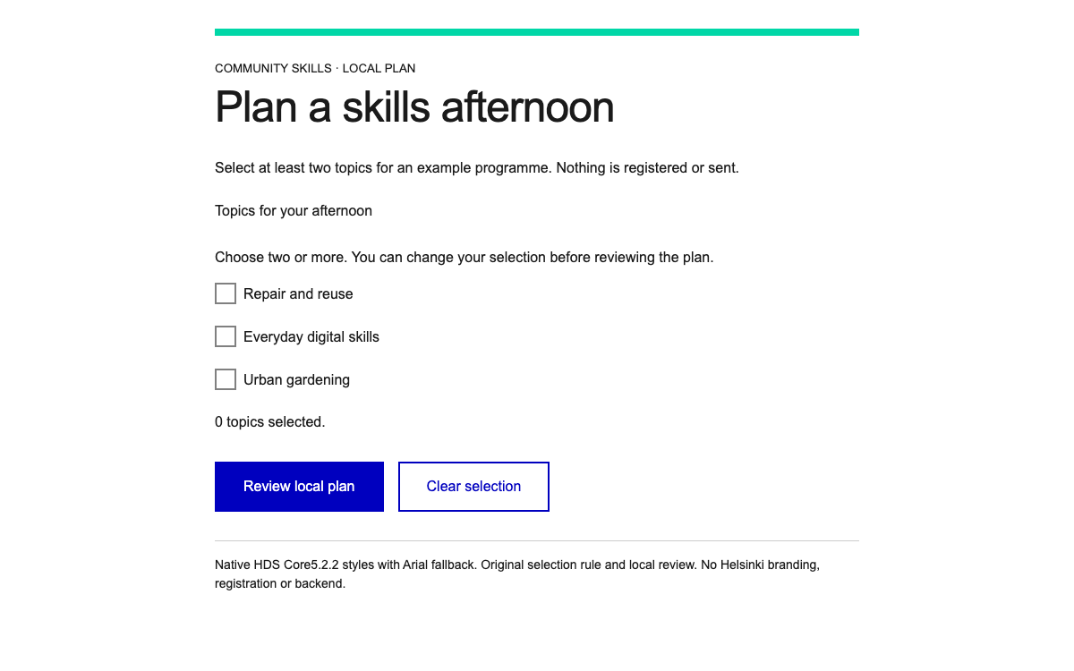
Compose native HDS selection groups, semantic feedback colors and linked error summaries with a complete local review-and-correction flow.

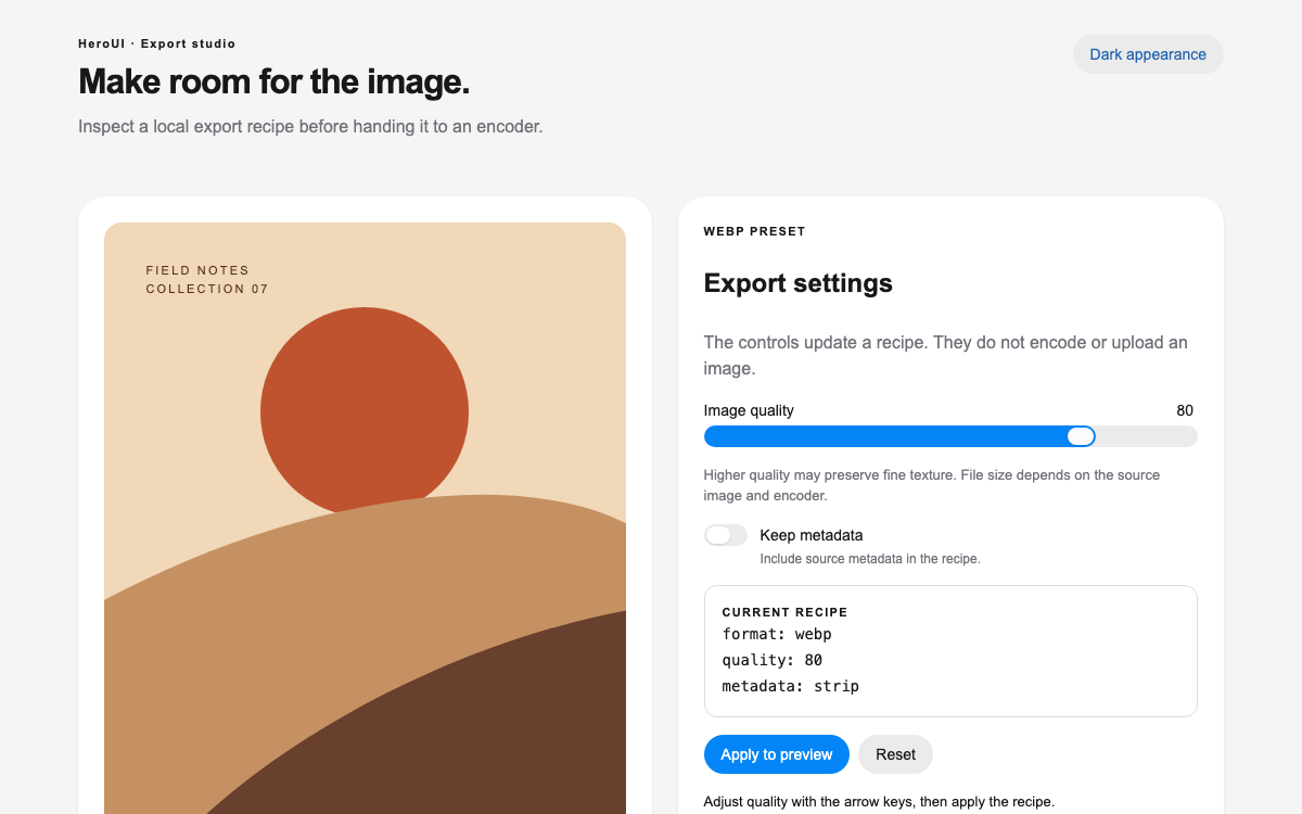
A HeroUI v3 reference with actual semantic CSS variables, compound React controls, light and dark surfaces, and a working image-export recipe.

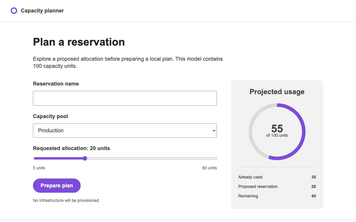
Model a capacity reservation with Grommet’s layout primitives, controlled form fields and numeric meters. Use its theme scale deliberately, and keep the base Grommet theme distinct from the separately installed HPE theme.

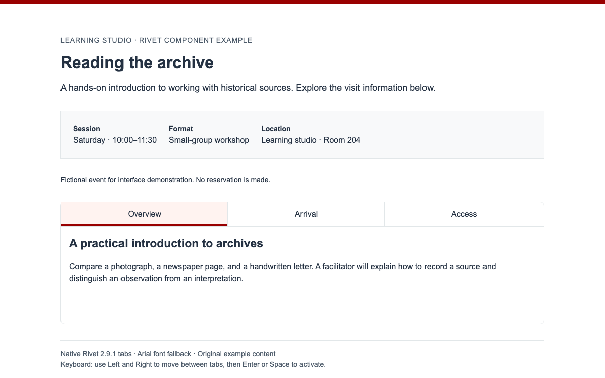
Build university pages with Rivet’s real token scale, HTML component anatomy, and native keyboard interactions. Explore a compact workshop detail page with accessible visit-information tabs.

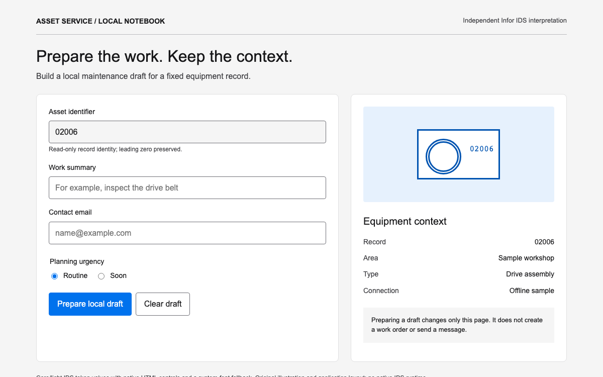
Compose an enterprise maintenance form with real IDS input states, theme aliases and an exact asset identifier. Inspect the current public theme tokens, a pinned Web Components package and a local draft workflow with validation and reset.

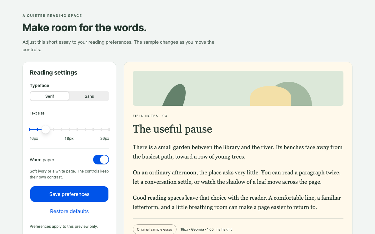
A native Ionic reading-preferences interface with verified color roles, iOS and Material range geometry, real segment and switch behavior, and an article that responds to font, size and paper choices.

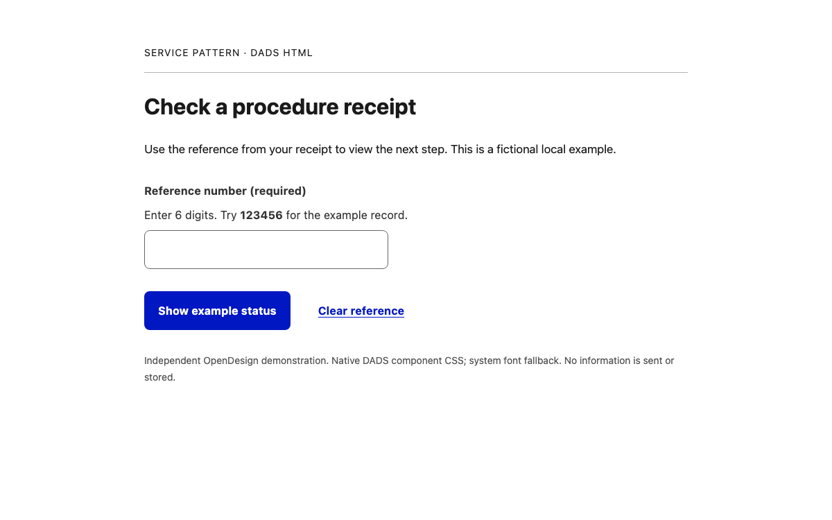
Build readable Japanese public-service interfaces with DADS text roles, semantic tokens and native HTML component anatomy. Try a working receipt lookup with format errors, a no-match result and a reviewable status record.

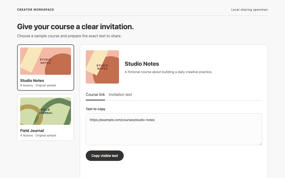
Build a creator-facing sharing panel with readable course context, clear copy actions and honest clipboard feedback. Explore Sage’s Rails component anatomy, its published typography specifications and the newer externally loaded Pine token layer.

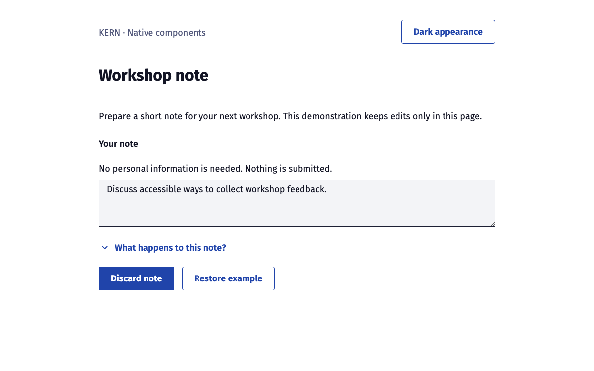
Build a native KERN interface with verified typography, semantic themes, disclosures and a reversible confirmation flow.

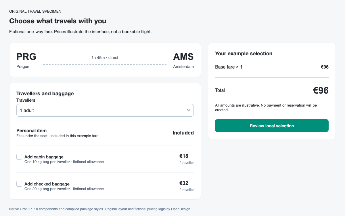
A travel-focused Orbit guide with real product colors and spacing, native baggage choices, a consistent price breakdown and a complete local review flow.
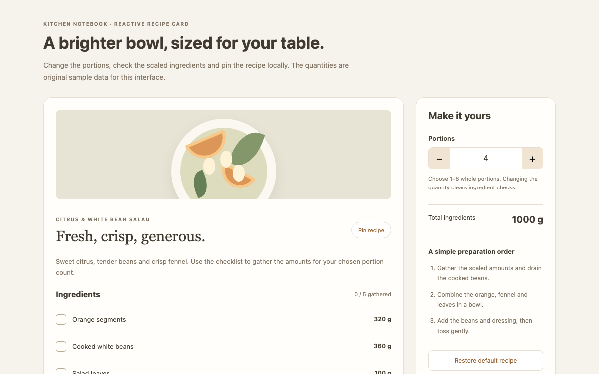
Kobalte provides headless components for Solid, including numeric fields with separate raw and formatted values, compound checkbox anatomy and pressed-state buttons. This guide connects those primitives to Solid signals through a recipe scaler with derived quantities and resettable ingredient checks.

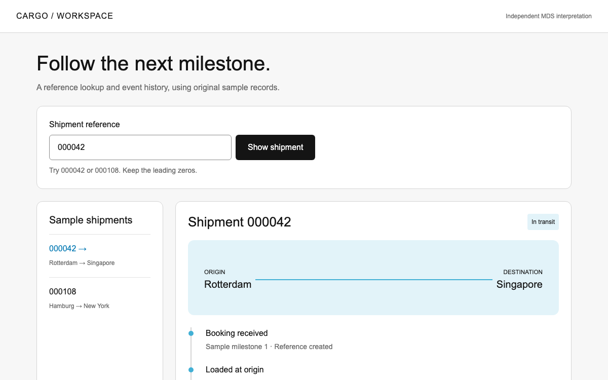
Study Maersk’s operational interface language through real light-theme roles, headline and text scales, nested radii and identifier handling. A sample shipment lookup demonstrates exact reference matching and an accessible event history without claiming access to live logistics data.

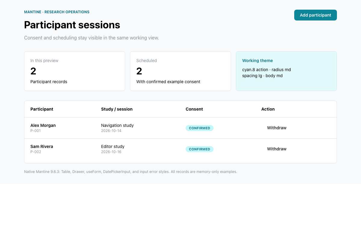
A Mantine 9 reference built around a native participant table and scheduling drawer. Inspect the actual theme scales, connect useForm to TextInput, Select, Checkbox, and DatePickerInput, and try validation before adding a local record.

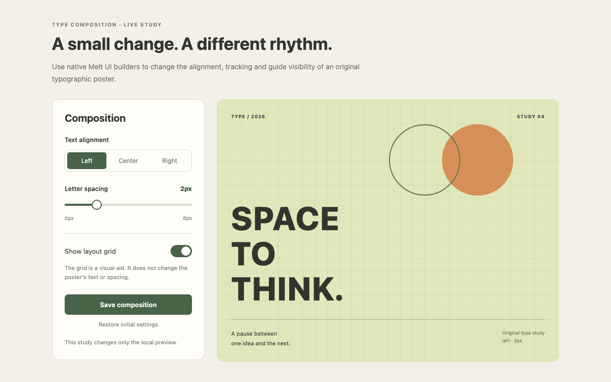
Melt UI’s store/action builders attach accessible behavior to Svelte markup you own. This guide uses @melt-ui/svelte 0.86.6 to connect radio, slider and switch builders through their attributes, actions and writable stores; it is distinct from the newer runes API.

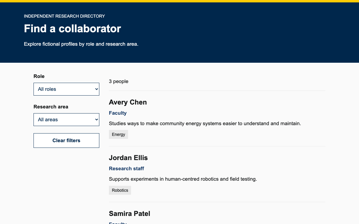
Understand Forty-Two’s supported WordPress workflow, web palette and people-directory patterns through a working role-and-research filter example.

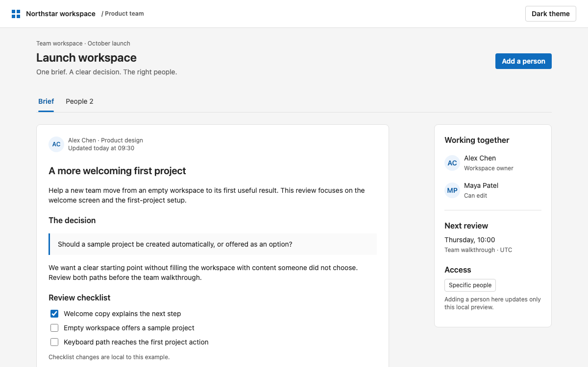
Build a Fluent UI React v9 workspace with real semantic tokens, the web type and spacing ramps, controlled tabs, and a validated access dialog. Compare the theme values, inspect the component anatomy, and try a local interaction before using the complete React example.

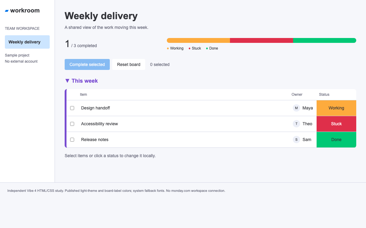
Compose a working delivery board with Vibe 4 tokens and React controls. Understand semantic action colors versus board labels, named spacing steps, font shorthands and the explicit CSS setup that a new application needs.

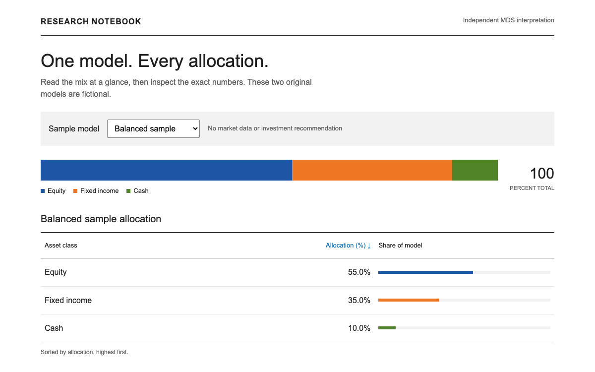
Build a research interface where numbers align, asset colors keep their meaning and typography remains readable. Explore MDS constants, Vue 3 adoption, the Morningstar Intrinsic transition and a sortable fictional allocation notebook.

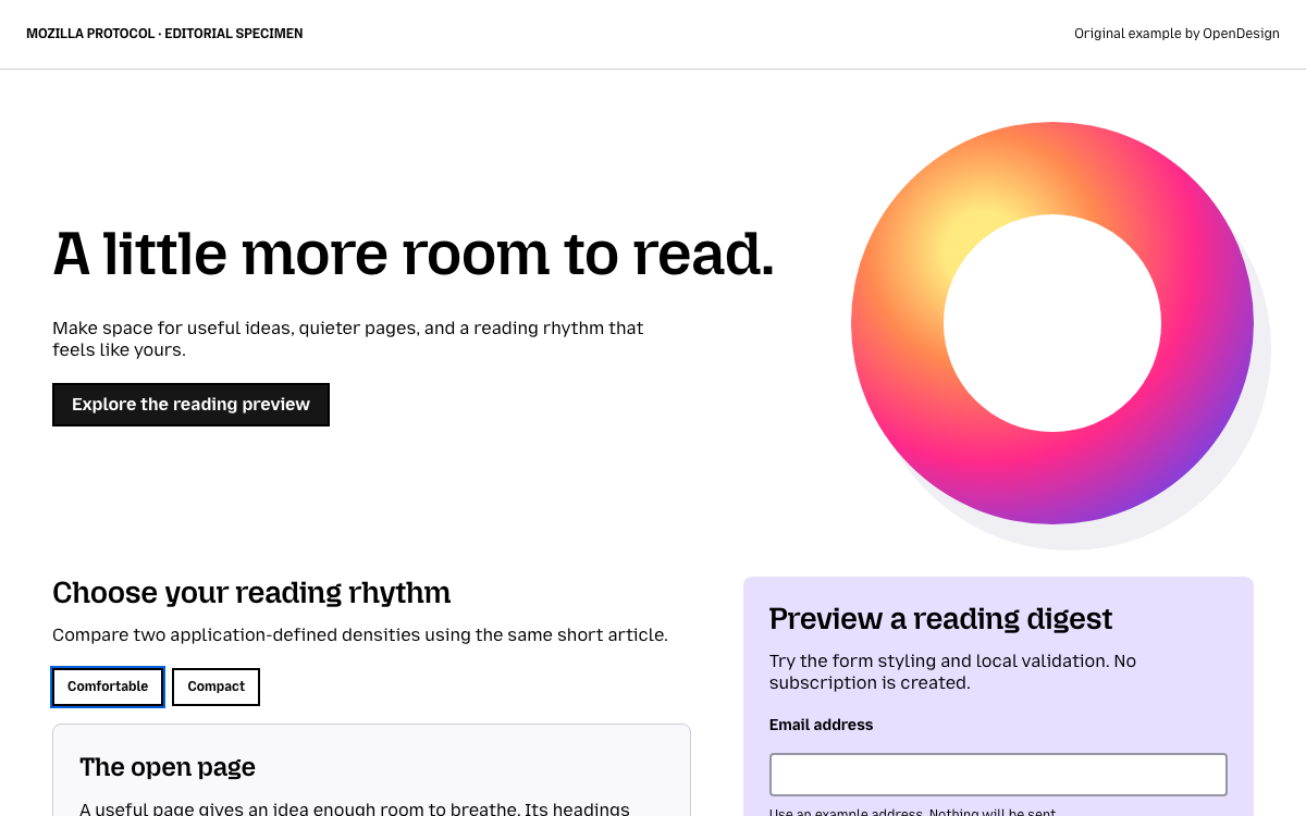
An editorial Protocol guide with real font stacks, spacing and container scales, a responsive illustrated reading page, and a complete native-CSS form example.

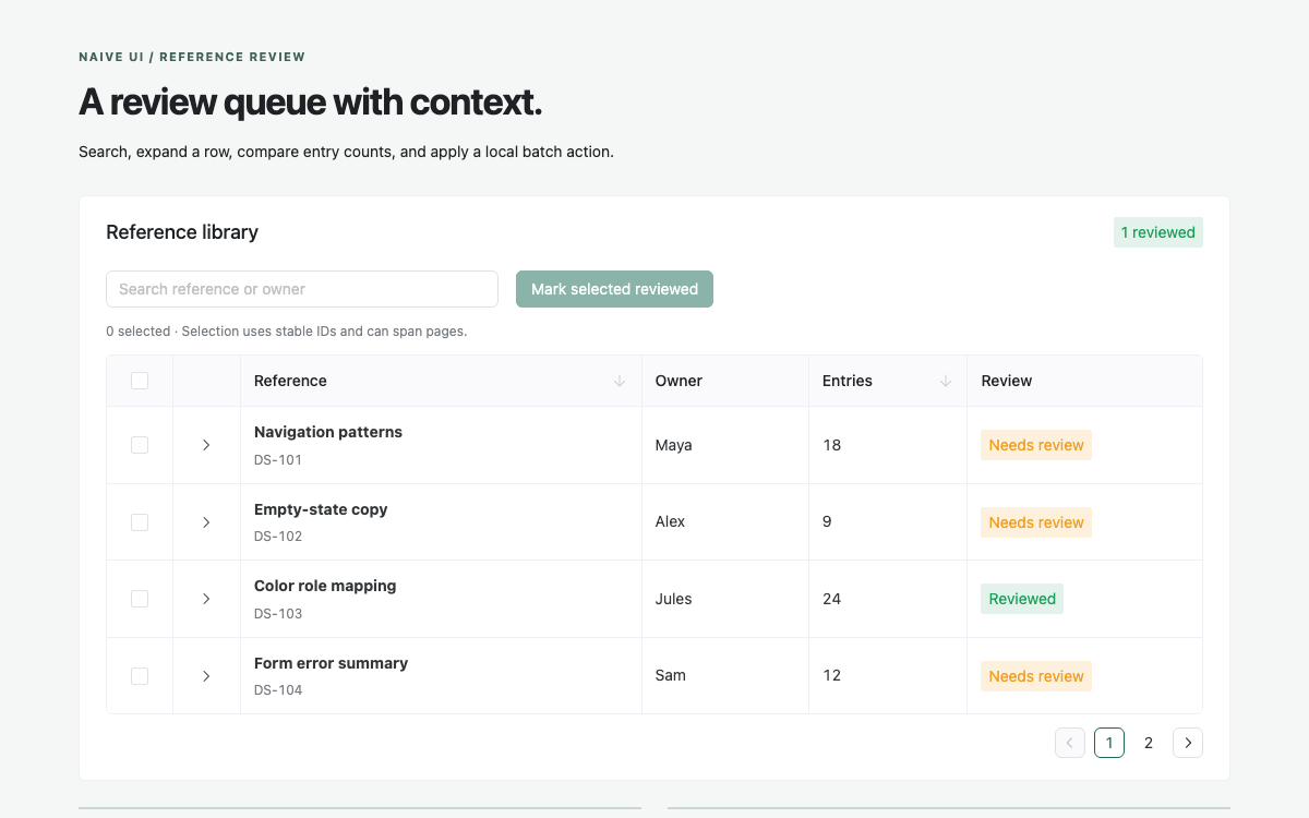
A native Naive UI data-table workbench with verified theme-object values, row selection, expansion, sorting, pagination and a local batch review action.

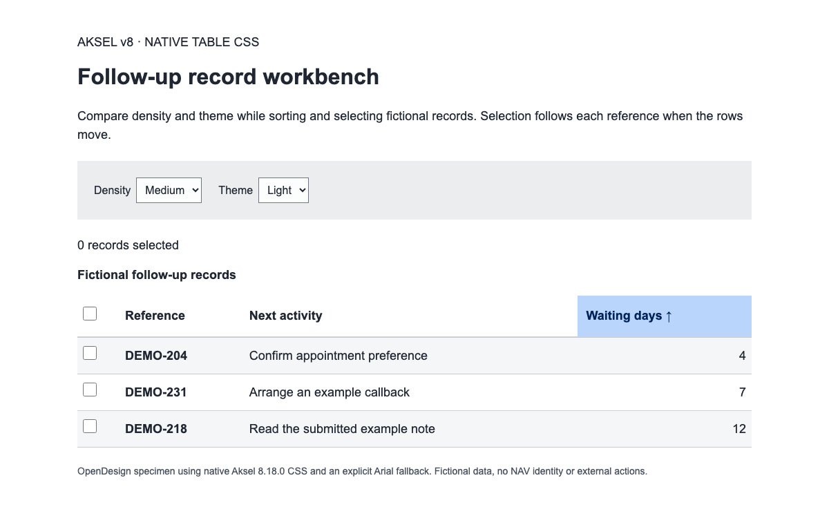
Use Aksel v8’s real ax tokens, native table density and semantic header structure. Sort and select fictional follow-up records while comparing light and dark themes.

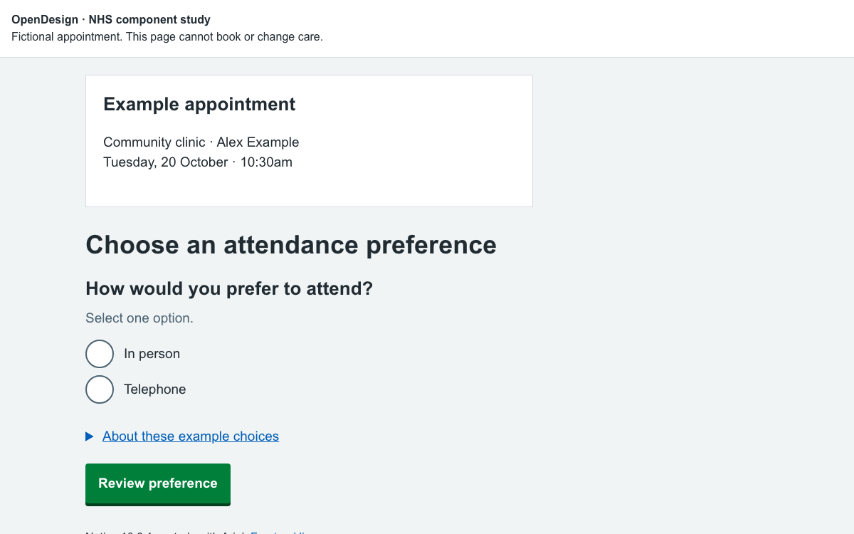
Use NHS.UK typography, responsive spacing, grouped radio choices and contextual details to build a clear appointment-preference journey.

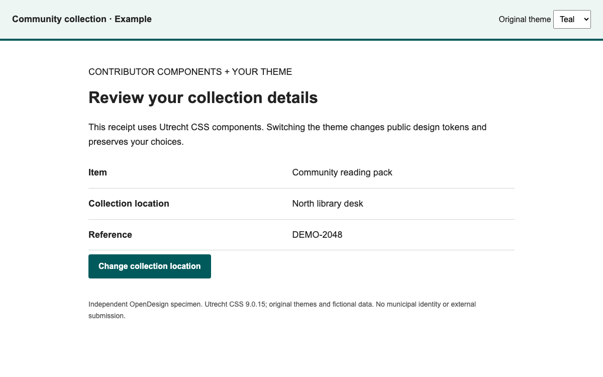
Compose a public-service interface from real contributor components and an explicit theme. This reference uses Utrecht CSS to demonstrate token mapping, data-list anatomy and two original themes with the same editing workflow.

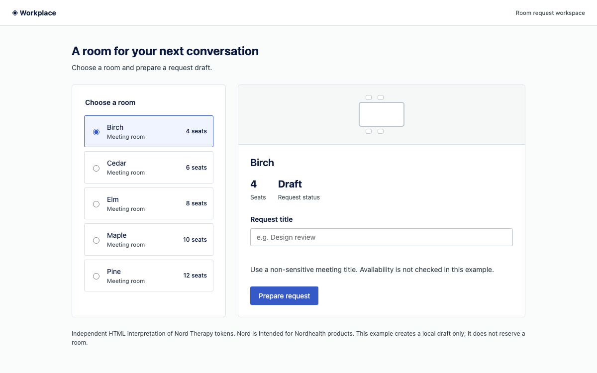
Inspect Nord’s Therapy theme tokens and Web Component contracts through a room-request draft: real color roles, responsive field sizing, explicit validation and locally prepared results.

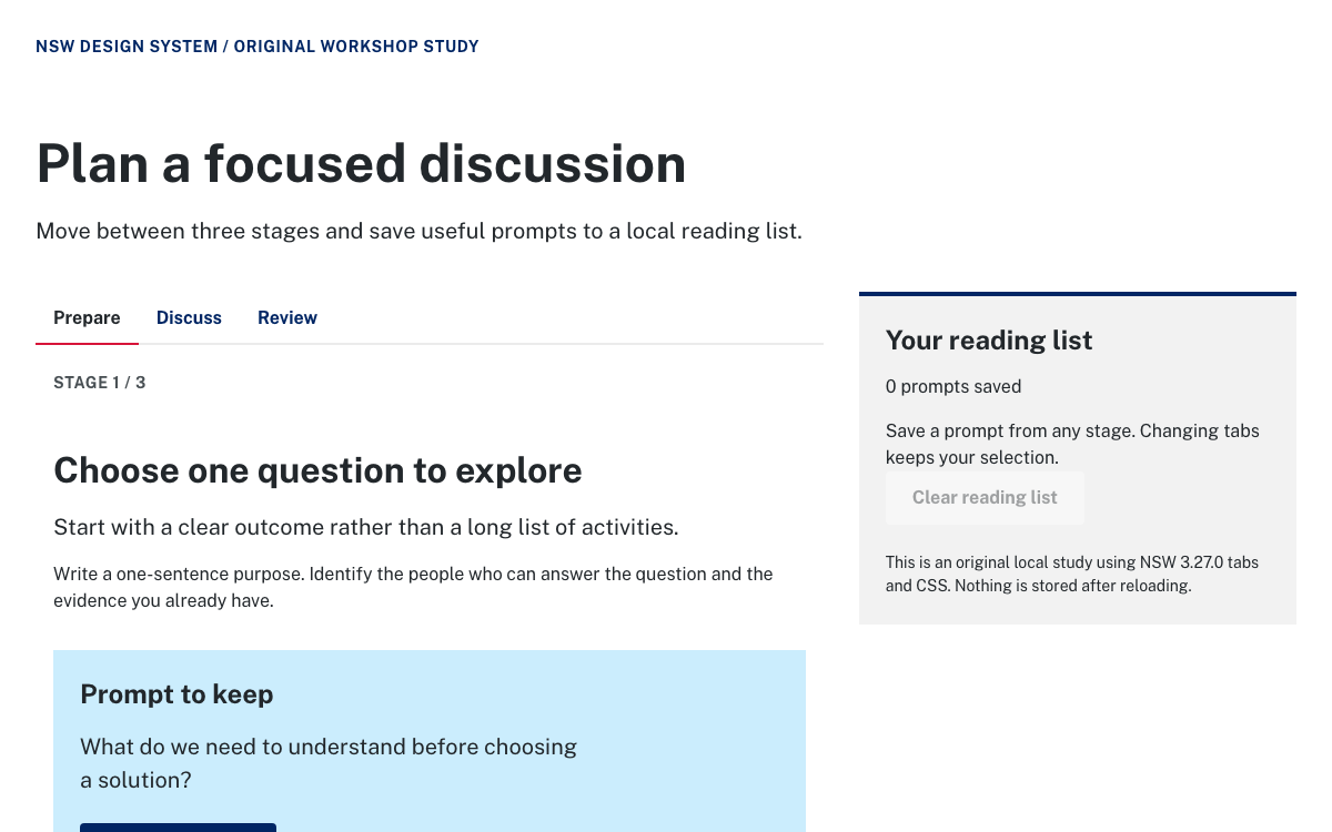
Explore NSW design tokens, Public Sans typography and native keyboard-accessible tabs through a complete workshop guide with an independent local reading list.

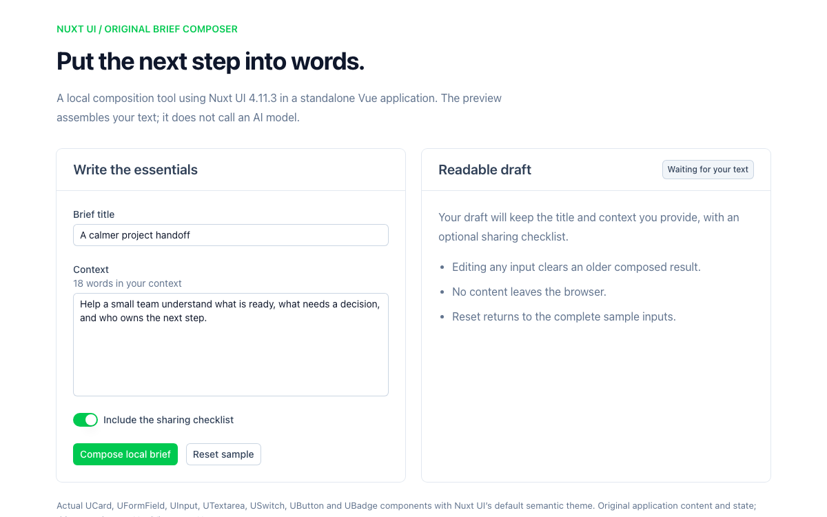
Build a complete Nuxt UI 4.11.3 brief composer with real Vue components, semantic theme references, input validation and explicit local draft behavior.

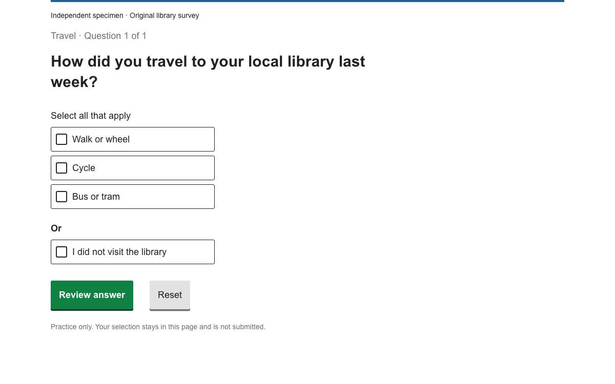
Build a survey answer that cannot contradict itself: native ONS checkboxes, mutually exclusive responses, exact type and color references, and a complete local review flow.

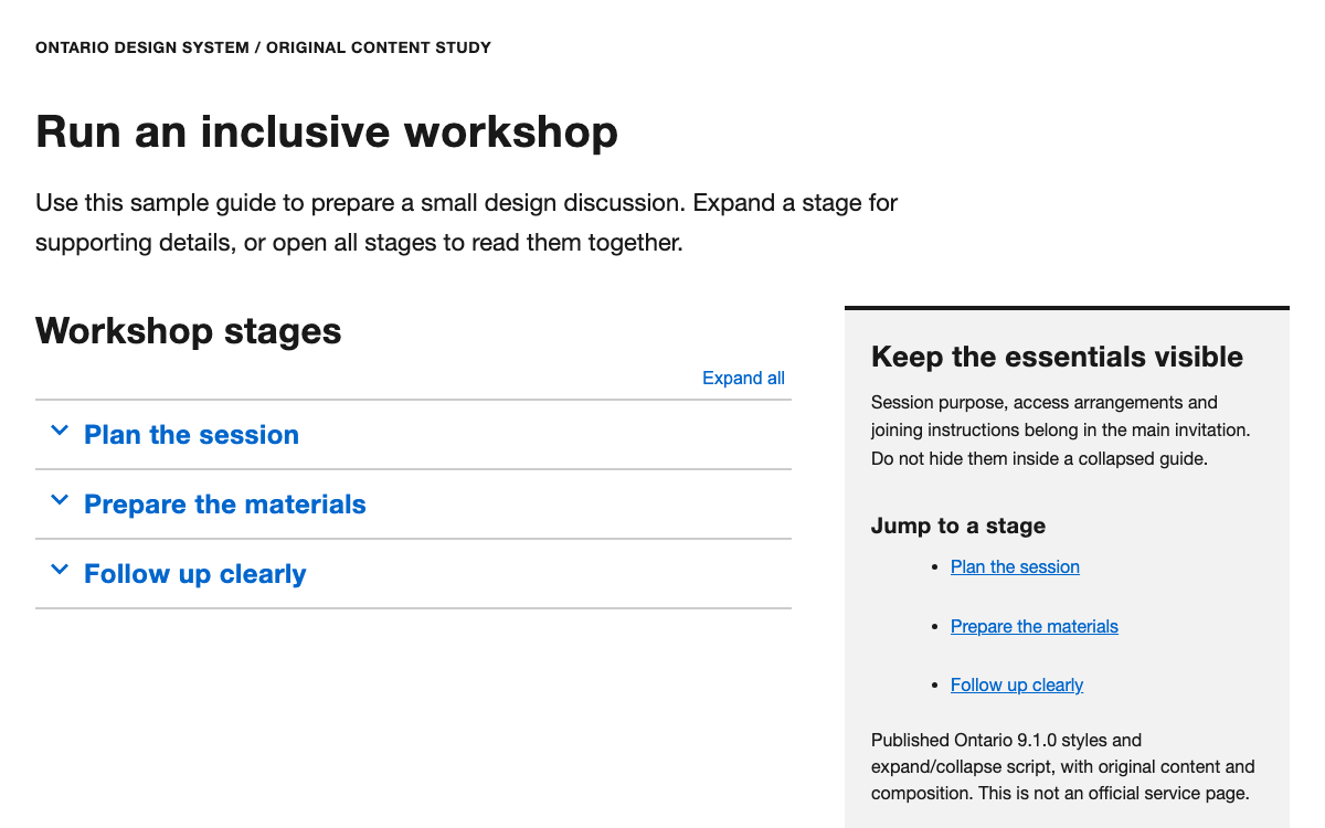
Build an Ontario-style long-form guide with real typography, published spacing and color values, native accordion behavior and complete version-matched source.

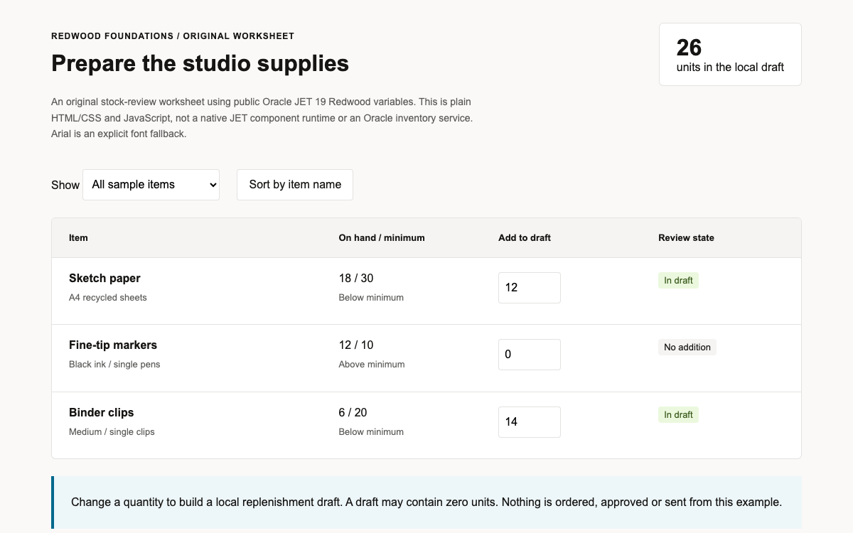
Study Oracle JET 19 Redwood’s actual palette, semantic roles, spacing and density boundaries through a complete original editable stock-review worksheet.

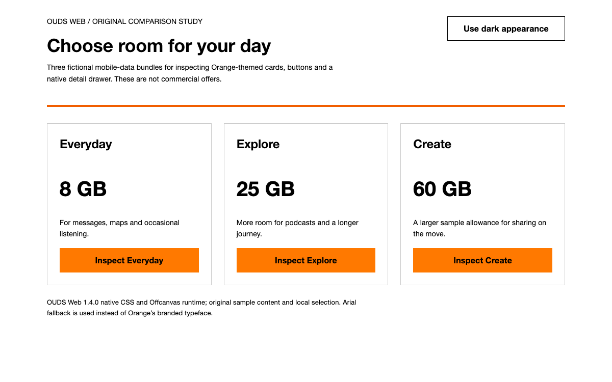
Inspect Orange OUDS 1.4’s real semantic tokens, theme packages and native Offcanvas behavior through a complete responsive comparison study.

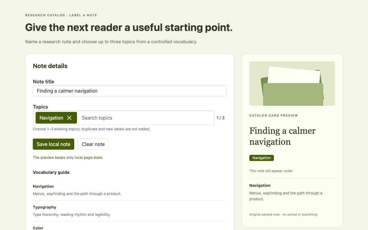
A native Oruga catalog editor with searchable, removable topic tags, enforced vocabulary limits, an optional theme’s real tokens and a live card that reflects the selected labels.

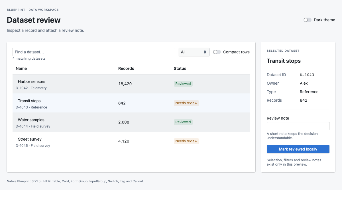
Build a dense data workspace with Blueprint: verified type and intent tokens, a selectable dataset table, a review inspector, and complete React source.

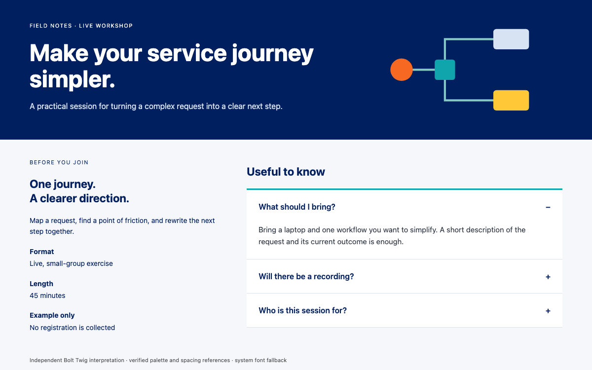
Explore Bolt’s Pega-branded content system: fluid typography, separate horizontal and vertical spacing, and a Twig accordion composition for an editorial resource page.

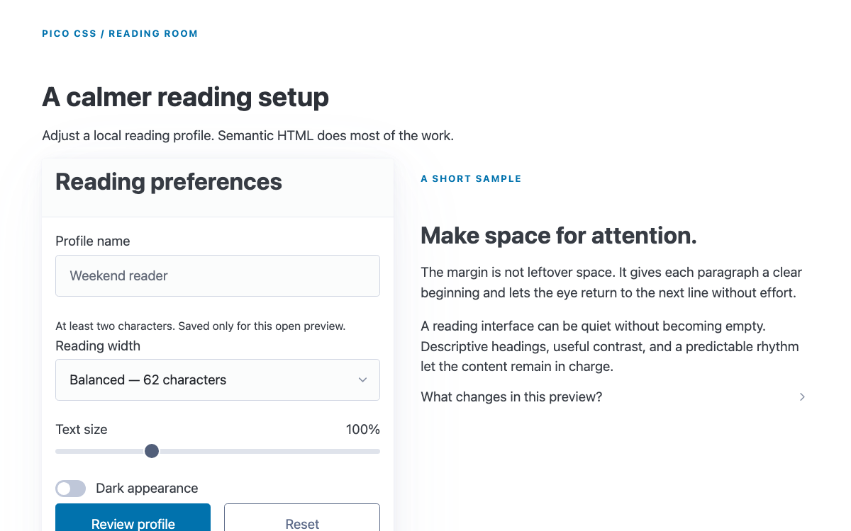
Pico CSS styles semantic HTML with a responsive rem-based type scale and theme variables. Its standard, classless and conditional distributions have different integration scopes; this guide uses the standard build for a reading-preferences form with native disclosure and dialog behavior.

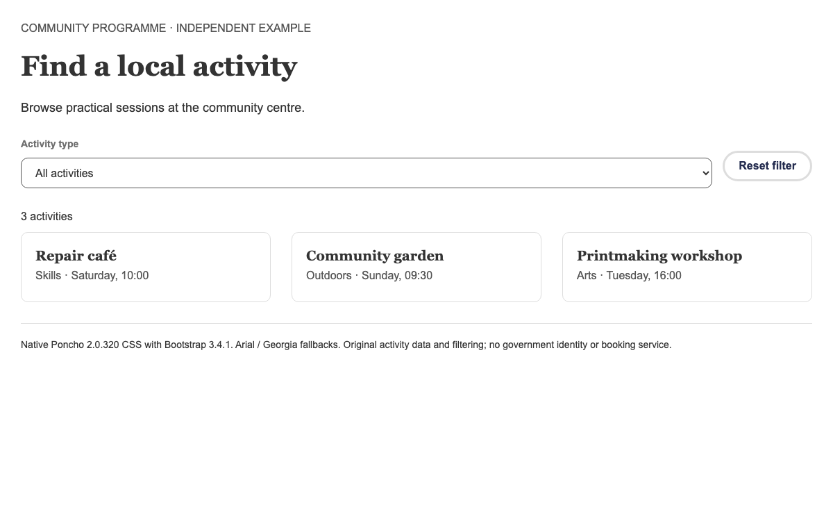
Inspect Poncho’s Bootstrap 3 grid, semantic action colors and fully clickable service panels through a working activity directory.

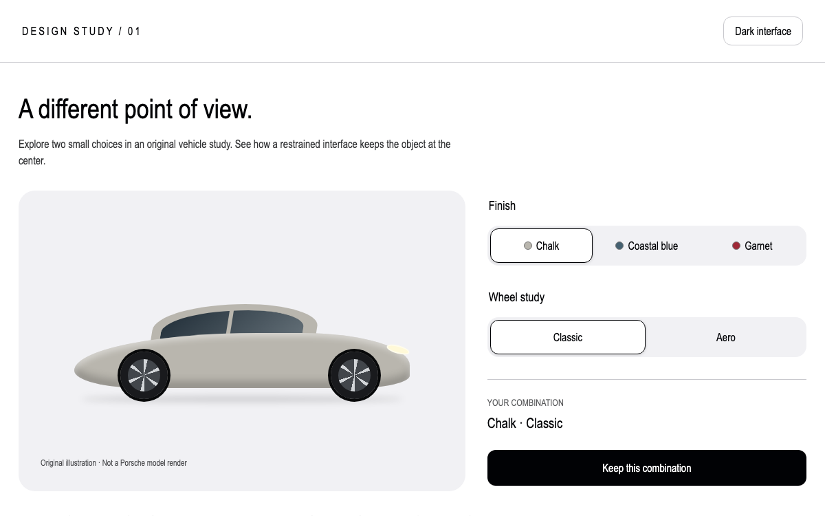
Explore Porsche Design System v4 through fluid spacing, CSS color schemes, Porsche Next typography and a two-choice configurator. The reference includes real token expressions and a complete Vite entry using current segmented-control events.

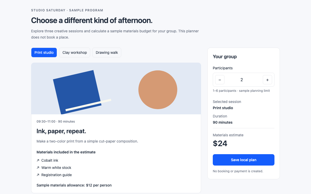
A native Preline session planner with linked tabs, a constrained input-number plugin, installed theme aliases, real Tailwind scales and a local materials estimate that updates with the selected session.

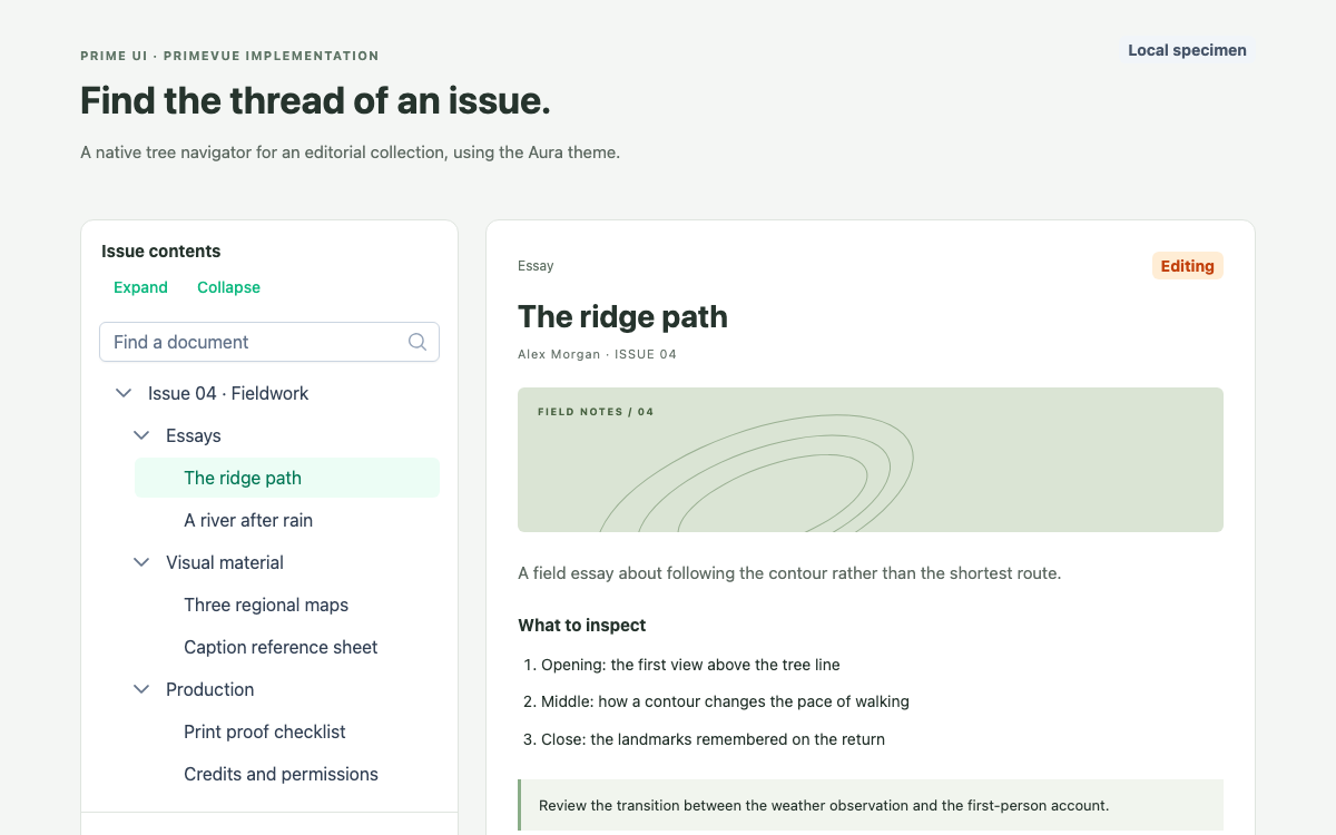
A version-pinned PrimeVue implementation of the Prime UI ecosystem: an Aura-themed document tree with real preset references, controlled expansion, filtering, selection and local pinning.

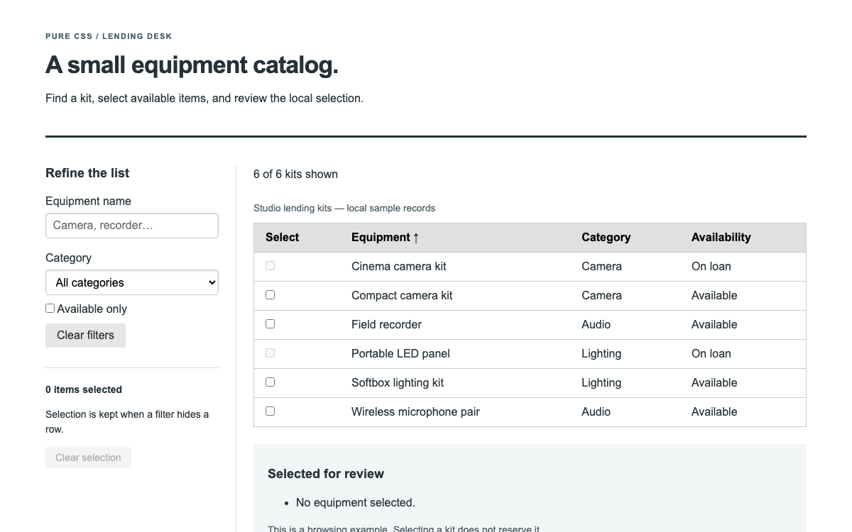
Pure CSS is a modular stylesheet for grids, forms, buttons, menus and tables, without a widget runtime. This guide shows how its optional responsive grid module and native semantic elements fit together in a filterable equipment catalog, with sorting and selection implemented explicitly.

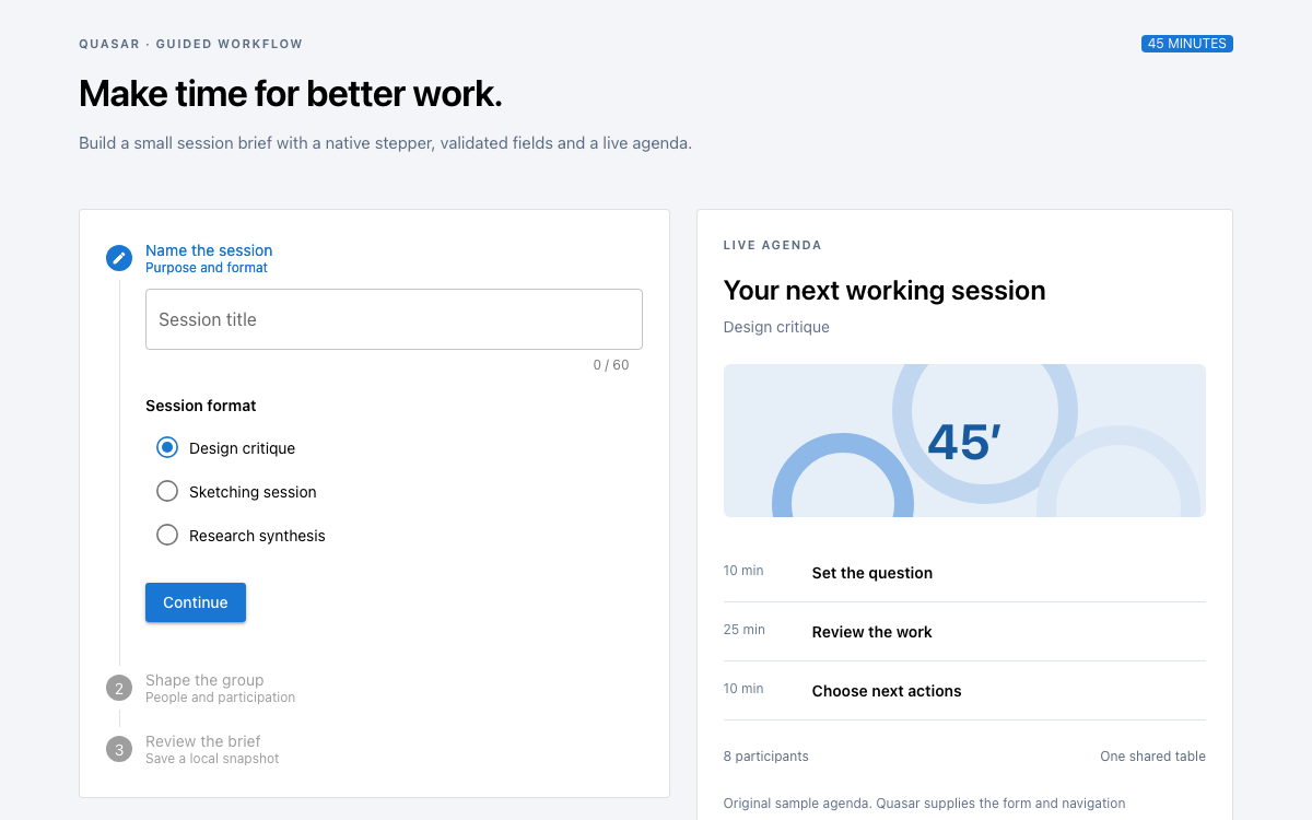
A native Quasar guided workflow with actual brand and spacing values, QForm validation, a three-step brief builder, radio format choices and a live forty-five-minute agenda.

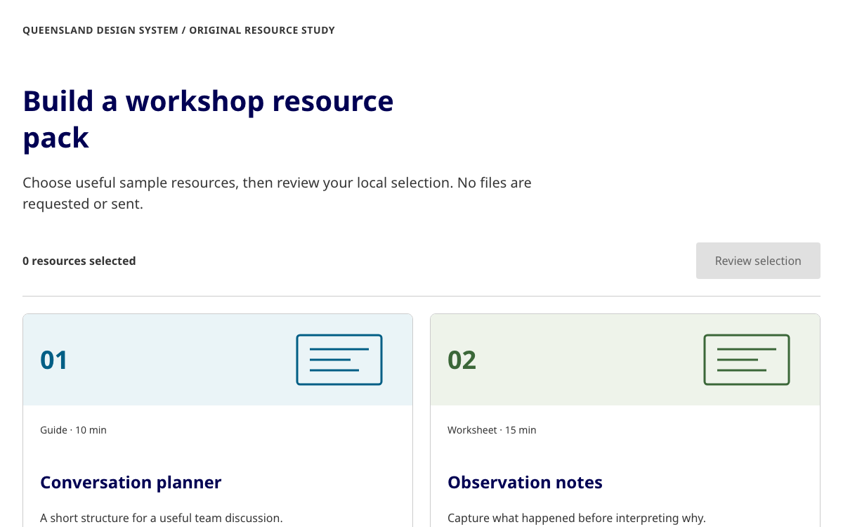
Explore Queensland’s Bootstrap implementation through a complete illustrated resource selector with real theme roles, native checkbox styling and an accessible review dialog.

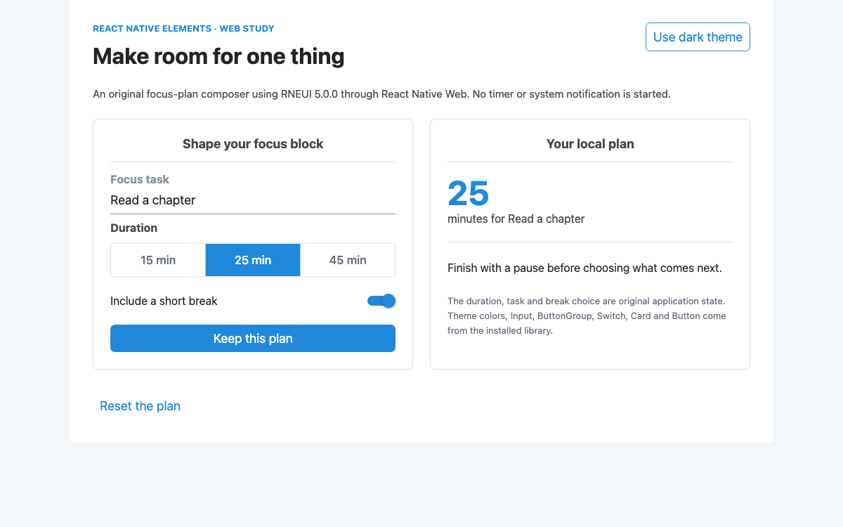
Build a complete focus-plan composer with React Native Elements 5.0.0: real theme roles, controlled inputs and selections, validation, local confirmation and a tested web build.

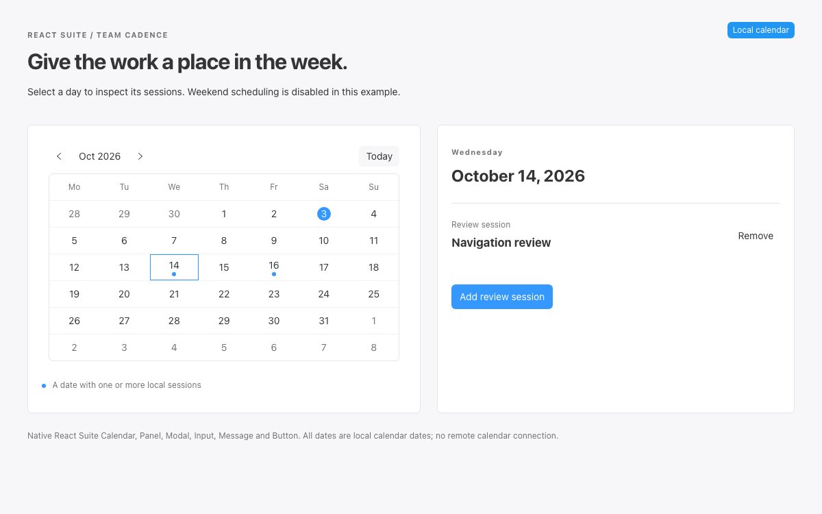
A native React Suite review calendar with verified v6 CSS variables, date-cell markers, a selected-day agenda, modal validation, and explicit local scheduling rules.

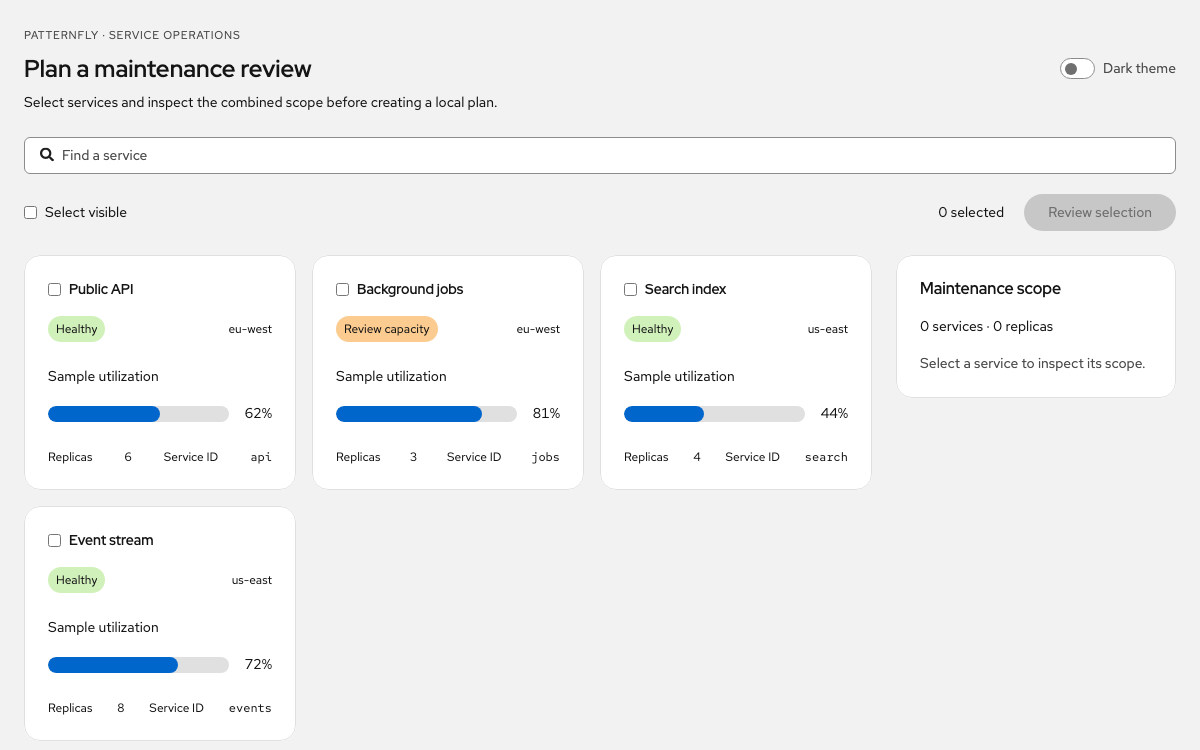
Use PatternFly for an operations workspace: semantic token references, selectable service cards, tri-state bulk selection, scope review, and complete native React code.

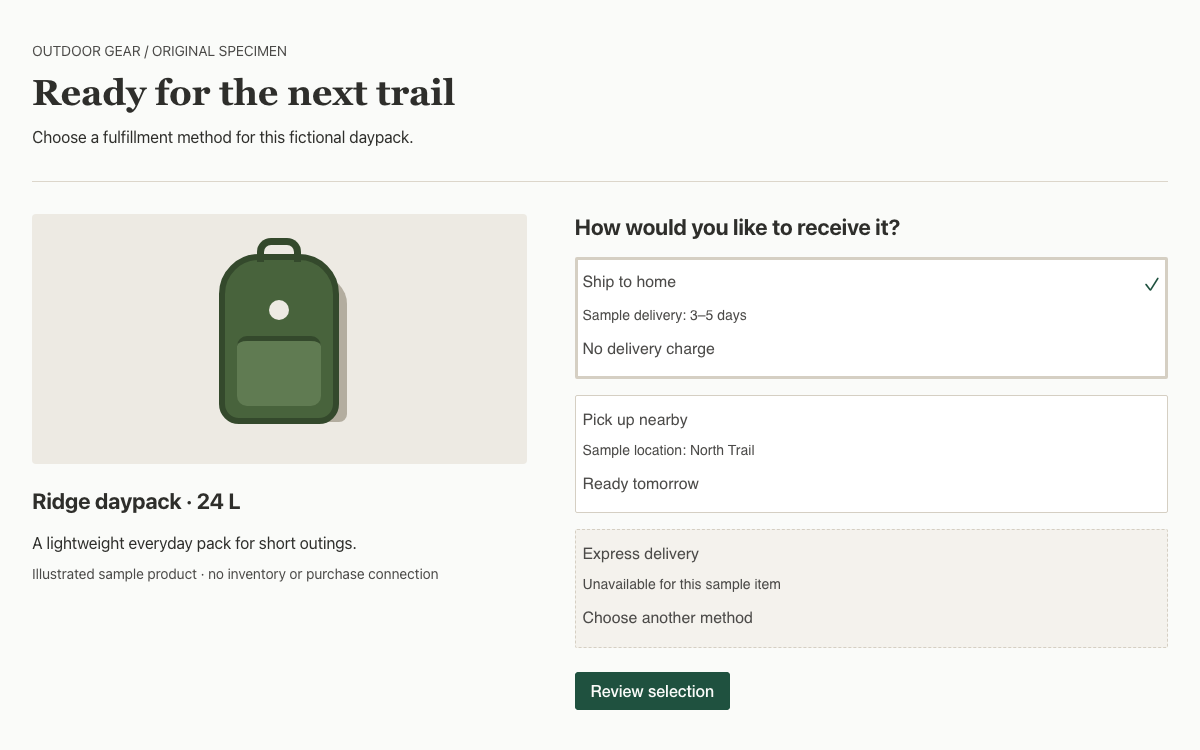
Build a concrete Cedar fulfillment selector with native Vue tiles, real token values, complete keyboard navigation and a responsive product composition.

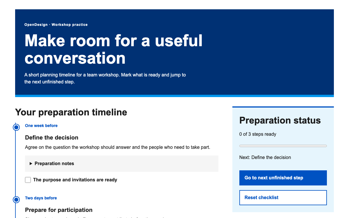
Explore Ripple’s actual color roles, 14-step spacing scale and responsive type references through a complete workshop timeline with progressive disclosure, progress and next-step keyboard focus.

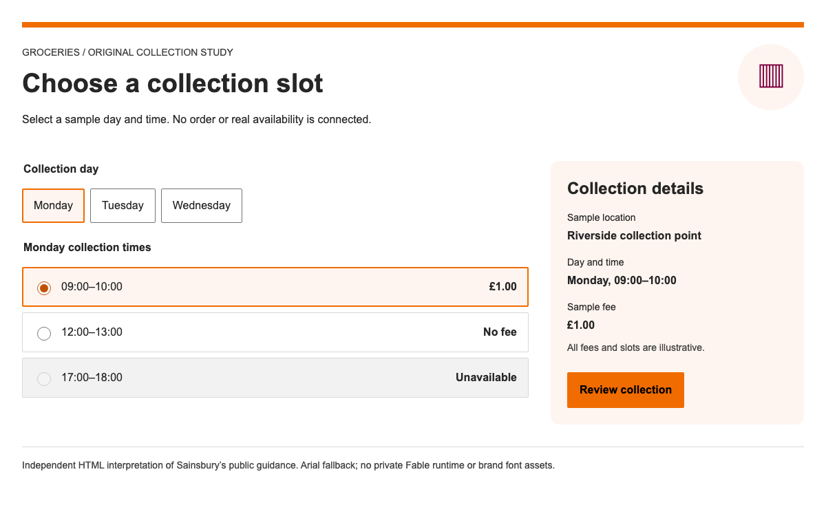
Apply Sainsbury’s public design guidance to a complete collection-slot flow: real palette and size references, accessible radio choices, an updating summary and honest local feedback.

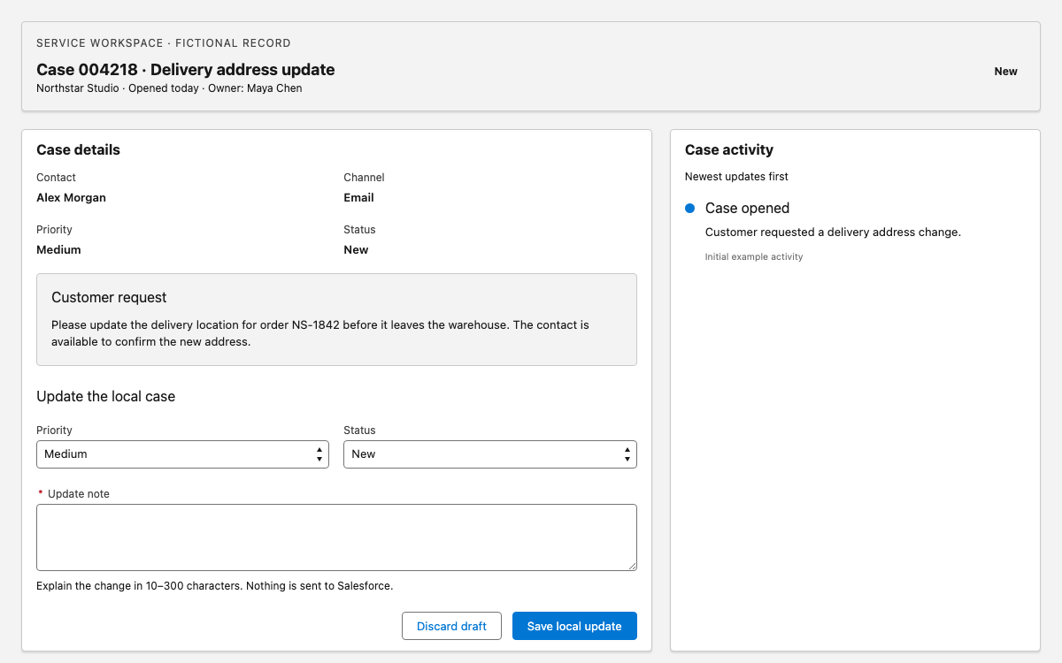
A Lightning blueprint guide for dense record work: real spacing, type and semantic colors, an editable case workspace, field validation and an activity history that reflects local changes.

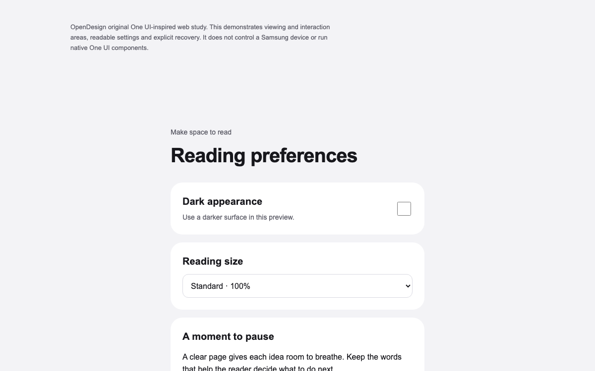
Study One UI’s viewing and interaction structure, 24dp margin guidance and 200% text-scaling requirement through a complete original reading-preferences preview with dark appearance and explicit reset recovery.

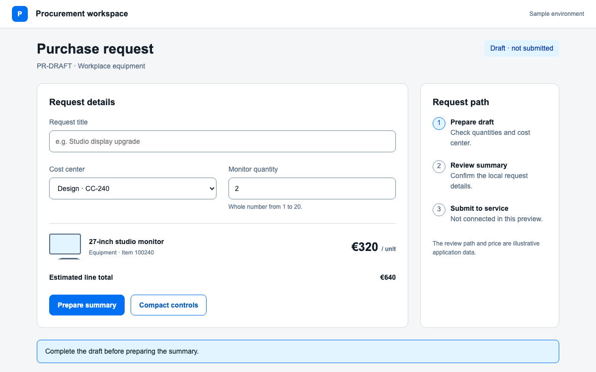
Use SAP Fiori’s Horizon theme through UI5 Web Components: real theme parameters, explicit content density, semantic value states, and a purchase-request composition with local validation.

Apply the Scottish Government’s responsive type, spacing and color roles through a native character-count field that preserves over-limit text and supports recovery.

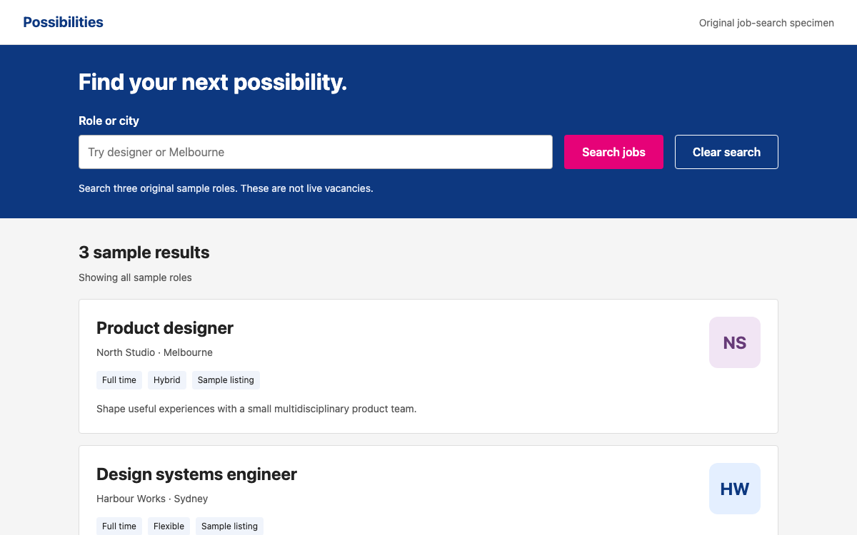
Understand Braid through an original job-search composition: theme-scoped variables, four real breakpoints, contextual text, distinct button tones and a controlled field that explains validation instead of disabling the action.

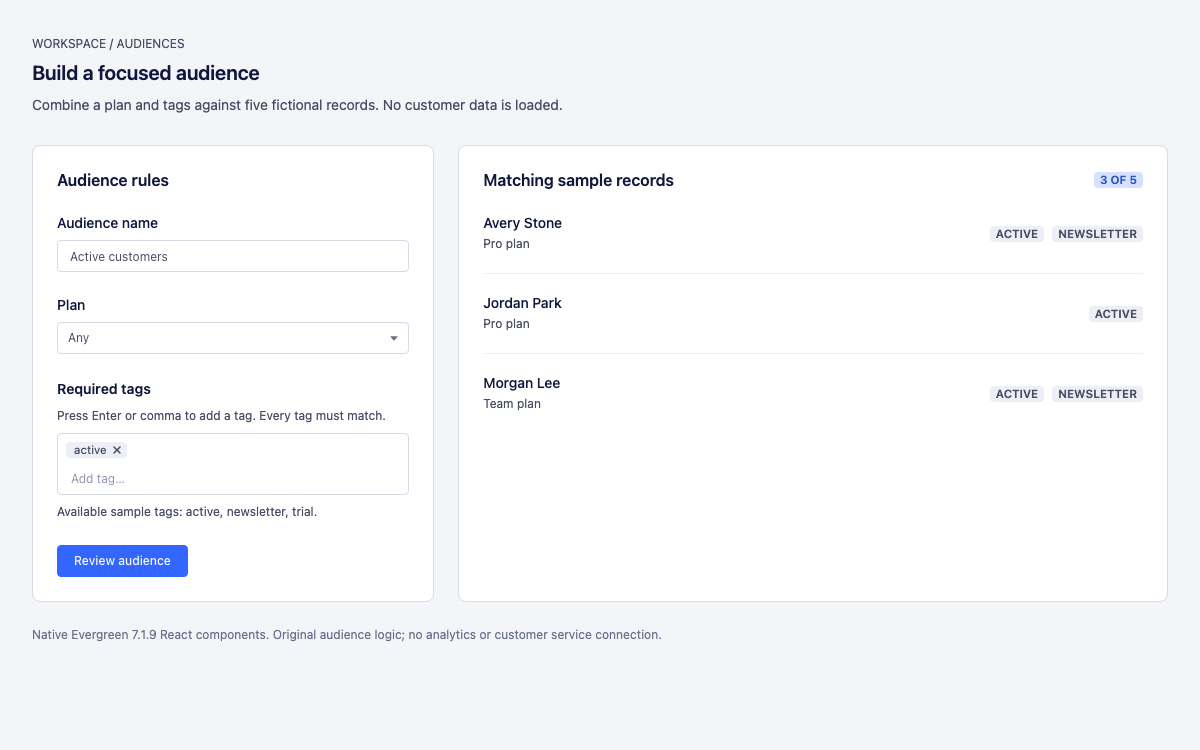
An Evergreen reference with actual theme values, controlled tag entry, live rule matching, an empty-state recovery path and a native review dialog.

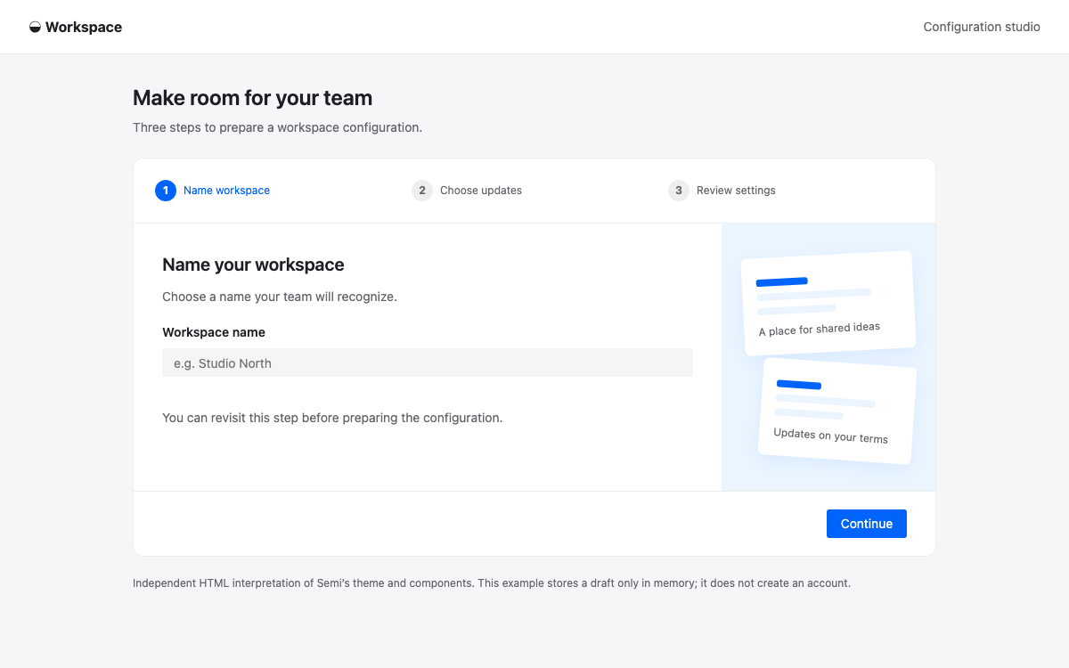
Create a sequential workspace setup with Semi’s recommended basic Steps, controlled Input and Switch, real theme tokens, and an explicit React 18 versus React 19 package choice.

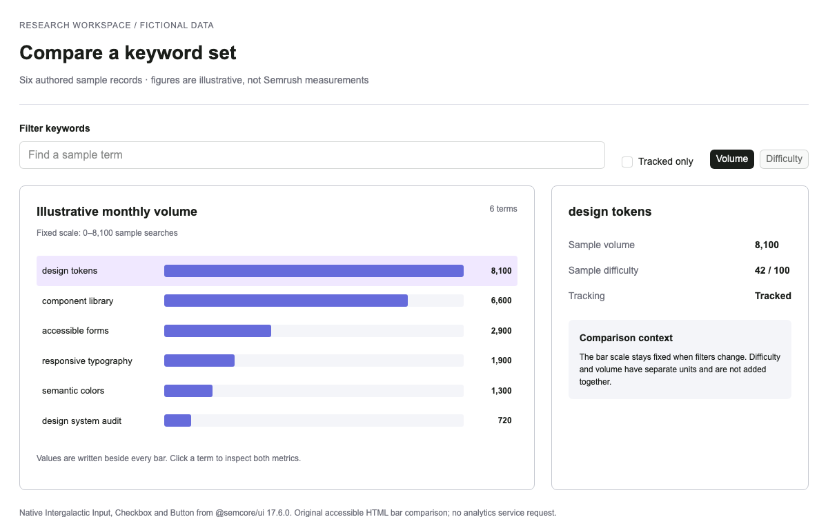
An Intergalactic guide with current semantic and chart tokens, native filtering controls, fixed-scale comparison, selected detail and a complete reproducible fixture.

Explore Horizon Workspace’s exact spacing, radius and typography references through a complete local request-review flow with draft retention, validation, status filters and recovery.

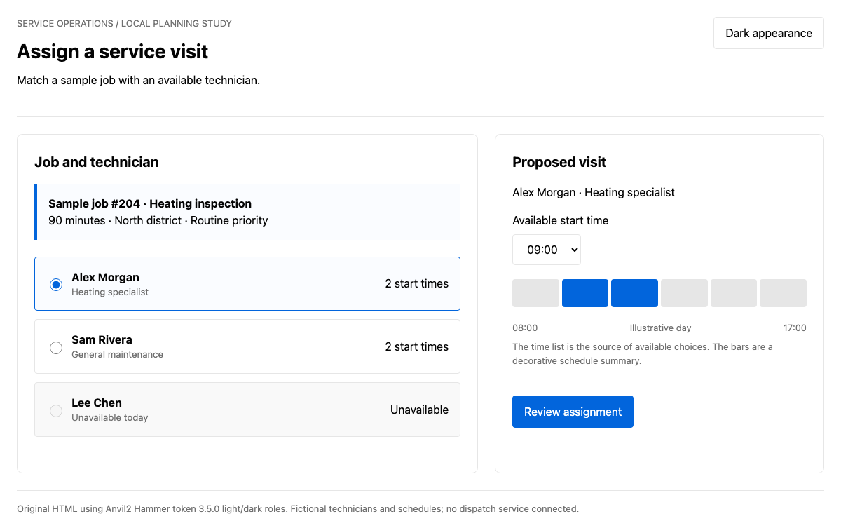
Make Anvil2 concrete with its three-tier token model, verified light/dark role values and a complete service-assignment interaction with synchronized technician, time and review states.

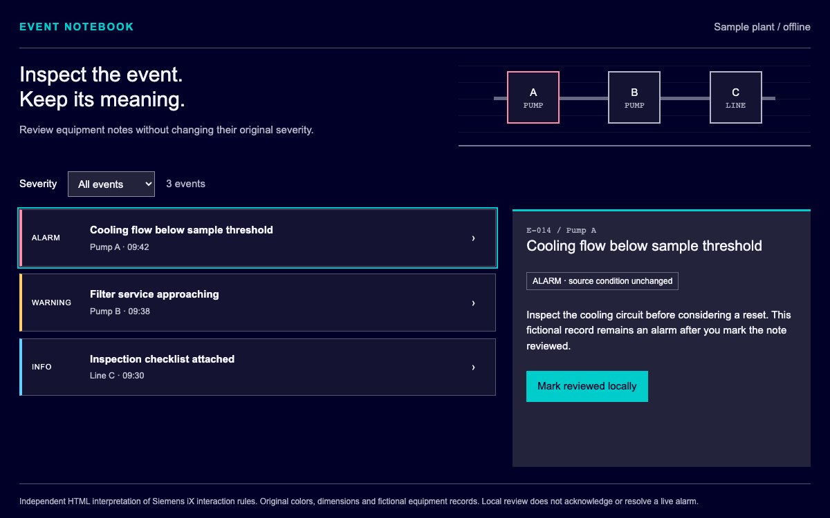
Inspect industrial events with an explicit severity vocabulary, theme-aware color roles and the iX Event List API. This guide builds a local equipment notebook without confusing a reviewed record with a resolved machine alarm.

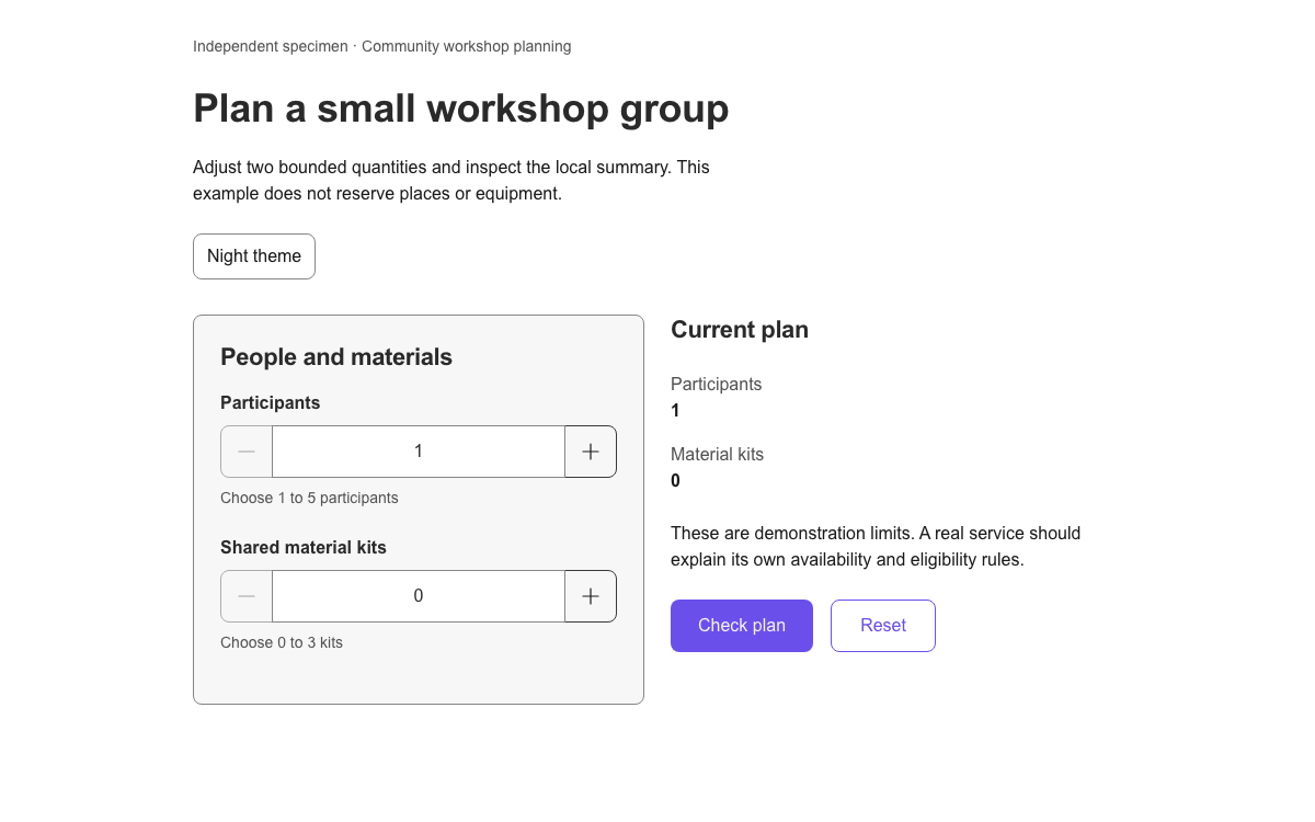
Use current SGDS Web Components with real responsive tokens, day and night themes, and native bounded quantities that keep a local plan synchronized.

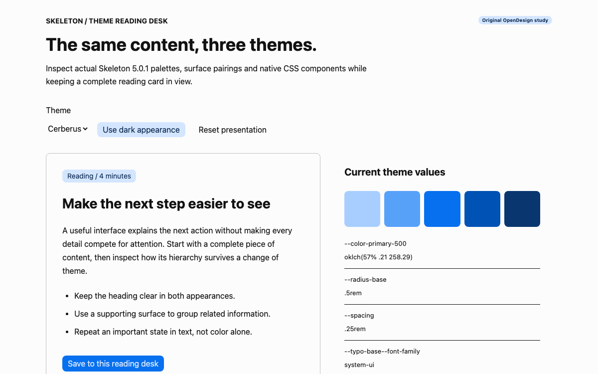
Compare Skeleton 5.0.1’s real Cerberus, Mint and Rose themes through a complete reading desk with live token inspection, dark surface pairings and reversible local state.

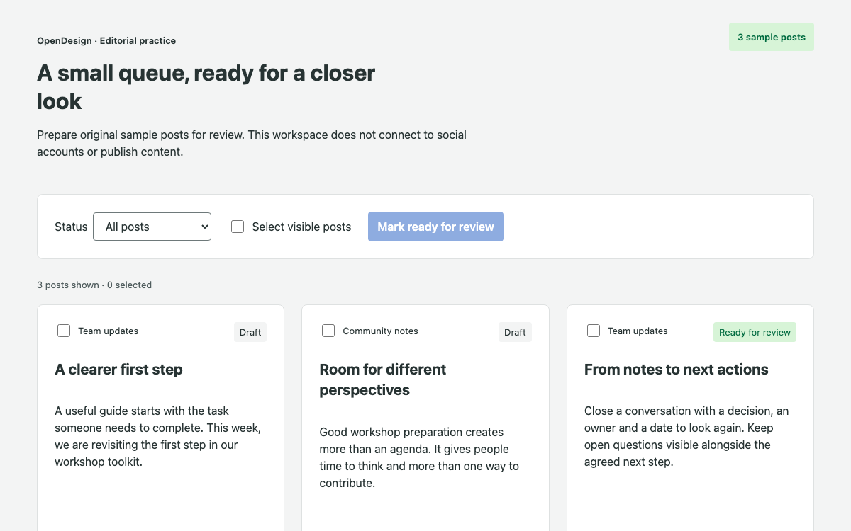
Inspect Seeds’ actual public color, spacing, product typography and border tokens through a complete editorial review queue with mixed selection, filtered empty states and undo.

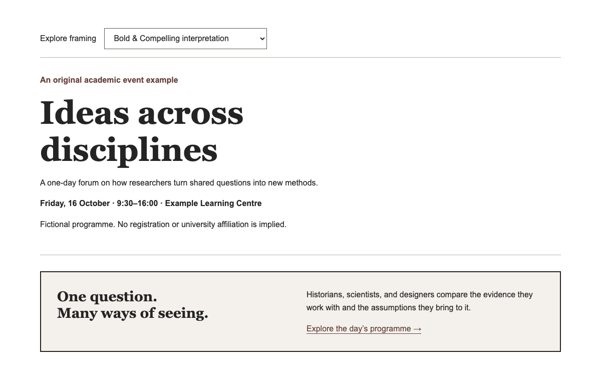
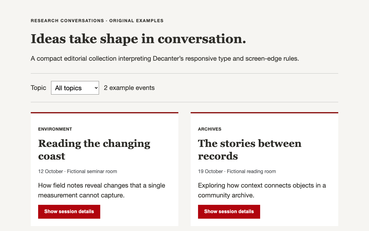
Compose academic editorial pages with Decanter’s Tailwind preset, responsive type scale and fluid screen edges. Explore original event cards with working topic filters and expandable abstracts.

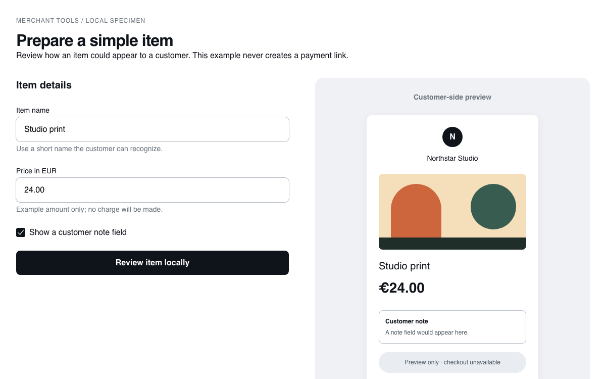
A Circuit guide with exact semantic tokens, native validation props, a complete merchant item editor and an illustrated customer-side preview.

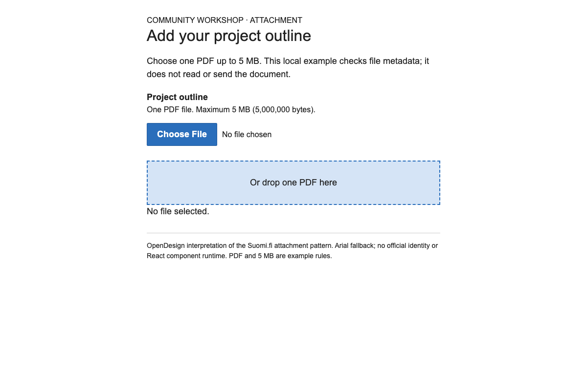
Build readable Finnish public-service forms with Source Sans 3, explicit spacing tokens and a recoverable document-selection pattern.

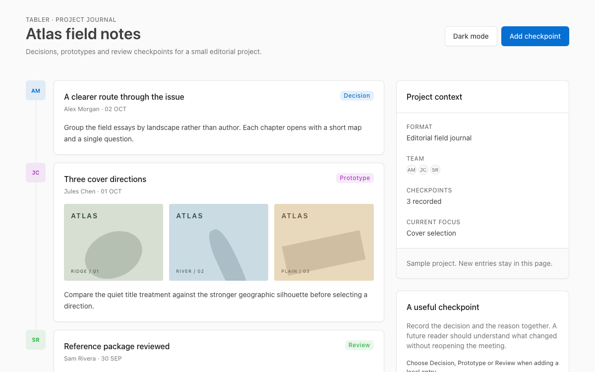
A native Tabler project journal with actual 1.6 theme variables, timeline cards, datagrid context, modal validation and a light/dark composition that can accept local checkpoints.

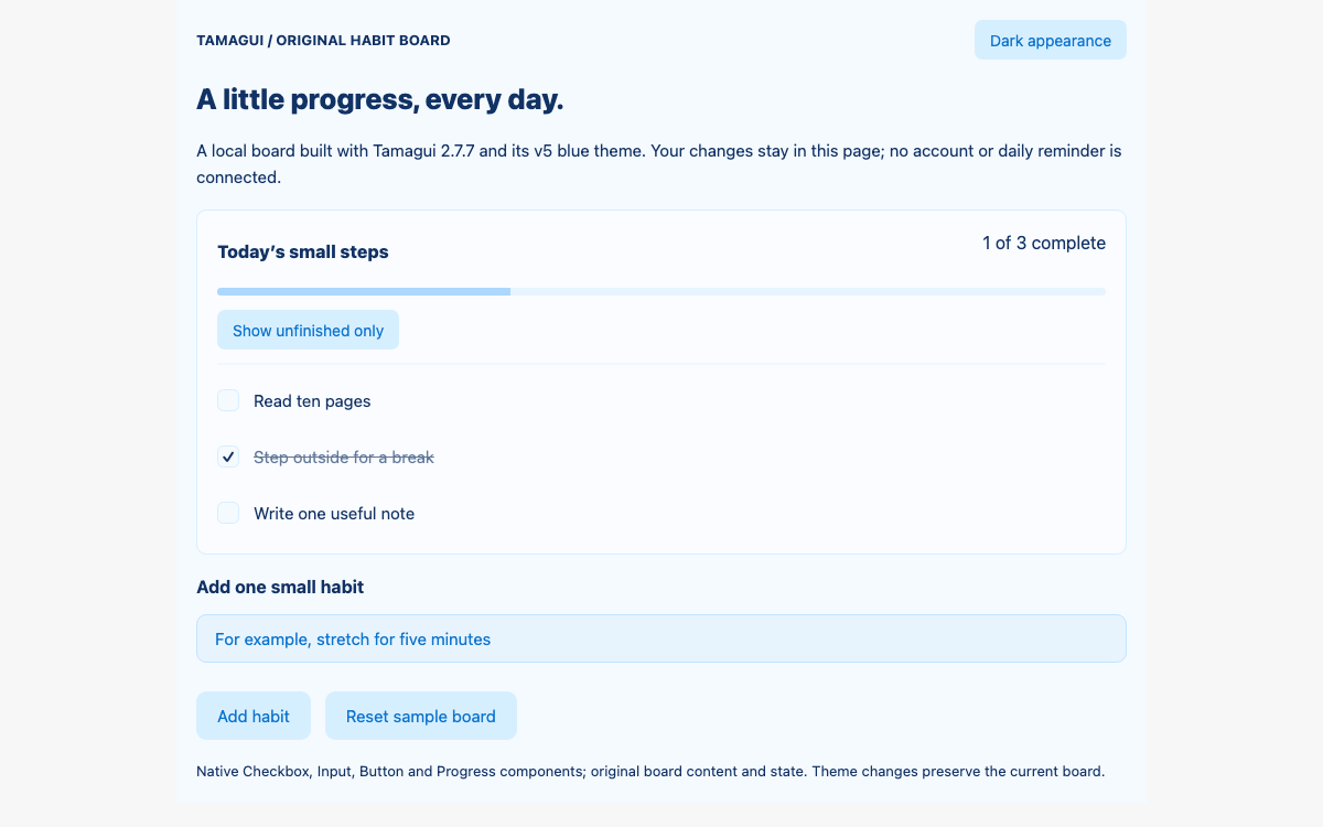
Explore Tamagui’s actual v5 token categories and light/dark blue themes through a complete native-component habit board with validation, progress and empty-state recovery.

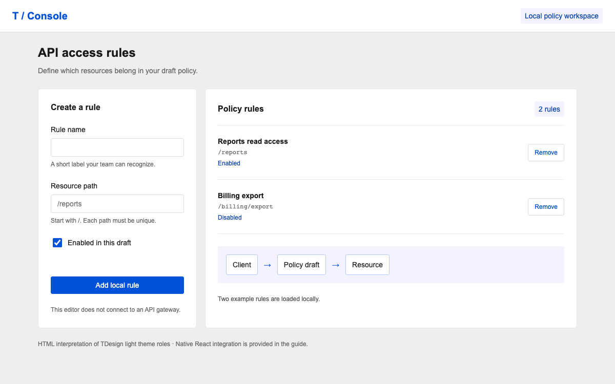
Build a compact API policy editor with TDesign React: concrete theme roles, its two-pixel size scale, Form field registration, and a typed Table composition.
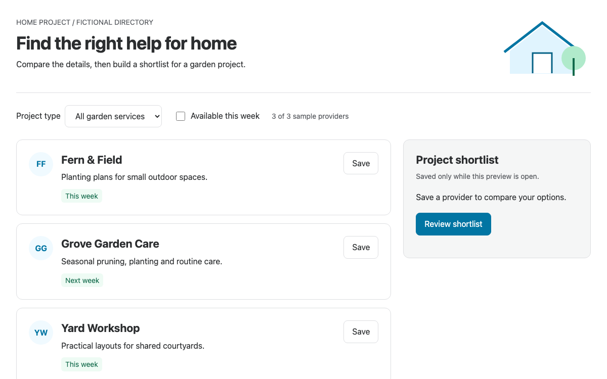
Build a service discovery interface with Thumbprint’s documented v2 primitives: compact provider cards, readable comparison details, clear selection states and a persistent shortlist.

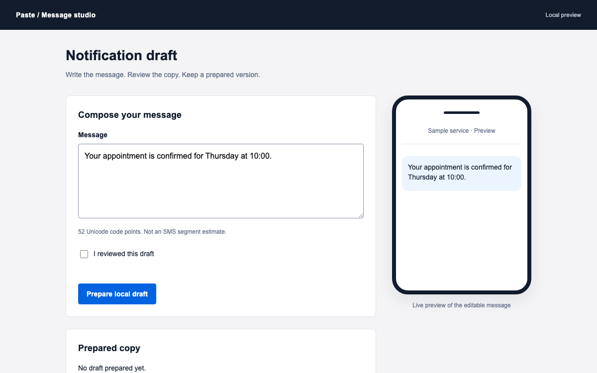
Compose a notification draft with Paste’s theme and button contracts, a verified spacing scale, and a clear distinction between editing, reviewing, and actually sending a message.

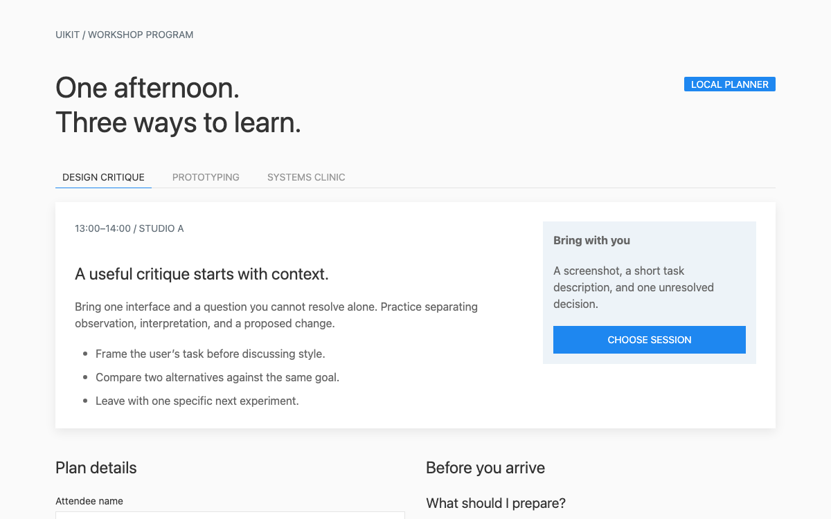
UIkit combines a CSS framework, Less customization and attribute-driven JavaScript components. Its Switcher, Accordion and responsive grid work together in the workshop planner below, illustrating where native component behavior ends and application selection state begins.

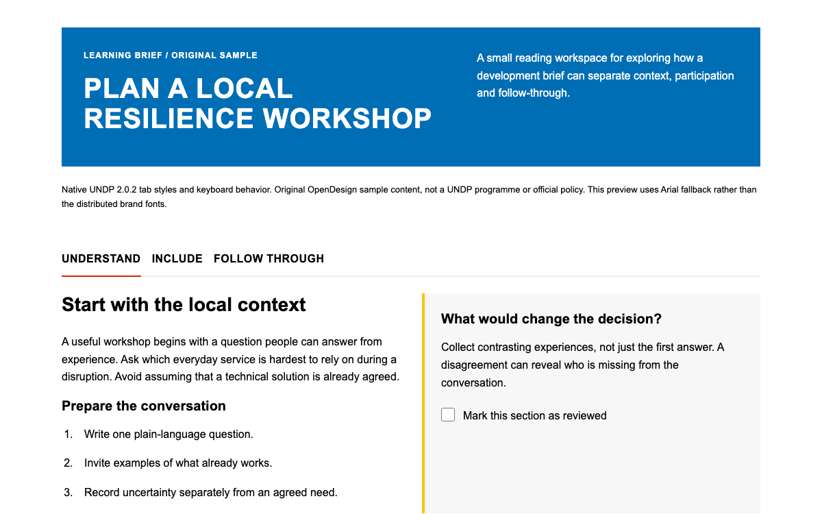
Explore UNDP’s published color and spacing tokens, native keyboard-operated tabs and a complete workshop-reading example with local review progress.

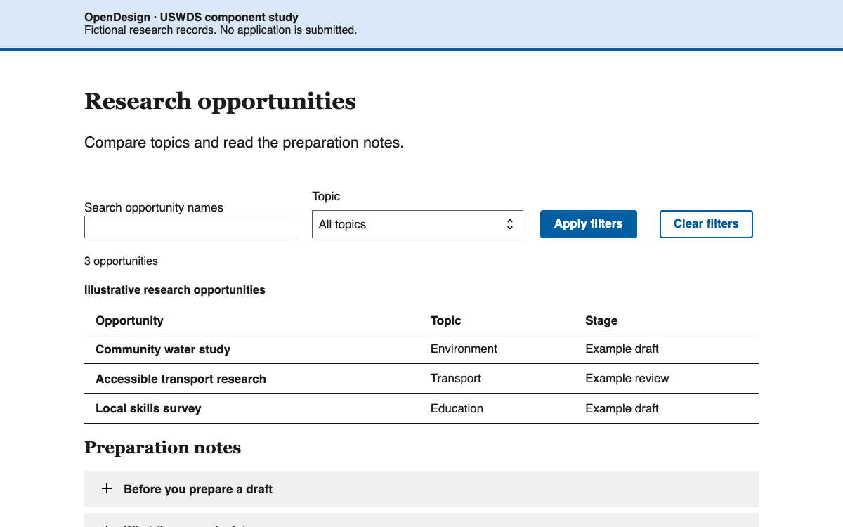
Connect USWDS spacing tokens, theme roles, semantic tables and native accordions in a searchable opportunity comparison.

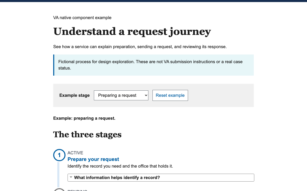
Build clear service journeys with VA’s semantic tokens and native Process List: visible step explanations, meaningful status labels, and supplementary details that keep the main path readable.

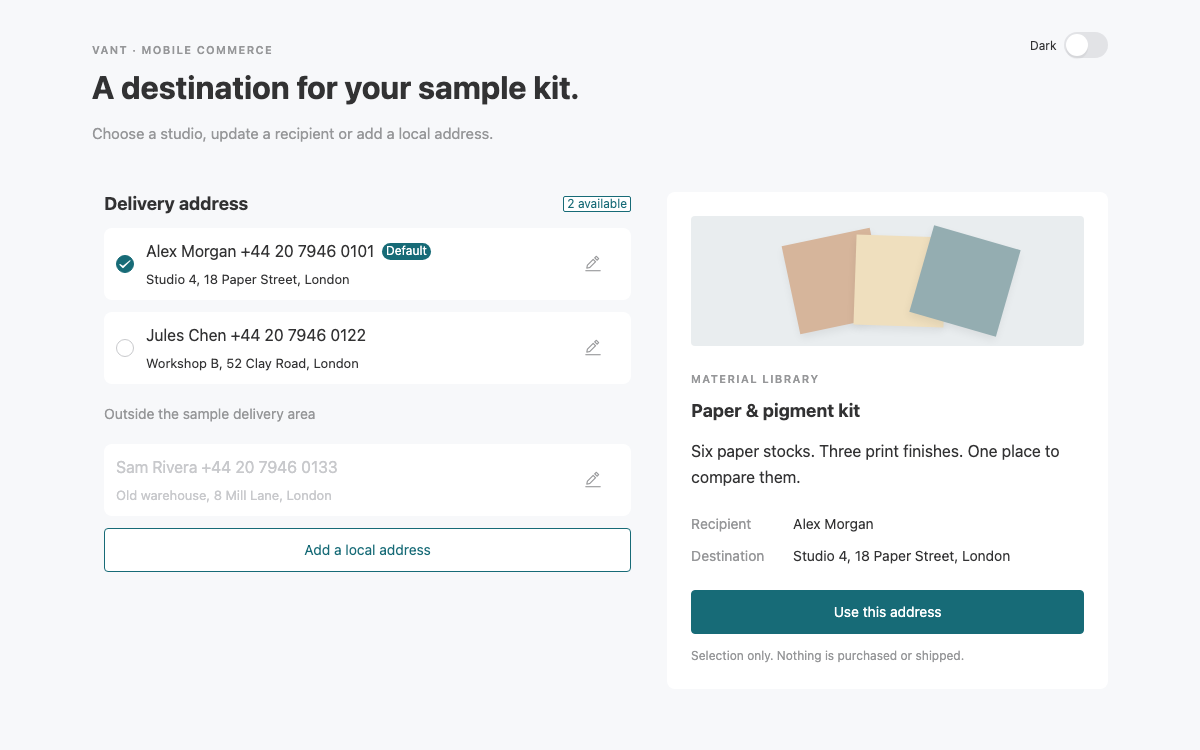
A mobile address-selection flow built with Vant 4: real CSS variables, controlled address identity, field validation, theme switching and an explicit local-only save.

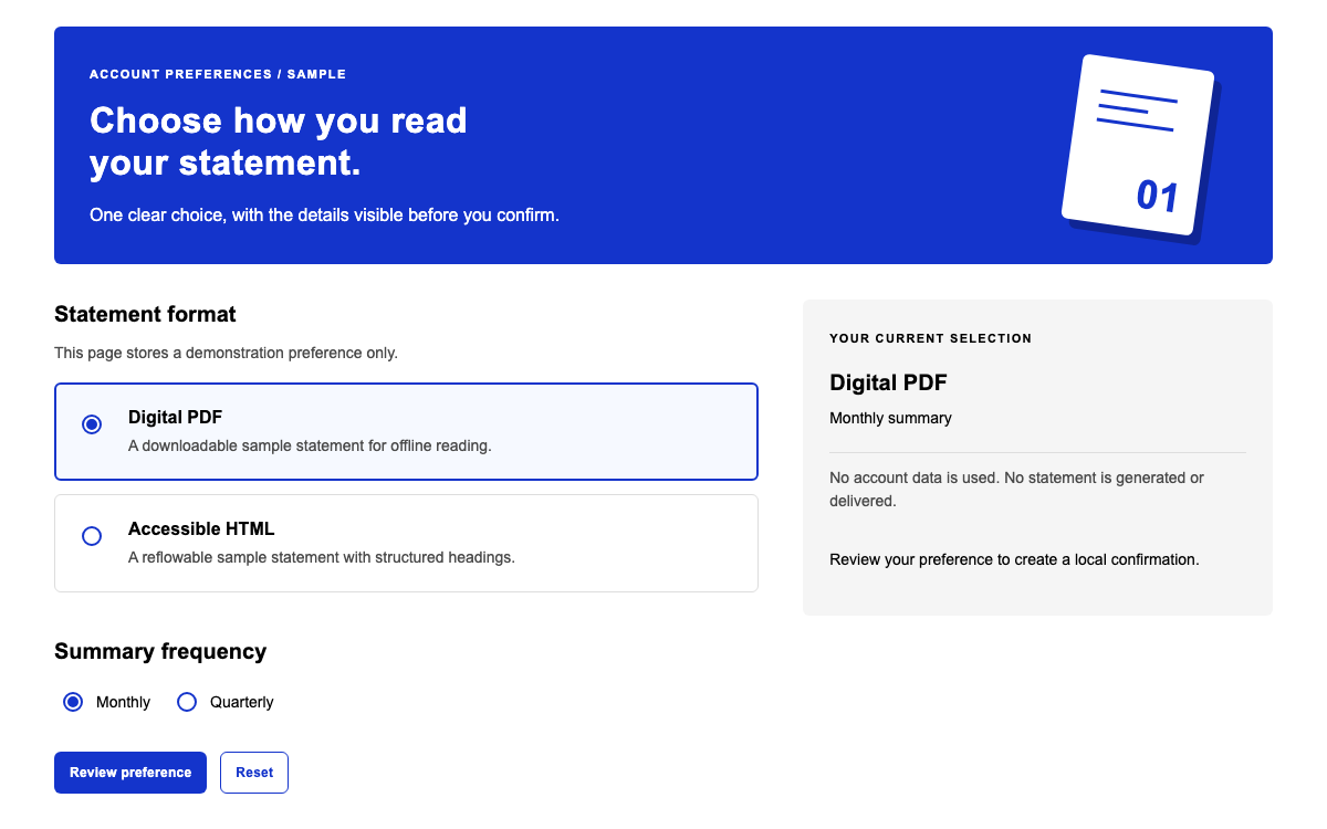
Use Visa’s Nova CSS to build a clear statement-format preference with native radio controls, an alternate-color header and a review summary. Inspect the exact 1.6.5 theme values, scalable spacing and complete stylesheet integration.

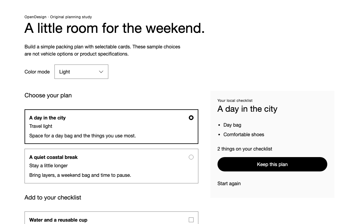
Inspect Volvo Cars’ HTML-first web foundation, actual light-mode tokens and native selectable-card styling through a complete packing-plan example with independent choices, theme switching and reset.

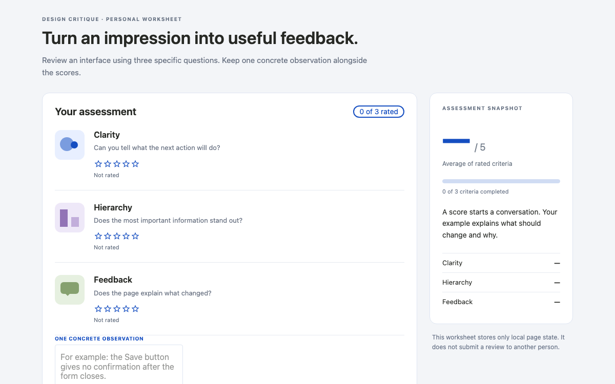
A native Vuestic critique worksheet with source-verified light and dark presets, accessible rating labels, textarea validation, a derived average and a saved state that preserves the completed assessment.

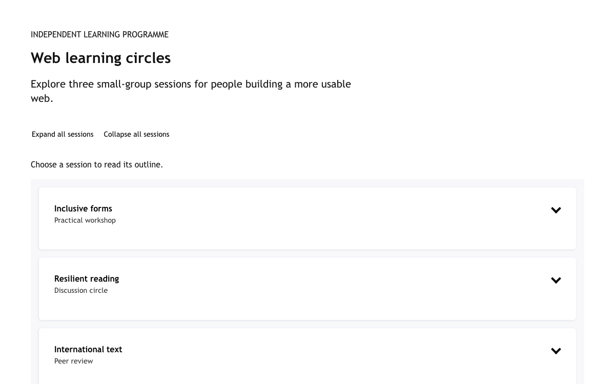
Build resilient reading interfaces with fluid type, semantic color roles and native collapsible content that remains readable without JavaScript.

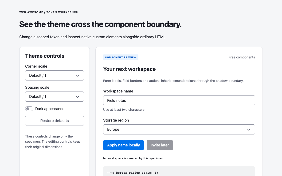
Inspect Web Awesome’s actual semantic tokens across native custom elements, including scoped radius and spacing changes, shadow-DOM styling, select behavior and input validation.

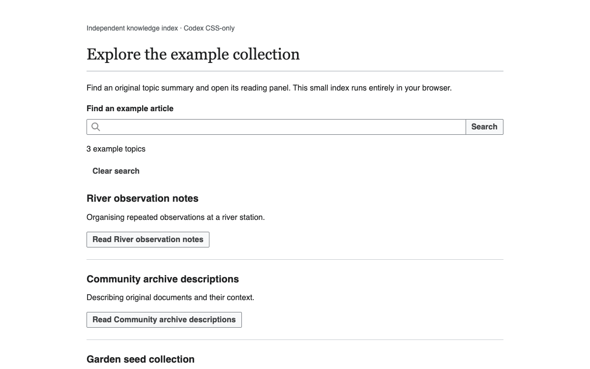
Use Codex’s real SearchInput anatomy, action hierarchy and reading-oriented tokens. Search a local article index, inspect a result and return to the same reading position.

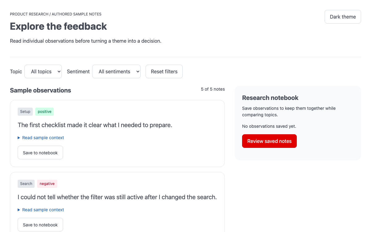
Use Wanda’s real theme roles and token syntax in a complete feedback-reading workspace with topic filters, expandable evidence context and a persistent local notebook.

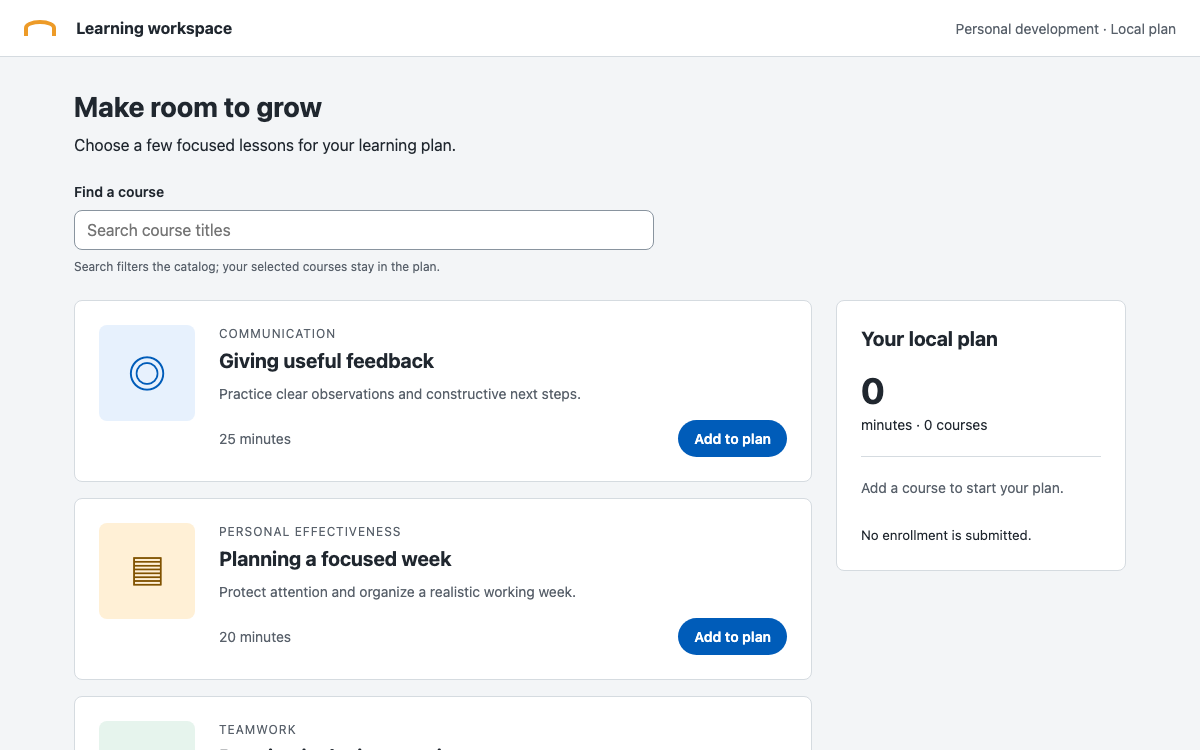
Build a local learning plan with Canvas Kit’s compound FormField, controlled TextInput and PrimaryButton, while distinguishing current semantic token sources from older space.x4 migration examples.

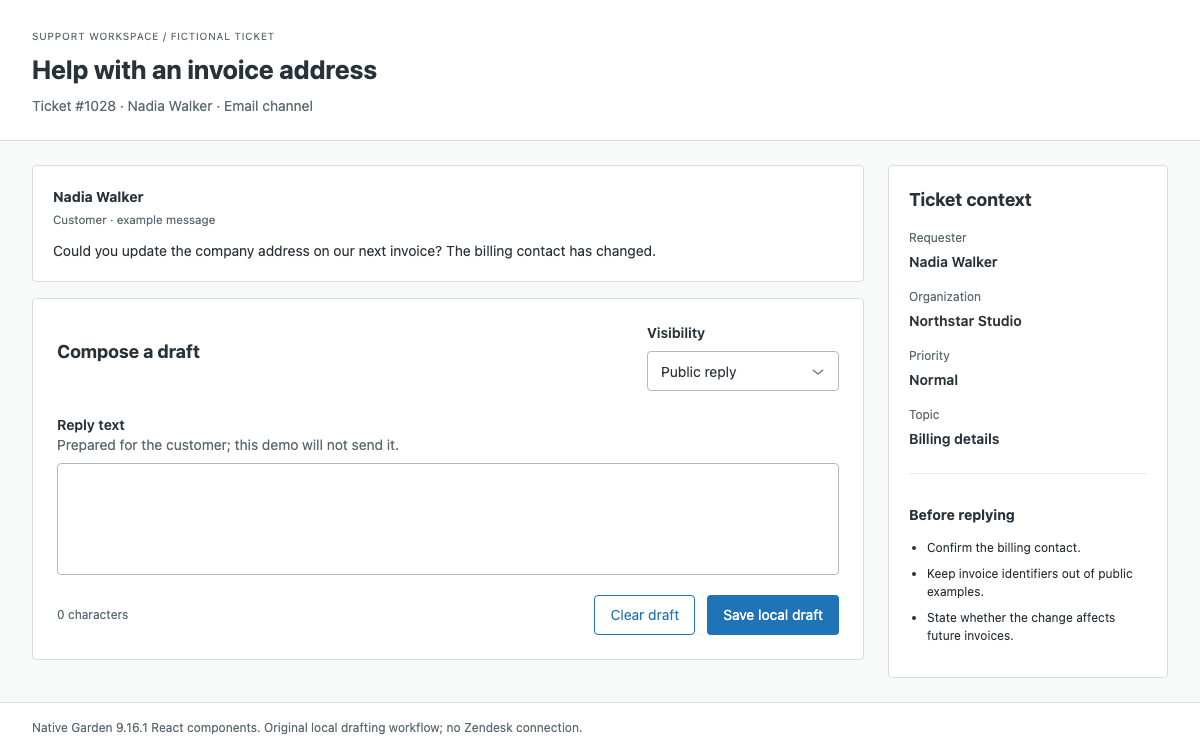
A Garden guide for support work with real theme aliases, type and radius scales, a complete reply composer, visibility-aware local drafts and field recovery.
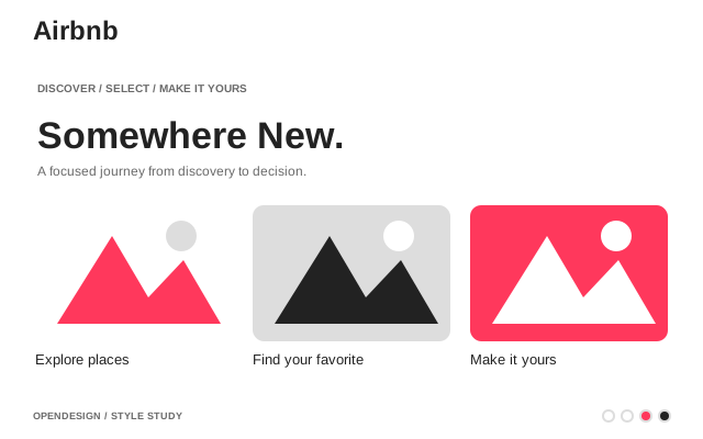
Travel marketplace. Warm coral accent, photography-driven, rounded UI.
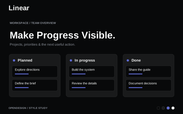
Project management. Ultra-minimal, precise, purple accent.
Calm, near-monochrome system anchored in deep teal-black with generous white space and editorial typography.
Consumer electronics. Premium white space, SF Pro, cinematic imagery.
Payment infrastructure. Signature purple gradients, weight-300 elegance.
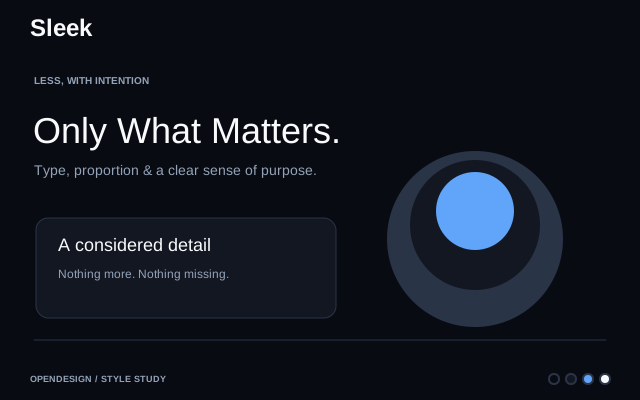
Digital banking. Sleek dark interface, gradient cards, fintech precision.
Frosted glass effect with translucent layers, subtle blur, and luminous borders for depth and modern elegance.
Money transfer. Bright green accent, friendly and clear.
Electric automotive. Radical subtraction, full-viewport photography, near-zero UI.
Language-learning platform. Bright owl green, chunky shadows, gamified joy.
Code-forward platform. Functional density, blue-on-white precision, Primer foundations.
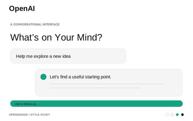
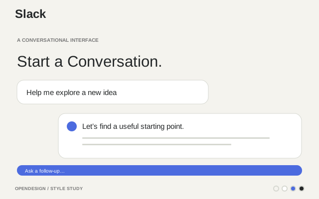
Conversational AI-first interface with minimal controls, clear outcomes, and delegated task flows for agentic workflows.
Spreadsheet-database hybrid. Colorful, friendly, structured data aesthetic.
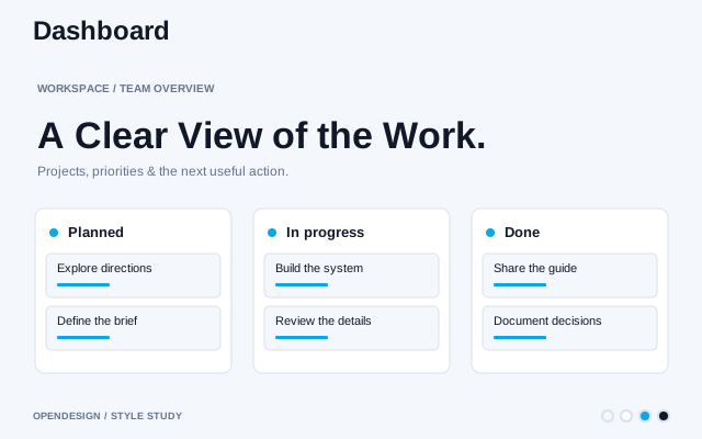
Structured, enterprise-focused design system emphasizing clarity, consistency, and efficiency for data-dense web applications.
App dashboard with purple-themed aesthetic, top-bar navigation, card-based layouts, and developer-first workflows.
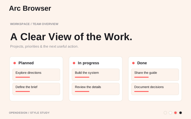
"The browser that browses for you." Translucent surfaces, gradient warmth, sidebar-first layout.
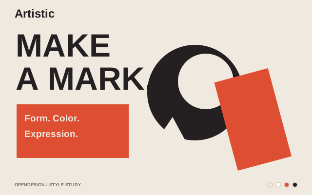
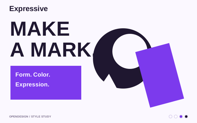
High-contrast, expressive style with creative typography and bold color choices for visually striking interfaces.
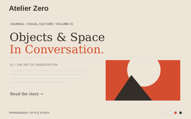
A magazine-grade, collage-driven visual system: warm paper canvas, surreal plaster-and-architecture imagery, oversized display type, hairline rules, Roman-numeral section markers, and tiny editorial annotations. Inspired by the production values of high-end print magazines (Monocle, Apartamento, IDEA) translated into a working website.
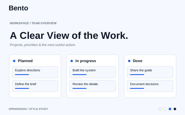
Modular grid layout with card-like blocks, clear hierarchy, soft spacing, and subtle visual contrast for organized, scannable interfaces.
Crypto exchange. Bold yellow accent on monochrome, trading-floor urgency.
Luxury automotive. Dark premium surfaces, precise German engineering aesthetic.
Motorsport performance sub-brand. Near-black cockpit surfaces, BMW M tricolor accents, sharp engineering geometry.
Strong visual presence with heavyweight typography, high-contrast colors, and commanding layouts.
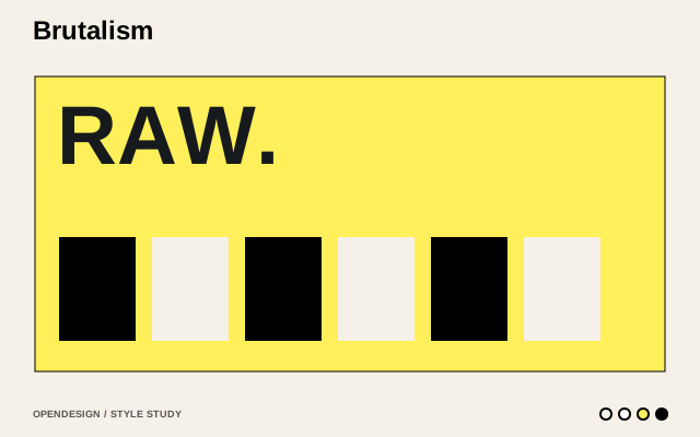
Raw, anti-design aesthetic inspired by concrete architecture with unadorned elements, jarring layouts, and functional minimalism.
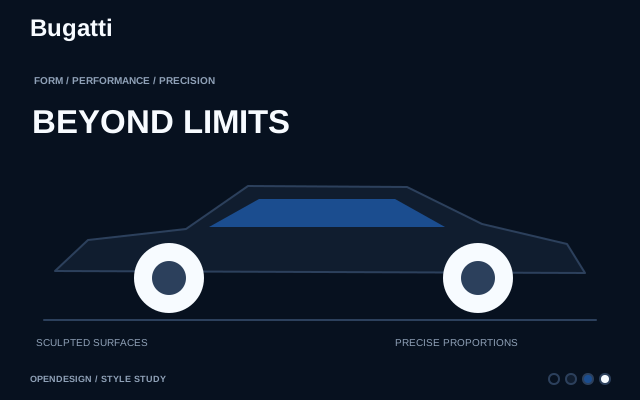
Hypercar brand. Cinema-black canvas, monochrome austerity, monumental display type.
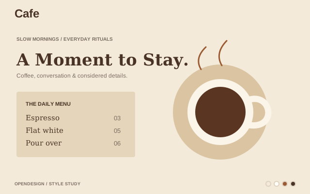
Cozy cafe-inspired interface with warm tones, soft typography, and clean layouts for a relaxed browsing experience.
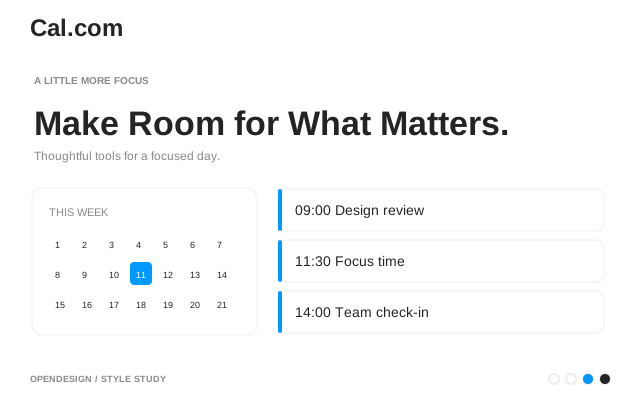
Open-source scheduling. Clean neutral UI, developer-oriented simplicity.
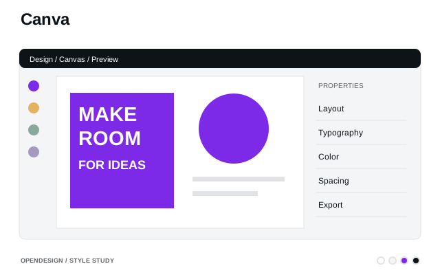
Visual creation platform. Vivid purple-blue gradient, generous spacing, friendly geometry.
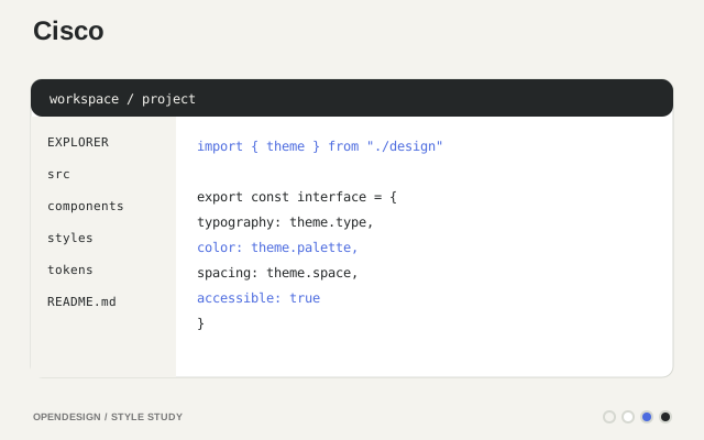
Enterprise infrastructure brand. Dark trust surfaces, Cisco Blue signal, technical clarity.
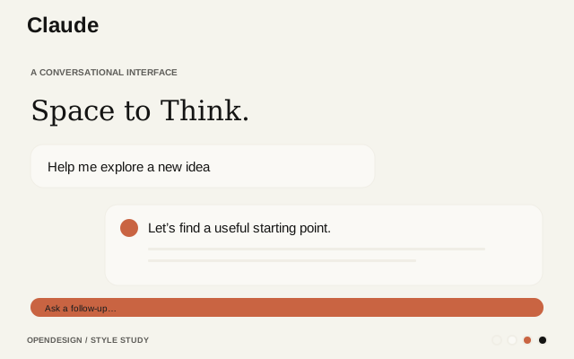
Anthropic's AI assistant. Warm terracotta accent, clean editorial layout.
Creative agency. Organic shapes, soft gradients, art-directed layout.
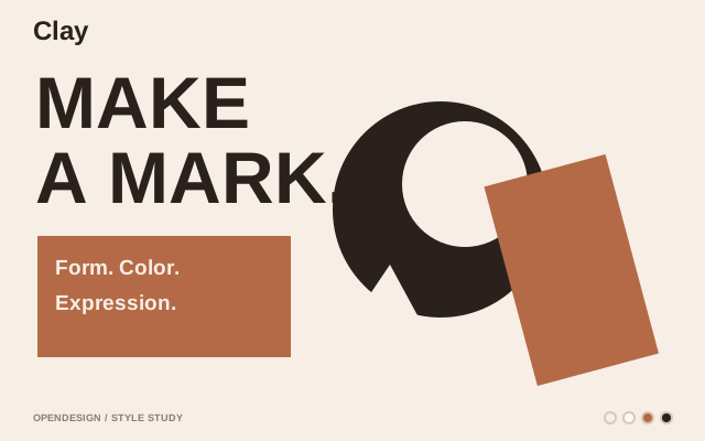
Soft, rounded 3D-like shapes mimicking malleable clay with playful, puffy elements and colorful surfaces.
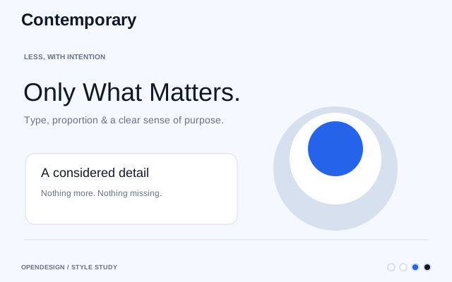
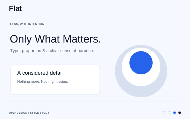
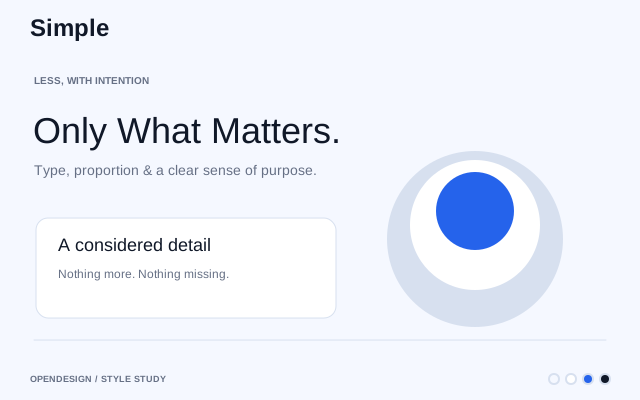
Simplicity-focused design with ample whitespace, legible typography, and a limited color palette to reduce visual clutter.
Fast analytics database. Yellow-accented, technical documentation style.
A compact, semantic component language for modern web applications: layered neutral surfaces, precise Inter typography, accessible controls, automatic light/dark color roles, and task-appropriate chart palettes.
Enterprise AI platform. Vibrant gradients, data-rich dashboard aesthetic.
Crypto exchange. Clean blue identity, trust-focused, institutional feel.
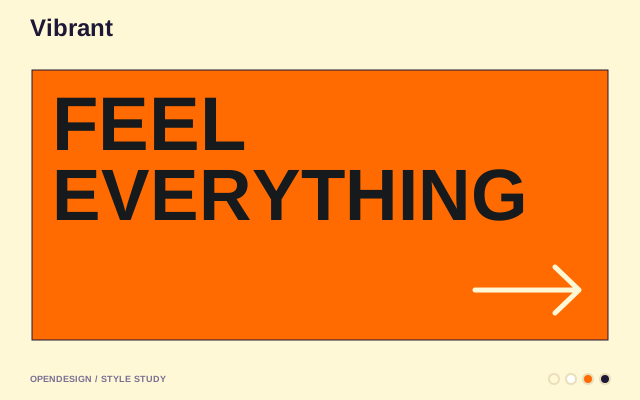
Vibrant, high-contrast palettes and gradients for engaging, memorable, and modern user experiences.
Tool integration platform. Modern dark with colorful integration icons.
Current-era minimalist design with bento grids, dark mode support, and high-performance accessible layouts.
Professional, brand-aligned design with structured grids, minimalist layouts, and consistent enterprise patterns.
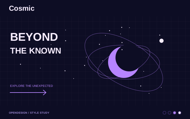
Futuristic sci-fi aesthetic with dark themes, vibrant neon accents, and immersive spatial elements.
Playful, character-driven design with expressive typography and bold graphics for landing pages and creative projects.
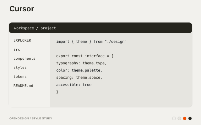
AI-first code editor. Sleek dark interface, gradient accents.
Dark-themed cloud-platform aesthetic with modular grids, glass-like panels, and strong data hierarchy for productivity dashboards.
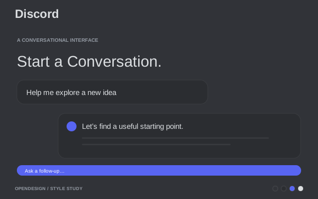
Voice / chat platform. Deep blurple, dark-first surfaces, playful accent moments.
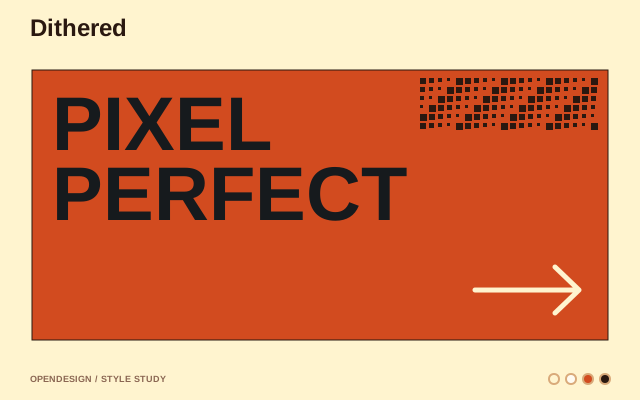
Dot-pattern rendering technique that simulates shades with a limited palette for nostalgic, retro, high-contrast visuals.
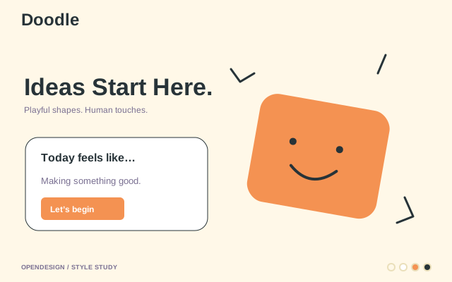
Hand-drawn, sketch-like style with doodles, handwritten fonts, and imperfect lines for a playful, informal feel.
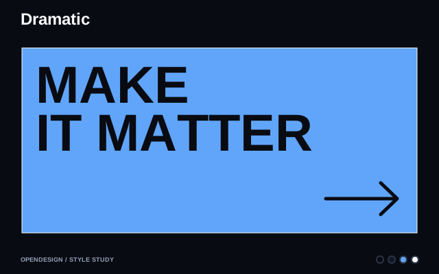
High-contrast, theatrical design with bold layouts, immersive visuals, and unconventional compositions that command attention.
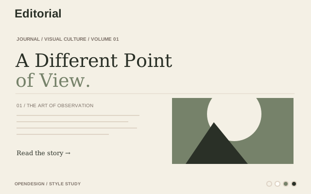
Magazine-inspired editorial layout with refined serif typography, structured grids, and elegant reading experiences.
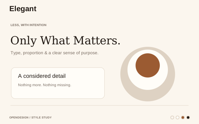
Graceful, refined aesthetic with delicate typography, minimal palettes, and polished layouts that exude sophistication.
AI voice platform. Dark cinematic UI, audio-waveform aesthetics.
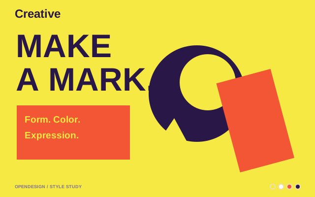
Dynamic, vibrant style with thick borders, geometric shapes, high-contrast colors, and expressive typography conveying motion and vitality.
Clean, high-contrast enterprise design for data-driven workflows with intuitive drag-and-drop patterns and structured layouts.
React Native platform. Dark theme, tight letter-spacing, code-centric.
Vibrant, personality-driven design with bold colors, playful graphics, and dynamic layouts that balance creativity with structure.
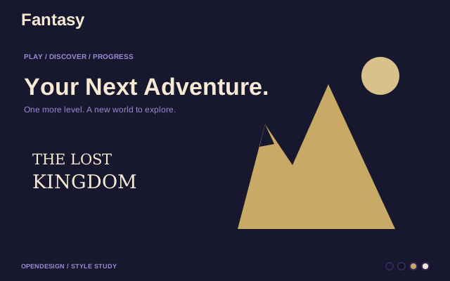
Game-inspired fantasy aesthetic with bold, premium visuals, rich color palettes, and immersive thematic elements.
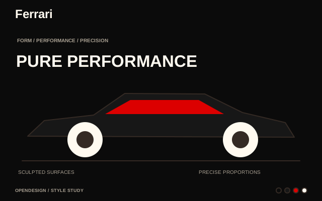
Luxury automotive. Chiaroscuro editorial, Ferrari Red accents, cinematic black.
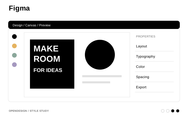
Collaborative design tool. Vibrant multi-color, playful yet professional.
Two-dimensional minimalist style with vibrant colors, clean typography, and no 3D effects for fast, user-friendly interfaces.
Website builder. Bold black and blue, motion-first, design-forward.
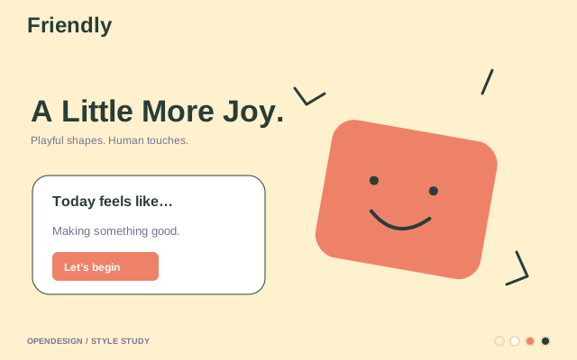
Approachable, intuitive design with rounded elements, ample whitespace, and soft pastel color palettes.
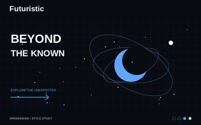
Forward-looking design with tech-inspired typography, modern layouts, and a sleek, innovation-driven aesthetic.
Smooth color transitions and gradient-rich surfaces for modern, playful interfaces with visual depth.
Infrastructure automation. Enterprise-clean, black and white.
Fighter jet / helicopter head-up display. Phosphor green on near-black, all-caps data overlays, angular geometry. Zero ambiguity at speed and altitude.
ML community hub. Sunny yellow accent, monospace identity, cheerful and dense.
Enterprise technology. Carbon design system, structured blue palette.
Customer messaging. Friendly blue palette, conversational UI patterns.
Editorial paper system: warm parchment canvas, ink-blue accent, serif-led hierarchy. Built for resumes, one-pagers, white papers, portfolios, slide decks — anything that should feel like high-quality print rather than UI. Multilingual by design (EN · zh-CN · ja).
Crypto trading. Purple-accented dark UI, data-dense dashboards.
Supercar brand. True black surfaces, gold accents, dramatic uppercase typography.
Conversion-focused design that removes friction and guides users toward action through clarity, trust, and speed.
Playful, minimal design with bright colors, rounded shapes, tactile 3D borders, and friendly illustrations for approachable interfaces.
Loom async video. Purple primary, friendly surfaces, video-first layout. Clean and professional without being corporate.
AI full-stack builder. Playful gradients, friendly dev aesthetic.
High-end dark aesthetic with bold headings, monochromatic palette, and premium feel for luxury brand experiences.
Global payments network. Warm cream canvas, orbital pill shapes, editorial warmth.
Google's Material Design with layered surfaces, dynamic theming, built-in motion, and responsive cross-platform patterns.
Tech retail store. Photography-first, binary light/dark surfaces, Meta Blue CTAs.
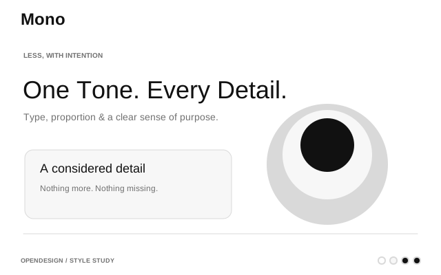
Stripped-back design emphasizing whitespace, clean typography, and restrained color for maximum clarity and focus.
AI model provider. Bold dark interface with neon accents.
Documentation platform. Clean, green-accented, reading-optimized.
Visual collaboration. Bright yellow accent, infinite canvas aesthetic.
Space/aerospace mission monitoring. Dark command center, amber telemetry, monospace precision. Functional clarity above all else.
Open-weight LLM provider. French-engineered minimalism, purple-toned.
Contemporary editorial style with serif typography, minimal palettes, and clean layouts for polished digital products.
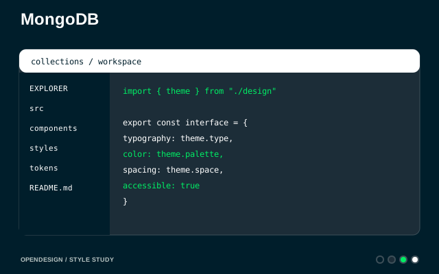
Document database. Green leaf branding, developer documentation focus.
Monospace-driven, matrix-inspired design with high-contrast elements, compact density, and a hacker-chic aesthetic.
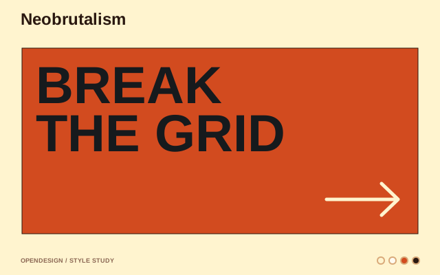
Modern take on brutalism with bold borders, vivid accent colors, and raw, high-contrast layouts on warm surfaces.
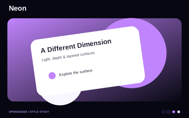
Electric neon glow effects with high-contrast color pairings for bold, attention-grabbing interfaces.
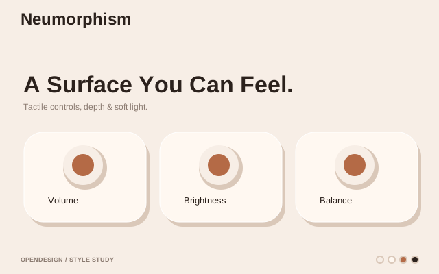
Soft, extruded UI elements with inner and outer shadows on monochromatic surfaces for a tactile, embedded look.
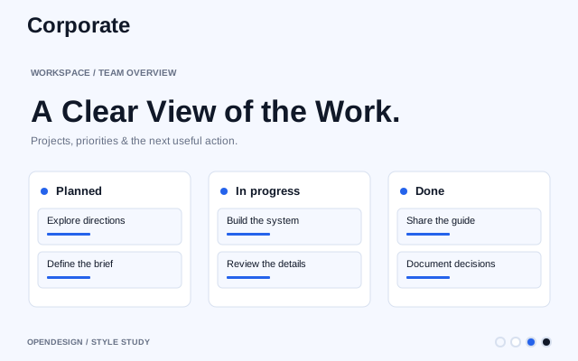
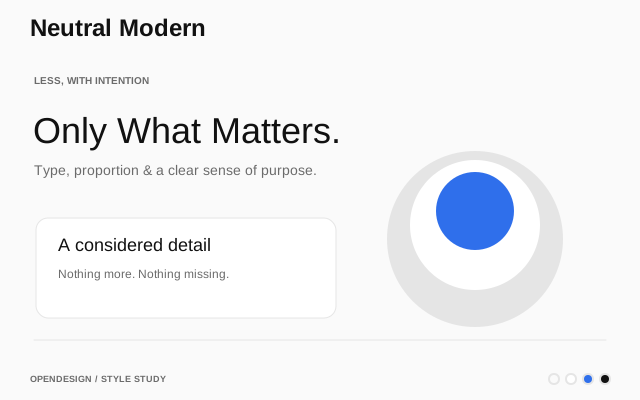
A clean, product-oriented default. Use when the brief doesn't call for a specific mood — good for B2B tools, dashboards, and utility pages.
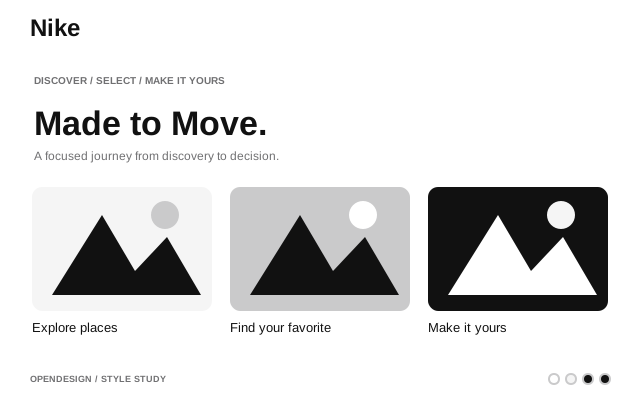
Athletic retail. Monochrome UI, massive uppercase type, full-bleed photography.
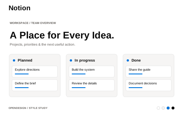
All-in-one workspace. Warm minimalism, serif headings, soft surfaces.
GPU computing. Green-black energy, technical power aesthetic.
Run LLMs locally. Terminal-first, monochrome simplicity.
AI coding platform. Developer-centric dark theme.
Retro arcade-inspired design with pixel fonts, dotted borders, playful high-contrast colors, and 8-bit game aesthetics.
Paper-textured, print-inspired design with minimal colors, clean serif/sans typography, and tactile surface qualities.
Conversational AI search engine. Deep-dark canvas, sharp typography, single violet accent, dense information hierarchy.
Spatial depth design with isometric views, vanishing points, and layered elements that guide attention through 3D-like realism.
Visual discovery. Red accent, masonry grid, image-first.
Gaming console retail. Three-surface channel layout, quiet-authority display type, cyan hover-scale.
Product analytics. Playful hedgehog branding, developer-friendly dark UI.
Apple-inspired premium aesthetic with precise spacing, modern typography, and a refined, polished visual language.
Polished, business-ready design with modern typography, structured layouts, and a trustworthy visual identity.
Print-inspired visual language for books, magazines, and reports with editorial grids and expressive typography.
Productivity launcher. Sleek dark chrome, vibrant gradient accents.
Carefully curated, modern minimal style with elegant serif typography and understated, sophisticated palettes.
French automotive. Vibrant aurora gradients, NouvelR typography, bold energy.
Run ML models via API. Clean white canvas, code-forward.
Email API. Minimal dark theme, monospace accents.
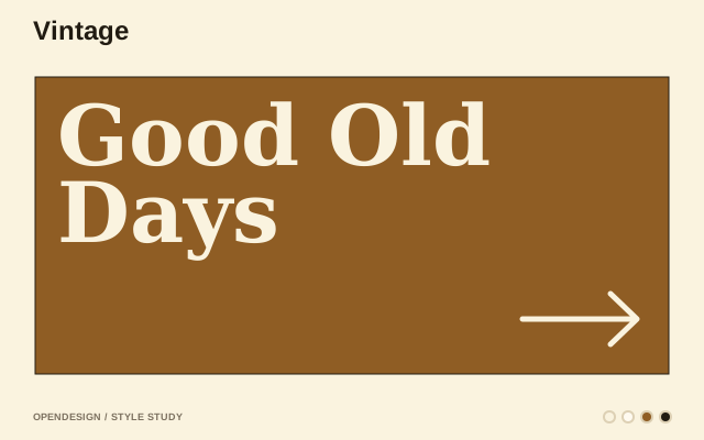
Throwback design with vintage-inspired typography, high-contrast retro palettes, and nostalgic visual elements.
AI video generation. Cinematic dark UI, media-rich layout.
Headless CMS. Red accent, content-first editorial layout.
Error monitoring. Dark dashboard, data-dense, pink-purple accent.
Shadcn/ui-inspired design with minimal, clean components, monochrome palette, and utility-first patterns.
E-commerce platform. Dark-first cinematic, neon green accent, ultra-light type.
Straightforward, no-frills design with clean typography, neutral colors, and intuitive layouts that stay out of the way.
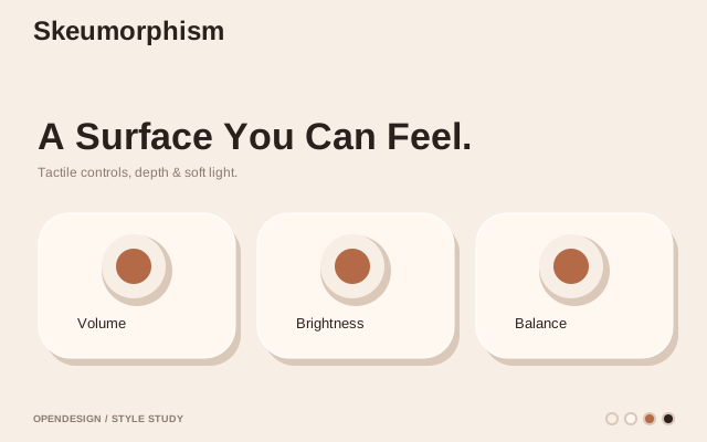
Real-world mimicry with textured surfaces, 3D effects, and familiar physical metaphors for intuitive digital interfaces.
Workplace communication platform. Aubergine-primary, multi-accent logo palette, light surfaces with dark sidebar, warm and approachable.
Modern minimalist aesthetic with clean lines, intentional color palette, subtle interactions, and consistent spacing.
Space technology. Stark black and white, full-bleed imagery, futuristic.
Generous whitespace, consistent padding, and grid-based layouts for clean, readable, and breathing interfaces.
Music streaming. Vibrant green on dark, bold type, album-art-driven.
Global coffee retail brand. Four-tier green system, warm cream canvas, full-pill buttons.
Narrative-driven design using visuals, copy, and interaction to guide users through engaging, emotionally resonant journeys.
Open-source Firebase alternative. Dark emerald theme, code-first.
Fast email client. Premium dark UI, keyboard-first, purple glow.
Classic block-game inspired design with playful colors, bold display fonts, and compact, high-energy layouts.
Tech editorial media. Acid-mint and ultraviolet accents, Manuka display, rave-flyer story tiles.
Open-source AI infrastructure. Technical, blueprint-style design.
Editorial-technical design system. Neutral canvas, single vermillion accent, sharp corners, Geist typography, hard shadows, structured composition.
Surface: web A cosmic-premium, glassmorphic dark system that captures the visceral awe of a solar eclipse — obsidian surfaces, amber "corona" highlights, and cyan atmospheric accents.
Bloomberg-style financial trading terminal. Dark-only, data-dense, cyan/coral buy/sell signals. Everything readable at a glance from two meters away.
Mobility platform. Bold black and white, tight type, urban energy.
Frontend deployment. Black and white precision, Geist font.
Lively, colorful design with bold playful typography, warm accents, and dynamic visual energy.
1950s-1990s nostalgia with skeuomorphic touches, grainy textures, retro color palettes, and pixel-style typography.
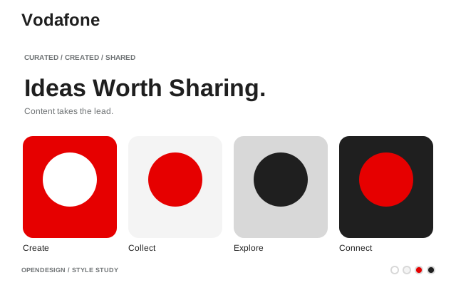
Global telecom brand. Monumental uppercase display, Vodafone Red chapter bands.
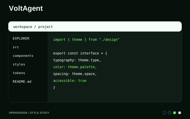
AI agent framework. Void-black canvas, emerald accent, terminal-native.
A serif-led magazine aesthetic. Terracotta accent on warm off-white paper — good for long-form, editorial, and brand-led marketing pages.
Modern terminal. Dark IDE-like interface, block-based command UI.
Collaboration platform. Momentum typography, blue action system, multi-user accent spectrum.
Visual web builder. Blue-accented, polished marketing site aesthetic.
Brand visual language for WeChat Mini Programs, official accounts, and open ecosystem extensions.
Tech magazine. Paper-white broadsheet density, custom serif display, mono kickers, ink-blue links.
Elon Musk's AI lab. Stark monochrome, futuristic minimalism.
Lifestyle UGC social platform. Singular brand red, generous radius, content-first.
Automation platform. Warm orange, friendly illustration-driven.
No matching systems. Try another name or category.
From Reference to Interface
Look beyond the accent color. Compare the type, spacing, components, and layout against the kind of interface you are building.
Give your agent the design rules and a concrete task. Keep the source and your project's existing constraints together.
Check real content, component states, keyboard use, and a narrow screen before applying the direction across your project.
Make It Your Own
Start with a website you admire or a design you have already made. Turn its visual decisions into a system you can inspect, refine, and use again.

Add a website link in Design Systems. OpenDesign reads the available page styles and assets to assemble a palette, typography, and reusable design guidance. Review the result and refine it with your Agent.
Choose Create Design System from your project’s More menu. OpenDesign creates a new design-system project from the existing files, then asks your Agent to extract its visual rules, components, and patterns.
Inspect the design rules, style tokens, and UI previews. Refine the generated package before using it as the starting point for your next design.
Connect Your Workflow
Compare OpenDesign with other design tools and choose a workflow that fits how you create and iterate.
Compare Design ToolsAgentExplore design guides for coding agents, from preparing a brief to reviewing the interface they build.
Explore Agent GuidesSkillsBrowse reusable skills for focused design tasks and give your Agent a more specific way to work.
Browse SkillsBuild With OpenDesign
Choose a guide, give your agent a clear brief, and build your next interface with OpenDesign.