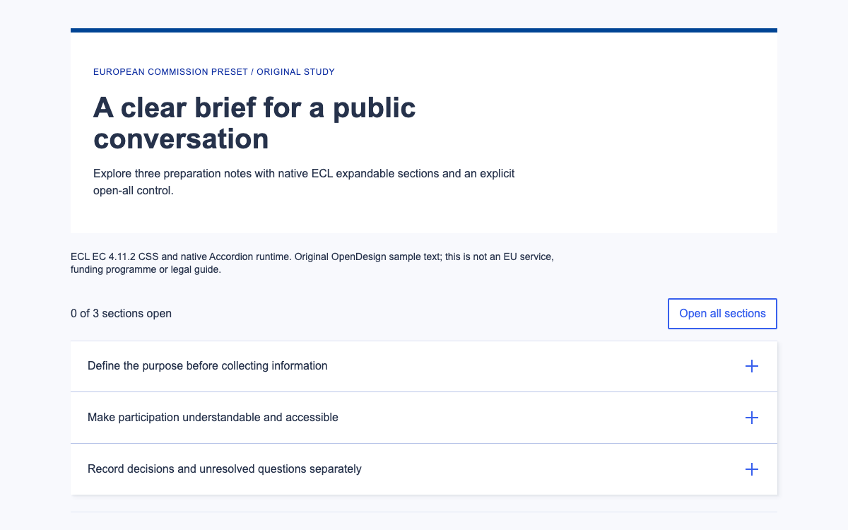
Understand the French State system’s concrete typography, grid and accordion API within its institutional scope. Compare linked and independent disclosure behaviour in a clearly neutral educational specimen.
Original neutral HTML/CSS/JavaScript interpretation of documented accordion structure. No official DSFR assets or state visual identity. · Implementation reference
02
DSFR Design System Design Reference
Official DSFR v1.15 documentation and verified @gouvfr/dsfr 1.15.3 package metadata. These are official reference values; the neutral preview demonstrates interaction structure without using the state visual identity.
DSFR is the French State design system. The current official terms describe .gouv.fr services and state mobile applications as its intended setting, and distinguish state users and operators from outside organisations. This is a substantive adoption boundary, not a footnote that can be removed by hiding a logo.
An eligible team should use the official project approval and implementation process. An unrelated product can study the documented information architecture and accessibility reasoning without presenting itself through the French State identity. The preview on this page is an original neutral accordion exercise: it does not load DSFR styles, fonts or scripts.
The typography documentation identifies Marianne and Spectral, with Arial and Georgia fallbacks respectively. Standard body text is 16px/24px; article text is 18px/28px. H1 changes from 32px/40px on mobile to 40px/48px on desktop. These values describe the official system, while the demonstration uses its own neutral type treatment.
Text-size classes do not replace semantic heading levels. Keep the page title as h1 and each accordion title at the appropriate heading depth. A larger visual style should not be used to skip the document outline.
The grid reference defines SM 576px, MD 768px, LG 992px and XL 1248px. Its largest content maximum is 1200px. Optional gutters are 16px at smaller sizes and 24px from LG. The code grid has no gutters by default, which matters when translating a Figma grid into markup.
Spacing is based on multiples of 4px with documented exceptions of −6px, −2px, 2px and 6px. A spacing class therefore represents a controlled system rather than permission to invent arbitrary offsets. The neutral preview uses an independent single reading column and does not claim to reproduce the official grid.
The documented component has a section.fr-accordion, a heading.fr-accordion__title, a button.fr-accordion__btn and a following div.fr-collapse. The button’s aria-controls must match the panel id; aria-expanded describes its open state. The heading level follows the surrounding page.
The panel contains proper text elements such as paragraphs and lists. Native DSFR JavaScript manages the expanded class; an eligible application should not add a second independent click handler that fights the component. The neutral preview implements its own similarly explicit open/closed state for educational comparison.
A fr-accordions-group is linked by default: opening one item closes the other open item. Setting data-fr-group="false" permits multiple panels to remain open. The specimen exposes both modes so the reader can compare their effect on cross-referencing information.
This distinction matters for preparation instructions. Someone checking a document list may need an address panel open at the same time. A one-open-at-a-time group conserves space but repeatedly hides context. Choose the mode from the task instead of treating the default as an editorial rule.
The accessibility page goes further than the runtime default: it recommends independent groups by default because linked groups can create usability difficulties. The specimen therefore starts in independent mode.
Independent mode supports comparing two sections at once.
Linked mode restricts the screen to one expanded section.
Changing modes should leave an internally consistent aria-expanded state.
The component guidance recommends accordions for long, optional or selectively relevant content. It advises against hiding information that every user must read, using accordions for very short content, nesting complex controls or putting them inside a modal.
Accordingly, the specimen leaves its purpose and controls visible. Only the optional room-access notes, equipment list and arrival explanation are folded. Each heading names a distinct question, and the revealed content uses short paragraphs and lists rather than a second interactive workflow.
Keep the principal instruction outside the accordion.
Split supporting material by reader question rather than arbitrary length.
Use an ordinary paragraph when a section contains only a short answer.
Each neutral preview trigger is a real button, so Enter and Space use browser button activation. The script changes both aria-expanded and the controlled panel’s hidden state. It never removes the trigger when its panel closes, and focus stays on the activated button.
The mode selector allows an immediate comparison of independent and linked behaviour. A small visible state readout lists the open panels; this is a learning aid in the specimen, not an official DSFR component. At narrow widths titles wrap and the button target keeps its full width.
The official accessibility page also documents insufficient dark-theme hover contrasts and specific screen-reader/browser announcement limitations. Do not infer complete accessibility from using the component unchanged; review those known limitations for the version and environment being deployed.
The official code page lists core and accordion CSS dependencies, plus core and accordion module scripts. Once loaded, the runtime enhances the documented markup automatically. Its public API can disclose a panel through dsfr(element).collapse.disclose() after initialisation.
The supplied installation entry is for an eligible institutional project. It is source-verified but not executed inside this neutral preview, which intentionally has no DSFR runtime dependency. Production teams should keep the official asset directory structure, component markup and current usage conditions together when upgrading.
The full document includes its layout, controls and initialization. Extract the linked example archive to obtain the exact relative vendor assets, then serve it over HTTP.
html
<!doctype html><html lang="en"><meta charset="utf-8"><meta name="viewport" content="width=device-width,initial-scale=1"><title>Accordion structure laboratory</title><style>*{box-sizing:border-box}body{margin:0;font:16px/1.6 Arial,sans-serif;color:#28251f;background:#faf9f6}main{max-width:54rem;margin:auto;padding:32px 24px}.notice{background:#eee9df;border-left:4px solid #6b573d;padding:16px}h1{font:700 32px/1.3 Georgia,serif;margin:24px 0}h2{font-size:18px;margin:0}.mode{display:flex;gap:12px;align-items:center;flex-wrap:wrap;margin:24px 0}select{font:inherit;padding:10px;background:white;border:1px solid #777}section{border-bottom:1px solid #aaa18f}.trigger{font:700 18px/1.5 Arial,sans-serif;border:0;background:transparent;color:inherit;display:flex;justify-content:space-between;gap:16px;text-align:start;padding:20px 8px;width:100%;cursor:pointer}.trigger::after{content:'+'}.trigger[aria-expanded=true]::after{content:'−'}.panel{padding:0 24px 24px}.panel p{margin-top:0}:focus-visible{outline:3px solid #6b573d;outline-offset:3px}#state{font-size:14px;background:#eee9df;padding:12px;margin-top:24px}small{display:block;margin-top:24px;color:#625a4e;font-size:14px}[hidden]{display:none!important}@media(max-width:600px){main{padding:24px 16px}h1{font-size:28px}.panel{padding-inline:8px}}</style><main><div class="notice">Neutral interaction study · No DSFR visual identity or assets</div><h1>Prepare for a community workshop</h1><p>The purpose and main instruction stay visible: arrive with your booking note. Optional supporting details can be opened below.</p><div class="mode"><label for="mode">Panel behaviour</label><select id="mode"><option value="independent">Independent: compare sections</option><option value="linked">Linked: one section at a time</option></select></div><div id="group"><section><h2><button type="button" class="trigger" aria-expanded="false" aria-controls="access">Room access</button></h2><div class="panel" id="access" hidden><p>The fictional workshop room is reached from the courtyard. The step-free entrance is on the same level as the activity room.</p><p>Ask the example welcome desk for assistance if the courtyard route is unavailable. These are demonstration instructions, not a real venue guide.</p></div></section><section><h2><button type="button" class="trigger" aria-expanded="false" aria-controls="equipment">Equipment to bring</button></h2><div class="panel" id="equipment" hidden><p>The example workshop uses simple paper materials. Bring the following if convenient:</p><ul><li>A notebook for your own observations.</li><li>A pencil or pen you can use comfortably.</li><li>Your fictional booking reference.</li></ul></div></section><section><h2><button type="button" class="trigger" aria-expanded="false" aria-controls="arrival">What happens on arrival</button></h2><div class="panel" id="arrival" hidden><p>The example facilitator explains the activity before participants choose a seat. No personal information is collected by this demonstration.</p><p>Keep this panel open with the equipment list to compare the two instructions in independent mode.</p></div></section></div><p id="state" role="status">Open sections: none</p><small>Original OpenDesign educational specimen. DSFR documentation informs the structural comparison; this is not a government service or native DSFR rendering.</small></main><script>const buttons=[...document.querySelectorAll('.trigger')],mode=document.querySelector('#mode');function set(b,open){b.setAttribute('aria-expanded',String(open));document.getElementById(b.getAttribute('aria-controls')).hidden=!open}function announce(){const names=buttons.filter(b=>b.getAttribute('aria-expanded')==='true').map(b=>b.textContent);document.querySelector('#state').textContent='Open sections: '+(names.join(', ')||'none')}buttons.forEach(b=>b.onclick=()=>{const open=b.getAttribute('aria-expanded')!=='true';if(open&&mode.value==='linked')buttons.forEach(x=>set(x,false));set(b,open);announce()});mode.onchange=()=>{if(mode.value==='linked'){let retained=false;buttons.forEach(b=>{if(b.getAttribute('aria-expanded')==='true'){if(retained)set(b,false);retained=true}})}announce()};</script></html>
Download the complete example from Sources. Its README gives the exact local launch command.
Keep vendor paths relative to this document; the archive includes the complete assets used by this preview.
04
DSFR Design System Agent Setup
Implementation Starting Point
Source-verified eligible-project installation; not executed by the neutral preview. Preserve institutional scope and current official terms. Copy the dist directory so dependent assets keep their relative paths. The complete working-example ZIP in Sources also provides the exact preview dependencies and full document. Extract it, run python3 -m http.server 8080 in that directory, then open http://localhost:8080/dsfr.html. Do not open module-based examples through file://.
bash
# For a project within the documented DSFR institutional scope:
npm install @gouvfr/[email protected]
# Copy node_modules/@gouvfr/dsfr/dist to your public asset directory.
# In <head>:
# <link rel="stylesheet" href="/dsfr/core/core.min.css">
# <link rel="stylesheet" href="/dsfr/component/accordion/accordion.min.css">
# Before </body>:
# <script type="module" src="/dsfr/core/core.module.min.js"></script>
# <script type="module" src="/dsfr/component/accordion/accordion.module.min.js"></script>
A Prompt for Your Project
Agent Prompt
Explain DSFR accordion structure and scope. For an eligible state project use fr-accordion, fr-accordion__title, fr-accordion__btn and fr-collapse with matching ids/aria-controls, core plus accordion assets, and data-fr-group=false when comparisons need multiple sections open. For an independent educational preview use neutral original styling and clearly label it as a structural interpretation; do not load state identity fonts or claim official service status.
05
DSFR Design System Sources and Scope
DSFR has a documented institutional usage scope. This page is a technical reference, and its original neutral preview is not a French government service or a DSFR-branded implementation.