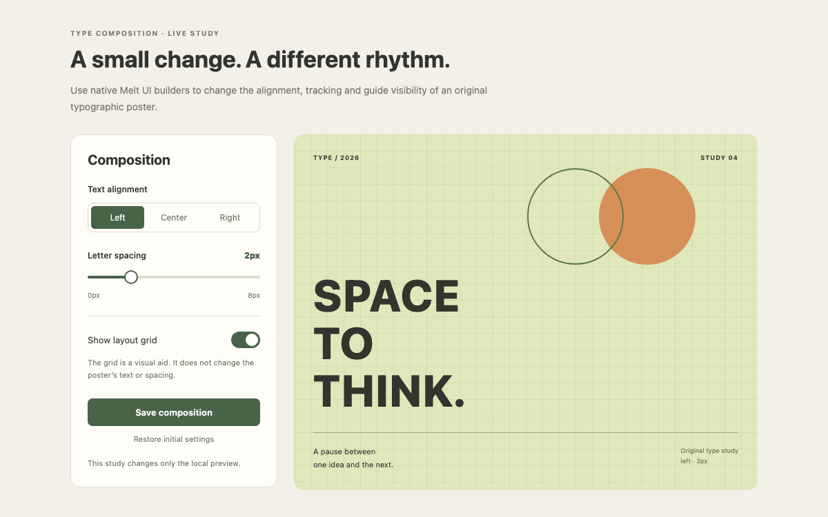
A native Ionic reading-preferences interface with verified color roles, iOS and Material range geometry, real segment and switch behavior, and an article that responds to font, size and paper choices.
Verified Ionic Vue/Core 9.0.6. Core colors are taken from the installed core.css. The demo explicitly selects iOS mode. Reading typography, paper colors and surrounding spacing are original application choices, not Ionic defaults.
Ionic Framework Design System Choose the Rendering Mode Deliberately
Choose the Rendering Mode Deliberately
Ionic exposes web components through framework integrations. This sample uses Ionic Vue 9.0.6 and sets mode to ios in IonicVue configuration. That gives the segment, toggle, range and buttons a coherent platform treatment regardless of the desktop browser used to inspect the page. Mode is a component rendering decision; it does not turn the page into a native mobile application.
The example deliberately uses an ordinary main element instead of a full-screen IonApp/IonContent shell. That makes a component specimen fit its content inside an embedded resource page. An actual routed Ionic application should follow the framework’s page and router structure, including IonPage where required for transitions.
Ionic Framework Design System An Ionic Color Is a Family of Related Variables
An Ionic Color Is a Family of Related Variables
The installed core stylesheet defines primary as #0054e9, with separate RGB channels, contrast, shade and tint values. Components can use those related values in different states. Replacing only the base hex can leave other states inconsistent; a custom brand color should define its complete family.
This specimen retains the default primary color for native controls. Warm paper is a separate application surface at #fff9eb, and the article text stays #24362e. Switching the page to white changes only the reading surface. It does not silently alter the control palette or claim to implement Ionic’s full dark palette.
Ionic Framework Design System Make the Reader’s Type Choice Observable
Make the Reader’s Type Choice Observable
The segment switches the article between Georgia and system-ui. The controls themselves remain system-ui so the preference affects the intended reading content rather than changing labels and control dimensions unexpectedly. No external font is requested; the sample relies on the corresponding local font stacks.
Text size is an integer from sixteen to twenty-six pixels. The article heading is proportional to that size, and the line-height stays 1.65. At widths below 360px the heading ratio decreases to 1.6em, so the largest size remains readable in a narrow embedded column. These are original application values, clearly separate from Ionic’s component defaults.
Ionic Framework Design System A Segment Has a Controlled Selection and Native Semantics
A Segment Has a Controlled Selection and Native Semantics
IonSegment receives the current face value and two IonSegmentButton children. Its ionChange event updates the model from event.detail.value. Each button has a distinct stable value, serif or sans, and the visible label explains the choice. A paragraph labels the complete control using aria-labelledby.
The actual accessibility tree exposes a tablist with selected tabs, not a group of ordinary buttons. The local interaction test therefore targets the native Sans tab and verifies that the reading font changes. Merely styling two buttons to look segmented would not establish the same selection behavior.
Ionic Framework Design System Use Range Events and Constraints as a Single Contract
Use Range Events and Constraints as a Single Contract
IonRange sets min, max and step explicitly; relying on its default zero-to-one-hundred range would not express a useful reading size. Snapping and ticks reveal the available increments, and the pin formatter appends px to the value shown during interaction. The persistent size label below the control remains readable after dragging stops.
The handler uses ionChange and converts its value to a number. That is appropriate for a single knob; a dual-knob range would return a different value shape and require separate handling. The compiled iOS range uses a twenty-six-pixel knob and four-pixel bar, while Material mode uses eighteen and two. Those differences are recorded rather than flattened into a made-up universal Ionic token.
Focus the Text size slider and press Right Arrow eight times to reach 26px.
Select Sans and turn Warm paper off.
Save preferences and check the exact typeface, size and paper snapshot.
Ionic Framework Design System A Boolean Paper Choice Should Update the Surface Immediately
A Boolean Paper Choice Should Update the Surface Immediately
IonToggle receives checked from the warm model. Its event supplies detail.checked, which is assigned directly to that Boolean state. The visible Warm paper label belongs to the native switch, and the nearby explanation tells the reader that it changes the article surface.
The warm class changes the article background without removing its border or changing the essay. This keeps the comparison meaningful. It also avoids conflating a paper tint preference with a platform-level light/dark setting, which would require coordinating many more Ionic surface and text variables.
Ionic Framework Design System Separate Applied Preferences from a Saved Snapshot
Separate Applied Preferences from a Saved Snapshot
Every setting applies immediately to the article. Save preferences records a readable snapshot in local reactive state and disables itself while that snapshot is current. A watcher on all three models clears the message after any change, preventing stale confirmation from describing a new combination.
Restore defaults sets serif, eighteen pixels and warm paper, then clears the saved message. The status explicitly says the preferences apply only to this preview. There is no localStorage persistence, account setting or native preferences plugin behind the action; a reload starts with the defaults.
Ionic Framework Design System Preserve Native Shadow-DOM Controls While Styling the Composition
Preserve Native Shadow-DOM Controls While Styling the Composition
The range has a visible Text size label, the toggle contains its own text label, and the segment is labelled Typeface. The original illustration is aria-hidden. Save feedback uses role=status, while the article remains ordinary semantic HTML so its heading and paragraphs follow the reader’s normal document navigation.
Ionic components encapsulate internal markup in shadow DOM. The sample uses public properties, events and documented CSS custom properties instead of querying private internal classes. The surrounding page uses content height and zero minimum widths; checking it at 280px catches embedded-width failures that a standalone phone screenshot can miss.
Keep label relationships on the native components.
Use public properties and events rather than changing shadow internals.
Verify keyboard size changes and the live article together.
Ionic Framework Design System Install the Vue Integration and Include Core CSS
Install the Vue Integration and Include Core CSS
The complete entry registers IonicVue and imports @ionic/vue/css/core.css before the original stylesheet. The installed Vue package also resolves vue-router, so the reproducible dependency command includes vue-router even though this embedded specimen does not configure navigation. Omitting that peer caused the local bundle to fail resolution.
The two complete examples supply App.vue and style.css. A standard Vite Vue project compiles the SFC and its native component imports. The standalone resource preview bundles the resulting JavaScript and CSS locally, including the component implementations, so changing the controls needs no external CDN request.
Native IonSegment, IonRange, IonToggle and IonButton control an original short essay.
vue
<script setup>
import {ref,computed,watch} from 'vue';
import {IonSegment,IonSegmentButton,IonLabel,IonRange,IonToggle,IonButton,IonChip} from '@ionic/vue';
const face=ref('serif'),size=ref(18),warm=ref(true),saved=ref('');
const family=computed(()=>face.value==='serif'?'Georgia, serif':'system-ui, sans-serif');
watch([face,size,warm],()=>saved.value='');
function save(){saved.value=`Saved locally: ${face.value}, ${size.value}px, ${warm.value?'warm':'white'} paper.`}
function reset(){face.value='serif';size.value=18;warm.value=true;saved.value=''}
</script>
<template>
<main class="reader-shell">
<header><p class="eyebrow">A QUIETER READING SPACE</p><h1>Make room for the words.</h1><p>Adjust this short essay to your reading preferences. The sample changes as you move the controls.</p></header>
<div class="reader-layout"><section class="preferences" aria-labelledby="preferences-title"><h2 id="preferences-title">Reading settings</h2><p class="label" id="face-label">Typeface</p>
<IonSegment :value="face" @ionChange="face=$event.detail.value" aria-labelledby="face-label"><IonSegmentButton value="serif"><IonLabel>Serif</IonLabel></IonSegmentButton><IonSegmentButton value="sans"><IonLabel>Sans</IonLabel></IonSegmentButton></IonSegment>
<IonRange :value="size" @ionChange="size=Number($event.detail.value)" :min="16" :max="26" :step="1" :snaps="true" :ticks="true" :pin="true" label="Text size" label-placement="stacked" :pin-formatter="v=>`${v}px`"/><p class="scale"><span>16px</span><strong>{{size}}px</strong><span>26px</span></p>
<div class="paper-toggle"><IonToggle :checked="warm" @ionChange="warm=$event.detail.checked" justify="space-between">Warm paper</IonToggle><p>Soft ivory or a white page. The controls keep their own contrast.</p></div>
<IonButton expand="block" @click="save" :disabled="!!saved">Save preferences</IonButton><IonButton expand="block" fill="clear" @click="reset">Restore defaults</IonButton><p class="save-result" role="status">{{saved||'Preferences apply to this preview only.'}}</p></section>
<article class="reading-paper" :class="{warm}" :style="{fontFamily:family,fontSize:size+'px'}"><div class="paper-art" aria-hidden="true"><span></span><i></i><b></b></div><p class="article-kicker">FIELD NOTES · 03</p><h2>The useful pause</h2><p>There is a small garden between the library and the river. Its benches face away from the busiest path, toward a row of young trees.</p><p>On an ordinary afternoon, the place asks very little. You can read a paragraph twice, let a conversation settle, or watch the shadow of a leaf move across the page.</p><p>Good reading spaces leave that choice with the reader. A comfortable line, a familiar letterform, and a little breathing room can make a page easier to return to.</p><footer><IonChip outline>Original sample essay</IonChip><span>{{size}}px · {{face==='serif'?'Georgia':'System sans'}} · 1.65 line height</span></footer></article></div>
</main>
</template>
The range uses its documented --bar-height custom property.
All prose artwork is original CSS and marked decorative.
04
Ionic Framework Design System Agent Setup
Implementation Starting Point
Verified Ionic Vue/Core 9.0.6. The complete SFC and stylesheet appear above; vue-router is installed as an integration dependency although the preview has no routed pages.
javascript
// Start with: npm create vite@latest ionic-reader -- --template vue
// cd ionic-reader && npm install
// npm install @ionic/[email protected] @ionic/[email protected] vue-router@4
// Save the complete examples as src/App.vue and src/style.css.
// src/main.js:
import {createApp} from 'vue';
import {IonicVue} from '@ionic/vue';
import '@ionic/vue/css/core.css';
import './style.css';
import App from './App.vue';
createApp(App).use(IonicVue, {mode:'ios'}).mount('#app');
// The Vite index.html must contain:
// <div id="app"></div><script type="module" src="/src/main.js"></script>
// Run: npm run dev
A Prompt for Your Project
Agent Prompt
Use Ionic Vue/Core 9.0.6 in explicit iOS mode to build the supplied reading-preferences specimen. Keep the native Segment for font choice, Range for text size, Toggle for paper appearance and Button actions connected to the actual article styles. Maintain the 16–26px range and reflect changes in the local saved preference snapshot. Include IonicVue setup, the required CSS and vue-router peer dependency; retain the content-height composition rather than adding a full-screen shell inside the embed. No inspection uploads or remote account changes are involved.
05
Ionic Framework Design System Sources and Scope
Ionic Vue/Core 9.0.6, iOS mode. Original essay, artwork, reading scale and warm-paper colors. Save is local reactive state and does not persist across reloads. This embedded component specimen is not a complete routed or native-device Ionic app.