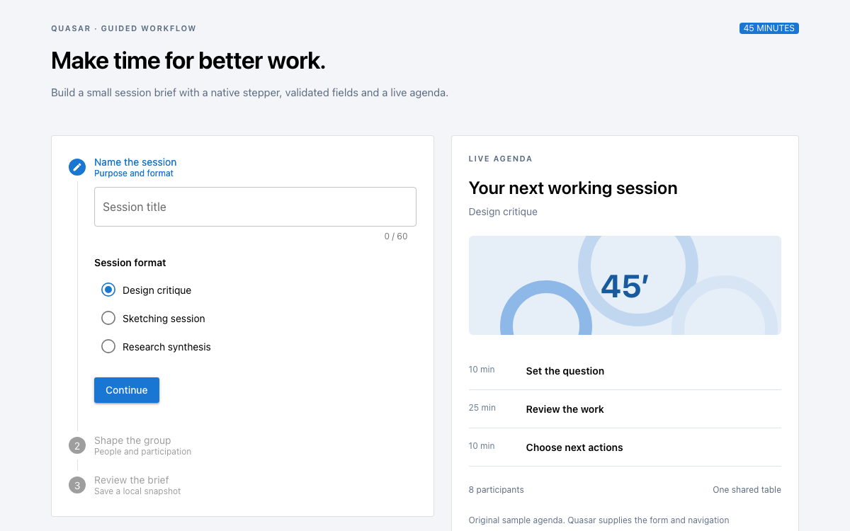
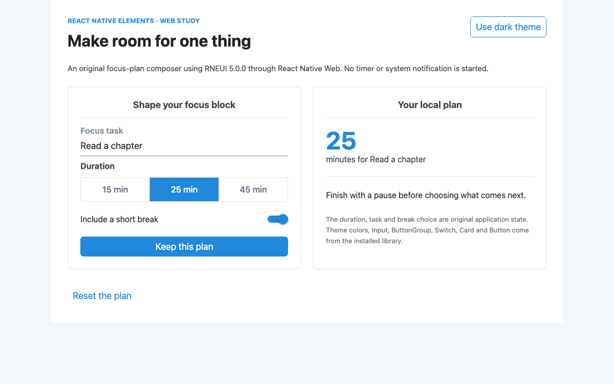
Enterprise component system · New Resource

Prime UI Design System.

A version-pinned PrimeVue implementation of the Prime UI ecosystem: an Aura-themed document tree with real preset references, controlled expansion, filtering, selection and local pinning.

OpenDesign Guide9 Chapters51 Reference EntriesOriginal Application Guide
01

Prime UI Design System Interface Preview

Filter a hierarchical issue, select a document, expand or collapse folders and pin local references.

Editorial document libraryOpen Full Example
PrimeVue 4.5.5 with Vue 3 and @primeuix/themes 1.2.5 Aura. This is a specific Vue implementation, not a cross-framework package. · Implementation reference
02

Prime UI Design System Design Reference

This Prime UI resource implements PrimeVue 4.5.5 with @primeuix/themes 1.2.5 Aura, rather than claiming one interchangeable API across PrimeVue, PrimeReact and PrimeNG. Values were inspected from that installed preset. The page fixes a 16px root; rem geometry is interpreted against that explicit choice.

Aura emerald primitives

Source
Name / RuleValue / ConfigurationUse
primitive.emerald.50#ecfdf5 Actual primitive color used by the default primary ramp.
primitive.emerald.100#d1fae5 Actual primitive color used by the default primary ramp.
primitive.emerald.200#a7f3d0 Actual primitive color used by the default primary ramp.
primitive.emerald.300#6ee7b7 Actual primitive color used by the default primary ramp.
primitive.emerald.400#34d399 Actual primitive color used by the default primary ramp.
primitive.emerald.500#10b981 Actual primitive color used by the default primary ramp.
primitive.emerald.600#059669 Actual primitive color used by the default primary ramp.
primitive.emerald.700#047857 Actual primitive color used by the default primary ramp.
primitive.emerald.800#065f46 Actual primitive color used by the default primary ramp.
primitive.emerald.900#064e3b Actual primitive color used by the default primary ramp.
primitive.emerald.950#022c22 Actual primitive color used by the default primary ramp.

Aura light semantic roles

Source
Name / RuleValue / ConfigurationUse
semantic.colorScheme.light.primary.color{primary.500}Actual Aura preset value; braces preserve a token reference.
semantic.colorScheme.light.primary.contrastColor#ffffff Actual Aura preset value; braces preserve a token reference.
semantic.colorScheme.light.primary.hoverColor{primary.600}Actual Aura preset value; braces preserve a token reference.
semantic.colorScheme.light.primary.activeColor{primary.700}Actual Aura preset value; braces preserve a token reference.
semantic.colorScheme.light.highlight.background{primary.50}Actual Aura preset value; braces preserve a token reference.
semantic.colorScheme.light.highlight.focusBackground{primary.100}Actual Aura preset value; braces preserve a token reference.
semantic.colorScheme.light.highlight.color{primary.700}Actual Aura preset value; braces preserve a token reference.
semantic.colorScheme.light.highlight.focusColor{primary.800}Actual Aura preset value; braces preserve a token reference.
semantic.colorScheme.light.text.color{surface.700}Actual Aura preset value; braces preserve a token reference.
semantic.colorScheme.light.text.hoverColor{surface.800}Actual Aura preset value; braces preserve a token reference.
semantic.colorScheme.light.text.mutedColor{surface.500}Actual Aura preset value; braces preserve a token reference.
semantic.colorScheme.light.text.hoverMutedColor{surface.600}Actual Aura preset value; braces preserve a token reference.

Aura radii and field spacing

Source
Name / RuleValue / ConfigurationUse
primitive.borderRadius.none0Actual Aura preset value; braces preserve a token reference.
primitive.borderRadius.xs2pxActual Aura preset value; braces preserve a token reference.
primitive.borderRadius.sm4pxActual Aura preset value; braces preserve a token reference.
primitive.borderRadius.md6pxActual Aura preset value; braces preserve a token reference.
primitive.borderRadius.lg8pxActual Aura preset value; braces preserve a token reference.
primitive.borderRadius.xl12pxActual Aura preset value; braces preserve a token reference.
semantic.formField.paddingX0.75remActual shared field padding or radius reference.
semantic.formField.paddingY0.5remActual shared field padding or radius reference.
semantic.formField.borderRadius{border.radius.md}Actual shared field padding or radius reference.
semantic.focusRing.width1pxActual Aura preset value; braces preserve a token reference.
semantic.focusRing.stylesolidActual Aura preset value; braces preserve a token reference.
semantic.focusRing.color{primary.color}Actual Aura preset value; braces preserve a token reference.
semantic.focusRing.offset2pxActual Aura preset value; braces preserve a token reference.
semantic.focusRing.shadownoneActual Aura preset value; braces preserve a token reference.

Native Tree geometry

Source
Name / RuleValue / ConfigurationUse
components.tree.root.padding1remActual Tree root layout value.
components.tree.root.gap2pxActual Tree root layout value.
components.tree.root.indent1remActual Tree root layout value.
components.tree.node.padding0.25rem 0.5remActual node spacing or selection role.
components.tree.node.gap0.25remActual node spacing or selection role.
components.tree.node.selectedBackground{highlight.background}Actual node spacing or selection role.
components.tree.node.selectedColor{highlight.color}Actual node spacing or selection role.
components.tree.nodeToggleButton.size1.75remNative disclosure target geometry.

Explicit application type and spacing

Source
Name / RuleValue / ConfigurationUse
Root font size16pxOriginal explicit baseline for this specimen.
Font familysystem-ui, sans-serifOriginal page font; not an Aura font download.
Page heading34px / 1.15; 29px mobileOriginal editorial hierarchy.
Detail body15px / 1.7Original document reading style.
Sidebar / gap340px / 24pxOriginal desktop layout.
Mobile breakpoint760pxOriginal stacked layout boundary.
03

Prime UI Design System Complete Guide

A practical guide to choosing, applying, and reviewing this system for a real interface.

DESIGN-prime-ui.md

Complete guidance, an implementation starting point, and source links.

Download Guide

Prime UI Design System Is an Ecosystem, Not One Import

Prime UI Is an Ecosystem, Not One Import

PrimeTek’s UI ecosystem includes implementations for different frameworks. This page chooses a concrete one: PrimeVue 4.5.5 with Vue 3 and the Aura preset from @primeuix/themes 1.2.5. The complete entry file, imports and component example belong to that Vue setup. A React or Angular project needs its corresponding package and API rather than copying these Vue tags unchanged.

From this OpenDesign guide

Version pinning is material here. The installed 4.5.5 package carries an MIT license and the verified local specimen runs without a license key. A test of the newer 5.0.2 runtime displayed a PrimeUI license error, so this example deliberately does not present an unqualified latest-version command or imply identical authorization terms across releases.

Read the supporting specification

Prime UI Design System Primitive, Semantic and Component Tokens Form a Chain

Primitive, Semantic and Component Tokens Form a Chain

Aura separates raw color primitives from semantic roles and component values. The default primary ramp references emerald primitives. In light mode, primary.color references primary.500, hoverColor references primary.600 and activeColor references primary.700. Highlight roles use lighter primary surfaces and darker foregrounds for selection.

The Tree then maps its selected background and text to highlight roles rather than hard-coding a second unrelated green. The specification keeps brace references intact, because a reference explains how a theme propagates changes. Replacing every alias with an isolated hex value would hide that useful dependency.

Read the supporting specification

Prime UI Design System Read Values from the Matched Preset

Read Values from the Matched Preset

In the pinned Aura preset the Tree root padding and indent are both one rem, node padding is 0.25rem 0.5rem, and the toggle button is 1.75rem. The specimen fixes html to sixteen pixels, making those dimensions explicit. Different preset releases or root sizes can produce different density even when the component markup looks similar.

Border-radius primitives range from zero through two, four, six, eight and twelve pixels. Shared field padding is 0.75rem horizontally and 0.5rem vertically. The page’s thirty-four-pixel heading, system font and twenty-four-pixel column gap are original layout choices outside the native component theme.

Read the supporting specification

Prime UI Design System Node Keys Make Expansion and Selection Stable

Node Keys Make Expansion and Selection Stable

The tree models one issue, three folders and six document leaves. Every node has a stable key and label. Folder nodes have selectable:false, so they organize the hierarchy without pretending to be a readable document. The expandedKeys model controls the open folders; Expand and Collapse replace that map deliberately.

Single selection uses selectionKeys and a node-select handler. Only a key found in the document record map updates the detail pane. Renaming a visible label would not require changing its identity, and collapsing a folder does not erase the currently selected document or its pinned state.

Read the supporting specification

Prime UI Design System Native Filtering Retains the Context of a Match

Native Filtering Retains the Context of a Match

The Tree enables its built-in filter with filterMode lenient and a visible Find a document placeholder. Searching for maps narrows the displayed hierarchy to the matching document and its ancestors. The reader can still understand where the result belongs instead of receiving an unrelated flat suggestion list.

Clearing the filter restores the hierarchy. Filtering does not rewrite the source nodes or remove pinned documents. The detail pane retains the last explicitly selected leaf, avoiding a surprising content change on every keystroke. A larger collection might need lazy data loading, but this complete sample uses six local records and makes no server-search claim.

  1. Search for “maps” and inspect the retained issue/folder context.
  2. Select Three regional maps to update the document panel.
  3. Clear the filter and confirm the selected document is still available in the hierarchy.

Read the supporting specification

Prime UI Design System A Selected Document Needs Distinct Useful Content

A Selected Document Needs Distinct Useful Content

Each document has a type, owner, status, introduction, inspection list and a specific note. An essay asks for sequence and caption checks; a map reference asks for consistent orientation and independent scale; a proof checklist asks about legibility and trim. The content changes with the selection rather than reusing the same paragraph under six titles.

Status tags remain descriptive sample metadata. They do not trigger an external publishing workflow. The contour graphic is original decorative geometry, marked as such where relevant; it is not a geographic map and should not be interpreted as one.

Read the supporting specification

Prime UI Design System Pinned State Is Independent of the Tree Model

Pinned State Is Independent of the Tree Model

Pin this document adds the current document key to a local array. Once present, the button changes to Pinned and becomes disabled, preventing duplicate entries. Removing a pinned row removes only that key and leaves the tree selection untouched. The pinned count is derived from the array.

This separation matters because selection, expansion and saved references solve different tasks. A user can collapse all folders while keeping a selected essay open, or filter to another part of the issue without losing a pinned reference. None of those actions implies that a remote document has been edited.

Read the supporting specification

Prime UI Design System Keep the Native Tree Keyboard Model

Keep the Native Tree Keyboard Model

The native Tree exposes hierarchy through tree and treeitem roles, selection and expansion attributes, and the relationship between nested levels. Its keyboard model uses arrows to move through visible nodes and expand or collapse branches, with Enter or Space selecting a focused node. The page supplies a clear aria-label for the collection.

The detail pane and pinned list use ordinary headings, lists and named buttons. On mobile, the navigator precedes the document in reading order. The layout stacks at the original 760px breakpoint without clipping the tree or removing document instructions, and a status line reports the current selection.

  • Use stable keys when the visible tree order changes.
  • Keep folders nonselectable when they have no associated detail content.
  • Give Remove buttons the specific document name rather than one repeated ambiguous label.

Read the supporting specification

Prime UI Design System Register the Theme Once at the Vue Root

Register the Theme Once at the Vue Root

The entry file imports PrimeVue from primevue/config, Aura from @primeuix/themes/aura and the complete App.vue. It registers the plugin with theme.preset set to Aura. darkModeSelector is false in this fixed light specimen; a production theme switch should be configured through the matching release’s supported options rather than mixing documentation from a newer major version.

PrimeVue’s styled components generate the needed component styles from the preset. The supplied style.css only defines the original page layout and illustration. No legacy primevue/resources/theme.css import is used. The verified setup selected a tree leaf, pinned it, filtered the hierarchy and rendered at 390px without an invalid-license notice.

Read the supporting specification

Prime UI Design System Component Examples

Complete native Tree and detail view

Stable node keys, controlled expanded/selection maps, filter and node-select handling.

vue
<script setup>
import {ref,computed} from 'vue';import Tree from 'primevue/tree';import Button from 'primevue/button';import Tag from 'primevue/tag';
const nodes=[{key:'issue',label:'Issue 04 · Fieldwork',selectable:false,children:[{key:'essays',label:'Essays',selectable:false,children:[{key:'ridge',label:'The ridge path'},{key:'river',label:'A river after rain'}]},{key:'visuals',label:'Visual material',selectable:false,children:[{key:'maps',label:'Three regional maps'},{key:'captions',label:'Caption reference sheet'}]},{key:'production',label:'Production',selectable:false,children:[{key:'proof',label:'Print proof checklist'},{key:'credits',label:'Credits and permissions'}]}]}];
const documents={ridge:{type:'Essay',owner:'Alex Morgan',status:'Editing',title:'The ridge path',intro:'A field essay about following the contour rather than the shortest route.',items:['Opening: the first view above the tree line','Middle: how a contour changes the pace of walking','Close: the landmarks remembered on the return'],note:'Review the transition between the weather observation and the first-person account.'},river:{type:'Essay',owner:'Jules Chen',status:'Review',title:'A river after rain',intro:'An observational essay that follows sediment, sound and changing water levels.',items:['Keep the time sequence explicit','Pair each field image with an observation','Check the final geographic names'],note:'Compare the image captions with the text before locking the layout.'},maps:{type:'Visual reference',owner:'Sam Rivera',status:'Review',title:'Three regional maps',intro:'A consistent reference treatment for ridge, river and open plain.',items:['Same north orientation','Shared legend and label size','Scale shown independently on each map'],note:'The miniature map below is original decorative geometry, not a geographic claim.'},captions:{type:'Reference',owner:'Maya Patel',status:'Editing',title:'Caption reference sheet',intro:'One place to keep subject, location, credit and contextual description.',items:['Subject and date','Location at an appropriate level of precision','Author or source credit'],note:'Do not use the visible caption as a substitute for a useful image alt description.'},proof:{type:'Checklist',owner:'Alex Morgan',status:'Ready',title:'Print proof checklist',intro:'Review the physical proof at actual scale before choosing the final stock.',items:['Body text and small labels remain legible','Images preserve the intended tonal range','Trim and page sequence match the layout'],note:'This is a sample editorial workflow, not a print vendor specification.'},credits:{type:'Reference',owner:'Maya Patel',status:'Review',title:'Credits and permissions',intro:'Keep attribution close to each asset record so it survives layout changes.',items:['Creator name and source','Allowed uses recorded separately','Credit wording copied accurately'],note:'This sample does not provide legal permission for any external image.'}};
const expanded=ref({issue:true,essays:true,visuals:true,production:true}),selection=ref({'ridge':true}),current=ref('ridge'),saved=ref([]);const doc=computed(()=>documents[current.value]);function select(node){if(documents[node.key])current.value=node.key;}function pin(){if(!saved.value.includes(current.value))saved.value.push(current.value);}function expandAll(){expanded.value={issue:true,essays:true,visuals:true,production:true};}
</script>
<template><main class="editorial-library"><header><div><p class="eyebrow">PRIME UI · PRIMEVUE IMPLEMENTATION</p><h1>Find the thread of an issue.</h1><p class="intro">A native tree navigator for an editorial collection, using the Aura theme.</p></div><Tag value="Local specimen" severity="secondary" /></header><div class="library-layout"><aside class="library-nav"><div class="nav-heading"><h2>Issue contents</h2><div><Button label="Expand" text size="small" @click="expandAll"/><Button label="Collapse" text size="small" @click="expanded={}"/></div></div><Tree :value="nodes" v-model:expandedKeys="expanded" v-model:selectionKeys="selection" selectionMode="single" :filter="true" filterMode="lenient" filterPlaceholder="Find a document" aria-label="Editorial document tree" @node-select="select" /><section class="pinned"><h2>Pinned documents <span>{{saved.length}}</span></h2><ul v-if="saved.length"><li v-for="key in saved" :key="key"><span>{{documents[key].title}}</span><Button label="Remove" text size="small" :aria-label="`Remove ${documents[key].title}`" @click="saved=saved.filter(x=>x!==key)"/></li></ul><p v-else>No documents pinned yet.</p></section></aside><article class="document"><div class="document-top"><span>{{doc.type}}</span><Tag :value="doc.status" :severity="doc.status==='Ready'?'success':doc.status==='Review'?'info':'warn'"/></div><h2>{{doc.title}}</h2><p class="owner">{{doc.owner}} · ISSUE 04</p><div class="map-art" aria-hidden="true"><i></i><i></i><i></i><span>FIELD NOTES / 04</span></div><p class="intro">{{doc.intro}}</p><h3>What to inspect</h3><ol><li v-for="item in doc.items" :key="item">{{item}}</li></ol><aside class="document-note">{{doc.note}}</aside><Button :label="saved.includes(current)?'Pinned':'Pin this document'" :disabled="saved.includes(current)" @click="pin"/><p class="local-note">Sample records only. Pinning changes this page’s local state.</p></article></div><p class="selection-status" role="status">Selected document: {{doc.title}}</p></main></template>

Code reference

  • Folder nodes use selectable:false; only document leaves change the detail view.
  • The native filter is lenient and preserves matching hierarchy.
  • Pinned documents are separate application state.
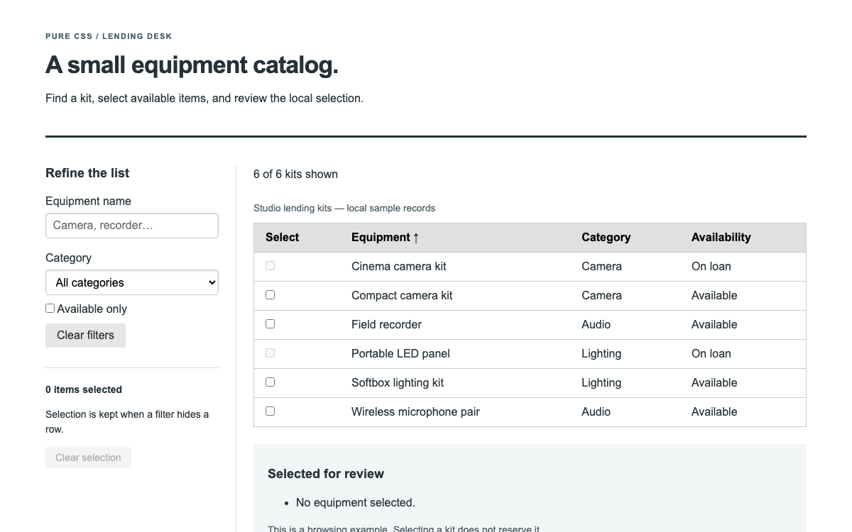
Original editorial layout

A responsive document navigator around Aura-styled native components.

css
*{box-sizing:border-box}html{font-size:16px}body{margin:0;background:#f4f6f4;color:#26342d;font-family:system-ui,sans-serif}.editorial-library{max-width:1120px;padding:32px;margin:auto}header{display:flex;align-items:flex-start;justify-content:space-between;gap:24px;margin-bottom:32px}.eyebrow{font-size:11px;letter-spacing:.12em;font-weight:700;color:#5f7566}h1{font-size:34px;line-height:1.15;margin:14px 0}.intro{font-size:15px;line-height:1.7;color:#5f6b63}.library-layout{display:grid;grid-template-columns:340px 1fr;gap:24px}.library-nav,.document{background:white;border:1px solid #dfe5df;border-radius:12px;min-width:0}.nav-heading{padding:18px 18px 0}.nav-heading h2,.pinned h2{font-size:15px;margin:0 0 8px}.nav-heading>div{display:flex;gap:4px}.pinned{border-top:1px solid #dfe5df;padding:20px}.pinned h2{display:flex;justify-content:space-between}.pinned p{font-size:13px;color:#6a766e}.pinned ul{list-style:none;padding:0;margin:0}.pinned li{display:flex;align-items:center;justify-content:space-between;gap:8px;font-size:12px;padding:8px 0}.document{padding:28px}.document-top{display:flex;justify-content:space-between;align-items:center;font-size:12px;color:#617265}.document h2{font-size:28px;line-height:1.2;margin:16px 0 8px}.owner{font-size:11px;letter-spacing:.08em;color:#6a766e}.map-art{height:130px;background:#dae4d4;border-radius:6px;position:relative;overflow:hidden;margin:24px 0}.map-art i{position:absolute;width:300px;height:130px;border:1px solid #63845a;opacity:.55;border-radius:50%;left:10%;top:30%;transform:rotate(-20deg)}.map-art i:nth-child(2){width:240px;height:100px;top:42%;left:16%}.map-art i:nth-child(3){width:180px;height:70px;top:54%;left:22%}.map-art span{position:absolute;top:16px;left:18px;font-size:9px;font-weight:700;letter-spacing:.16em;color:#496342}.document h3{font-size:15px;margin-top:24px}.document ol{padding-left:21px;font-size:14px;line-height:1.7}.document li{margin:10px 0}.document-note{border-left:3px solid #8aad88;background:#f1f5ee;padding:12px 16px;font-size:13px;line-height:1.7;margin:24px 0}.local-note,.selection-status{font-size:12px;color:#6a766e;line-height:1.6}.selection-status{margin-top:20px}@media(max-width:760px){.editorial-library{padding:24px 14px}header{flex-direction:column;gap:6px}h1{font-size:29px}.library-layout{grid-template-columns:1fr}.document{padding:22px}}

Code reference

  • The contour illustration is decorative original geometry, not a real map.
  • Root size is explicitly 16px so rem dimensions are reproducible.
04

Prime UI Design System Agent Setup

Implementation Starting Point

Verified PrimeVue 4.5.5 with @primeuix/themes 1.2.5. The installed PrimeVue 4 package is MIT-licensed. Do not assume the same setup or license requirements for a different major version.

javascript
// Create the project first:
// npm create vite@latest prime-ui-specimen -- --template vue
// cd prime-ui-specimen && npm install
// In a Vite Vue 3 project:
// npm install [email protected] @primeuix/[email protected]
// Save the complete SFC as App.vue and layout as style.css.
import {createApp} from 'vue';
import PrimeVue from 'primevue/config';
import Aura from '@primeuix/themes/aura';
import App from './App.vue';
import './style.css';
createApp(App).use(PrimeVue, {
  theme: {preset: Aura, options: {darkModeSelector: false}}
}).mount('#app');
// index.html contains <div id="app"></div>.
// This example is pinned to 4.5.5, not the newer 5.x runtime.
// Keep the template index.html and replace its entry with the code above.
// npm run dev

A Prompt for Your Project

Agent Prompt
Build from the supplied PrimeVue 4.5.5 editorial document library with the matching Aura preset from @primeuix/themes 1.2.5. Preserve native Tree expansion, filtering and selection with stable node keys, and keep the selected document detail distinct from the pinned-document list. Pin and unpin actual documents without turning category nodes into documents or duplicating pins. Retain the full provider setup and original responsive CSS. This is the verified version-four example; do not silently replace it with a newer major runtime or turn it into a procurement workflow.
05

Prime UI Design System Sources and Scope

Prime UI ecosystem, concretely implemented with PrimeVue 4.5.5 and Aura 1.2.5. This page does not claim identical APIs or license requirements across framework packages or newer major versions. All records and pinning are local.