CSS component system · New Resource

daisyUI Design System.

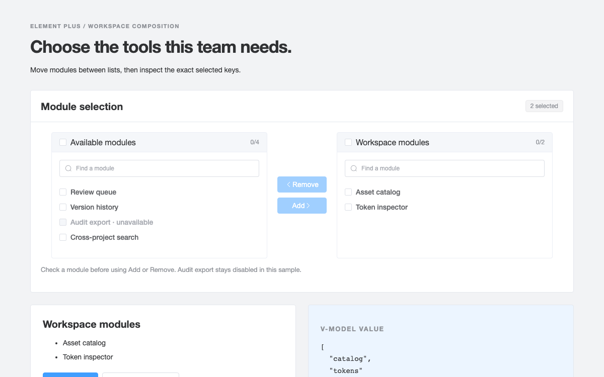
A CSS-native invitation studio that demonstrates daisyUI 5 semantic themes, paired content colors, radio-button joins, range controls, browser validation and a real dialog review step.

OpenDesign Guide9 Chapters29 Reference EntriesOriginal Application Guide
01

daisyUI Design System Interface Preview

Switch Emerald, Lo-fi and Night, change a workshop card and review a local draft.

Invitation theme studioOpen Full Example
Official daisyUI 5.7.47 classes compiled with Tailwind CSS 4.3.3; application behavior is plain JavaScript. · Implementation reference
02

daisyUI Design System Design Reference

daisyUI 5.7.47, built with Tailwind CSS 4.3.3. The listed color and geometry values belong to the bundled Emerald theme; Lo-fi and Night intentionally define different values. Page typography and spacing are original choices using Tailwind-compatible dimensions.

Emerald semantic colors

Source
Name / RuleValue / ConfigurationUse
--color-base-100oklch(100% 0 0)Main component surface.
--color-base-200oklch(93% 0 0)Page surface in this example.
--color-base-300oklch(86% 0 0)Surface boundary.
--color-base-contentoklch(35.519% 0.032 262.988)Text on base surfaces.
--color-primaryoklch(76.662% 0.135 153.45)Main action and invitation background.
--color-primary-contentoklch(33.387% 0.04 162.24)Text paired with primary.
--color-secondaryoklch(61.302% 0.202 261.294)Secondary role.
--color-secondary-contentoklch(100% 0 0)Text paired with secondary.
--color-accentoklch(72.772% 0.149 33.2)Accent role.
--color-accent-contentoklch(0% 0 0)Text paired with accent.
--color-neutraloklch(35.519% 0.032 262.988)Neutral emphasis.
--color-neutral-contentoklch(98.462% 0.001 247.838)Text paired with neutral.
--color-infooklch(72.06% 0.191 231.6)Information role.
--color-successoklch(64.8% 0.15 160)Success role.
--color-warningoklch(84.71% 0.199 83.87)Warning role.
--color-erroroklch(71.76% 0.221 22.18)Error role.

Emerald component geometry

Source
Name / RuleValue / ConfigurationUse
--radius-selector1remCheckbox, toggle and similar selector rounding.
--radius-field0.5remInput/button-type field rounding.
--radius-box1remCard/modal box rounding.
--size-selector0.25remSelector base size used by component calculations.
--size-field0.25remField base size used by component calculations.
--border1pxComponent border width.
--depth0Emerald disables depth effects.
--noise0Emerald disables noise effects.

Original invitation layout scale

Source
Name / RuleValue / ConfigurationUse
Page spacing32px desktop / 24px 16px mobileOriginal composition, not a separate daisyUI spacing-token system.
Main heading36px / 1.1; 30px below 700pxOriginal hierarchy above component defaults.
Invitation title34px / 1.15; 30px on mobileOriginal large type with long-word wrapping.
Supporting copy14px / 1.6Original readable explanatory copy.
Layout breakpoint700pxOriginal split-to-stacked breakpoint, not a daisyUI breakpoint token.
03

daisyUI Design System Complete Guide

A practical guide to choosing, applying, and reviewing this system for a real interface.

DESIGN-daisyui.md

Complete guidance, an implementation starting point, and source links.

Download Guide

daisyUI Design System Semantic Component Classes on Tailwind CSS

Semantic Component Classes on Tailwind CSS

daisyUI supplies component classes through a Tailwind plugin. In version five the setup lives in CSS: import tailwindcss, then declare the daisyui plugin and enabled themes. The specimen uses btn, card, fieldset, range, checkbox, join and modal rather than recreating those component appearances with bespoke selectors.

From this OpenDesign guide

The plugin does not supply the application’s state management. The native inputs, browser validation, dialog methods and small JavaScript module make this invitation studio interactive. The distinction matters when selecting the library: it can work with several frameworks because its component layer is CSS, but a class name alone does not implement a server operation.

Read the supporting specification

daisyUI Design System Pair Every Colored Surface with Its Content Role

Pair Every Colored Surface with Its Content Role

The invitation card uses bg-primary and text-primary-content together. The role strip repeats this pairing for secondary, accent and neutral. These are coordinated semantic roles, not a single fixed palette that must be copied into every component. Selecting another enabled theme changes the underlying variables without changing the card markup.

Emerald’s primary is a light green and its primary-content is a dark green. Using white text automatically on every primary background would ignore the theme’s intended content role. The specification table preserves the actual OKLCH values from the installed Emerald theme; it does not convert them into guessed hexadecimal brand colors.

Read the supporting specification

daisyUI Design System Compile the Themes You Intend to Offer

Compile the Themes You Intend to Offer

The CSS plugin configuration enables Emerald as the default plus Lo-fi and Night. A select control changes data-theme on the document element. Only those compiled themes are offered in the menu; selecting a name that was never built would not conjure the corresponding CSS.

Themes also carry radius, field sizing, border and effect variables. Switching from Emerald to Lo-fi therefore changes more than a color swatch. To scope a theme to an embedded region, data-theme can be placed on that region instead of html. This standalone specimen deliberately applies it to the whole document.

  1. Compile the intended themes in the daisyUI plugin block.
  2. Use semantic background and content classes in the component markup.
  3. Change data-theme and inspect controls, surfaces and text together.

Read the supporting specification

daisyUI Design System Selector, Field and Box Radii Are Separate

Selector, Field and Box Radii Are Separate

Emerald defines radius-selector as one rem, radius-field as half a rem and radius-box as one rem. Its size-selector and size-field are quarter-rem base units used by component calculations. These values are not interchangeable with the spacing between page sections. The specification separates component geometry from the original workbench layout.

The surrounding page uses a system sans stack, a large editorial heading and a two-column composition. daisyUI does not require that headline hierarchy. At the original 700px breakpoint the page stacks the editor above the invitation; it preserves every input and action rather than hiding settings to fit a screenshot.

Read the supporting specification

daisyUI Design System A Join Groups Real Radio Inputs

A Join Groups Real Radio Inputs

The format options are radio inputs with a shared name, join-item and btn classes. Selecting Studio session or Online circle changes the native checked state and the preview copy. A row of styled buttons without a persistent selection state would not represent this mutually exclusive choice as clearly.

Seats uses a native range input from four to twenty-four in steps of two. An output element mirrors its current number, while endpoint labels explain the intended gathering size. The materials control is a real checkbox. Its state changes the invitation footer rather than merely toggling the checkbox’s color.

Read the supporting specification

daisyUI Design System CSS Validation Reflects Browser Constraints

CSS Validation Reflects Browser Constraints

The title input is required and has minimum and maximum length constraints. The validator class and validator-hint present the invalid state; the browser is still responsible for enforcing the native constraint. The form does not bypass validity through a generic click handler on the review button.

After ordinary validation passes, the submit handler trims the title and checks its meaningful length. This catches a string of spaces that can satisfy an untrimmed minlength. A custom validity message is cleared on the next input event so a corrected title can be submitted. User content is rendered through textContent, never inserted as HTML.

Read the supporting specification

daisyUI Design System A Real Dialog Holds a Review Snapshot

A Real Dialog Holds a Review Snapshot

Review invitation copies the current title, format, seats and materials into a snapshot, then calls dialog.showModal. The modal class supplies daisyUI styling while the browser provides native dialog behavior. The heading labels the dialog through aria-labelledby, and Escape can close the review without saving.

Keep editing closes the dialog and leaves the form unchanged. Save local draft closes it and announces the exact snapshot in a status region. The message states that no invitations were sent. This is intentionally not a simulated email delivery success: the example has no recipient list or sending service.

Read the supporting specification

daisyUI Design System Reset and Editing Have Observable Effects

Reset and Editing Have Observable Effects

Changing a field updates the card immediately and hides a previous saved notice. That prevents a stale success statement from appearing to describe a newer unsaved invitation. Reset waits until the browser has restored form defaults, then rebuilds the preview from those actual values. It leaves the independently selected theme in place.

The decorative three-shape artwork derives its fill from primary-content, so it responds to theme changes along with the typography. It is marked aria-hidden because it adds no information about seats or format. The visible preview title and footer carry the meaningful content.

  • Invalid input prevents review and identifies the title field.
  • Escape dismisses review without generating a saved result.
  • Editing after a save clears the old result while retaining the current theme.

Read the supporting specification

daisyUI Design System A Small CSS Build with Explicit Source Discovery

A Small CSS Build with Explicit Source Discovery

The supplied setup uses Tailwind’s CLI, a local input.css and the three source files shown above. source(none) disables broad automatic scanning, and the explicit source directive points at the HTML containing the component and utility classes. This makes the example’s generated CSS depend on its actual markup.

The build output is combined with the original layout stylesheet; plain JavaScript handles the interaction. The standalone preview inlines the result and has no remote dependency. A Vite, Astro or React project can use its normal Tailwind integration instead, but should retain the enabled-theme list and ensure the class-bearing source files are included.

Read the supporting specification

daisyUI Design System Component Examples

Semantic HTML component composition

Fieldsets, radio-button join, native range, checkbox, card and dialog.

html
<main class="workshop"><header class="page-heading"><div><p class="eyebrow">DAISYUI · SEMANTIC THEMES</p><h1>A small gathering,<br>a considered invitation.</h1><p class="muted">Compose a local workshop card and watch the theme roles follow.</p></div><label class="fieldset">Theme<select id="theme" class="select"><option value="emerald">Emerald</option><option value="lofi">Lo-fi</option><option value="night">Night</option></select></label></header><div class="workbench"><form id="invitation" class="card bg-base-100 border border-base-300"><div class="card-body"><h2 class="card-title">Workshop details</h2><fieldset class="fieldset"><legend class="fieldset-legend">Workshop title</legend><input id="title" class="input validator w-full" required minlength="5" maxlength="52" value="Making room for ideas" aria-describedby="title-help"><p id="title-help" class="validator-hint">Use 5–52 characters.</p></fieldset><fieldset class="fieldset"><legend class="fieldset-legend">Format</legend><div class="join"><input class="join-item btn" type="radio" name="format" value="Studio session" aria-label="Studio session" checked><input class="join-item btn" type="radio" name="format" value="Online circle" aria-label="Online circle"></div></fieldset><fieldset class="fieldset"><legend class="fieldset-legend">Seats <output id="seat-count" for="seats">12</output></legend><input id="seats" class="range range-primary w-full" type="range" min="4" max="24" step="2" value="12" aria-label="Number of seats"><div class="range-labels"><span>4 · intimate</span><span>24 · open room</span></div></fieldset><label class="extras"><input id="materials" class="checkbox checkbox-primary" type="checkbox" checked><span>Include a materials pack<small>Paper, pencils and a small printed prompt.</small></span></label><div class="card-actions"><button class="btn btn-primary" type="submit">Review invitation</button><button class="btn btn-ghost" type="reset">Reset</button></div></div></form><section class="specimen" aria-label="Invitation preview"><div class="invitation-card card bg-primary text-primary-content"><div class="card-body"><div class="card-top"><span class="badge badge-outline">OPEN STUDIO</span><span>LOCAL DRAFT</span></div><div class="shape-art" aria-hidden="true"><i></i><i></i><i></i></div><p class="preview-kicker">A WORKSHOP FOR CURIOUS PEOPLE</p><h2 id="preview-title">Making room for ideas</h2><p id="preview-format">Studio session</p><div class="invite-footer"><strong id="preview-seats">12 seats</strong><span id="preview-materials">Materials included</span></div></div></div><div class="role-strip" aria-label="Theme color roles"><span class="bg-primary text-primary-content">Primary</span><span class="bg-secondary text-secondary-content">Secondary</span><span class="bg-accent text-accent-content">Accent</span><span class="bg-neutral text-neutral-content">Neutral</span></div><p class="muted specimen-note">The same semantic classes use each theme’s background and matching content colors.</p></section></div><div id="result" class="alert alert-success" role="status" hidden></div><dialog id="review" class="modal" aria-labelledby="review-title"><div class="modal-box"><h2 id="review-title">Review your local invitation</h2><p id="review-copy"></p><p class="muted">This prepares a local draft. No invitations are sent.</p><div class="modal-action"><button id="back" class="btn">Keep editing</button><button id="approve" class="btn btn-primary">Save local draft</button></div></div></dialog></main>

Code reference

  • Primary backgrounds always pair with primary-content text.
  • The range remains a native input with min, max and step.
  • The dialog is opened through showModal, not a visual-only open class.

Local draft behavior

Live preview, stable review snapshot, theme selection and native validation.

javascript
const q=s=>document.querySelector(s),form=q('#invitation'),dialog=q('#review');let snapshot;
function update(){const title=q('#title').value.trim(),seats=q('#seats').value,format=q('[name="format"]:checked').value,materials=q('#materials').checked;q('#preview-title').textContent=title||'Your workshop title';q('#seat-count').value=seats;q('#preview-seats').textContent=`${seats} seats`;q('#preview-format').textContent=format;q('#preview-materials').textContent=materials?'Materials included':'Bring your own materials';q('#result').hidden=true;}
q('#theme').addEventListener('change',e=>document.documentElement.dataset.theme=e.target.value);form.addEventListener('input',update);form.addEventListener('reset',()=>setTimeout(update,0));form.addEventListener('submit',e=>{e.preventDefault();snapshot={title:q('#title').value.trim(),seats:q('#seats').value,format:q('[name="format"]:checked').value,materials:q('#materials').checked};if(snapshot.title.length<5){q('#title').setCustomValidity('Enter at least five non-space characters.');q('#title').reportValidity();return;}q('#review-copy').textContent=`${snapshot.title} · ${snapshot.format} · ${snapshot.seats} seats · ${snapshot.materials?'Materials included':'Bring your own materials'}`;dialog.showModal();});q('#title').addEventListener('input',()=>q('#title').setCustomValidity(''));q('#back').onclick=()=>dialog.close();q('#approve').onclick=()=>{dialog.close();q('#result').hidden=false;q('#result').textContent=`Local draft saved: ${snapshot.title}, ${snapshot.seats} seats. No invitations were sent.`;};update();

Code reference

  • No daisyUI JavaScript runtime is imported.
  • All user strings are assigned with textContent.
  • Saving creates only an in-memory local result.

Original layout stylesheet

Responsive arrangement and decorative geometry around native CSS components.

css
body{margin:0;background:var(--color-base-200);color:var(--color-base-content);font-family:ui-sans-serif,system-ui,sans-serif}.workshop{max-width:1100px;margin:auto;padding:32px}.page-heading{display:flex;justify-content:space-between;gap:24px;align-items:flex-start;margin-bottom:32px}.eyebrow,.preview-kicker{font-size:11px;font-weight:700;letter-spacing:.12em}h1{font-size:36px;line-height:1.1;margin:14px 0}h2{font-size:20px;font-weight:650}.muted{opacity:.7;font-size:14px;line-height:1.6}.workbench{display:grid;grid-template-columns:1fr 1fr;gap:28px}.fieldset{margin:8px 0;min-width:0}.card-body{gap:12px}.fieldset-legend{gap:8px}.range-labels{display:flex;justify-content:space-between;font-size:11px;opacity:.7}.extras{display:flex;gap:12px;font-size:14px;margin:16px 0}.extras small{display:block;opacity:.65;margin-top:4px}.card-actions{margin-top:12px}.card-top{display:flex;justify-content:space-between;align-items:center;font-size:10px;letter-spacing:.1em}.shape-art{height:135px;position:relative;display:flex;justify-content:center;align-items:center;margin:16px 0}.shape-art i{width:95px;height:95px;background:var(--color-primary-content);opacity:.8;border-radius:50%;margin-right:-20px}.shape-art i:nth-child(2){border-radius:0;transform:rotate(45deg);opacity:.3}.shape-art i:nth-child(3){border-radius:50% 50% 0 0;opacity:.55}.invitation-card h2{font-size:34px;line-height:1.15;margin:4px 0;overflow-wrap:anywhere}.invite-footer{display:flex;justify-content:space-between;gap:16px;align-items:center;border-top:1px solid currentColor;padding-top:20px;margin-top:20px;font-size:12px}.role-strip{display:flex;gap:8px;margin-top:16px}.role-strip span{padding:8px;font-size:10px;border-radius:4px;flex:1;text-align:center}.specimen-note{margin-top:12px}.alert{margin-top:24px}.alert[hidden]{display:none}.modal-box p{margin:16px 0}.join{display:flex}.join .btn{flex:1;font-size:12px;padding-inline:12px}@media(max-width:700px){.workshop{padding:24px 16px}.page-heading{flex-direction:column;gap:8px}.page-heading .fieldset{width:100%}h1{font-size:30px}.workbench{grid-template-columns:1fr}.card-body{padding:20px}.invitation-card h2{font-size:30px}}

Code reference

  • The page layout and heading scale are application decisions.

Complete index.html document

Use with the stylesheet build and complete interaction source supplied above.

html
<!doctype html>
<html lang="en" data-theme="emerald"><head><meta charset="utf-8"><meta name="viewport" content="width=device-width,initial-scale=1"><title>daisyUI specimen</title><link rel="stylesheet" href="output.css"><link rel="stylesheet" href="style.css"></head><body>
<main class="workshop"><header class="page-heading"><div><p class="eyebrow">DAISYUI · SEMANTIC THEMES</p><h1>A small gathering,<br>a considered invitation.</h1><p class="muted">Compose a local workshop card and watch the theme roles follow.</p></div><label class="fieldset">Theme<select id="theme" class="select"><option value="emerald">Emerald</option><option value="lofi">Lo-fi</option><option value="night">Night</option></select></label></header><div class="workbench"><form id="invitation" class="card bg-base-100 border border-base-300"><div class="card-body"><h2 class="card-title">Workshop details</h2><fieldset class="fieldset"><legend class="fieldset-legend">Workshop title</legend><input id="title" class="input validator w-full" required minlength="5" maxlength="52" value="Making room for ideas" aria-describedby="title-help"><p id="title-help" class="validator-hint">Use 5–52 characters.</p></fieldset><fieldset class="fieldset"><legend class="fieldset-legend">Format</legend><div class="join"><input class="join-item btn" type="radio" name="format" value="Studio session" aria-label="Studio session" checked><input class="join-item btn" type="radio" name="format" value="Online circle" aria-label="Online circle"></div></fieldset><fieldset class="fieldset"><legend class="fieldset-legend">Seats <output id="seat-count" for="seats">12</output></legend><input id="seats" class="range range-primary w-full" type="range" min="4" max="24" step="2" value="12" aria-label="Number of seats"><div class="range-labels"><span>4 · intimate</span><span>24 · open room</span></div></fieldset><label class="extras"><input id="materials" class="checkbox checkbox-primary" type="checkbox" checked><span>Include a materials pack<small>Paper, pencils and a small printed prompt.</small></span></label><div class="card-actions"><button class="btn btn-primary" type="submit">Review invitation</button><button class="btn btn-ghost" type="reset">Reset</button></div></div></form><section class="specimen" aria-label="Invitation preview"><div class="invitation-card card bg-primary text-primary-content"><div class="card-body"><div class="card-top"><span class="badge badge-outline">OPEN STUDIO</span><span>LOCAL DRAFT</span></div><div class="shape-art" aria-hidden="true"><i></i><i></i><i></i></div><p class="preview-kicker">A WORKSHOP FOR CURIOUS PEOPLE</p><h2 id="preview-title">Making room for ideas</h2><p id="preview-format">Studio session</p><div class="invite-footer"><strong id="preview-seats">12 seats</strong><span id="preview-materials">Materials included</span></div></div></div><div class="role-strip" aria-label="Theme color roles"><span class="bg-primary text-primary-content">Primary</span><span class="bg-secondary text-secondary-content">Secondary</span><span class="bg-accent text-accent-content">Accent</span><span class="bg-neutral text-neutral-content">Neutral</span></div><p class="muted specimen-note">The same semantic classes use each theme’s background and matching content colors.</p></section></div><div id="result" class="alert alert-success" role="status" hidden></div><dialog id="review" class="modal" aria-labelledby="review-title"><div class="modal-box"><h2 id="review-title">Review your local invitation</h2><p id="review-copy"></p><p class="muted">This prepares a local draft. No invitations are sent.</p><div class="modal-action"><button id="back" class="btn">Keep editing</button><button id="approve" class="btn btn-primary">Save local draft</button></div></div></dialog></main>

<script src="app.js" defer></script></body></html>

Code reference

  • Save the supplied interaction as app.js.
  • The viewport and native asset loading are included.
04

daisyUI Design System Agent Setup

Implementation Starting Point

Verified with daisyUI 5.7.47 and Tailwind CSS 4.3.3. The card artwork and page layout are original; component CSS and Emerald theme values are native.

css
/* npm install -D [email protected] @tailwindcss/[email protected] [email protected] */
/* Save the HTML example as body.html in the same directory as input.css. */
/* input.css */
@import "tailwindcss" source(none);
@source "./body.html";
@plugin "daisyui" {
  themes: emerald --default, lofi, night;
}
/* Build: npx @tailwindcss/cli -i ./input.css -o ./output.css --minify */
/* In index.html, link output.css then style.css; include body.html markup. */
/* Load the supplied app.js with <script src="app.js" defer></script>. */
/* Set <html lang="en" data-theme="emerald"> and a viewport meta tag. */

A Prompt for Your Project

Agent Prompt
Use daisyUI 5.7.47 with the supplied Tailwind 4 build and the Emerald, Lo-fi and Night themes to reproduce the invitation studio. Pair semantic surface colors with their content roles. Preserve the joined native radio inputs, even-step seat range, materials checkbox and title validation. Review captures the current invitation in a native dialog; Save local draft confirms that snapshot, while later editing clears the message. Reset the form independently of the selected theme, and do not claim invitations were sent.
05

daisyUI Design System Sources and Scope

daisyUI 5.7.47 and Tailwind CSS 4.3.3. Emerald values are theme-specific. The local draft neither persists data nor sends invitations.