A native React Suite review calendar with verified v6 CSS variables, date-cell markers, a selected-day agenda, modal validation, and explicit local scheduling rules.
Native React Suite 6.2.4 Calendar, Panel, Modal, Input, Message, Button and Tag. · Implementation reference
02
React Suite Design System Design Reference
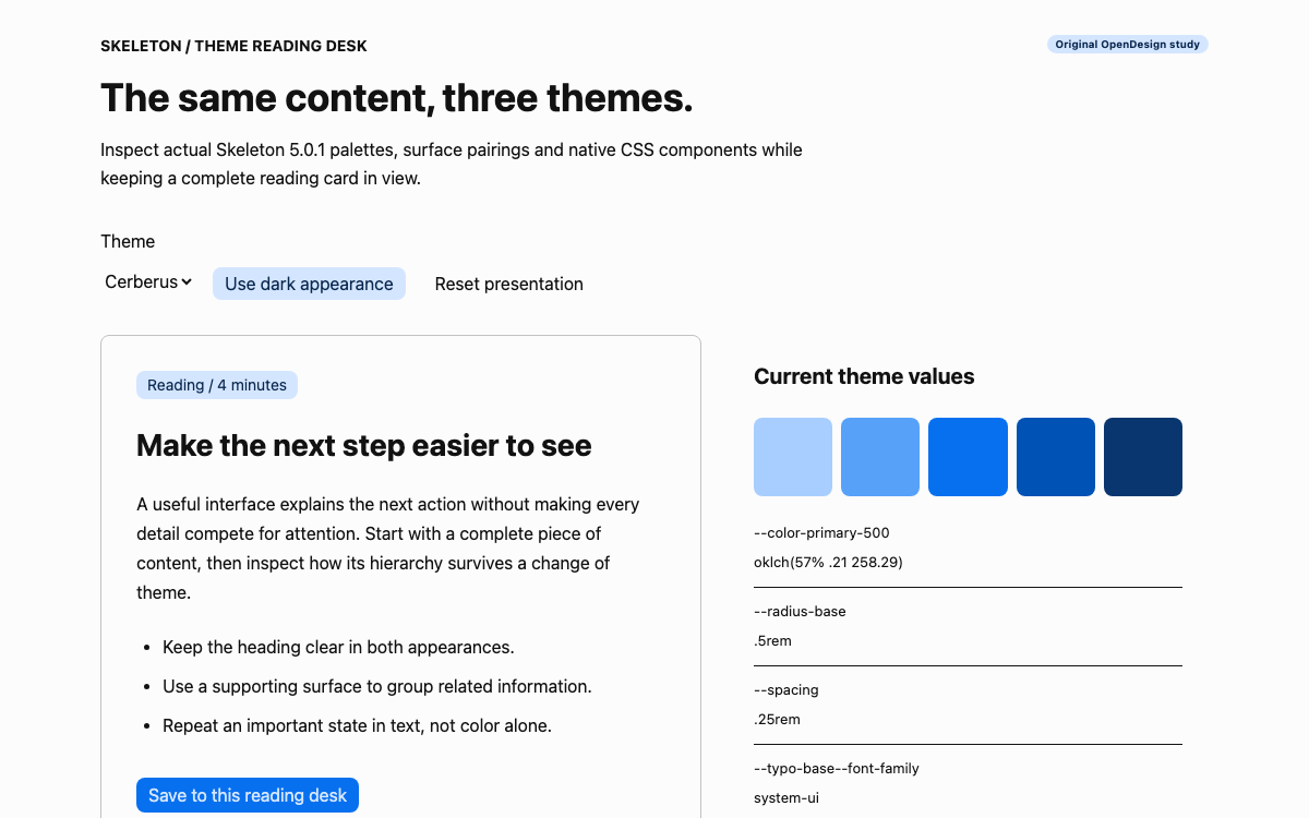
React Suite 6.2.4 compiled stylesheet, checked against current v6 CSS-variable documentation. Values below are first/default definitions; semantic aliases can resolve differently in other provider themes. Original calendar layout rules are identified separately.
React Suite Design System A Native Calendar With a Separate Agenda
A Native Calendar With a Separate Agenda
React Suite targets component-rich applications and supplies both controls and larger working surfaces such as Calendar. This example uses version 6.2.4 with its compiled stylesheet. A CustomProvider wraps the application, while Calendar, Panel, Modal and other components are imported from rsuite.
The calendar does not pretend to be a connected scheduling service. It holds two initial sample sessions and allows local additions/removals. The selected day and the list of records are separate React states, so navigating to a day does not mutate the schedule. A reader can inspect every state transition in the complete App source.
React Suite Design System A v6 CSS-Variable Reference
A v6 CSS-Variable Reference
The specification is drawn from the installed v6 CSS, not an older Less tutorial. Typography, spacing, radius, palette and semantic roles are all available as --rs variables. The default body uses the small type size, 0.875rem, while the root remains sixteen pixels. This distinction explains why a default control surface may look denser than a sixteen-pixel content article.
The page uses --rs-bg-well behind --rs-bg-card panels and --rs-border-primary for agenda separators. A marker uses primary-500; a field error uses the semantic text-error role. The reference preserves aliases for text and surfaces so the roles stay understandable when a provider theme changes their resolution.
React Suite Design System Use the Library Scale Around the Calendar
Use the Library Scale Around the Calendar
The real radius scale includes four, six, eight and twelve-pixel values for sm through xl at the default root. The base spacing increment is 0.25rem. Rather than treating these as a decorative palette, the provided CSS uses actual surface and text variables in the surrounding agenda and helper content.
The application’s heading is an explicit 32px choice with a 1.2 line height, reduced to 28px on narrow screens. Session titles use seventeen pixels to fit compact agenda rows. Those page choices do not overwrite the library’s global type variables. Calendar labels and modal controls therefore retain the native component sizing.
React Suite Design System Control the Selected Date Without UTC Drift
Control the Selected Date Without UTC Drift
Calendar receives a Date value and onSelect updates that selected value. isoWeek starts the visible week on Monday. The fixed initial value uses new Date(2026,9,14), where nine is October because JavaScript months are zero-based. The page is an intentionally fixed specimen rather than an assertion about today’s calendar.
The key function uses getFullYear, getMonth and getDate to produce a local YYYY-MM-DD key. It avoids toISOString().slice(0,10), which converts through UTC and can shift a local calendar day in some time zones. These records represent dates without a time of day, so adding an implicit UTC conversion would introduce meaning the data does not contain.
React Suite Design System Date Markers and Selected-Day Content
Date Markers and Selected-Day Content
renderCell checks whether the local records contain an entry for that date and returns a small event marker. The marker is supplementary: selecting the date shows the actual titles in the agenda. A colored dot alone would not tell the user what is scheduled or let them remove the correct item.
The compact calendar remains narrow enough for a mobile view. The agenda is a separate Panel with a date heading, session cards and a local add action. At the original 760px breakpoint it moves below the calendar. This arrangement avoids squeezing a full event title into every calendar cell or creating an unreadable horizontal calendar.
Select the sample day containing Navigation review.
Inspect the session title in the agenda rather than relying on the dot.
Remove the session and confirm its date marker disappears when no records remain.
React Suite Design System Application Scheduling Rules Are Explicit
Application Scheduling Rules Are Explicit
Weekend scheduling is disabled using getDay() values zero and six. The calendar still allows selecting those dates so the agenda can explain the rule rather than making the day seem broken. A warning message appears and the add button is disabled. This is a local team policy, not a limitation of React Suite Calendar.
A weekday with no sessions shows a specific empty state and keeps the add action available. Removing a session changes the records and posts a local notice. It does not claim an attendee was notified. The Date objects, record array and simple policy are all visible in the source so they can be replaced deliberately for a real product.
React Suite Design System A Focused Entry Dialog With Validation
A Focused Entry Dialog With Validation
Opening Add review session clears the title and any previous error. Modal uses its Header, Title, Body and Footer composition, with open and onClose controlled by React state. The input has a real associated label, an invalid state and error description. A title shorter than three trimmed characters keeps the modal open and shows an alert.
A valid submission appends one record for the selected date, closes the modal and shows an informational message. The Modal component handles its dialog behavior, including Escape and focus management. Cancel only closes the draft. The application does not close the modal before knowing whether its own title rule passed.
Cancel discards the unsaved title.
A rejected title remains available to correct.
A valid title adds one local record and updates the calendar marker.
React Suite Design System Load the v6 Styles and Complete Application
Load the v6 Styles and Complete Application
Install [email protected] in a React project and import rsuite/dist/rsuite.min.css. The App example includes that import, its original style.css and the CustomProvider wrapper. The setup entry uses React createRoot and does not depend on a remote CDN. The standalone preview bundles the same native components and CSS locally.
React Suite also provides a no-reset stylesheet distribution. This example uses the standard stylesheet deliberately; mixing both distributions would duplicate styling and obscure which reset governs the page. In an existing application, choose the distribution that fits the surrounding style architecture and verify forms and headings together.
React Suite Design System A Real Calendar Needs Additional Domain State
A Real Calendar Needs Additional Domain State
A connected scheduler would need times, time zones, participants, permissions and a persistence result. This date-only specimen does not invent those fields or pretend a successful state update sent an invitation. Its footer and notices keep the local scope visible. The local date-key function is appropriate for these records but is not a complete strategy for time-zone-aware meetings.
If adding a remote request, keep the draft modal open until a confirmed result or show a recoverable error. Prevent duplicate submissions and preserve the selected date and title after failure. The library supplies the interface primitives; application correctness depends on tying those primitives to the actual operation.
Controlled Calendar with date-cell markers, local date keys and a modal entry flow.
jsx
import React,{useState} from 'react';
import {CustomProvider,Calendar,Panel,Button,Modal,Input,Message,Tag} from 'rsuite';
import 'rsuite/dist/rsuite.min.css';
import './style.css';
const key=d=>`${d.getFullYear()}-${String(d.getMonth()+1).padStart(2,'0')}-${String(d.getDate()).padStart(2,'0')}`;
export default function App(){const[date,setDate]=useState(new Date(2026,9,14)),[open,setOpen]=useState(false),[title,setTitle]=useState(''),[error,setError]=useState(''),[notice,setNotice]=useState(''),[events,setEvents]=useState([{id:1,date:'2026-10-14',title:'Navigation review'},{id:2,date:'2026-10-16',title:'Prototype handoff'}]);const selected=events.filter(e=>e.date===key(date));const weekend=[0,6].includes(date.getDay());function save(){if(title.trim().length<3){setError('Use at least three characters for the session title.');return;}setEvents([...events,{id:Date.now(),date:key(date),title:title.trim()}]);setOpen(false);setNotice('Added to the local calendar only. No invitation was sent.');}
return <CustomProvider><main className='schedule'><header><div><p className='eyebrow'>REACT SUITE / TEAM CADENCE</p><h1>Give the work a place in the week.</h1><p>Select a day to inspect its sessions. Weekend scheduling is disabled in this example.</p></div><Tag color='blue'>Local calendar</Tag></header>{notice&&<Message type='info' closable onClose={()=>setNotice('')}>{notice}</Message>}<div className='schedule-grid'><Panel bordered className='calendar-panel'><Calendar compact bordered isoWeek value={date} onSelect={setDate} renderCell={d=>events.some(e=>e.date===key(d))?<span className='event-dot' aria-label='Has a session'/>:null}/><p className='calendar-legend'><span className='event-dot'/> A date with one or more local sessions</p></Panel><Panel bordered className='agenda-panel'><p className='eyebrow'>{date.toLocaleDateString('en',{weekday:'long'})}</p><h2>{date.toLocaleDateString('en',{month:'long',day:'numeric',year:'numeric'})}</h2>{weekend&&<Message type='warning'>The sample team does not schedule weekend reviews.</Message>}<div className='agenda'>{selected.length?selected.map(e=><article key={e.id}><div><span className='event-kind'>Review session</span><h3>{e.title}</h3></div><Button appearance='subtle' size='sm' aria-label={'Remove '+e.title} onClick={()=>{setEvents(events.filter(x=>x.id!==e.id));setNotice('Removed from the local calendar. No attendee was notified.')}}>Remove</Button></article>):<div className='empty'><h3>No sessions for this day.</h3><p>Choose another date or add a local review session.</p></div>}</div><Button appearance='primary' disabled={weekend} onClick={()=>{setTitle('');setError('');setOpen(true)}}>Add review session</Button></Panel></div><footer>Native React Suite Calendar, Panel, Modal, Input, Message and Button. All dates are local calendar dates; no remote calendar connection.</footer><Modal open={open} onClose={()=>setOpen(false)} size='sm'><Modal.Header><Modal.Title>Add review session</Modal.Title></Modal.Header><Modal.Body><p>For {key(date)}. This adds a record only in the preview.</p><label htmlFor='session-title'>Session title</label><Input id='session-title' value={title} onChange={v=>{setTitle(v);setError('')}} aria-invalid={!!error} aria-describedby='title-error' autoFocus/>{error&&<p id='title-error' role='alert' className='field-error'>{error}</p>}</Modal.Body><Modal.Footer><Button onClick={()=>setOpen(false)} appearance='subtle'>Cancel</Button><Button onClick={save} appearance='primary'>Add locally</Button></Modal.Footer></Modal></main></CustomProvider>}
The page heading and 760px breakpoint are original choices.
04
React Suite Design System Agent Setup
Implementation Starting Point
Native example built with React 19 and React Suite 6.2.4. No external calendar service is used. The complete application and styling are supplied above.
jsx
// Create the project first:
// npm create vite@latest react-suite-specimen -- --template react
// cd react-suite-specimen && npm install
// In a React project:
// npm install [email protected]
// Save the complete App example as App.jsx and the CSS example as style.css.
import React from 'react';
import {createRoot} from 'react-dom/client';
import App from './App.jsx';
createRoot(document.getElementById('root')).render(<App/>);
// index.html needs <div id="root"></div> and the Vite module entry.
// App.jsx imports rsuite/dist/rsuite.min.css and wraps CustomProvider.
// Keep the template index.html and replace its entry with the code above.
// npm run dev
A Prompt for Your Project
Agent Prompt
Use the React Suite 6.2.4 calendar and agenda composition with CustomProvider and the native stylesheet. Preserve weekday selection, disabled weekend behavior and the Modal/Input flow for a local review entry. Keep the selected date and the agenda entries in application state, validate the entered review information before adding it, and leave the agenda unchanged on cancellation. Retain the responsive calendar layout and date-specific agenda output. Do not imply a calendar invitation or external scheduling service.
05
React Suite Design System Sources and Scope
React Suite 6.2.4. Local date-only calendar with original weekend policy and sample records; no invitations or external scheduling.