Service Management · New Resource

ServiceTitan Anvil Design System.

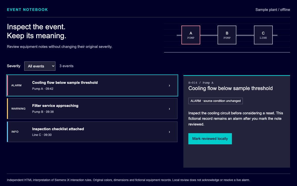
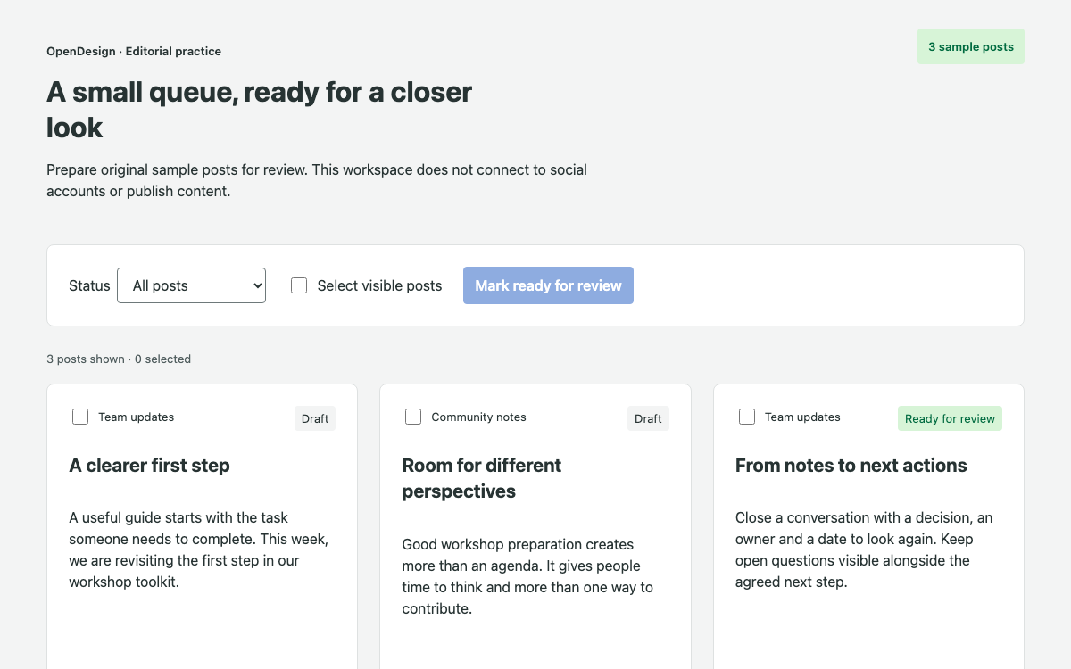
Make Anvil2 concrete with its three-tier token model, verified light/dark role values and a complete service-assignment interaction with synchronized technician, time and review states.

OpenDesign Guide7 Chapters38 Reference EntriesOriginal Application Guide
01

ServiceTitan Anvil Design System Interface Preview

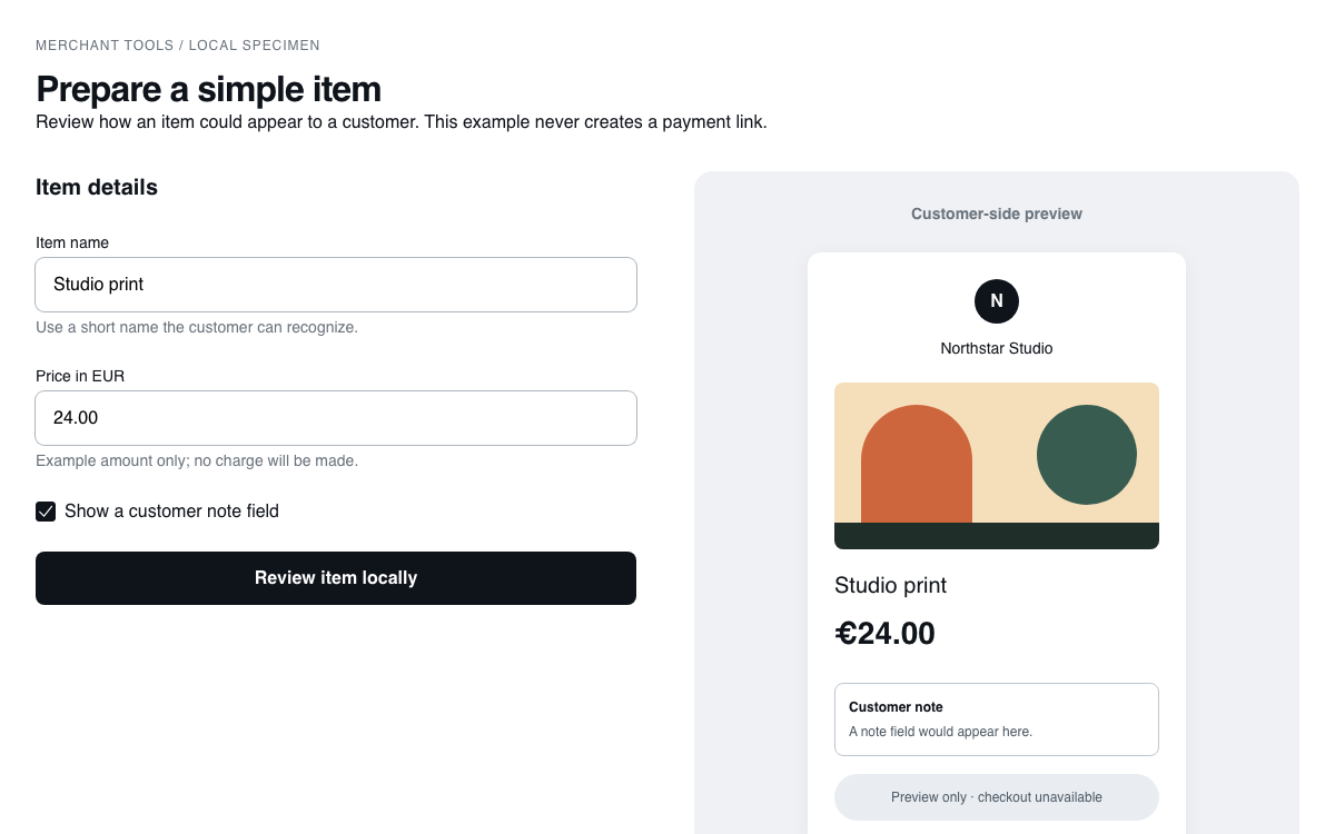
Switch light/dark appearance, select available staff and review a synchronized local plan.

Match a technician to a service visitOpen Full Example
Original HTML with Hammer token 3.5.0 role values. · Implementation reference
02

ServiceTitan Anvil Design System Design Reference

@servicetitan/hammer-token 3.5.0 core theme exports, with the Anvil2 theming documentation.

Semantic light and dark pairs

Source
Name / RuleValue / ConfigurationUse
BackgroundColorDefaultlight #ffffff / dark #1a1a1aMain application surface.
BackgroundColorDefaultHoverlight #f9f9f9 / dark #292929Hover surface.
BackgroundColorPrimarylight #0265dc / dark #70b1ffPrimary action fill.
BackgroundColorPrimaryHoverlight #1d4ca3 / dark #9ecaffNative primary hover role.
BackgroundColorPrimaryFaintlight #fafcff / dark #000b19Quiet selected surface.
ForegroundColorSubduedlight #707070 / dark #c4c4c4Supporting text.
ForegroundColorOnPrimarylight #ffffff / dark #1a1a1aText paired with primary fill.
ForegroundColorPrimarylight #0265dc / dark #70b1ffInteractive foreground.
BorderColorSubduedlight #e6e6e6 / dark #404040Low-emphasis boundaries.
BorderColorPrimarylight #0265dc / dark #9ecaffInteractive boundary.
StatusColorInfolight #0265dc / dark #70b1ffInformational state.
StatusColorDangerlight #d62100 / dark #ff5b3dImmediate attention.
StatusColorSuccesslight #077e50 / dark #0bd085Completed local review.
StatusColorWarninglight #ffbe00 / dark #ffe278Noncritical caution.

Primitive geometry and responsive values

Source
Name / RuleValue / ConfigurationUse
BreakpointSm640pxPublished primitive; semantic/component aliases determine actual application roles.
BreakpointMd768pxPublished primitive; semantic/component aliases determine actual application roles.
BreakpointLg1024pxPublished primitive; semantic/component aliases determine actual application roles.
BreakpointXl1280pxPublished primitive; semantic/component aliases determine actual application roles.
BreakpointXxl1536pxPublished primitive; semantic/component aliases determine actual application roles.
DurationDefault200msPublished primitive; semantic/component aliases determine actual application roles.
DurationInstant0msPublished primitive; semantic/component aliases determine actual application roles.
DurationFast100msPublished primitive; semantic/component aliases determine actual application roles.
DurationSlow300msPublished primitive; semantic/component aliases determine actual application roles.
Radius00remPublished primitive; semantic/component aliases determine actual application roles.
Radius10.1875remPublished primitive; semantic/component aliases determine actual application roles.
Radius20.375remPublished primitive; semantic/component aliases determine actual application roles.
Radius30.5625remPublished primitive; semantic/component aliases determine actual application roles.
Radius40.75remPublished primitive; semantic/component aliases determine actual application roles.
Radius50.9375remPublished primitive; semantic/component aliases determine actual application roles.
Radius61.125remPublished primitive; semantic/component aliases determine actual application roles.
Radius71.3125remPublished primitive; semantic/component aliases determine actual application roles.
Radius81.5remPublished primitive; semantic/component aliases determine actual application roles.

ThemeProvider override contract

Source
Name / RuleValue / ConfigurationUse
theme.semanticsemantic token overridesChange a role such as BackgroundColorPrimary.
theme.componentcomponent token overridesNarrow a change to a component role such as ButtonPrimaryBackgroundColor.
valuedefault/light token valueProvide the light appearance value.
extensions.appearance.dark.valuedark appearance valueSpecify the matching dark appearance.
CSS output--a2-<kebab-case-name>ThemeProvider serializes the token key into a CSS variable.
Primitive cascaderesolved at build timeOverriding a primitive at runtime does not recompute semantic aliases.
03

ServiceTitan Anvil Design System Complete Guide

A practical guide to choosing, applying, and reviewing this system for a real interface.

DESIGN-servicetitan-anvil.md

Complete guidance, an implementation starting point, and source links.

Download Guide

ServiceTitan Anvil Design System Three-tier Token Architecture

Keep primitives below semantic roles

Anvil2 separates raw primitives, semantic roles and component-specific aliases. A product should usually choose the role that describes the interface meaning rather than copying a primitive blue into every control. The reference table includes exact exported values and their dark equivalents, so a theme change can be reviewed as a pair.

From this OpenDesign guide

Do not expect runtime alias recomputation

The official theming guide states that primitive references are resolved during the build. Changing a primitive through a runtime provider does not automatically regenerate the semantic layer. To recolor the application, override the relevant semantic role; to change one component, use the component tier. This prevents a partially changed theme that leaves related controls inconsistent.

ServiceTitan Anvil Design System Light and Dark Appearance

Pair foreground and background changes

The primary action uses BackgroundColorPrimary with ForegroundColorOnPrimary. In light appearance this is blue with white text; in dark appearance it is a lighter blue with a dark label. Switching only the fill would produce an incoherent pair. The complete HTML study uses light-dark() with a color-scheme switch to demonstrate those values without claiming to be ThemeProvider.

Use status hues with a written meaning

Anvil2 assigns status meaning to color families. The local review uses a success role but still says exactly what happened. An unavailable technician is labeled in text and has a disabled radio. No green tint is used to imply that a service visit was dispatched; the example never connects to a dispatch backend.

ServiceTitan Anvil Design System Service Assignment and State

Make availability constrain the next choice

Selecting a technician replaces the start-time options with that person’s fictional availability. The unavailable person remains visible but cannot be selected. This is a dependency between two controls, so changing the first must reset the second to a valid value rather than keeping a time that belongs to someone else.

Separate planning from execution

Review assignment records a local plan and explicitly says that no visit has been dispatched. A production workflow would need permission checks, a fresh schedule response and conflict handling before committing. The example keeps that boundary visible while still providing a complete interaction that can be exercised and adapted.

ServiceTitan Anvil Design System Operational Density and Readability

Keep the job context close to selection

A compact job summary contains the task, duration, area and priority. Technician choices form a readable vertical list, and the proposed visit is a separate panel. The interface uses neutral boundaries and restrained accent color so the selection and main action remain easy to identify. The schedule bars are labeled illustrative; the actual time select is authoritative.

Preserve the reading order on mobile

ServiceTitan Anvil Design System Native Integration and Complete HTML Alternative

Use the documented provider shape

Anvil2’s ThemeProvider accepts semantic and component token overrides with value and dark appearance extensions. The guide includes a complete provider example below, sourced to the public documentation. It is a native integration reference, distinct from the independent HTML specimen that was executed locally.

Avoid claiming an unverified package runtime

This page provides a working HTML implementation and verified token data. The native provider example is a separate integration reference and is not the runtime shown in the preview. When adopting React components, install a mutually compatible Anvil2 release, include its required styles, and verify the component APIs before replacing the native HTML controls.

ServiceTitan Anvil Design System Accessibility and State Verification

Use native form semantics

Technicians are labeled native radios, the start time is a labeled select, and the appearance control exposes aria-pressed. The review message is a status region. The browser’s native keyboard model handles radio selection; visible focus styling remains independent of selected or hover styling.

Check changes after confirmation

Changing a technician or time clears old review feedback. Switching appearance preserves the selected technician and time because a visual theme change should not erase a plan. Tests should cover both transitions, plus disabled selection and narrow-screen overflow, rather than only checking that a button can be clicked.

ServiceTitan Anvil Design System Agent Handoff and Implementation

Start with the full state model

Save and run the complete HTML example to inspect the behavior. Its token-derived light/dark pairs are visible at the top of the CSS and its authored availability data is visible in the script. A native React implementation can keep the same state transitions while substituting verified Anvil2 controls.

  1. Run the complete HTML specimen.
  2. Select the second technician and verify the start-time options change.
  3. Review the plan, then change the time and verify feedback clears.
  4. Switch appearance and verify the current selection remains.

Specify what requires real data

Ask the agent to retain the dependent time list, disabled staff member, review invalidation and appearance behavior. Replace the fictional job and staff only when a real data contract is available. Do not turn the local review into a success claim simply by changing the button label.

  • Check availability before a real dispatch.
  • Keep semantic and component overrides separate.
  • Test both light and dark foreground/background pairs.

ServiceTitan Anvil Design System Component Examples

Complete local assignment specimen

Original HTML/CSS/JavaScript with token-derived appearances and dependent form state.

html
<!doctype html>
<html lang="en">
  <meta charset="utf-8" /><meta
    name="viewport"
    content="width=device-width,initial-scale=1"
  /><title>Dispatch assignment study</title
  ><style>
    :root {
      color-scheme: light;
      --surface: light-dark(#fff, #1a1a1a);
      --hover: light-dark(#f9f9f9, #292929);
      --text: light-dark(#040404, #fff);
      --muted: light-dark(#707070, #c4c4c4);
      --line: light-dark(#e6e6e6, #404040);
      --action: light-dark(#0265dc, #70b1ff);
      --on-action: light-dark(#fff, #1a1a1a);
      --faint: light-dark(#fafcff, #000b19);
      --success: light-dark(#077e50, #0bd085);
    }
    * {
      box-sizing: border-box;
    }
    body {
      margin: 0;
      padding: 24px;
      background: var(--surface);
      color: var(--text);
      font:
        16px/1.5 system-ui,
        sans-serif;
    }
    h1 {
      font-size: 28px;
      margin: 8px 0;
    }
    h2 {
      font-size: 20px;
      margin: 0 0 16px;
    }
    p {
      margin: 8px 0 16px;
    }
    .small {
      font-size: 13px;
      color: var(--muted);
    }
    header {
      display: flex;
      justify-content: space-between;
      gap: 24px;
      border-bottom: 1px solid var(--line);
      padding-bottom: 24px;
    }
    button,
    select {
      font: inherit;
      color: inherit;
      background: var(--surface);
      border: 1px solid var(--line);
      border-radius: 4px;
      padding: 10px 16px;
      min-height: 44px;
    }
    button {
      cursor: pointer;
    }
    button:hover {
      background: var(--hover);
    }
    button:focus-visible,
    select:focus-visible,
    input:focus-visible {
      outline: 3px solid var(--action);
      outline-offset: 3px;
    }
    main {
      display: grid;
      grid-template-columns: 1.4fr 1fr;
      gap: 24px;
      margin-top: 24px;
    }
    .board {
      border: 1px solid var(--line);
      border-radius: 8px;
      padding: 24px;
    }
    .job {
      padding: 16px;
      background: var(--faint);
      border-left: 4px solid var(--action);
      margin-bottom: 24px;
    }
    .job strong {
      display: block;
    }
    .people {
      display: grid;
      gap: 12px;
    }
    .person {
      display: grid;
      grid-template-columns: 24px 1fr auto;
      gap: 12px;
      padding: 16px;
      border: 1px solid var(--line);
      border-radius: 4px;
      align-items: center;
    }
    .person:has(:checked) {
      border-color: var(--action);
      background: var(--faint);
    }
    input {
      accent-color: var(--action);
      width: 18px;
      height: 18px;
    }
    .person small {
      display: block;
      color: var(--muted);
    }
    .person:has(:disabled) {
      background: var(--hover);
    }
    .timeline {
      display: flex;
      gap: 4px;
      margin: 20px 0;
    }
    .timeline span {
      height: 40px;
      flex: 1;
      background: var(--line);
      border-radius: 4px;
    }
    .timeline .open {
      background: var(--action);
    }
    .timeline-label {
      display: flex;
      justify-content: space-between;
      font-size: 13px;
      color: var(--muted);
    }
    label[for="time"] {
      display: block;
      margin: 16px 0 8px;
    }
    .primary {
      background: var(--action);
      color: var(--on-action);
      border-color: var(--action);
      margin-top: 24px;
    }
    .primary:hover {
      filter: brightness(0.95);
      background: var(--action);
    }
    #feedback {
      color: var(--success);
      padding-top: 16px;
    }
    footer {
      border-top: 1px solid var(--line);
      padding-top: 16px;
      margin-top: 24px;
      font-size: 13px;
      color: var(--muted);
    }
    @media (max-width: 767px) {
      body {
        padding: 16px;
      }
      main {
        grid-template-columns: 1fr;
      }
      .board {
        padding: 16px;
      }
      header {
        display: block;
      }
      header button {
        margin-top: 8px;
      }
      .person {
        grid-template-columns: 24px 1fr;
      }
      .person > span:last-child {
        grid-column: 2;
      }
    }
  </style>
  <body>
    <header>
      <div>
        <div class="small">SERVICE OPERATIONS / LOCAL PLANNING STUDY</div>
        <h1>Assign a service visit</h1>
        <p>Match a sample job with an available technician.</p>
      </div>
      <div>
        <button id="theme" aria-pressed="false">Dark appearance</button>
      </div>
    </header>
    <main>
      <section class="board">
        <h2>Job and technician</h2>
        <div class="job">
          <strong>Sample job #204 · Heating inspection</strong
          ><span>90 minutes · North district · Routine priority</span>
        </div>
        <div class="people" id="people"></div>
      </section>
      <aside class="board">
        <h2>Proposed visit</h2>
        <p id="technician"></p>
        <label for="time">Available start time</label
        ><select id="time"></select>
        <div class="timeline" aria-hidden="true">
          <span></span><span class="open"></span><span class="open"></span
          ><span></span><span></span><span></span>
        </div>
        <div class="timeline-label">
          <span>08:00</span><span>Illustrative day</span><span>17:00</span>
        </div>
        <p class="small">
          The time list is the source of available choices. The bars are a
          decorative schedule summary.
        </p>
        <button id="assign" class="primary">Review assignment</button>
        <p id="feedback" role="status"></p>
      </aside>
    </main>
    <footer>
      Original HTML using Anvil2 Hammer token 3.5.0 light/dark roles. Fictional
      technicians and schedules; no dispatch service connected.
    </footer>
    <script>
      const staff = [
        {
          id: "alex",
          name: "Alex Morgan",
          skill: "Heating specialist",
          slots: ["09:00", "11:00"],
        },
        {
          id: "sam",
          name: "Sam Rivera",
          skill: "General maintenance",
          slots: ["13:00", "15:00"],
        },
        { id: "lee", name: "Lee Chen", skill: "Unavailable today", slots: [] },
      ];
      let selected = "alex";
      const $ = (id) => document.getElementById(id);
      function update() {
        const p = staff.find((s) => s.id === selected);
        $("technician").textContent = p.name + " · " + p.skill;
        $("time").replaceChildren(...p.slots.map((t) => new Option(t, t)));
        $("feedback").textContent = "";
      }
      $("people").replaceChildren(
        ...staff.map((p) => {
          const l = document.createElement("label");
          l.className = "person";
          const input = document.createElement("input");
          input.type = "radio";
          input.name = "technician";
          input.checked = p.id === selected;
          input.disabled = p.slots.length === 0;
          input.onchange = () => {
            selected = p.id;
            update();
          };
          const text = document.createElement("span");
          text.innerHTML = `<strong>${p.name}</strong><small>${p.skill}</small>`;
          const availability = document.createElement("span");
          availability.textContent = p.slots.length
            ? p.slots.length + " start times"
            : "Unavailable";
          l.append(input, text, availability);
          return l;
        }),
      );
      $("time").onchange = () => {
        $("feedback").textContent = "";
      };
      $("assign").onclick = () => {
        $("feedback").textContent =
          "Local plan: " +
          staff.find((s) => s.id === selected).name +
          " at " +
          $("time").value +
          ". No visit has been dispatched.";
      };
      $("theme").onclick = () => {
        let dark = $("theme").getAttribute("aria-pressed") !== "true";
        $("theme").setAttribute("aria-pressed", dark);
        document.documentElement.style.colorScheme = dark ? "dark" : "light";
      };
      update();
    </script>
  </body>
</html>

Code reference

  • Save as index.html; modern browsers support light-dark(). This is not the native Anvil2 runtime.

ThemeProvider integration reference

Documented semantic override shape in a complete React entry. Validate against the installed Anvil2 release.

jsx
import React from 'react';
import { createRoot } from 'react-dom/client';
import { ThemeProvider } from '@servicetitan/anvil2';

const theme = {
  semantic: {
    BackgroundColorPrimary: {
      value: '#7c3aed',
      extensions: { appearance: { dark: { value: '#a78bfa' } } },
    },
  },
};

function App() {
  return (
    <ThemeProvider theme={theme}>
      <main>
        <h1>Theme integration check</h1>
        <div style={{ background: 'var(--a2-background-color-primary)', padding: 24 }}>
          <span style={{ color: 'var(--a2-foreground-color-on-primary)' }}>
            Primary role with the provider’s matching foreground role
          </span>
        </div>
      </main>
    </ThemeProvider>
  );
}
createRoot(document.getElementById('root')).render(<App />);

Code reference

  • This provider reference was checked against official documentation; the running specimen above is independent HTML.
04

ServiceTitan Anvil Design System Agent Setup

Implementation Starting Point

No Anvil2 package is needed for the executed specimen. The separate ThemeProvider example requires a compatible native installation.

sh
# Save the complete HTML example as index.html
python3 -m http.server 8080
# Open http://localhost:8080

A Prompt for Your Project

Agent Prompt
Build a service-assignment interface using Anvil2 semantic roles. Keep the light/dark foreground pairs, technician-dependent time choices, disabled unavailable staff and review invalidation from the complete example. Choose explicitly between original HTML and a verified Anvil2 React installation. Never claim a dispatch without a backend response.
05

ServiceTitan Anvil Design System Sources and Scope

An OpenDesign guide to ServiceTitan Anvil2. Token values are extracted from public Hammer token 3.5.0. The running example is original HTML, not an Anvil2 React runtime; all technicians and availability are fictional.