SumUp Circuit Design System Merchant Editor Composition
Separate merchant input from customer presentation
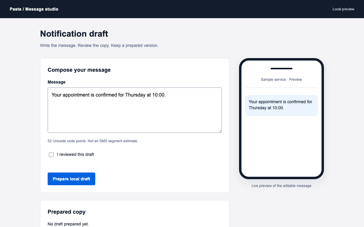
The item editor and receipt-like preview show two views of the same state. A short form names the item, sets an illustrative amount and chooses whether a customer note field is shown. The preview demonstrates the effect without creating a checkout or requesting payment information.
Use an original product illustration
The geometric print image is authored CSS artwork with an accessible description. It gives the customer preview a recognizable object instead of a blank image rectangle, while avoiding a fake merchant photograph or a copied SumUp product asset.
SumUp Circuit Design System Semantic Theme and Package Scope
Use the exact pinned theme
This example runs @sumup/circuit-ui 8.15.0 with @sumup/design-tokens 7.3.1. The reference table is read from that package’s light.css. Current upstream documentation has moved toward the @sumup-oss namespace; this is a reproducible pinned integration, not a claim that the older namespace is the newest release.
Load component styles and token styles
The React entry imports both the component stylesheet and the light token file. Component class names alone are not enough when their CSS custom properties have not been defined. A scoped dark palette would also need a complete base theme to provide shared non-color values.
SumUp Circuit Design System Neutral Surfaces and Action Contrast
Keep the item as the visual focus
The editor uses a white surface and dark foreground while the customer preview sits on a subtle neutral background. The original artwork adds controlled color inside the item image, leaving the native primary action readable and easy to find.
Keep the preview action visibly noninteractive
The customer-side footer is a text block labeled Preview only, not a disabled Pay button that suggests a nearly working checkout. The only real submit action belongs to the editor and reviews a local item. This helps users understand the specimen’s actual interaction boundary.
SumUp Circuit Design System Typography and Fallbacks
Use the theme stack honestly
The published stack begins with Aktiv Grotesk and includes Helvetica, Arial and system fallbacks. This offline specimen does not download the first font. Its native Headline and Body components still provide the intended hierarchy, while available fonts determine the final letter shapes.
Keep the amount and its currency together
SumUp Circuit Design System Spacing and Rounded Surfaces
Use the named step sequence
The token scale uses bit, byte, kilo, mega and larger names. These are design labels rather than powers-of-two arithmetic. The table preserves exact pixel values so developers do not invent a scale from the naming metaphor.
Align control edges without flattening hierarchy
The form uses a consistent vertical gap and full-width primary action. The preview uses a larger rounded outer surface and a smaller receipt interior. On a phone the preview follows the form, with padding reduced before the controls are compressed.
SumUp Circuit Design System Item Validation and Draft State
Validate the full string before formatting
The application accepts one to five integer digits and up to two decimal places, with a positive numeric value. This is an authored sample rule. It avoids parseFloat accepting a partial string such as 24abc, and it focuses the first invalid native Input after submission.
Clear stale review on any edit
Name, amount and note visibility all invalidate the previous snapshot. The successful state includes the reviewed item name and amount, so it is tied to a concrete draft. The code does not store this result in a backend or create a payment request.
SumUp Circuit Design System Input Recovery and Preview Semantics
Exercise both field errors
The item name and price use native required labels, invalid state and validationHint. The source retains input refs to return focus to the first failing field. Error recovery can be tested without entering real customer or card data.
Clear the name and submit to inspect the first field error.
Try 24abc or zero, then correct the amount to 24.50.
Review locally and edit a field to dismiss the outdated snapshot.
Label the illustration and static preview honestly
The artwork has a short image-role description. The customer note area is an explanatory placeholder within an explicitly labeled preview, not a fake editable input. The real note-setting checkbox stays in the merchant form and controls whether that preview region appears.
SumUp Circuit Design System React and CSS Integration
Include the public peers and both stylesheets
The entry uses React 18 and the pinned Circuit components, with token, icon, internationalization and Emotion peers matching the package requirements. The code imports light.css and styles.css explicitly. It does not rely on an undocumented provider or hidden project-level theme setup.
@sumup/circuit-ui 8.15.0 component styles.
@sumup/design-tokens 7.3.1 full light theme.
React 18 and the component package’s declared peers.
Add payment services only in a real application
SumUp Circuit Design System Component Examples
main.jsx — complete working specimen
Edit an item and inspect its customer-side preview. The source below is the full React entry, including all state and validation.
jsx
import React, { useState, useRef } from "react";
import { createRoot } from "react-dom/client";
import { Input, Checkbox, Button, Headline, Body } from "@sumup/circuit-ui";
import "@sumup/design-tokens/light.css";
import "@sumup/circuit-ui/styles.css";
import "./circuit.css";
function App() {
  const [name, setName] = useState("Studio print"),
    [price, setPrice] = useState("24.00"),
    [note, setNote] = useState(true),
    [errors, setErrors] = useState({}),
    [review, setReview] = useState(null);
  const nameRef = useRef(),
    priceRef = useRef();
  const valid = /^\d{1,5}(\.\d{1,2})?$/.test(price) && Number(price) > 0;
  const amount = valid
    ? new Intl.NumberFormat("en-IE", {
        style: "currency",
        currency: "EUR",
      }).format(Number(price))
    : "—";
  function change(fn) {
    fn();
    setReview(null);
    setErrors({});
  }
  function submit(e) {
    e.preventDefault();
    const next = {};
    if (!name.trim()) next.name = "Enter an item name.";
    if (!valid)
      next.price = "Use a positive amount with up to two decimal places.";
    setErrors(next);
    if (next.name) {
      nameRef.current.focus();
      return;
    }
    if (next.price) {
      priceRef.current.focus();
      return;
    }
    setReview({ name: name.trim(), amount, note });
  }
  return (
    <main className="circuit-example">
      <header>
        <p className="eyebrow">MERCHANT TOOLS / LOCAL SPECIMEN</p>
        <Headline as="h1">Prepare a simple item</Headline>
        <Body>
          Review how an item could appear to a customer. This example never
          creates a payment link.
        </Body>
      </header>
      <div className="circuit-grid">
        <form onSubmit={submit} noValidate>
          <h2>Item details</h2>
          <Input
            ref={nameRef}
            label="Item name"
            required
            value={name}
            maxLength={80}
            invalid={!!errors.name}
            validationHint={
              errors.name || "Use a short name the customer can recognize."
            }
            onChange={(e) => change(() => setName(e.target.value))}
          />
          <Input
            ref={priceRef}
            label="Price in EUR"
            required
            inputMode="decimal"
            value={price}
            invalid={!!errors.price}
            validationHint={
              errors.price || "Example amount only; no charge will be made."
            }
            onChange={(e) => change(() => setPrice(e.target.value))}
          />
          <Checkbox
            label="Show a customer note field"
            checked={note}
            onChange={(e) => change(() => setNote(e.target.checked))}
          />
          <Button variant="primary" type="submit" stretch>
            Review item locally
          </Button>
          {review && (
            <div className="review" role="status">
              <strong>Item reviewed</strong>
              <p>
                {review.name} · {review.amount}
              </p>
              <small>
                Local snapshot only. No payment link or charge created.
              </small>
            </div>
          )}
        </form>
        <section className="preview-surface" aria-labelledby="preview-heading">
          <h2 id="preview-heading">Customer-side preview</h2>
          <div className="receipt">
            <div className="shop-mark" aria-hidden="true">
              N
            </div>
            <p className="shop-name">Northstar Studio</p>
            <div
              className="print-art"
              role="img"
              aria-label="Original geometric print illustration"
            >
              <i></i>
              <b></b>
              <span></span>
            </div>
            <h3>{name.trim() || "Your item name"}</h3>
            <p className="receipt-price">{amount}</p>
            {note && (
              <div className="note-placeholder">
                <span>Customer note</span>
                <p>A note field would appear here.</p>
              </div>
            )}
            <div className="preview-action">
              Preview only · checkout unavailable
            </div>
          </div>
        </section>
      </div>
      <footer>
        Native Circuit UI 8.15.0 components and design tokens 7.3.1. Original
        item editor and illustration by OpenDesign.
      </footer>
    </main>
  );
}
createRoot(document.getElementById("root")).render(<App />);
Save beside main.jsx. These custom composition rules are distinguished from the library token reference.
04
SumUp Circuit Design System Agent Setup
Implementation Starting Point
The pinned native example was bundled and browser-checked locally. The specimen uses only local application state.
sh
npm create vite@latest circuit-item -- --template react
cd circuit-item
npm install
npm install [email protected][email protected] @sumup/[email protected] @sumup/[email protected] @sumup/icons @sumup/intl@1 @emotion/react @emotion/styled @emotion/is-prop-valid
# Replace src/main.jsx and add src/circuit.css.
npm run dev
A Prompt for Your Project
Agent Prompt
Build a Circuit item editor using the pinned native controls and both required stylesheets. Validate complete amount strings, preserve currency formatting, clear stale local review after edits, and keep the customer-side preview distinct from a real checkout. Use the original illustration and exact semantic token roles.
05
SumUp Circuit Design System Sources and Scope
OpenDesign application guide to a pinned Circuit package generation. The illustration, amount and item are examples. This local editor creates no payment link, charge or SumUp account action; current upstream packages use the newer @sumup-oss namespace.