UNDP 2.0.2 native tab CSS and script, original OpenDesign content and progress logic; Arial fallback. · Implementation reference
02
UNDP Design System Design Reference
Concrete values and behavior from the public @undp/design-system-assets 2.0.2 distribution. Original page composition and progress behavior are identified separately.
Actual public package values. The sample uses blue for its editorial lead and yellow for a supporting reading card; those content mappings are original.
--undpds-color-blue-700
#1f5a95
Actual public package values. The sample uses blue for its editorial lead and yellow for a supporting reading card; those content mappings are original.
--undpds-color-gray-200
#f7f7f7
Actual public package values. The sample uses blue for its editorial lead and yellow for a supporting reading card; those content mappings are original.
--undpds-color-gray-300
#edeff0
Actual public package values. The sample uses blue for its editorial lead and yellow for a supporting reading card; those content mappings are original.
--undpds-color-gray-700
#232e3d
Actual public package values. The sample uses blue for its editorial lead and yellow for a supporting reading card; those content mappings are original.
--undpds-color-yellow-600
#fbc412
Actual public package values. The sample uses blue for its editorial lead and yellow for a supporting reading card; those content mappings are original.
--undpds-color-dark-red
#d12800
Actual public package values. The sample uses blue for its editorial lead and yellow for a supporting reading card; those content mappings are original.
--undpds-color-background-default
#fff
Actual public package values. The sample uses blue for its editorial lead and yellow for a supporting reading card; those content mappings are original.
--undpds-color-border-default
#000
Actual public package values. The sample uses blue for its editorial lead and yellow for a supporting reading card; those content mappings are original.
UNDP Design System UNDP Runtime and Asset Boundaries
Choose the assets package for a static page
The supplied example installs @undp/design-system-assets at 2.0.2. This is the distribution containing base CSS, component CSS and browser scripts; it is different from starting the full Storybook development repository. Only the base stylesheet, tab stylesheet and tab script are needed for this composition. Loading all.min.js or every component stylesheet would add unrelated behavior without improving the reading workspace.
base-minimal.min.css supplies foundations and typography declarations.
components/tab.min.css supplies the native tab presentation.
js/tabs.min.js exports the tabs() initializer.
Keep institutional identity and sample content distinct
The brief is original OpenDesign practice content about planning a local workshop. It is not a UNDP programme, policy statement or reporting portal. The preview contains no emblem or institutional navigation. Native styling and behavior are identified precisely, while the brief, checkbox progress and reset action remain clearly described as original application code.
UNDP Design System UNDP Color Roles and Editorial Hierarchy
Build around the actual blue scale
The shipped --undpds-color-blue-600 is #006eb5 and blue-700 is #1f5a95. The example uses the former as a lead-block background and the latter for the reset action. Gray-200 supplies the quiet supporting card, gray-300 divides the tabs and yellow-600 adds its border accent. The current tab receives the library’s dark-red underline. These roles are inspectable in the supplied CSS rather than inferred from a screenshot.
Do not turn SDG colors into invented status meanings
The base package includes a separate SDG palette as well as general color tokens. A development-themed page should not assign those entries to arbitrary success or error states just because they are available. In this composition, completion is expressed through a checked control and a readable count; no color alone carries the review state.
UNDP Design System UNDP Typography, Spacing and Font Scope
Distinguish declarations from loaded fonts
The package declares ProximaNova and SohneBreit families and contains font files, but this preview deliberately uses Arial fallback. That substitution is visible in the example note and CSS. The reference table still records the real family declarations so a reader can understand the original system. A project adopting the branded faces must handle the appropriate assets and usage rights rather than assuming a font-family name makes the fonts available.
Use the actual spacing names
The current pixel scale runs from spacing-002 through spacing-160, including 12, 24 and 48 pixels. The tab stylesheet also consumes older aliases such as spacing-03 for 8px and spacing-09 for 48px; both are present in this version. The demo keeps these library rules and adds a two-column editorial layout that becomes one column below 720px. That layout breakpoint is an original composition decision, distinct from the component stylesheet’s 48em breakpoint.
UNDP Design System UNDP Native Tab Structure and Initialization
Keep the tab and panel collections aligned
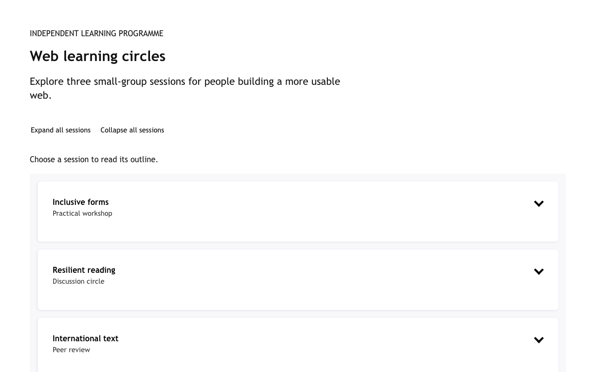
The root has data-undpds-component="tabs", a role="tablist" list, three .tabs-title elements with role="tab", and three .tabs-panel sections inside .tabs-content. The script pairs these collections by order. Missing a panel or giving a different count prevents useful initialization. Each panel therefore has a stable ID and complete content before tabs() runs. Native initialization creates aria-controls and aria-labelledby relationships and marks the selected item with is-active.
Choose hash behavior deliberately
UNDP Design System UNDP Keyboard Navigation and Visible State
Verify real panel visibility
Arrow keys and Home or End change the active tab and focus through the native implementation. Enter and Space also activate it. The script updates tabindex, aria-selected, hidden and aria-hidden together. Testing only an active CSS class would miss a failure where several panels remained visible or a hidden panel still received focus. The browser checks exercise both the selected item and the actual content shown.
Keep review controls attached to their section
Each panel includes a native checkbox labeled Mark this section as reviewed. The state persists when its panel is hidden because the node is not recreated. The progress count is a polite status message and describes only this local preview. It is neither a learning credential nor a server-side completion record. A user can return to a section and reverse the selection directly.
UNDP Design System UNDP Local Progress and Recovery
Make the reset scope explicit
Reset reading progress clears the three checkboxes and recalculates the count. It does not change the active tab or erase content. The handler uses the same progress function as a checkbox change, avoiding two separate descriptions of completion. The sample stores nothing outside the current document, so a full reload starts a new reading session.
Avoid making optional reading feel mandatory
The count supports orientation; it is not a gate that blocks access to later sections. All three tabs remain available at zero reviewed sections, and readers can visit them in any order. A production workflow that required acknowledgement would need its own requirement, error handling and persistence rather than borrowing this local progress model.
UNDP Design System UNDP Responsive Reading Composition
Reflow the content instead of shrinking it
The blue introduction and each panel use two columns at wider sizes. At 720px they stack, the outside padding reduces to 16px and the large title steps down. The tab list wraps when needed while retaining every label. No fixed-height panel clips a longer translation or paragraph, and the supporting note remains real text instead of a decorative image.
Test the embedded width
A detail page’s content column is narrower than the browser viewport. This example was tested down to 280px as a standalone document as well as at desktop, tablet and phone widths. A component that fits the full phone screen can still overflow inside the detail page’s inset frame; the shared page check measures both.
UNDP Design System UNDP Complete Static Integration
Keep the supplied files together
Save the supplied index.html, undp.css and undp-app.js in one directory, install the pinned assets package, and serve that directory. The HTML points to the package’s base CSS, tab CSS and tab browser script before loading the small application script. No bundler, jQuery or GSAP is needed for this example. The locally embedded preview inlines those same component assets while removing unused font-face declarations.
Save all three supplied files in the same directory.
Serve the folder and test tab selection using pointer and keyboard.
Review all sections, switch back, then reset the local count.
Separate component behavior from application behavior
UNDP Design System Design System Component Examples
undp-index.html — complete source
Save this as index.html; all three content panels and asset imports are included.
html
<!doctype html><html lang="en"><head><meta charset="utf-8"><meta name="viewport" content="width=device-width,initial-scale=1"><title>Workshop reading brief</title><link rel="stylesheet" href="./node_modules/@undp/design-system-assets/css/base-minimal.min.css"><link rel="stylesheet" href="./node_modules/@undp/design-system-assets/css/components/tab.min.css"><link rel="stylesheet" href="./undp.css"></head><body><main><header class="intro"><div><p class="eyebrow">Learning brief / original sample</p><h1>Plan a local resilience workshop</h1></div><p>A small reading workspace for exploring how a development brief can separate context, participation and follow-through.</p></header><p class="study-note">Native UNDP 2.0.2 tab styles and keyboard behavior. Original OpenDesign sample content, not a UNDP programme or official policy. This preview uses Arial fallback rather than the distributed brand fonts.</p><div class="tabs" data-undpds-component="tabs"><ul role="tablist" aria-label="Workshop reading sections" data-deep-link="false"><li role="tab" class="tabs-title is-active" tabindex="0">Understand</li><li role="tab" class="tabs-title" tabindex="-1">Include</li><li role="tab" class="tabs-title" tabindex="-1">Follow through</li></ul><div class="tabs-content"><section id="understand" class="tabs-panel is-active"><div class="panel-grid"><div><h2>Start with the local context</h2><p>A useful workshop begins with a question people can answer from experience. Ask which everyday service is hardest to rely on during a disruption. Avoid assuming that a technical solution is already agreed.</p><h3>Prepare the conversation</h3><ol><li>Write one plain-language question.</li><li>Invite examples of what already works.</li><li>Record uncertainty separately from an agreed need.</li></ol></div><aside class="reading-card"><h3>What would change the decision?</h3><p>Collect contrasting experiences, not just the first answer. A disagreement can reveal who is missing from the conversation.</p><label><input type="checkbox" data-read="understand">Mark this section as reviewed</label></aside></div></section><section id="include" class="tabs-panel"><div class="panel-grid"><div><h2>Make participation practical</h2><p>Participation depends on when, where and how a session takes place. Offer more than one way to contribute and explain how notes will be used before the discussion begins.</p><h3>Remove avoidable barriers</h3><ol><li>Offer spoken and written contributions.</li><li>Ask participants about access needs privately.</li><li>Explain how to decline recording or attribution.</li></ol></div><aside class="reading-card"><h3>Who has not been heard?</h3><p>A count of attendees does not prove representative participation. Check whether the invitation, language or format prevented people from joining.</p><label><input type="checkbox" data-read="include">Mark this section as reviewed</label></aside></div></section><section id="follow" class="tabs-panel"><div class="panel-grid"><div><h2>Close the loop with participants</h2><p>End with a short record of decisions, open questions and named next steps. Send a readable summary back through a channel that participants can actually access.</p><h3>Turn discussion into a next step</h3><ol><li>Separate decisions from suggestions.</li><li>Attach an owner and review point to the next action.</li><li>Invite corrections before treating the notes as agreed.</li></ol></div><aside class="reading-card"><h3>What happens after the session?</h3><p>A clear follow-up commitment is more useful than a polished report with no owner. Keep unresolved issues visible in the next conversation.</p><label><input type="checkbox" data-read="follow">Mark this section as reviewed</label></aside></div></section></div></div><div class="bottom"><p id="progress" role="status">0 of 3 sections reviewed in this preview</p><button id="reset" type="button">Reset reading progress</button></div></main><script src="./node_modules/@undp/design-system-assets/js/tabs.min.js"></script><script src="./undp-app.js"></script></body></html>
Keep the file names and relative package paths together.
undp-app.js — complete source
Native tab initialization and original local progress/reset behavior.
javascript
tabs();const boxes=[...document.querySelectorAll('[data-read]')];function progress(){document.querySelector('#progress').textContent=boxes.filter(x=>x.checked).length+' of 3 sections reviewed in this preview';}boxes.forEach(x=>x.addEventListener('change',progress));document.querySelector('#reset').addEventListener('click',()=>{boxes.forEach(x=>x.checked=false);progress();});
Keep the file names and relative package paths together.
04
UNDP Design System Agent Setup
Implementation Starting Point
Open http://localhost:8000/. The HTML imports the actual package assets; no full Storybook project is required.
sh
npm init -y
npm install @undp/[email protected]
# Save the supplied HTML as index.html alongside undp.css and undp-app.js.
python3 -m http.server 8000
A Prompt for Your Project
Agent Prompt
Implement the supplied UNDP 2.0.2 native-tab reading workspace using all provided HTML, CSS and JavaScript. Preserve real token names, matching tab/panel counts, arrow/Home/End behavior, explicit Arial fallback, local-only review progress and non-gating navigation. Keep original workshop text distinct from institutional policy.
05
UNDP Design System Sources and Scope
An OpenDesign application guide using UNDP 2.0.2 native tab assets and original content. Arial fallback is explicit; no UNDP programme or official policy is represented.