Enterprise Product Design · New Resource

REI Cedar Design System.

Build a concrete Cedar fulfillment selector with native Vue tiles, real token values, complete keyboard navigation and a responsive product composition.

OpenDesign Guide7 Chapters37 Reference EntriesOriginal Application Guide
01

REI Cedar Design System Interface Preview

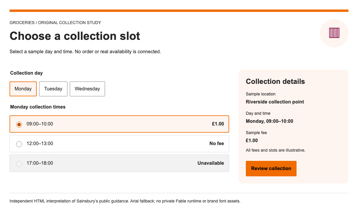
Use native Cedar tiles to select shipping or pickup, including keyboard navigation and an unavailable option.

Choose a fulfillment methodOpen Full Example
Native Cedar 17.1.0 / Vue 3 with original composition. · Implementation reference
02

REI Cedar Design System Design Reference

Values extracted from @rei/cdr-tokens 14.0.1 REI theme; native component behavior checked with @rei/cedar 17.1.0.

REI theme color roles

Source
Name / RuleValue / ConfigurationUse
cdr-color-background-button-primary-rest#1f513f Primary button fill.
cdr-color-background-button-primary-hover#c7dfd1 Primary hover fill.
cdr-color-background-primary#ffffff Default content surface.
cdr-color-background-secondary#F4F2ED Secondary surface.
cdr-color-text-button-primary#fafbf9 Primary button label.
cdr-color-text-primary#4b4a48 Main text role.
cdr-color-text-secondary#736e65 Supporting text.
cdr-color-text-error#811823 Error message text.
cdr-color-border-primary#d5cfc3 Primary surface boundary.
cdr-color-border-secondary#958e83 Secondary border role.

Space and radius at the 10px root

Source
Name / RuleValue / ConfigurationUse
cdr-space-zero0At the Cedar root, 1rem is 10px; do not apply these unchanged to a 16px root.
cdr-space-sixteenth-x0.1remAt the Cedar root, 1rem is 10px; do not apply these unchanged to a 16px root.
cdr-space-eighth-x0.2remAt the Cedar root, 1rem is 10px; do not apply these unchanged to a 16px root.
cdr-space-three-sixteenth-x0.3remAt the Cedar root, 1rem is 10px; do not apply these unchanged to a 16px root.
cdr-space-quarter-x0.4remAt the Cedar root, 1rem is 10px; do not apply these unchanged to a 16px root.
cdr-space-three-eighth-x0.6remAt the Cedar root, 1rem is 10px; do not apply these unchanged to a 16px root.
cdr-space-half-x0.8remAt the Cedar root, 1rem is 10px; do not apply these unchanged to a 16px root.
cdr-space-three-quarter-x1.2remAt the Cedar root, 1rem is 10px; do not apply these unchanged to a 16px root.
cdr-space-one-x1.6remAt the Cedar root, 1rem is 10px; do not apply these unchanged to a 16px root.
cdr-space-one-and-a-half-x2.4remAt the Cedar root, 1rem is 10px; do not apply these unchanged to a 16px root.
cdr-space-two-x3.2remAt the Cedar root, 1rem is 10px; do not apply these unchanged to a 16px root.
cdr-space-three-x4.8remAt the Cedar root, 1rem is 10px; do not apply these unchanged to a 16px root.
cdr-space-four-x6.4remAt the Cedar root, 1rem is 10px; do not apply these unchanged to a 16px root.
cdr-radius-sharp0Corner shape from the pinned token package.
cdr-radius-soft0.2remCorner shape from the pinned token package.
cdr-radius-softer0.4remCorner shape from the pinned token package.
cdr-radius-softest0.6remCorner shape from the pinned token package.
cdr-radius-round999.9remCorner shape from the pinned token package.

Fulfillment tile API

Source
Name / RuleValue / ConfigurationUse
checkedbooleanReflect the selected method.
disabledbooleanUnavailable option; do not allow state changes.
roleradio | checkboxUse radio for one fulfillment method.
tabindex0 / -1The application manages one tab stop and arrow-key navigation.
header slotmethod labelReadable choice name.
body slotsupporting detailsDelivery timing or pickup location.
footer slotprominent detailCost or availability.
icon-right slotselection indicatorThe specimen adds a check mark to the selected method.
loadingbooleanMasks body/footer while retaining header and dimensions.
03

REI Cedar Design System Complete Guide

A practical guide to choosing, applying, and reviewing this system for a real interface.

DESIGN-rei-cedar.md

Complete guidance, an implementation starting point, and source links.

Download Guide

REI Cedar Design System Vue Runtime and Style Dependencies

Pin components and tokens together

The working specimen uses @rei/cedar 17.1.0 with @rei/cdr-tokens 14.0.1 and Vue 3. The component package offers modular entrypoints. This example imports only CdrButton and CdrFulfillmentTile plus the CSS needed by their nested surface, layout and text components. The source lists every import, because JavaScript behavior alone does not guarantee styled output.

From this OpenDesign guide

Keep proprietary fonts out of the example

Cedar’s installation guidance distinguishes component use from REI font rights. The specimen does not import cdr-fonts.css or the aggregate stylesheet containing font faces. It uses system sans-serif for interface text and Georgia for the original editorial heading. Those fallbacks are application decisions, not the REI brand typeface.

REI Cedar Design System Token Units and Surface Colors

Use the Cedar root scale

Cedar tokens express 16px spacing as 1.6rem because the expected root size is 10px. Setting a 16px root would inflate the same value to 25.6px. The isolated specimen sets html to 62.5% and uses a 1.6rem body size. A host product with a different root needs a deliberate integration boundary rather than a global reset pasted into an existing site.

Map tokens to component roles

The primary button uses a deep green rest fill and a pale green hover fill. Content surfaces and borders use warm neutrals. The table records semantic values from the REI theme, not the documentation-site theme. The illustrated bag uses original decorative colors; those colors are not presented as official Cedar token exports.

REI Cedar Design System Fulfillment Tile Composition

Present one changing choice per tile

A fulfillment tile groups a method name, timing and cost or availability. It should not contain a second interactive link or button. In the specimen, the review action sits outside the radio group, and the unavailable express option includes an explanation that remains readable. The header/body/footer slots make the hierarchy explicit.

Show selection beyond a border

The selected method receives checked=true and a check mark in the icon-right slot. This makes the current choice apparent even where subtle border treatments are hard to distinguish. Clicking an available option updates only the selection; the separate review step confirms the local choice. Disabled methods never update the model.

REI Cedar Design System Product Context and Responsive Layout

Keep the item beside its choices

On wider screens, an original CSS daypack illustration and product summary sit beside the fulfillment choices. The product is fictional and the delivery promises are labeled samples. The composition demonstrates Cedar’s warm surfaces without copying REI product photography or inventing live stock information.

Reflow rather than shrink controls

REI Cedar Design System Selection, Keyboard and Feedback

Provide the application-level radio behavior

The tiles expose radio semantics, but the application owns the group label, selected value and focus model. Only the selected available choice is in the tab order. Arrow keys cycle through available choices, Home and End select the endpoints, and unavailable express delivery is skipped. This is included in the complete source rather than left as an accessibility TODO.

Invalidate stale review feedback

Review selection writes an honest local status without claiming an order was placed. Changing the selected tile clears the old result. The status region is separate from the method description, so assistive technology can announce feedback without changing the radio’s accessible name.

REI Cedar Design System Complete Vue Implementation

Reproduce the same native screen

Create a Vite Vue project, install the pinned packages, and use the complete main.js and cedar.css examples below. Keep the root element named root, or update the mount selector to match the Vite template. The example uses Vue render functions so no SFC preprocessing is hidden from the reader.

  1. Install the pinned component and token packages.
  2. Keep every CSS import from main.js.
  3. Mount the app into the root element.
  4. Use arrow keys to change fulfillment and review the local result.

Check styles before debugging layout

The first integration check is that the tiles have surfaces, boundaries and padding and the button has Cedar styling. If the interface behaves but looks like plain text, verify the component CSS and token CSS imports. If spacing is oversized, inspect the root font-size. These are separate causes with different fixes.

REI Cedar Design System Agent Handoff and Acceptance

Specify the integration boundary

Ask the agent for a Vue 3 fulfillment selector using the pinned Cedar components and token package, with no proprietary fonts. Supply the exact tile states and keyboard behavior. For a real product, replace fictional timing with a backend contract and handle loading and failures before enabling an order action.

Review the behavior and the source together

The local verification covers arrow-key selection, visible checked state, local confirmation, stale-result clearing and narrow layouts. The downloadable guide includes the same application code as the preview. Native runtime verification does not make the sample delivery promises real or grant permission to reuse REI branding.

  • Unavailable methods cannot become selected.
  • Changing a choice clears old confirmation.
  • No font assets or service calls are required.

REI Cedar Design System Component Examples

main.js — complete Vue fulfillment selector

Native components, local state, roving radio focus and all required style imports.

js
import { createApp, h, ref } from "vue";
import CdrButton from "@rei/cedar/CdrButton";
import CdrFulfillmentTile from "@rei/cedar/CdrFulfillmentTile";
import "@rei/cedar/dist/cdr-reset.css";
import "@rei/cedar/dist/style/cdr-button.css";
import "@rei/cedar/dist/style/cdr-fulfillment-title.css";
import "@rei/cedar/dist/style/cdr-surface-selection.css";
import "@rei/cedar/dist/style/cdr-layout.css";

import "@rei/cdr-tokens/css";
import "@rei/cedar/dist/style/cdr-surface.css";
import "@rei/cedar/dist/style/cdr-body.css";
import "@rei/cedar/dist/style/cdr-subheading-sans.css";
import "./cedar.css";
const choices = [
  {
    id: "ship",
    label: "Ship to home",
    detail: "Sample delivery: 3–5 days",
    price: "No delivery charge",
    available: true,
  },
  {
    id: "pickup",
    label: "Pick up nearby",
    detail: "Sample location: North Trail",
    price: "Ready tomorrow",
    available: true,
  },
  {
    id: "express",
    label: "Express delivery",
    detail: "Unavailable for this sample item",
    price: "Choose another method",
    available: false,
  },
];
createApp({
  setup() {
    const selected = ref("ship"),
      result = ref("");
    function choose(id) {
      selected.value = id;
      result.value = "";
    }
    function keyboard(e, id) {
      if (
        [
          "ArrowRight",
          "ArrowDown",
          "ArrowLeft",
          "ArrowUp",
          "Home",
          "End",
        ].includes(e.key)
      ) {
        e.preventDefault();
        const ids = choices.filter((x) => x.available).map((x) => x.id);
        let next =
          e.key === "Home"
            ? ids[0]
            : e.key === "End"
              ? ids.at(-1)
              : ids[
                  (ids.indexOf(id) +
                    (e.key === "ArrowRight" || e.key === "ArrowDown"
                      ? 1
                      : ids.length - 1)) %
                    ids.length
                ];
        choose(next);
        document.getElementById("choice-" + next).focus();
      }
    }
    return () =>
      h("main", [
        h("header", [
          h("p", { class: "eyebrow" }, "OUTDOOR GEAR / ORIGINAL SPECIMEN"),
          h("h1", "Ready for the next trail"),
          h("p", "Choose a fulfillment method for this fictional daypack."),
        ]),
        h("div", { class: "composition" }, [
          h("section", { class: "product", "aria-label": "Sample product" }, [
            h("div", { class: "art", "aria-hidden": "true" }, [
              h("div", { class: "pack" }, [h("i"), h("span"), h("b")]),
            ]),
            h("div", [
              h("h2", "Ridge daypack · 24 L"),
              h("p", "A lightweight everyday pack for short outings."),
              h(
                "p",
                { class: "note" },
                "Illustrated sample product · no inventory or purchase connection",
              ),
            ]),
          ]),
          h("section", { class: "options" }, [
            h(
              "h2",
              { id: "fulfillment-label" },
              "How would you like to receive it?",
            ),
            h(
              "div",
              {
                class: "tiles",
                role: "radiogroup",
                "aria-labelledby": "fulfillment-label",
              },
              choices.map((c) =>
                h(
                  CdrFulfillmentTile,
                  {
                    id: "choice-" + c.id,
                    role: "radio",
                    tabindex: c.available && selected.value === c.id ? 0 : -1,
                    checked: selected.value === c.id,
                    disabled: !c.available,
                    "aria-label": c.label,
                    onClick: () => c.available && choose(c.id),
                    onKeydown: (e) => keyboard(e, c.id),
                  },
                  {
                    header: () => c.label,
                    "icon-right": () =>
                      selected.value === c.id
                        ? h(
                            "span",
                            {
                              "aria-hidden": "true",
                              style: "font-size:2rem;color:#1f513f",
                            },
                            "✓",
                          )
                        : null,
                    body: () => c.detail,
                    footer: () => c.price,
                  },
                ),
              ),
            ),
            h("div", { class: "review" }, [
              h(
                CdrButton,
                {
                  onClick: () => {
                    result.value = `Local selection: ${choices.find((c) => c.id === selected.value).label}. No order has been placed.`;
                  },
                },
                () => "Review selection",
              ),
              h("p", { role: "status", class: "result" }, result.value),
            ]),
          ]),
        ]),
        h(
          "footer",
          "Native Cedar 17.1.0 fulfillment tiles and button. Original composition with system-font fallback; no REI proprietary fonts or photography.",
        ),
      ]);
  },
}).mount("#root");

Code reference

  • Use <div id="root"></div> in index.html.
cedar.css — original product composition

Responsive layout, a CSS illustration and explicit font fallbacks.

css
html {
  font-size: 62.5%;
}
body {
  margin: 0;
  color: #2e2e2b;
  background: #fafbf9;
  font:
    1.6rem/1.5 system-ui,
    sans-serif;
}
* {
  box-sizing: border-box;
}
main {
  padding: 3.2rem;
}
header {
  border-bottom: 1px solid #dcd6cb;
  margin-bottom: 3.2rem;
  padding-bottom: 2.4rem;
}
h1 {
  font:
    700 3.6rem/1.1 Georgia,
    serif;
  margin: 1.2rem 0;
}
h2 {
  font:
    700 2.2rem/1.25 system-ui,
    sans-serif;
  margin: 0 0 1.6rem;
}
p {
  margin: 0.8rem 0;
}
.eyebrow,
footer,
.note {
  font-size: 1.4rem;
  color: #4b4a48;
}
.composition {
  display: grid;
  grid-template-columns: 1fr 1.2fr;
  gap: 4.8rem;
}
.product {
  display: grid;
  gap: 2.4rem;
  align-content: start;
}
.art {
  height: 25rem;
  background: #edeae3;
  border-radius: 0.4rem;
  display: grid;
  place-items: center;
}
.pack {
  position: relative;
  width: 12rem;
  height: 17rem;
  border-radius: 4rem 4rem 2rem 2rem;
  background: #48633c;
  border: 0.6rem solid #34492c;
  box-shadow: 2rem 1rem 0 -1.2rem #b3ad9f;
}
.pack i {
  position: absolute;
  top: -2.2rem;
  left: 3.2rem;
  width: 4.4rem;
  height: 2.4rem;
  border: 0.7rem solid #34492c;
  border-bottom: 0;
  border-radius: 1.4rem 1.4rem 0 0;
}
.pack span {
  position: absolute;
  left: 1.2rem;
  right: 1.2rem;
  bottom: 1.2rem;
  height: 7rem;
  border-radius: 1rem;
  background: #607b52;
  border-top: 0.5rem solid #34492c;
}
.pack b {
  position: absolute;
  left: 4.4rem;
  top: 4rem;
  width: 2rem;
  height: 2rem;
  background: #edeae3;
  border-radius: 50%;
}
.tiles {
  display: grid;
  gap: 1.6rem;
}
.tiles > * {
  font-family: system-ui, sans-serif !important;
}
.review {
  margin-top: 2.4rem;
}
.result {
  color: #355e28;
  font-size: 1.4rem;
  margin-top: 1.6rem;
}
footer {
  margin-top: 3.2rem;
  padding-top: 1.6rem;
  border-top: 1px solid #dcd6cb;
}
:focus-visible {
  outline: 3px solid #406eb5;
  outline-offset: 3px;
}
@media (max-width: 700px) {
  main {
    padding: 2rem;
  }
  .composition {
    grid-template-columns: 1fr;
    gap: 3.2rem;
  }
  .product {
    grid-template-columns: 12rem 1fr;
    gap: 1.6rem;
  }
  .art {
    height: 17rem;
  }
  .pack {
    transform: scale(0.7);
  }
  h1 {
    font-size: 2.8rem;
  }
  .product h2 {
    font-size: 1.8rem;
  }
}

Code reference

  • No REI proprietary font files are imported.
04

REI Cedar Design System Agent Setup

Implementation Starting Point

The preview bundles these native modules locally. Fonts use system fallbacks.

sh
npm create vite@latest cedar-study -- --template vue
cd cedar-study
npm install
npm install @rei/[email protected] @rei/[email protected]
# Replace src/main.js and add src/cedar.css with the complete examples.
# Change the index.html mount element to id="root".
npm run dev

A Prompt for Your Project

Agent Prompt
Build a Vue 3 fulfillment selector with Cedar 17.1.0 and tokens 14.0.1 using this complete source. Keep the 10px root scale isolated, import the required component and token CSS, avoid proprietary fonts, and preserve roving radio focus and disabled choices. Use fictional availability until a real inventory contract is supplied.
05

REI Cedar Design System Sources and Scope

An OpenDesign guide to REI Cedar. The specimen runs Cedar 17.1.0 with tokens 14.0.1. Product, illustration, store and delivery details are fictional; REI proprietary fonts and photography are not included.