

Graphics
Motivational Social Card Design
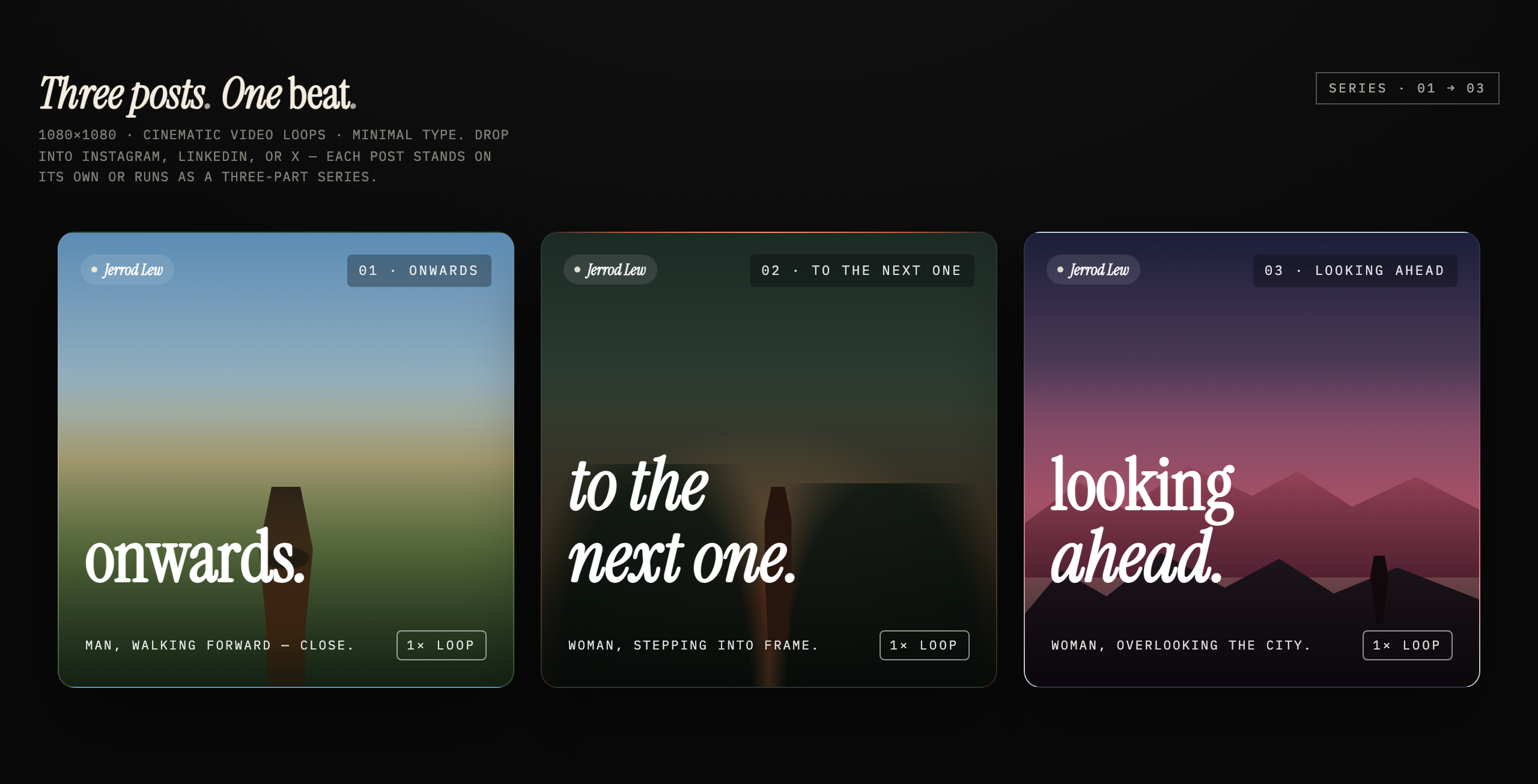
Three static square cards pair short motivational phrases with gradient scenes, abstract silhouettes, numbered labels, and a shared serif treatment.

Social Card Use Cases
- Social Campaign SequencesPlan related posts with independent meaning and shared visual rhythm.
- Motivational ContentPair concise forward-looking language with atmospheric gradients and abstract silhouettes.
- Square Social PublishingPlan square social artwork for individual posts or a three-part sequence.
Three-Card Series Highlights
- Three-Part NarrativeOnwards, next steps, and looking ahead form one sequence.
- Independent CardsEach post carries its own phrase, scene, and number.
- Minimal TypeLarge serif statements contrast with compact production metadata.
- Atmospheric CSS ScenesGradients and abstract silhouettes set three distinct visual moods.
The Three-Card Composition
1 / 1Three Posts, One Beat
This official OpenDesign example presents three coordinated social cards around the idea of moving forward. Its authored heading, “Three posts . One beat .”, establishes the central rule: each card should work independently while still contributing to a larger progression.
The sequence reads “onwards .” → “to the next one.” → “looking ahead.” The wording moves from an immediate action, through transition, toward a wider perspective. That progression gives the cards a narrative order without requiring a paragraph of explanation on any single post.
The source labels its intended format as 1080×1080 and mentions cinematic video loops, but the supplied HTML renders three static cards with CSS gradients and polygon silhouettes. The cards are responsive squares, capped at 380 CSS pixels in the desktop row. Neither the label nor the still screenshot establishes a 1080-pixel export or a working video loop.
Onwards
The first card pairs “onwards.” with an upright abstract silhouette over a blue-green gradient, giving the opening phrase a close foreground anchor.
To The Next One
The second card sets an italic phrase across two lines above a central polygon figure and green-amber backdrop. Its wording supplies the transition; the figure itself is static.
Looking Ahead
The final card sets “looking ahead.” over layered rose-colored peaks and a small distant silhouette, shifting the emphasis from a foreground figure to a wider setting.
Where The Series Fits
The source names Instagram, LinkedIn, and X as intended destinations, while also stating that every post can stand alone or run as a three-part series. That makes the design useful for a campaign that needs both sequential publishing and flexible reuse across a feed.
The cards are especially suited to short motivational announcements, progress milestones, career-oriented messages, or editorial social packages where the emotional direction matters more than dense information. The design leaves the statement prominent, so supporting copy should remain outside the card or stay deliberately brief.
The visible labels also make the sequence easy to package: “01 · ONWARDS,” “02 · TO THE NEXT ONE,” and “03 · LOOKING AHEAD” tell a reader where each post belongs. The tradeoff is that these labels reinforce order but add another layer of text around already large headlines.
Standalone Publishing
Publish one card when the message must work without prior context; its phrase and scene provide the complete local idea.
Sequential Publishing
Publish all three when the gradual movement from action to perspective is important to the campaign.
Cross-Platform Adaptation
Keep the square canvas and short statements as anchors, then verify how each platform treats the surrounding post context.
Shared Frames and Changing Scenes
The three cards share a square 1:1 format, but their CSS scenes change the emotional temperature. The first combines a blue-to-green gradient with a large upright polygon silhouette. The second uses darker green edges around a warm amber center and a smaller figure. The third shifts toward violet and rose with layered geometric peaks. Color variation separates the posts while the repeated frame keeps them related.
Typography supplies the strongest repeated pattern. “Onwards” is upright serif type with an italic period; both lines of “to the next one.” are italic; and the final card combines upright “looking” with italic “ahead.” Compact monospaced labels sit around the large statements. The different line breaks give the middle and final cards more vertical presence, making headline length an important adaptation constraint.
At the top, the visible name pill reads “Jerrod Lew,” beside the post number and phrase. That label is part of the artwork, not independent proof of authorship or endorsement. At the bottom, “1× LOOP” is a static badge. The source contains no CSS animation, script, or video player, so these repeated annotations organize the set rather than provide playback controls.
Start With The Reading Order
Place the short phrase, number, and scene description so the three cards can be understood as “onwards,” transition, and looking ahead.
Let Line Breaks Change The Pace
Preserve the distinct wrapping seen in “to the next one.” and “looking ahead.” only when the resulting scale remains legible inside the square.
Use Color To Separate Moments
Move from blue-green to dark green and amber, then violet and rose, while retaining enough contrast for the large light headline.
Visible Design And Capability Boundary
The supplied artifact is a static three-card HTML graphic built from local text, CSS gradients, polygon silhouettes, and repeated labels. It contains no animated CSS, script-driven motion, video media, or playback controls. Loop and publishing language is authored illustrative copy, not evidence of delivered video or platform integration. No connected publishing service, stored media pipeline, or performance result is established.
The strongest reusable lesson is the relationship between constrained copy and repeated framing: three short phrases create progression, while the same credit, numbering, footer treatment, and square canvas preserve identity. The tradeoff is intentional restraint. Any adaptation that adds longer captions, extra metrics, or denser calls to action would need a new layout decision rather than simple text replacement.
How to Create Motivational Social Card Design in OpenDesign
Set The Three-Card Structure
Create three static square social cards with a shared name-pill treatment, numbered sequence labels, large lower-positioned statements, scene descriptions, and a compact non-interactive loop annotation.
Suggested PromptCreate a static three-card motivational social design using 1:1 canvases. Use “onwards.”, “to the next one.”, and “looking ahead.” over distinct blue-green, green-amber, and violet-rose CSS gradient scenes with abstract polygon silhouettes and layered peaks. Use upright serif lettering for the first phrase, italic lettering for the middle phrase, and mixed upright and italic lettering for the last. Add compact monospaced numbered labels, a shared name pill, and static footer annotations. Each card should stand alone and also read in sequence. Stack the cards on narrow screens. Do not add video playback or imply connected publishing, storage, analytics, or live services.
Refine Phrase Scale And Wrapping
Check the headline line breaks against the square canvas. Keep “onwards.” compact, allow the middle phrase to occupy two lines, and ensure the final phrase remains readable over its layered scene.
Check The Series As A Set
Review the three cards together for progression, contrast, repeated credit and footer placement, and distinct visual moments. Confirm that the still design communicates the sequence without relying on unverified runtime behavior.
Export and Get a Share Link
Export your finished design, then use Share in OpenDesign to get a share link. Open the link in a separate browser window and check that the intended version and its assets are available before sending it.
AI Workflow Editorial Poster Design
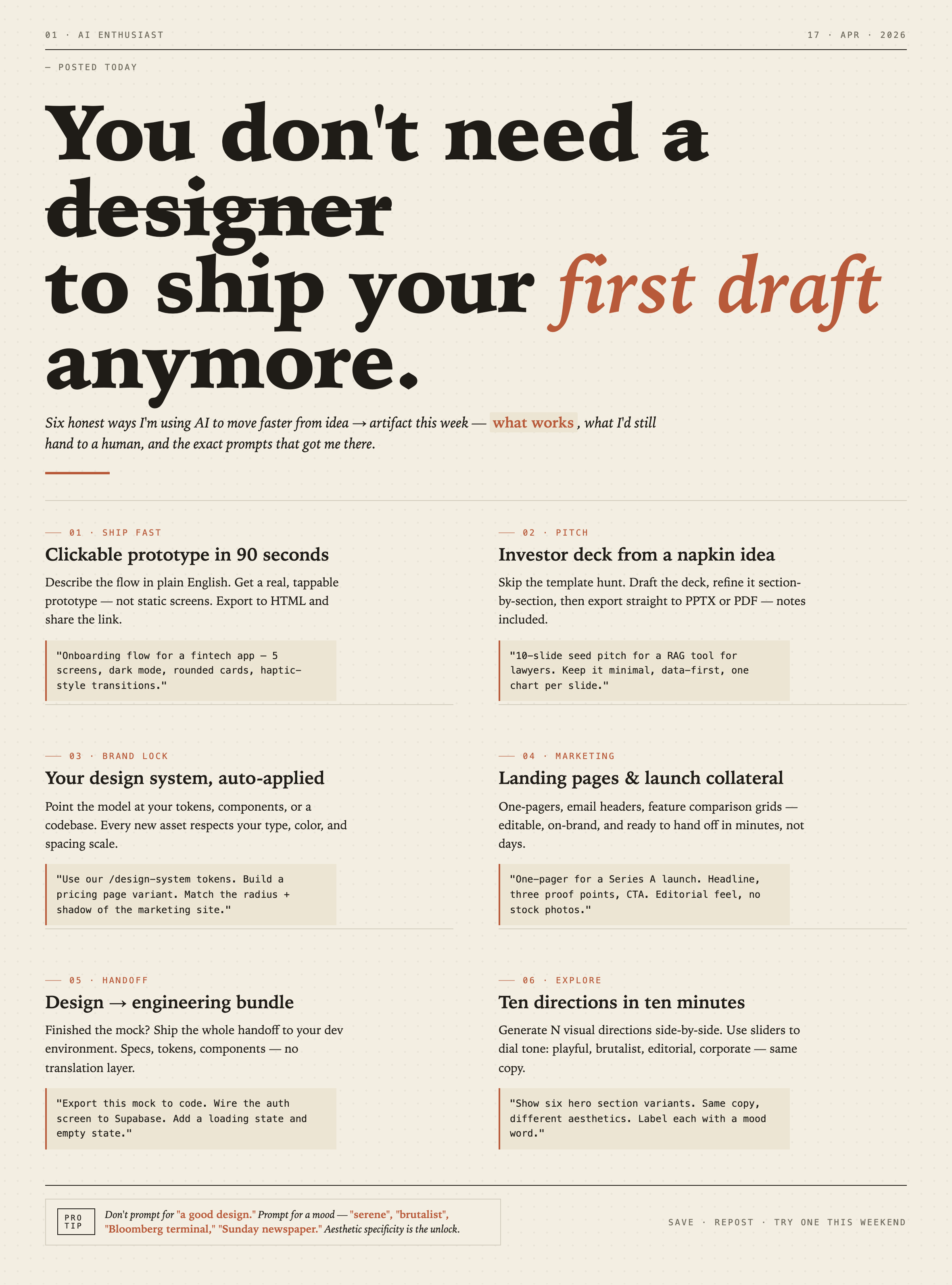
AI Workflow Editorial Poster Design presents six illustrated workflow claims with numbered chapters, concrete prompt specimens, and cream-and-rust typography.
Graphics
AI Workflow Social Carousel Design
Seven portrait cards use oversized Chinese headings, numbered habits, changing color fields, and a closing statement to explain AI editing workflows.
Graphics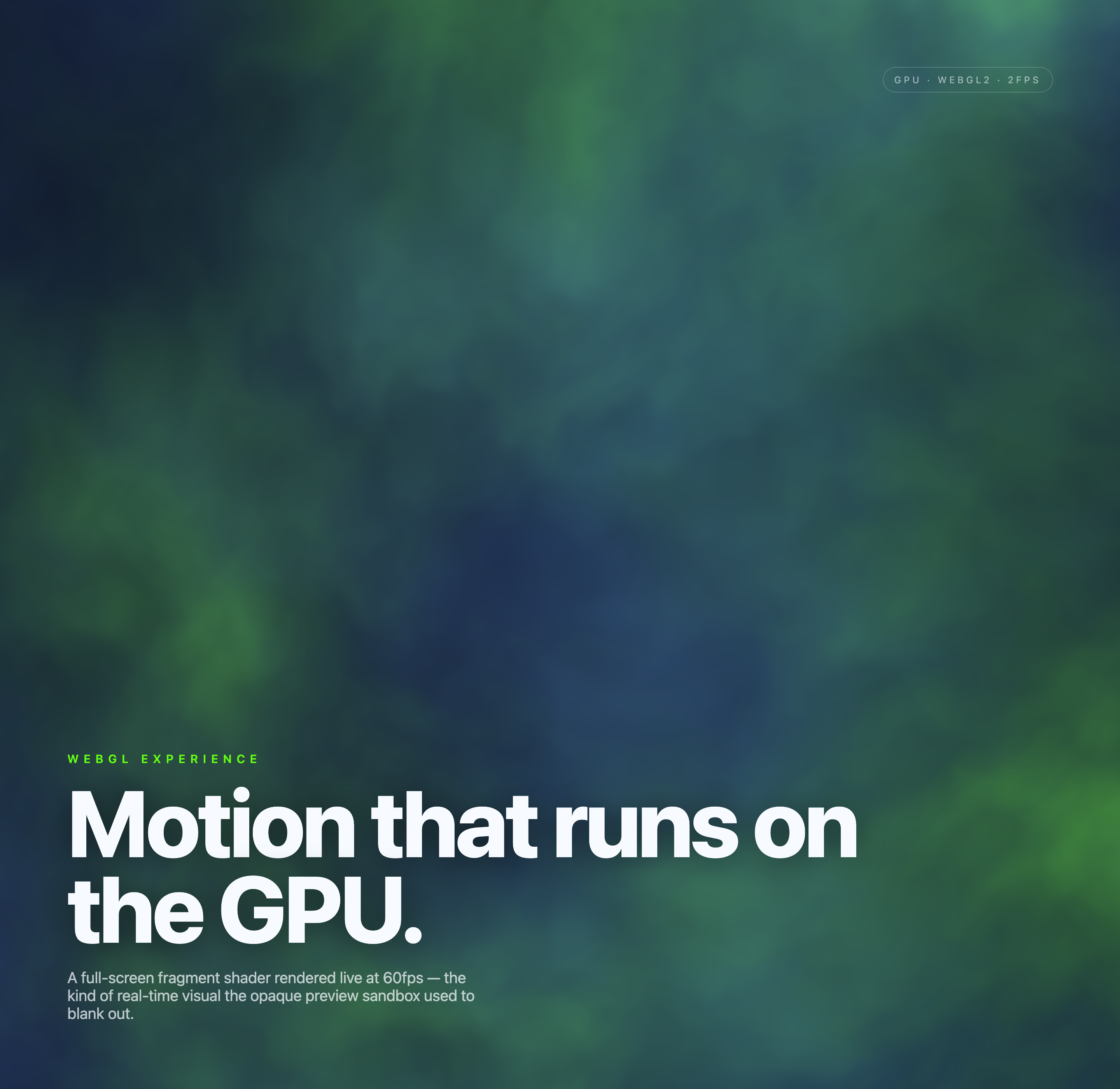
Aurora Field Shader Design
An automatically animated blue-green noise field gives a WebGL hero its atmosphere, while a fixed headline and small local frame-rate badge anchor the scene.
Graphics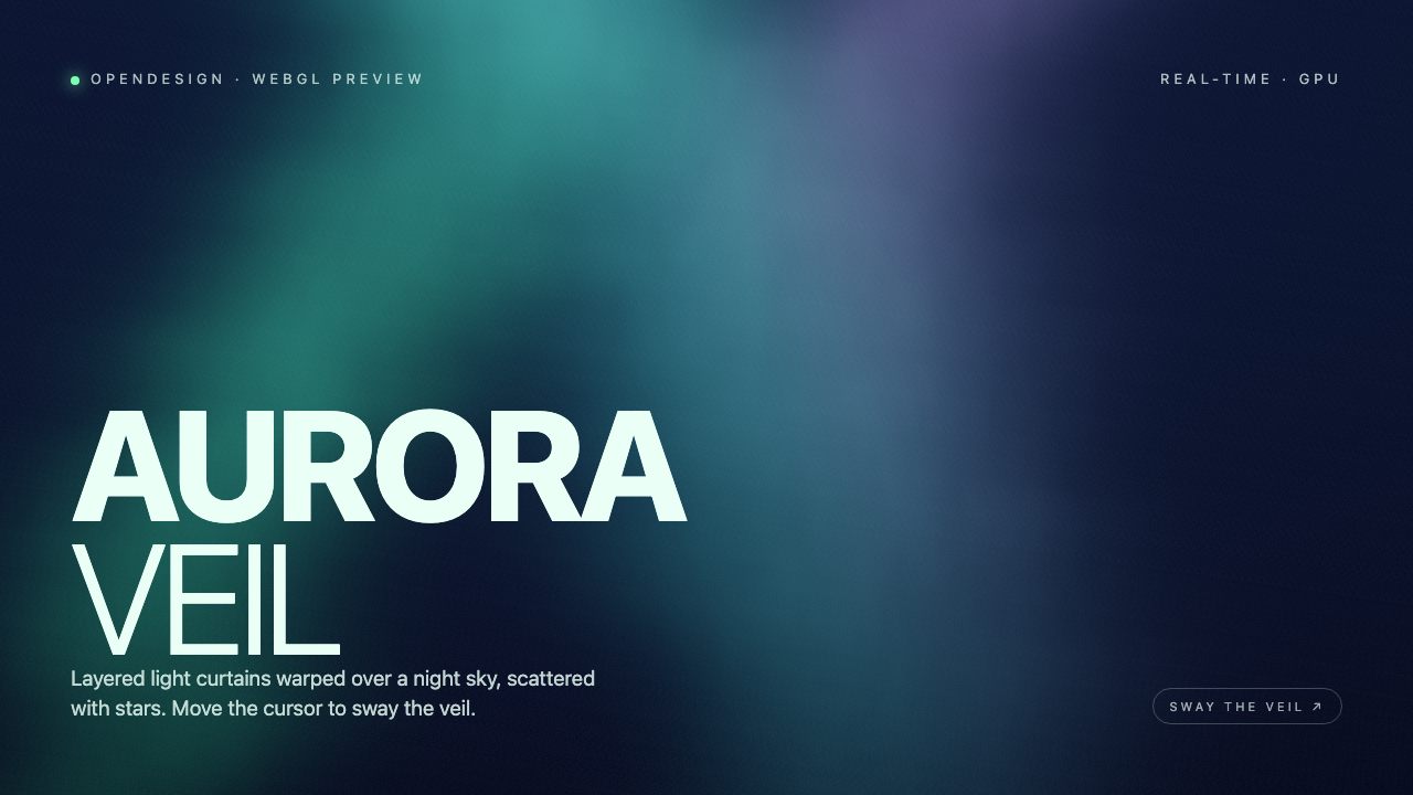
Aurora Veil Shader Design
Aurora Veil is an interactive shader composition that turns layered light, stars, and cursor motion into an atmospheric WebGL hero.
Graphics