

Graphics
Quote Sharing Card Design
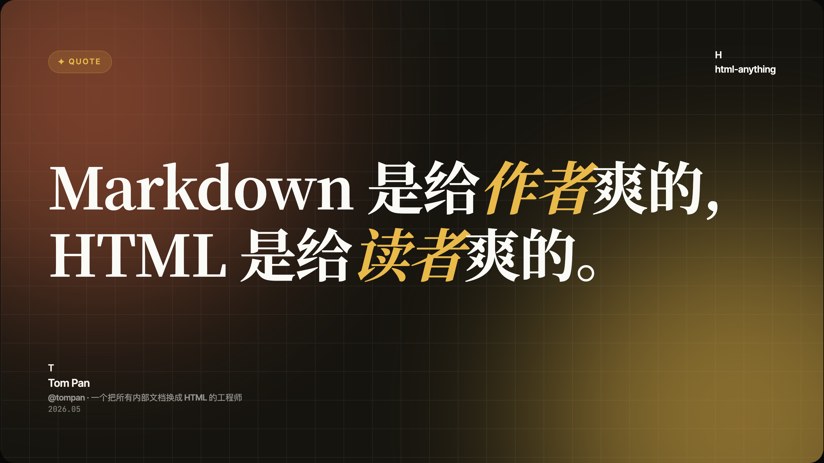
A Chinese quotation with Latin technology names, gold emphasis, and visible author credit fills a dark gridded editorial canvas.

Quote Card Use Cases
- Quote-Led Social PostsTurn one memorable statement into a composed, shareable graphic.
- Mixed-Script Editorial GraphicsBalance Latin and Chinese typography within one reading field.
- Author-Centered PublishingKeep quotation credit, handle, role, and date visibly connected.
- Internal Ideas And PrinciplesGive concise team concepts a distinct visual form.
Editorial Quote Highlights
- Editorial ContrastSerif quotation lettering contrasts with compact sans-serif metadata.
- Mixed-Script StatementLatin technology names and Chinese wording form one dominant quotation.
- Identity FooterAuthor name, handle, role, and date anchor the quotation.
- Grid-Led AtmosphereA dark grid and warm color field frame the text.
The Complete Quote Card
1 / 1A Two-Line Quote With Visible Credit
Distributed in the OpenDesign Community library with HTMLAnything declared as its upstream, this graphic is built around a single attributed statement. The visible composition opens with a small “✦ QUOTE” label, moves into a large Chinese quotation incorporating Latin technology names, and closes with Tom Pan’s identity block. That order makes the artifact read as a quotation first and a social post second.
The sample statement contrasts Markdown as a format for authors with HTML as a format for readers. “Markdown” begins the first line, while “HTML” begins the second, giving the two technologies parallel visual weight. Gold emphasis marks selected Chinese words, so the contrast functions as editorial emphasis rather than a separate chart, badge, or data visualization. These are mixed scripts within one Chinese quotation, not parallel English and Chinese versions.
The source CSS specifies a 1600px card with a 16:9 aspect ratio and a maximum width of 96vw. That proportion supports a wide, presentation-like reading surface: the statement can occupy most of the frame while the identity block remains legible as a smaller secondary zone. The tradeoff is intentional density; replacing the quote with a longer passage would require rebalancing the line breaks and type scale.
The depicted attribution names Tom Pan, uses the handle @tompan, describes an engineer who converts internal documents to HTML, and includes the date 2026.05. These details supply a name, role and publication-style date without competing with the central statement. They remain sample quotation credit, not verified personal history, an OpenDesign testimonial, or a replacement for the template’s declared HTMLAnything upstream.
Statement First
The large two-line quotation carries the main reading task, while the label and identity details provide context around it.
Credit In Place
Name, handle, role, and date sit together at lower left, making the source legible without adding a separate profile panel.
Use Cases For A Quote Sharing Card
The composition is suited to a short, attributable idea that benefits from visual emphasis. It can support an editorial social post, a conference or community quote series, or an internal principle published as a standalone image. In each case, the source text needs enough brevity to preserve the card’s two-line reading rhythm.
The identity block also makes the format useful when the author is part of the message. Here, the role line describes an engineer who converts internal documents to HTML, which gives the quotation a professional context. If a new use case has no meaningful author, handle, or date, the lower-left block would need a different information purpose rather than being retained as decoration.
For mixed-script publishing, the artifact demonstrates a practical relationship between scripts: the Latin technology names remain easy to scan, while the Chinese wording supplies the sentence structure. The tradeoff is that text length and font metrics can change the balance quickly. A recreation should test its actual wording rather than assuming the current line breaks will transfer.
| Observed Element | Reader Understands | Design Tradeoff |
|---|---|---|
| ✦ QUOTE label | The artifact is a quotation card before the statement is read. | It consumes little space but adds a category cue. |
| Markdown and HTML | The statement contrasts two named technologies. | Large type makes the comparison memorable but limits copy length. |
| Tom Pan and @tompan | The quotation has a specific credited author. | Attribution adds trust context but must remain visually secondary. |
| 2026.05 | The sample includes a publication-style date. | A date helps catalog the card but may require updating for reuse. |
Composition Of The Mixed-Script Statement
The visual hierarchy is built from scale and placement rather than from multiple interface controls. A small outlined gold “✦ QUOTE” pill sits near the upper left. The main statement spans the central area in oversized white and gold type, while “H” and “html-anything” appear at the upper right as compact contextual labels. This diagonal distribution keeps the card from becoming a centered text block.
The quotation’s two lines are not interchangeable. “Markdown” leads the first line, and “HTML” leads the second, so the reader encounters a direct visual pairing before finishing the Chinese sentence. Gold treatment highlights selected Chinese words across both lines, creating a repeated accent that ties the comparison together. If the emphasis were removed, the card would become calmer but lose the visual cue that guides the contrast.
The background uses a dark field with a visible grid, warmer brown illumination toward the left, and an olive-gold area toward the lower right. The grid gives the open space a measured structure, while the color transition keeps the large black regions from reading as empty. This atmosphere supports the technical subject, but it also raises a contrast constraint: light type must remain readable over both warm areas.
At the lower left, a “T” initial accompanies the author name, handle, role and date. This portraitless identity treatment connects the footer to the quotation while keeping it secondary to the oversized statement. Its compactness comes with a limit: the reader receives only a short depicted attribution, not a full profile or evidence establishing the quotation’s authenticity.
Scope And Capability Boundary
This artifact is a design-only graphic sample. The supplied evidence verifies a local HTML preview, a CSS-defined card proportion, visible typography, and the depicted text; it does not establish a live social integration, publishing workflow, connected data source, or measurable sharing performance. The quotation’s names, role description, and date should therefore be treated as illustrative content unless separately verified.
The template is distributed through OpenDesign Community and declares HTMLAnything as its upstream source; the depicted quotation separately credits Tom Pan. The bundled manifest declares an MIT license for the example plugin, but that does not establish separate licensing for every depicted asset. An adaptation should retain upstream credit and confirm rights for any quotation, author identity, or external font used.
How to Create Quote Sharing Card Design in OpenDesign
Set The Editorial Frame
Start with a wide 16:9 quotation canvas and reserve distinct zones for the upper-left category label, upper-right context, central statement, and lower-left attribution. Keep the proportions close to the supplied composition before adapting the content.
Suggested PromptCreate a 1600px-wide 16:9 mixed-script quotation card with a dark fine grid, warm brown and olive-gold corner lighting, a small gold “✦ QUOTE” label at upper left, and “H” with “html-anything” at upper right. Set a short two-line Chinese statement incorporating Latin technology names in oversized serif type, with selected words emphasized in gold. Place an initial, credited name, handle, short role and date in the lower attribution area. Treat all text as editable sample content; do not imply social publishing, connected services, or an original OpenDesign quotation.
Refine The Type Relationship
Replace the sample statement with a similarly short quotation, then test the actual Latin and Chinese line lengths together. Use the large serif treatment for the message, compact sans-serif text for identity and context, and a restrained accent color for selected emphasis rather than highlighting every word.
Check Attribution And Boundaries
Verify that the author name, handle, role description, and date belong to the quotation you are using. Keep those fields grouped in the lower-left identity block, and label any invented or placeholder content as sample content. Confirm that the final design remains a static graphic unless real publishing behavior is separately implemented and verified.
Export and Get a Share Link
Export your finished design, then use Share in OpenDesign to get a share link. Open the link in a separate browser window and check that the intended version and its assets are available before sending it.
AI Workflow Editorial Poster Design
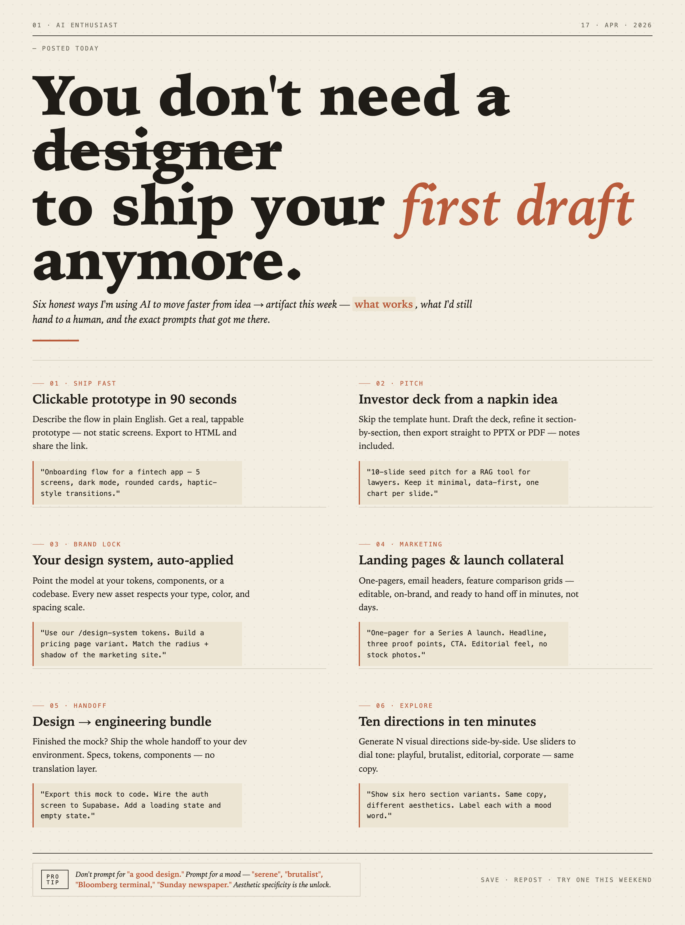
AI Workflow Editorial Poster Design presents six illustrated workflow claims with numbered chapters, concrete prompt specimens, and cream-and-rust typography.
Graphics
AI Workflow Social Carousel Design
Seven portrait cards use oversized Chinese headings, numbered habits, changing color fields, and a closing statement to explain AI editing workflows.
Graphics
Aurora Field Shader Design
An automatically animated blue-green noise field gives a WebGL hero its atmosphere, while a fixed headline and small local frame-rate badge anchor the scene.
Graphics
Aurora Veil Shader Design
Aurora Veil is an interactive shader composition that turns layered light, stars, and cursor motion into an atmospheric WebGL hero.
Graphics