
Website
Creative Portfolio Website Design
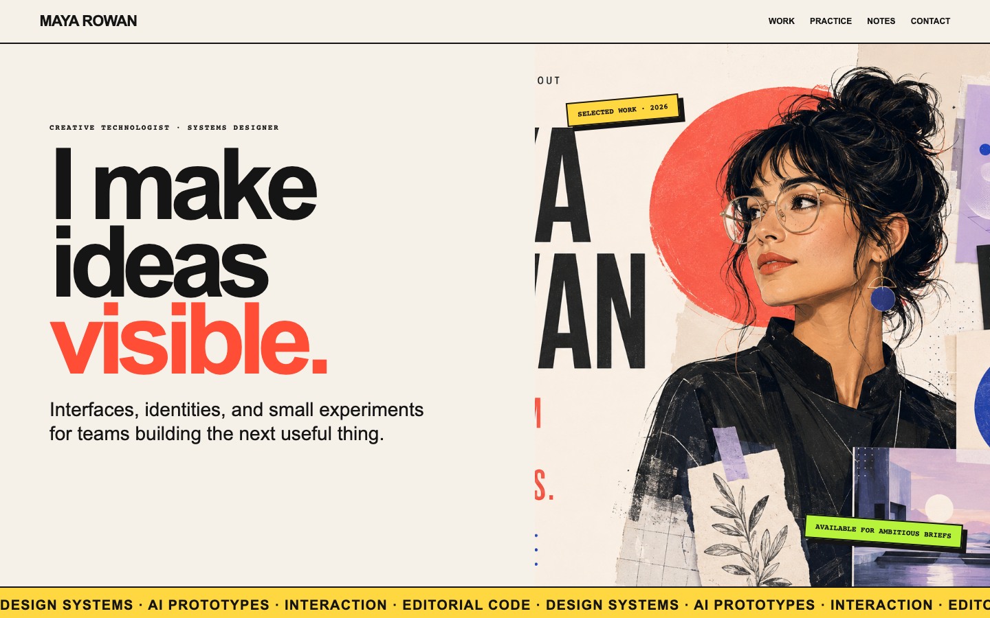
Maya Rowan’s fictional portfolio connects project cards, practice, and notes.

Design Ideas for
- Creative PortfoliosExplain a body of work through projects and practice.
- Independent Designer WebsitesConnect what you make with how you approach a brief.
- Studio Introduction PagesGive prospective collaborators a concrete starting point.
Portfolio Highlights
- Five Project IdeasEach card combines a project name with a short purpose.
- A Three-Stage PracticeResearch, prototyping, and reusable systems explain the approach.
- Notes Beside Finished WorkField notes and open questions add another view of the practice.
Creative Portfolio Website Design Preview
1 / 5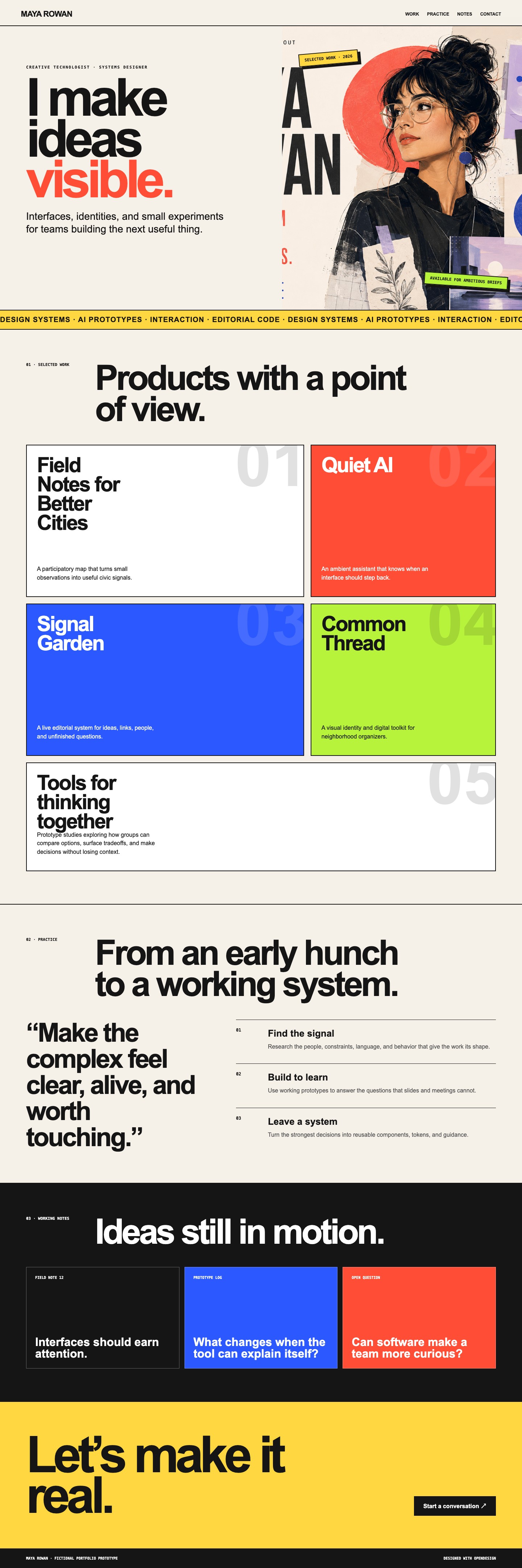
A Portfolio That Explains More Than Its Projects
Maya Rowan’s portfolio makes a specific tradeoff: it gives project names the visual weight that many portfolios give screenshots. The opening statement, “I make ideas visible,” leads into a grid of typographic project cards, not a wall of device mockups. The page therefore depends on its descriptions to explain what the work actually is.
The same editorial structure repeats at three scales: numbered sections organize the page, large names distinguish the projects, and small labels identify the working notes. This makes the site useful as a creative portfolio design reference even before replacing the fictional persona. The important part is how those levels work together, not the particular red or blue.
| Section | Visible Content | Question It Answers |
|---|---|---|
| Work | Five named projects with short descriptions. | What kinds of things does this designer make? |
| Practice | Find the Signal, Build to Learn, and Leave a System. | How does the designer approach an uncertain brief? |
| Notes | A field note, a prototype log, and an open question. | What is the designer thinking about between projects? |
| Contact | A closing invitation to start a conversation. | How would a prospective collaborator take the next step? |
Why the Project Cards Read Like Posters
The desktop project grid is deliberately unequal: its columns use a 1.2:0.8 ratio, so the left card gets roughly 60% of the available width. Each card is at least 420px tall. That makes room for a tightly wrapped title at the top and a separate explanatory sentence near the bottom.
An Eight-Character Title Width Changes the Rhythm
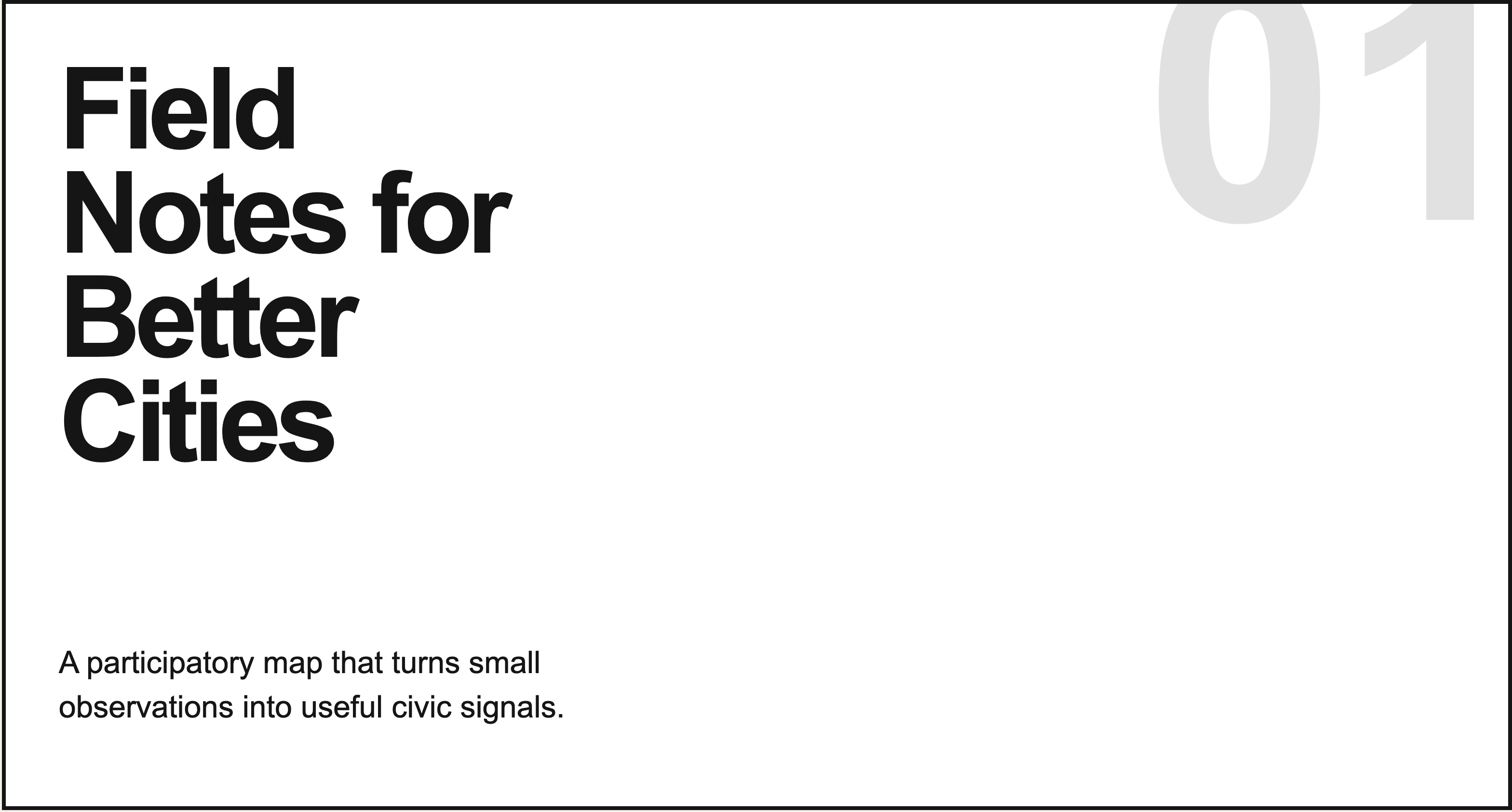
The source limits project headings to 8ch and uses a 0.92 line height. “Field Notes for Better Cities” becomes a tall block rather than a single line. The narrow measure gives the title its poster-like rhythm; it is not an accidental wrap caused by a small screenshot.
The Description Carries the Concrete Meaning
The first card names a participatory map and explains that small observations become civic signals. That is substantially more informative than “an innovative mapping experience.” The description sits 24px above the bottom edge, giving the reader a consistent place to find the explanation across differently colored cards.
From Selected Work to a Repeatable Practice
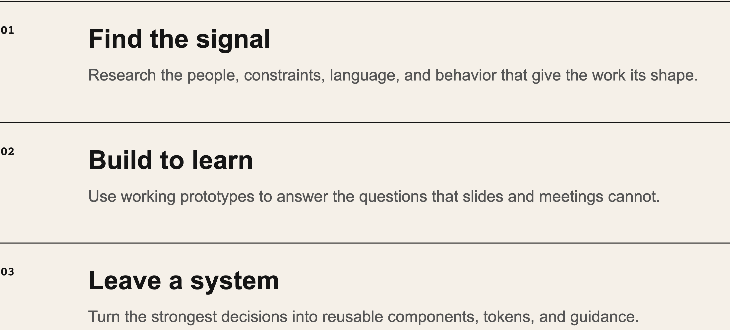
The Practice section reverses the emphasis of the project grid. A large quotation occupies the smaller column; three numbered explanations occupy the wider one. Each explanation has its own top rule and a fixed number column. The effect is a change from browsing individual ideas to reading a sequence of actions.
Find the Signal Names the Inputs
The first row explicitly lists people, constraints, language, and behavior. Compare that with Field Notes, whose subject is observations about cities: the project description names the material, while the practice row explains what the designer would look for in that material. The page suggests this relationship; it does not document a completed research study.
Build to Learn Names the Reason for a Prototype
The second row positions a working prototype as a way to answer questions. This is a different claim from producing a polished final interface. It fits the portfolio’s mix of ambient AI, editorial systems, and group decision tools, where exploring behavior is part of the design question.
Leave a System Names the Handoff
The final row names components, tokens, and guidance rather than ending with “launch.” That makes the proposed output more specific: another person should be able to continue from the decisions. For a real case study, this is where a component example or a short usage rule would support the statement.
A Portfolio Reference for Hackathon Projects
OpenDesign created this fictional portfolio as an official hackathon example. For a participant’s own entry, its strongest reusable idea is the separation between a project’s purpose, the decisions behind it, and what remains open. A project card can introduce an entry while a linked account supplies the actual evidence.
Where the Portfolio Concept Ends
The source switches the project grid and Practice section to one column below 760px, but it also hides the navigation links. That is a specific limitation to address in a real portfolio: retain a compact section menu rather than making visitors scroll through every project to reach Contact.
The fictional projects are not documented client engagements. Notes are headings rather than a populated publishing system, and Contact points to [email protected]. Replace those placeholders and verify the destinations before sharing a real portfolio.
How to Create a Creative Portfolio Website Design in OpenDesign
Describe Projects Before Choosing Their Colors
Prepare several project names with one sentence each explaining the audience and purpose. Add your role where known. This gives OpenDesign enough material to build cards that differ in substance, not only in appearance.
Suggested PromptCreate a creative portfolio website design with an introduction, five selected-work cards, a three-stage practice, working notes, and contact. Use large editorial typography, a warm neutral background, and a few contrasting card colors. Each project needs a name, purpose, and my role. Use labelled placeholders where information is missing. Do not invent clients or results. Keep Work, Practice, Notes, and Contact navigation usable on small screens.
Connect One Project to the Practice Section
Ask OpenDesign to show how one actual project moved from a question to a prototype and a deliverable. Replace broad service language with that example. Keep the remaining practice description short enough to support the work rather than overshadow it.
Test the Contact and Reading Paths
Read the cards without looking at their colors: each should still describe a distinct idea. Then test section navigation and the real contact link. Check that oversized titles wrap without hiding the descriptions on mobile.
Export and Get a Share Link
Export your finished design, then use Share in OpenDesign to get a share link. Open the link in a separate browser window and check that the intended version and its assets are available before sending it.
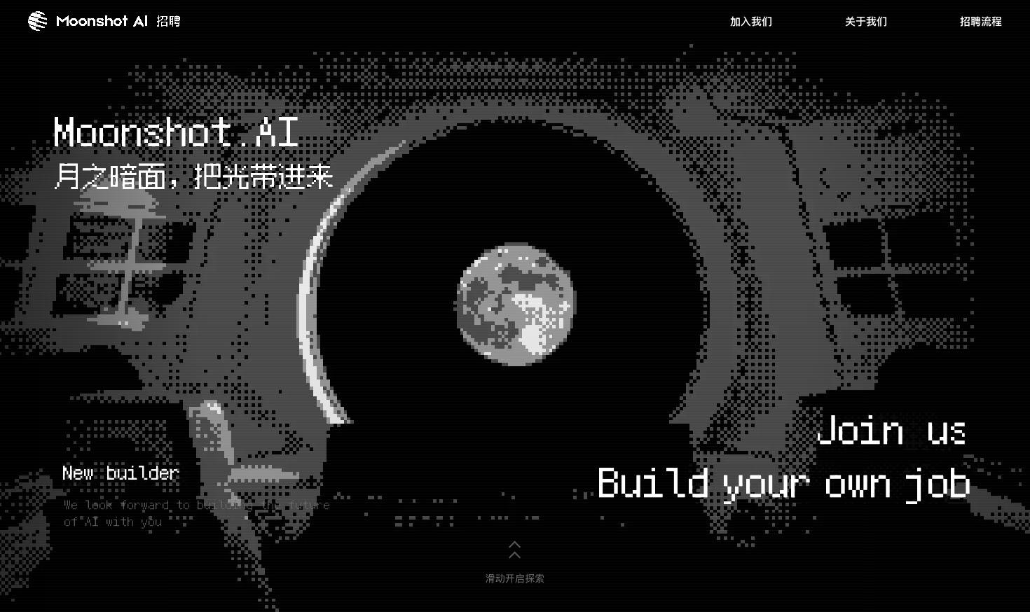
Careers Website Design
A Kimi careers study built from eight lunar scenes, with scroll-linked transitions and an illustrated application process.
Website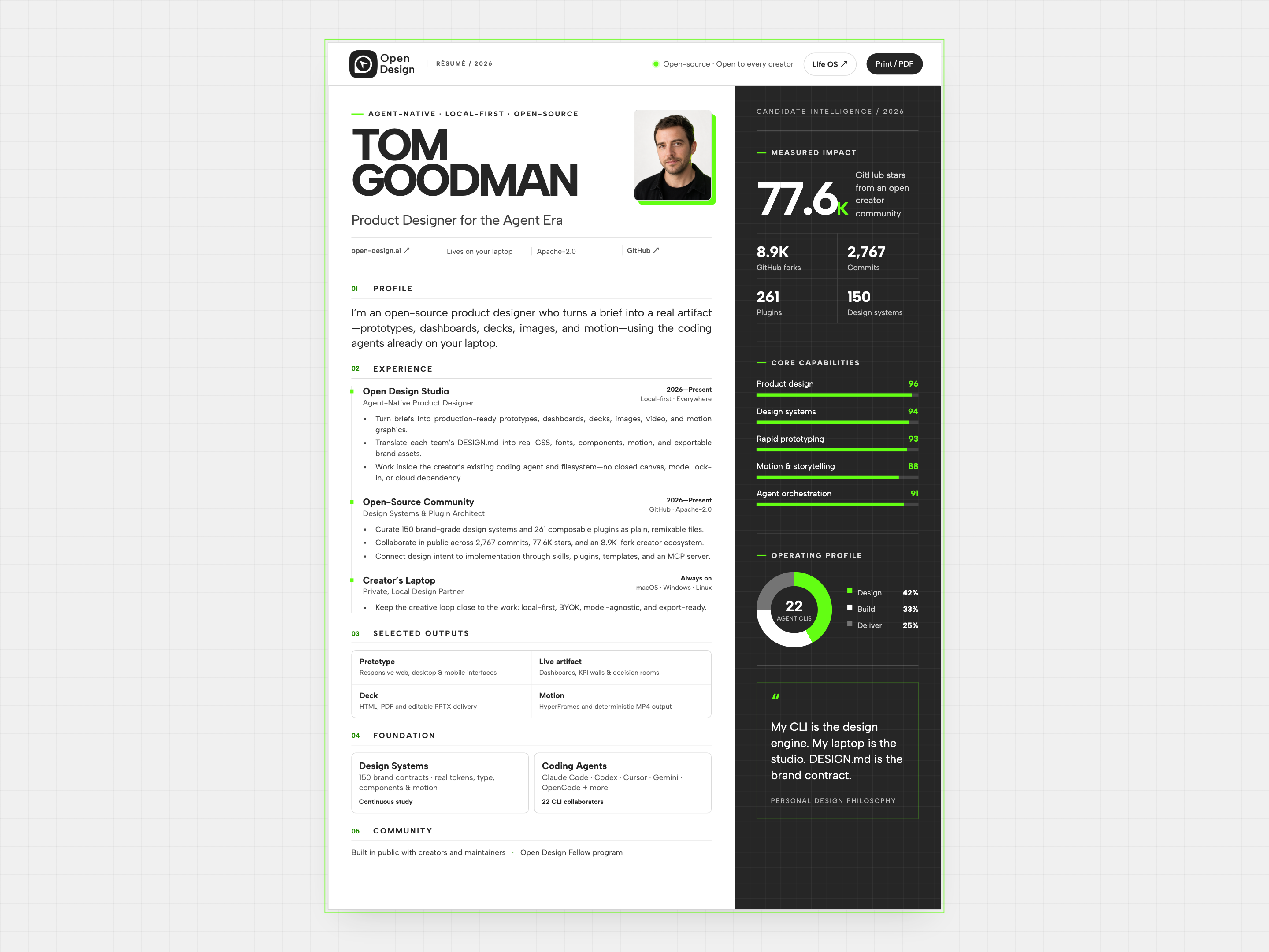
Resume Website Design
Tom Goodman’s fictional resume pairs experience with capability charts and selected outputs. Explore its two-column reading order, compact work cards, and separate print layout.
Website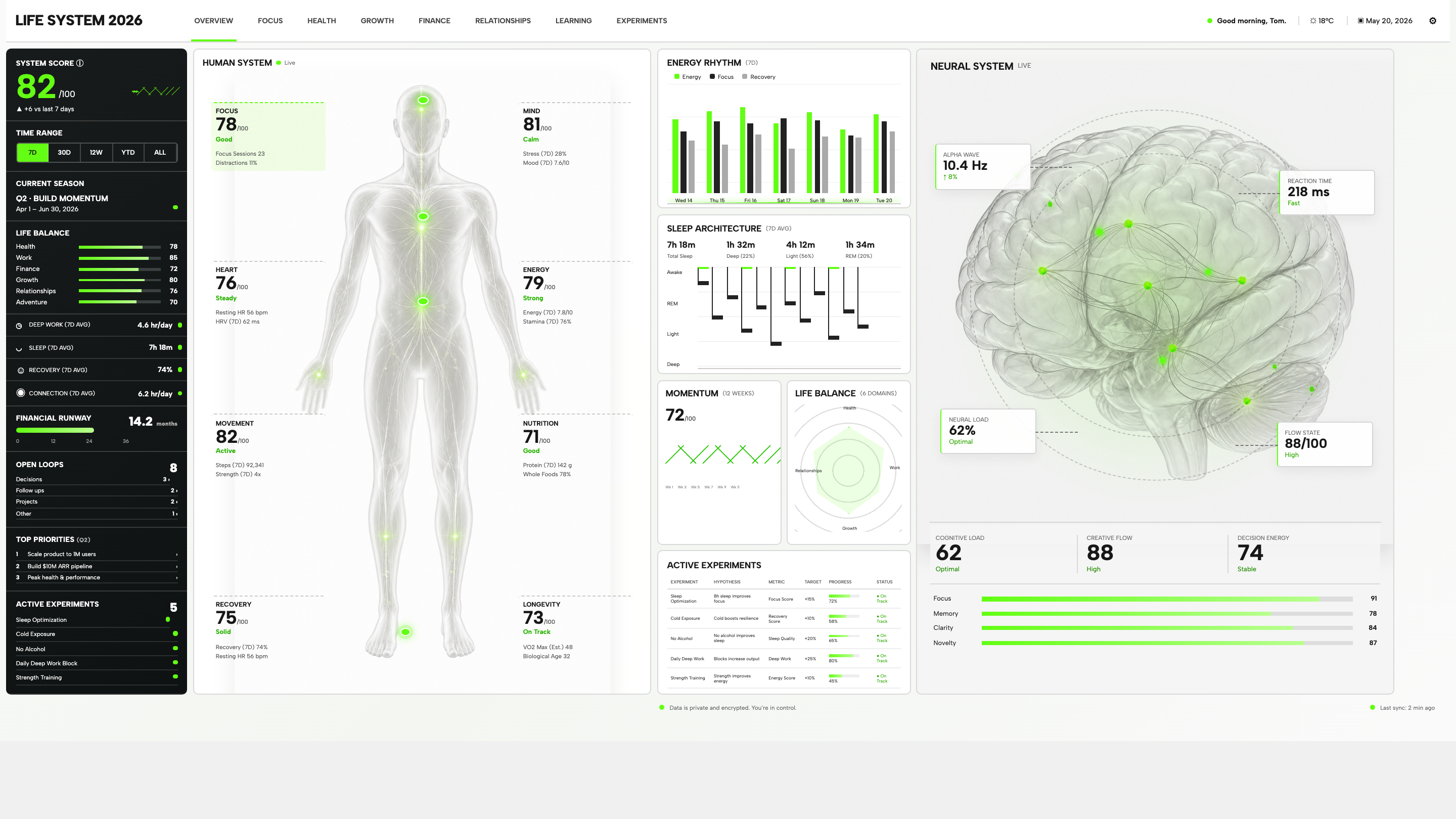
Personal Dashboard Design
Life System puts a weekly score, body-map metrics, daily rhythms, and five experiments on one desktop dashboard. Explore the layout in detail.
Desktop app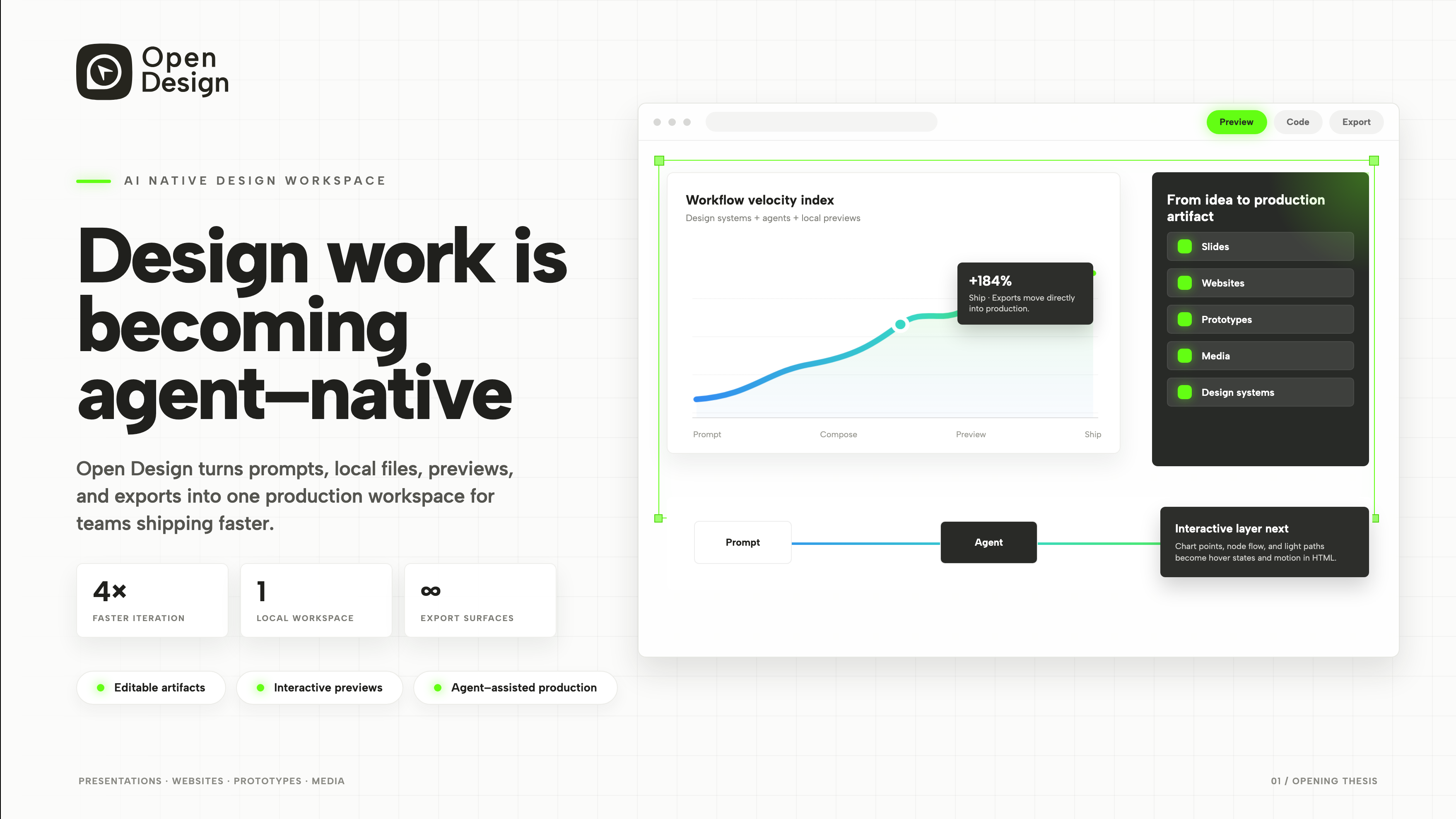
Product Presentation Design
An agent-native workspace pitch in 3 slides.
Slides