
Website
Careers Website Design
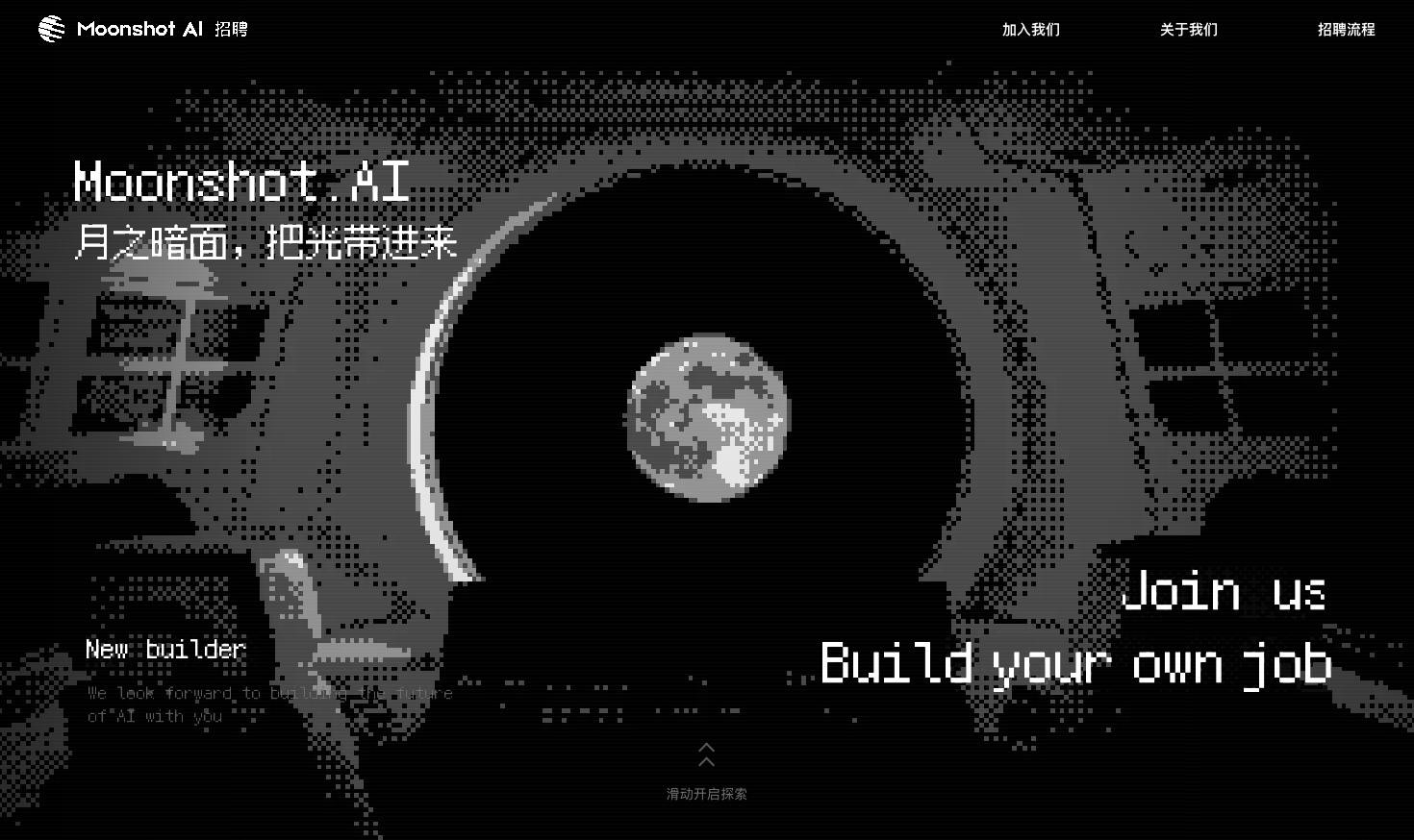
A Kimi careers study built from eight lunar scenes, with scroll-linked transitions and an illustrated application process.

Design Ideas for
- Careers Landing PagesIntroduce an employer before explaining how to apply.
- Recruitment Campaign WebsitesConnect a visual theme with joining and application information.
- Scrolling Brand StoriesOrganize a long narrative into distinct visual scenes.
Careers Page Highlights
- Eight Scrolling ScenesMove from a cockpit introduction to an application sequence.
- One Lunar Visual ThemeMoons, orbit paths, and pixel graphics connect the scenes.
- A Numbered Application DiagramFour numbered stops turn the process into a visual route.
Careers Website Design Preview
1 / 8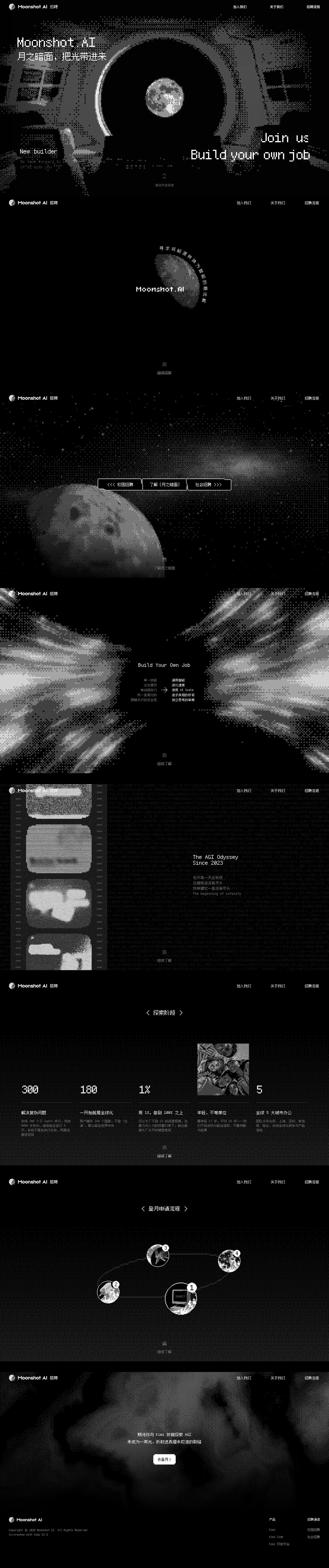
A Careers Page Told Through Eight Scenes
This Kimi careers reconstruction is not a long page whose sections simply pass through the viewport. It layers eight scenes in one visual stage and uses scroll progress to change their opacity, position, scale, and blur. The effect is closer to moving between frames of a presentation than reading a conventional job-listing page.
That distinction explains both its visual appeal and its limitations as a careers website design. The sequence can establish a strong atmosphere, but practical information must remain available outside the transitions. A visitor who wants the application process has a different task from someone exploring the brand story.
| Part of the Sequence | What Appears | Information to Preserve |
|---|---|---|
| Introduction and Moon Scenes | The organization’s identity and a lunar exploration setting. | Make it possible to identify the page as recruitment, even before scrolling. |
| Joining and Building | Invitations to join and Build Your Own Job. | Explain the available next step in words, not only through a visual metaphor. |
| Application and Closing | A four-stop process diagram and a final invitation. | Keep application guidance and a real destination accessible when the story ends. |
How Scroll Position Becomes a Scene Transition
The source maps the page’s scrollable travel onto positions from 0 to 7, one for each of the eight scenes. A scene becomes the current one when it is nearest to that position. Neighboring scenes can remain partly visible during the handoff; this is why a screenshot taken between stops can look soft or doubled.
| Scroll Position | What the Source Does | What the Reader Sees |
|---|---|---|
| Exactly at a Scene | Its opacity reaches 1 and the distance-based blur reaches 0. | A settled frame suitable for reading or capturing. |
| Halfway to the Next Scene | Both neighboring scenes have opacity 0.5 and approximately 1.3px blur. | A blended transition, not a crisp screenshot of either section. |
| Beyond the Scene | Its opacity falls to 0; a nearer scene becomes current. | The previous composition recedes instead of continuing down a normal document. |
Four Numbered Stops on an Orbital Application Path
The application scene translates a sequence into a lunar route. Stop 1, marked with a computer and Submit, appears near the lower middle; stop 2 is to its left, and stops 3 and 4 continue across the upper part of the orbit. The numbers carry the reading order because the geometry is not a familiar left-to-right timeline.
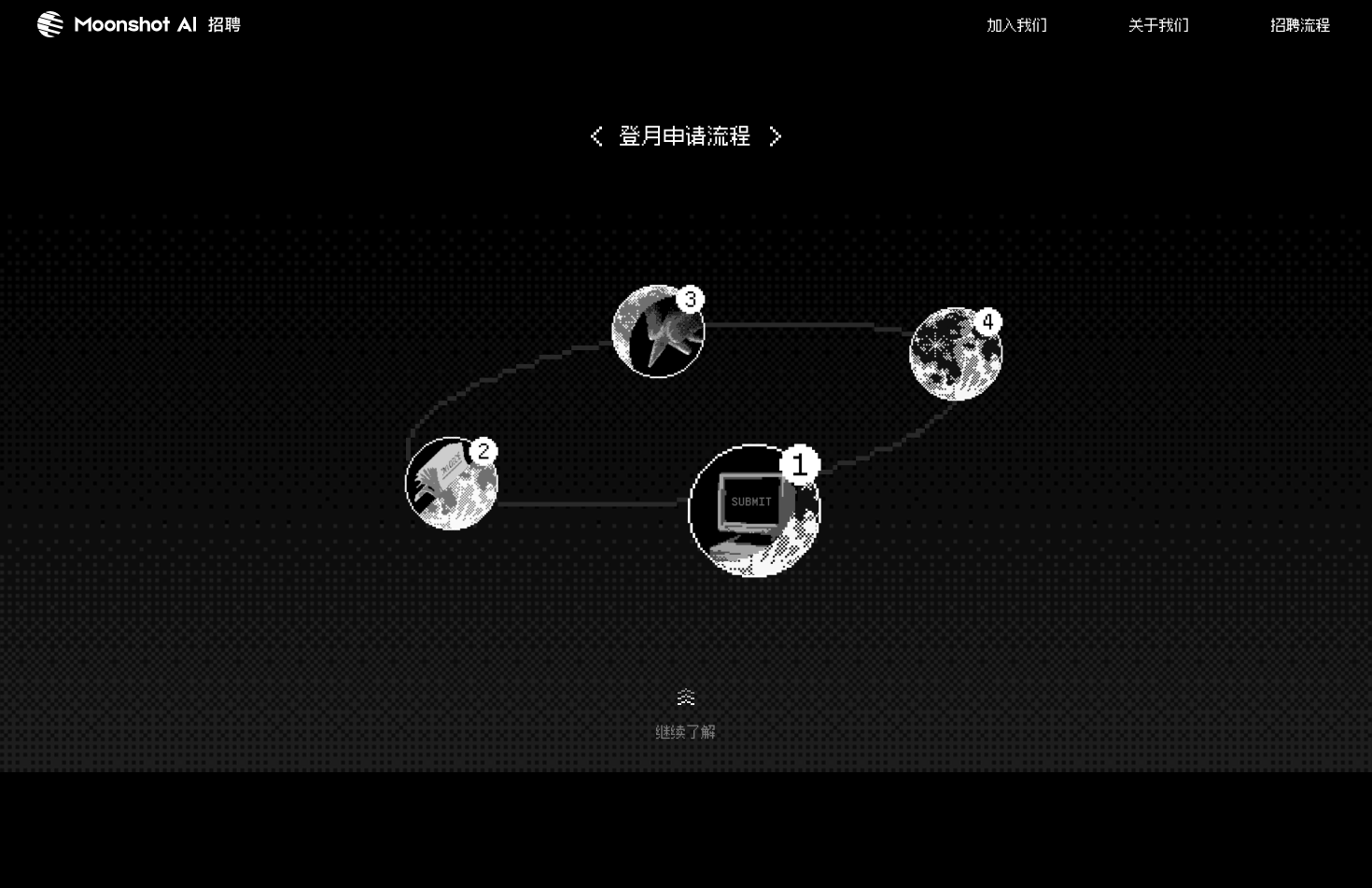
The Path Connects, but the Numbers Sequence
An orbital line explains that the four stops belong together. It does not by itself say where to begin or which direction to follow. The oversized number badges supply that missing order. The same distinction matters in a winding onboarding flow or illustrated process diagram.
The Illustration Is Not the Full Instruction
The scene names an application process, but the supplied reconstruction renders it as an image. A working page would still need the actual step names, requirements, and destinations as text. Those details should remain readable when the diagram stacks vertically on a phone.
Where a Visual Reconstruction Needs Real HTML
OpenDesign made this as an official hackathon example and visual study, not a commissioned Moonshot project. The distinction is visible in the implementation: scenes 2–8 are supplied reference images, and those images are marked aria-hidden. Changing which scene is current does not make the labels inside an image accessible as text.
Keep Headings Outside the Background Image
In a working version, a scene’s title and explanation should remain selectable text. A background can carry the cockpit, stars, or moon; it should not be the only location of an application instruction.
Separate Motion From Access to Information
Provide a settled, readable layout when motion is reduced, and a direct route to the process. This is a proposed improvement, not a feature verified in the supplied reconstruction. A visitor should not have to master the scroll animation to find the next step.
What This Careers Website Design Demonstrates
This case demonstrates scene composition and scroll-linked motion, not current vacancies or a working application backend. Its deliberately pixelated reference artwork is not vector artwork, and native-resolution export does not remove that stylistic limit. Use it to study the narrative and transition mechanics; use the employer’s official channels for actual hiring information.
How to Create a Careers Website Design in OpenDesign
Define the Story and the Practical Information
Start with your own organization’s introduction, joining options, and application steps. Specify which information is confirmed and which remains a placeholder before asking for a visual theme.
Suggested PromptCreate a careers website design for a fictional research studio. Use a lunar exploration theme across an introduction, joining options, team story, application process, and closing invitation. Keep recruitment navigation literal and readable. Build headings and the numbered process as semantic text rather than a single image. Use labelled placeholder roles and disabled placeholder application actions; do not imply a live recruitment backend. Include a readable reduced-motion layout.
Refine One Scene Transition First
Ask OpenDesign to connect the introduction and next scene while retaining a readable static state. Check that the transition does not hide the recruitment purpose or delay access to joining information before extending the effect across the page.
Test the Process Without the Visual Metaphor
Read the application steps as plain text and check their order on mobile. Confirm that actual links have real destinations and placeholders are clearly identified. Only then add the orbit path or other decorative treatment around the information.
Export and Get a Share Link
Export your finished design, then use Share in OpenDesign to get a share link. Open the link in a separate browser window and check that the intended version and its assets are available before sending it.
Creative Portfolio Website Design
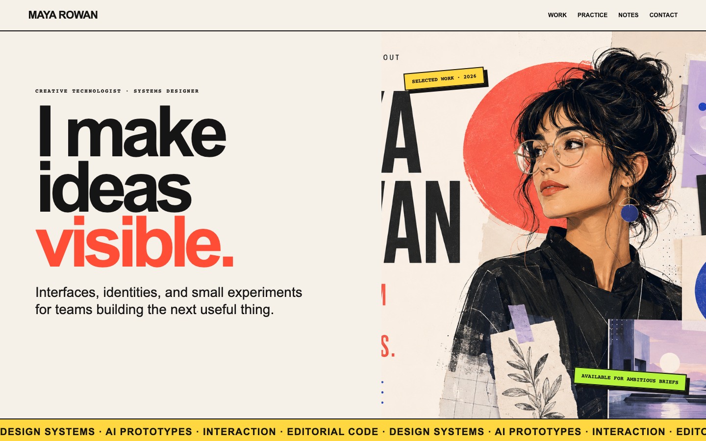
Maya Rowan’s fictional portfolio connects project cards, practice, and notes.
Website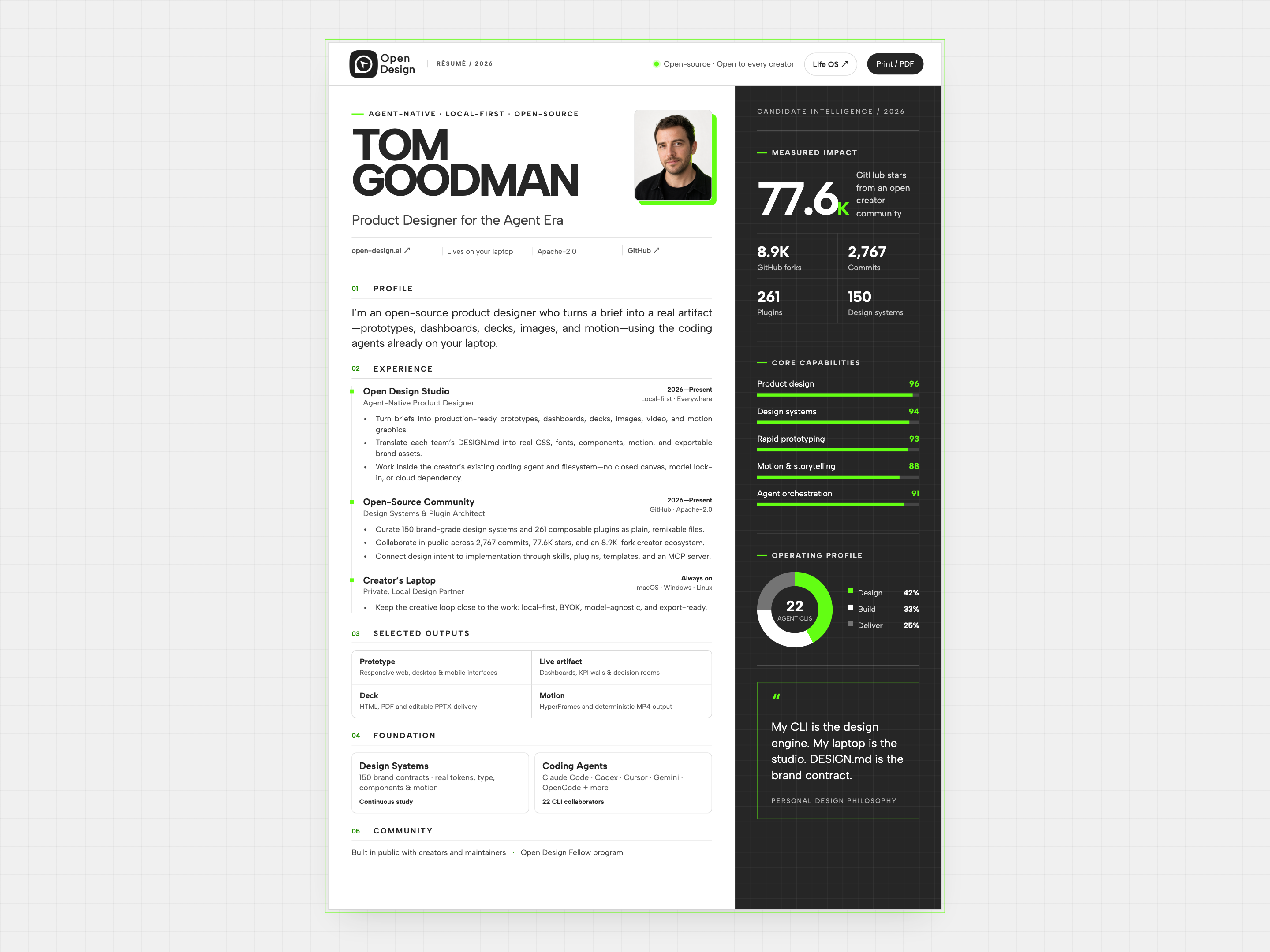
Resume Website Design
Tom Goodman’s fictional resume pairs experience with capability charts and selected outputs. Explore its two-column reading order, compact work cards, and separate print layout.
Website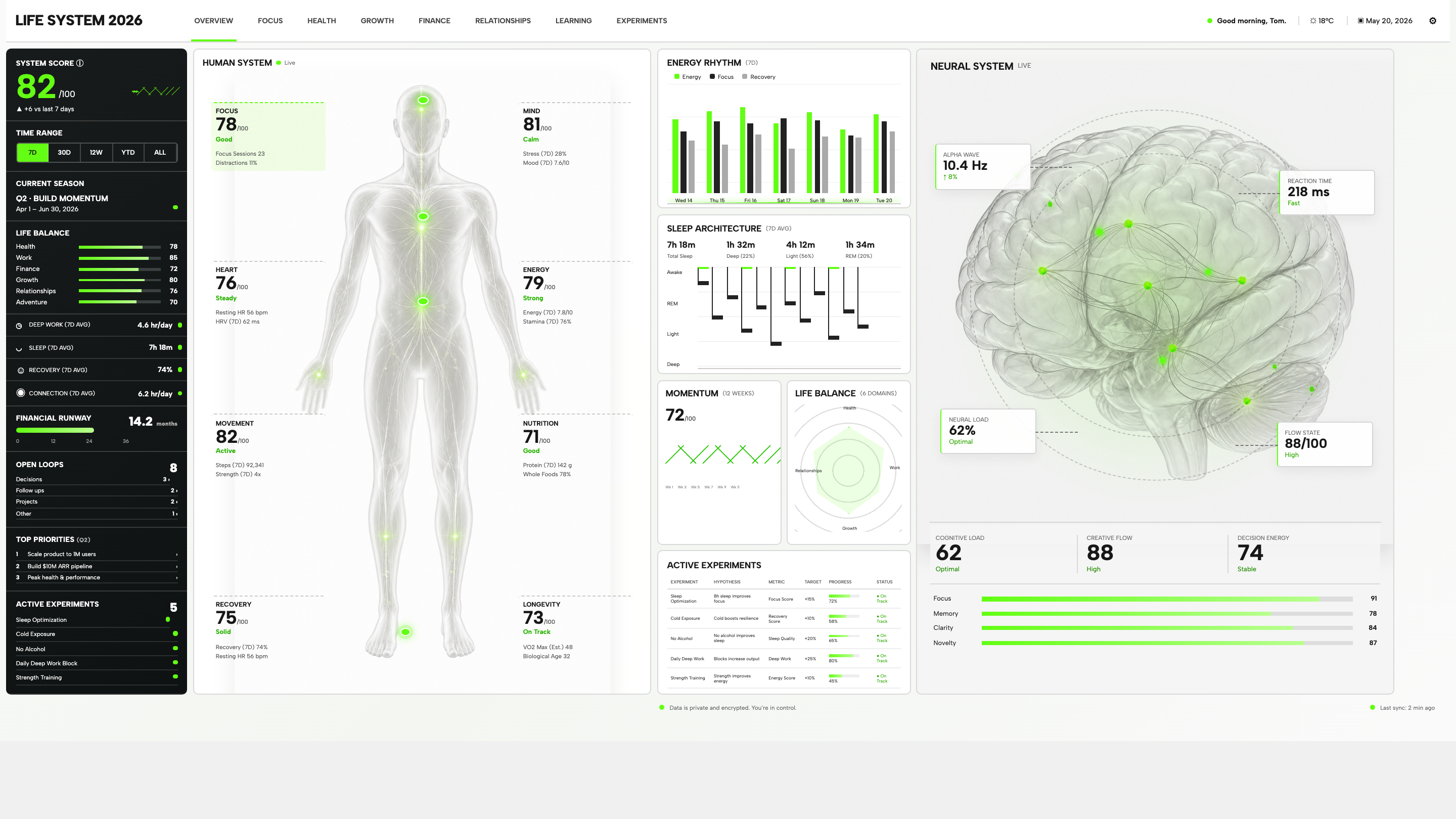
Personal Dashboard Design
Life System puts a weekly score, body-map metrics, daily rhythms, and five experiments on one desktop dashboard. Explore the layout in detail.
Desktop app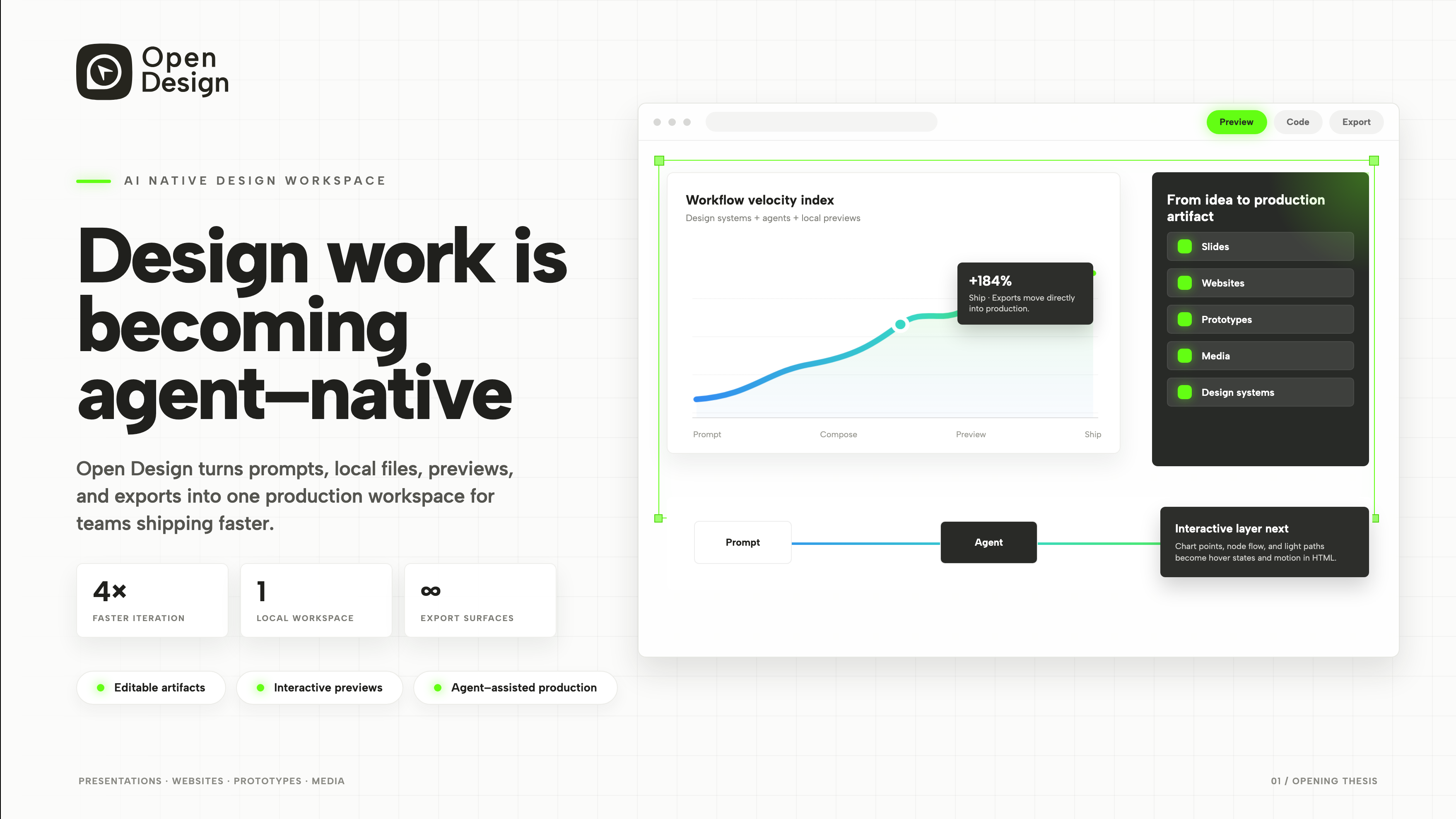
Product Presentation Design
An agent-native workspace pitch in 3 slides.
Slides