
Desktop app
Personal Dashboard Design
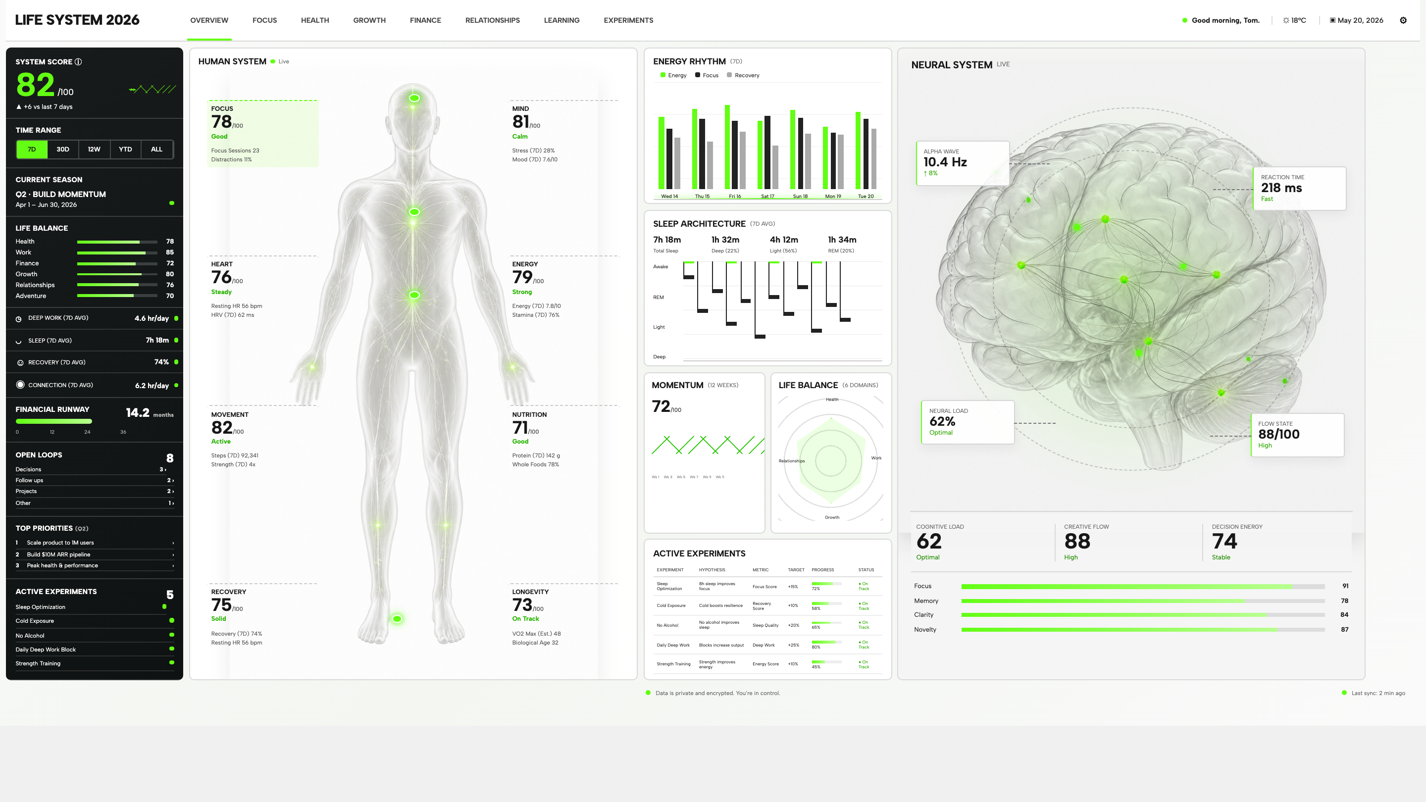
Life System puts a weekly score, body-map metrics, daily rhythms, and five experiments on one desktop dashboard. Explore the layout in detail.

Design Ideas for
- Personal Planning DashboardsA weekly summary beside open decisions and priorities.
- Habit and Activity TrackersDaily patterns paired with weekly averages.
- Experiment TrackersA hypothesis, target, and progress measure for each trial.
Dashboard Highlights
- One Summary, Four Levels of DetailA score, domain bars, weekly averages, and open loops share the dark rail.
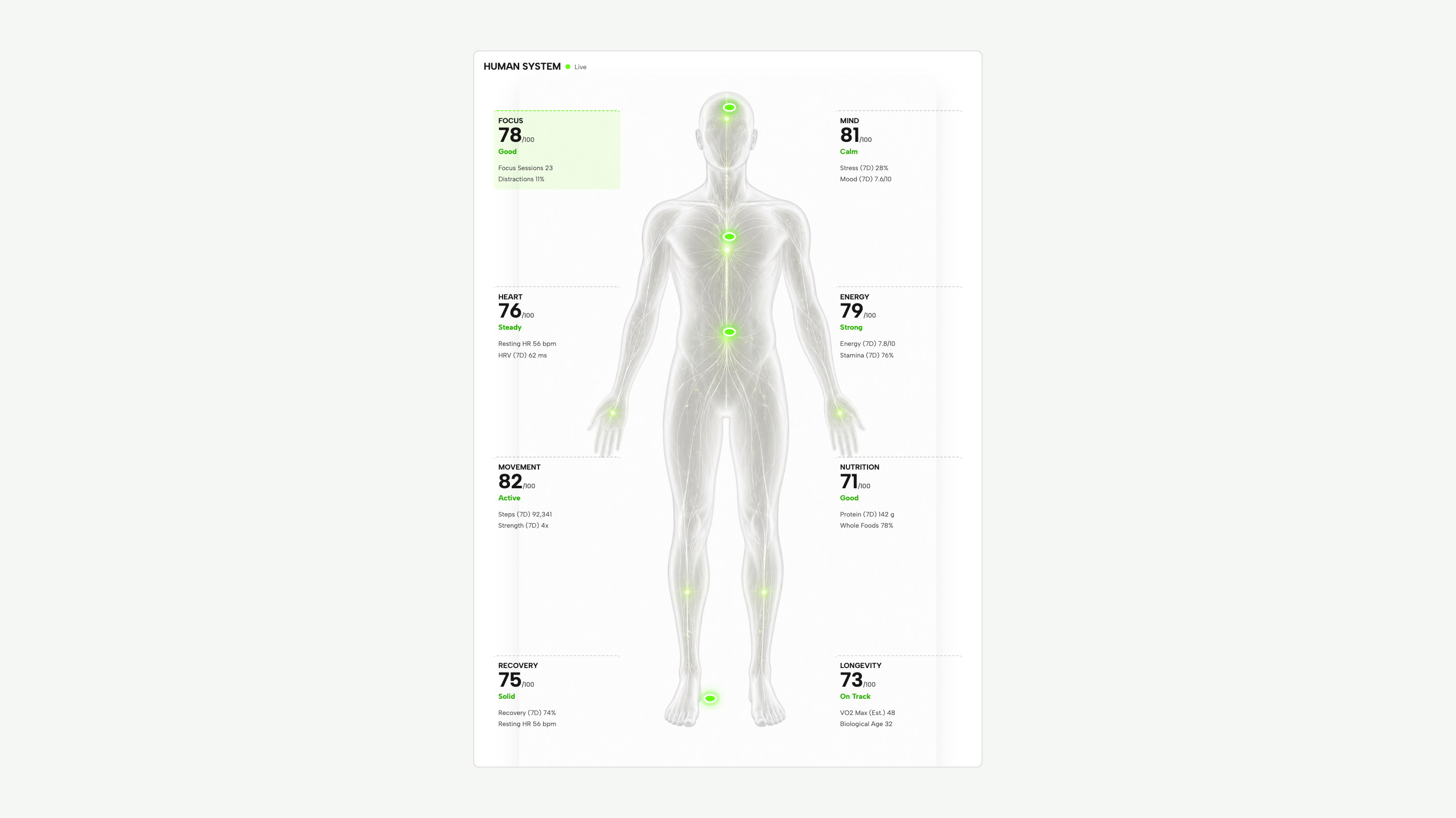
- Eight Metrics Around a Body MapFocus, movement, and recovery callouts sit beside a central figure.
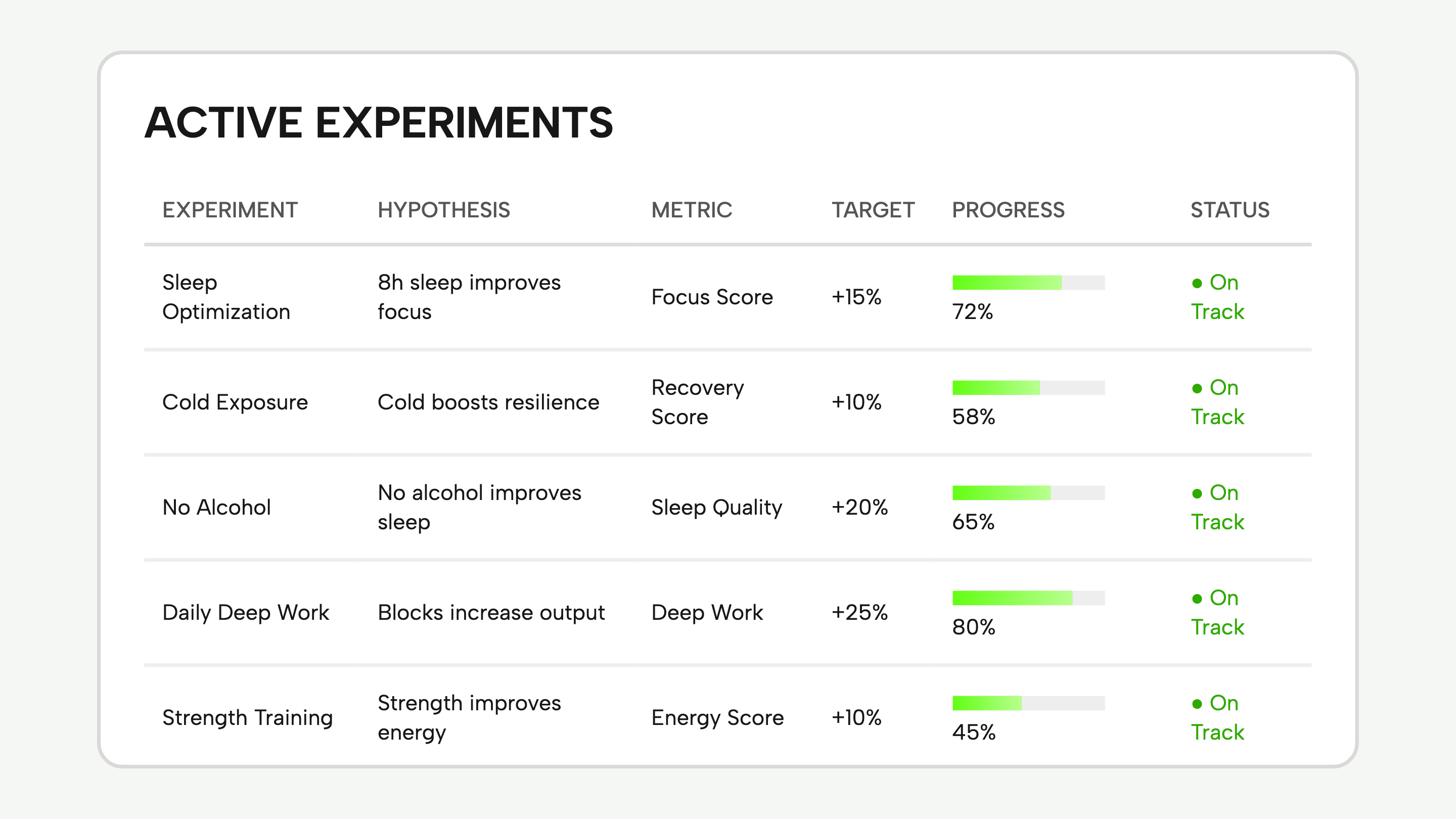
- Five Experiments, Six FieldsRows separate the hypothesis, metric, target, progress, and status.
Personal Dashboard Design Preview
1 / 4How This Personal Dashboard Is Organized
Life System is a desktop dashboard concept built around a single, dense workspace. Its narrow dark rail answers “What needs my attention?”; the larger white panels hold the readings behind that overview. Here is what each area actually contains.
| Area | What Is on Screen | What to Notice |
|---|---|---|
| Summary Rail | 82/100 System Score; six domain bars; four weekly averages; eight open loops. | The rail moves from an overall score to specific unfinished items. “Decisions 3” is more actionable than 82 alone. |
| Human System | Eight callouts for focus, mind, heart, energy, movement, nutrition, recovery, and longevity. | The labels sit around the figure, so the numbers remain readable without being drawn over the anatomy. |
| Daily Rhythms | Seven days of energy, focus, and recovery bars; a separate sleep-stage chart. | The grouped bars compare three series within each day. The sleep chart instead breaks one total into parts. |
| Experiments | Five trials with a hypothesis, metric, target, progress, and status. | The table makes the question and its intended measure visible together, instead of reducing each trial to a progress bar. |
Reading Scores in Context
The dashboard uses several kinds of numbers, but they do not all mean the same thing. A score needs a scale; a change needs a comparison period; a duration needs a unit. Life System provides some of that context and leaves other parts unresolved.
82/100 and +6 Answer Different Questions
The summary gives the current score and labels the change “vs last 7 days.” Keep that comparison beside the score when adapting this layout. The six domain bars do not document how 82 is calculated.
Hours and Scores Need Different Labels
The weekly averages show Deep Work as 4.6 hr/day, Sleep as 7h 18m, and Recovery as 74%. Retaining those units matters more than making all three numbers look identical.
An Experiment Tracker With Six Fields
Read the Deep Work row across the table: a named trial, “Blocks increase output,” the Deep Work metric, a +25% target, 80% progress, and On Track. The useful design choice is separating these fields. The weakness is that the last three can look like three versions of the same result.
| Displayed Value | What It Tells You | What Is Still Missing |
|---|---|---|
| +25% Target | The intended increase in Deep Work. | The starting value and measurement period. An increase of 25% needs a baseline. |
| 80% Progress | A progress value is shown for the trial. | Whether this means elapsed time, completed sessions, or movement toward the target. The prototype does not define it. |
| On Track | The row has a positive status label. | The rule behind that judgment. All five sample rows use this status, so the screen does not demonstrate an off-track state. |
Inspect the Dashboard in Three Passes
Use the four gallery views above to examine the same workspace at different scales. They are detail crops, not four separate application pages.
Trace the Summary to a Detail
Find Recovery in the summary rail: its seven-day average is 74%. Open Human System and locate Recovery again: the headline is 75/100, with the same 74% weekly reading underneath. The larger callout distinguishes a score from its supporting measure; the rail keeps only the compact reading.
Compare Two Ways of Showing Patterns
Return to the overview and find Energy Rhythm and Sleep Architecture. One groups energy, focus, and recovery by day; the other divides sleep into stages. If you reuse either chart, keep its grouping and labels—not just its green accent.
Read a Trial Before Its Progress Bar
Open Experiments and read the hypothesis first. Then find the metric and target that would test it. Finally inspect progress and status. This order reveals exactly which definitions the tracker still needs before real data can replace the samples.
What This Dashboard Design Demonstrates
Life System demonstrates a desktop information layout, not a connected personal-tracking service. The supplied code uses sample readings. Its time-range buttons change the selected state; they do not recalculate the scores or charts.
Layout Reference, Not Validated Measurements
The health and cognitive readings are illustrative interface content. No scoring formula, live data integration, or evidence for the experiment hypotheses is supplied. The privacy and sync labels on the screen are not verification of those capabilities.
An Official OpenDesign Example
This case was prepared as an official hackathon example, not a participant submission or an award winner. Study the layout and preview the original design; confirm reuse permissions before redistributing its assets.
How to Create a Personal Dashboard Design in OpenDesign
Describe the Workspace and Its Data
Start with the daily question your dashboard should answer. For a Life System-inspired design, ask for a summary rail, weekly patterns, and an experiment table. Specify sample data and readable units before requesting decorative illustrations.
Suggested PromptCreate a personal dashboard design for a weekly review. Use a narrow dark summary rail beside white detail panels. Include weekly deep-work hours, sleep duration, open decisions, a seven-day activity chart, and an experiment table with hypothesis, metric, baseline, target, completed sessions, and result. Use labelled sample data. Keep target attainment separate from trial completion. Do not imply that health sensors or live account integrations are connected.
Refine One Metric From Summary to Detail
Ask OpenDesign to carry one weekly reading from the rail into its detail panel without changing its unit or time period. If you add a separate score, label it separately. Keep illustrations secondary until the labels and comparison periods are readable.
Test the Table and Smaller Screens
Ask for one on-track experiment, one missed target, and one trial with no result yet. Check that status text explains each state and that progress counts sessions rather than implying success. On a narrow screen, turn the table into labelled rows and confirm the main controls remain usable.
Export and Get a Share Link
Export your finished design, then use Share in OpenDesign to get a share link. Open the link in a separate browser window and check that the intended version and its assets are available before sending it.
Careers Website Design
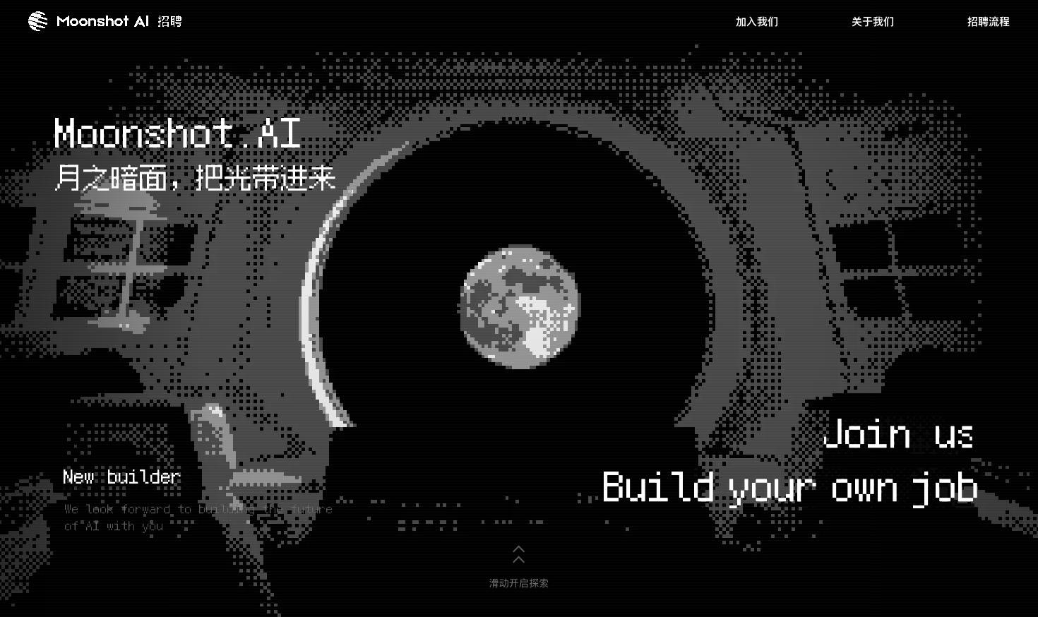
A Kimi careers study built from eight lunar scenes, with scroll-linked transitions and an illustrated application process.
Website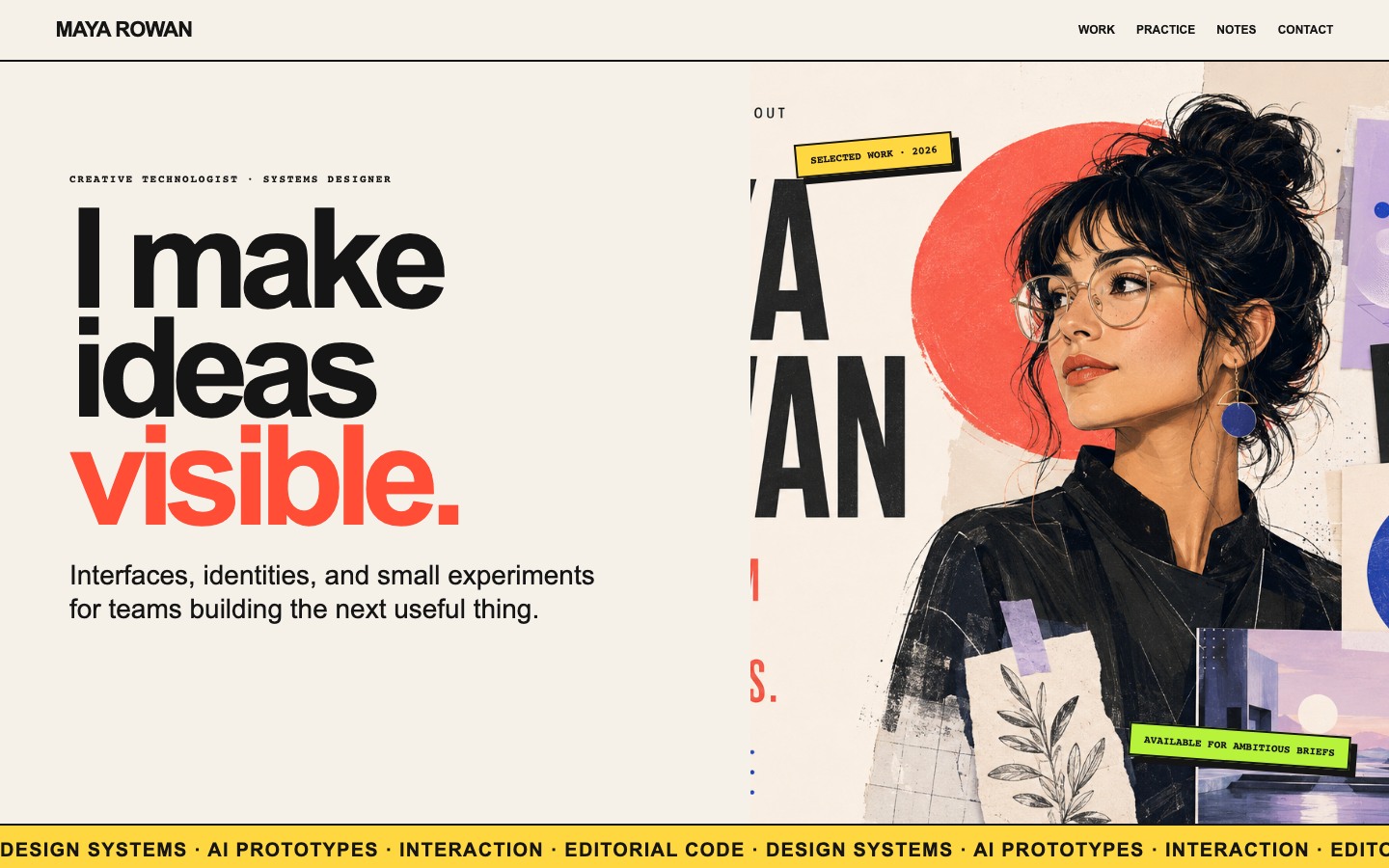
Creative Portfolio Website Design
Maya Rowan’s fictional portfolio connects project cards, practice, and notes.
Website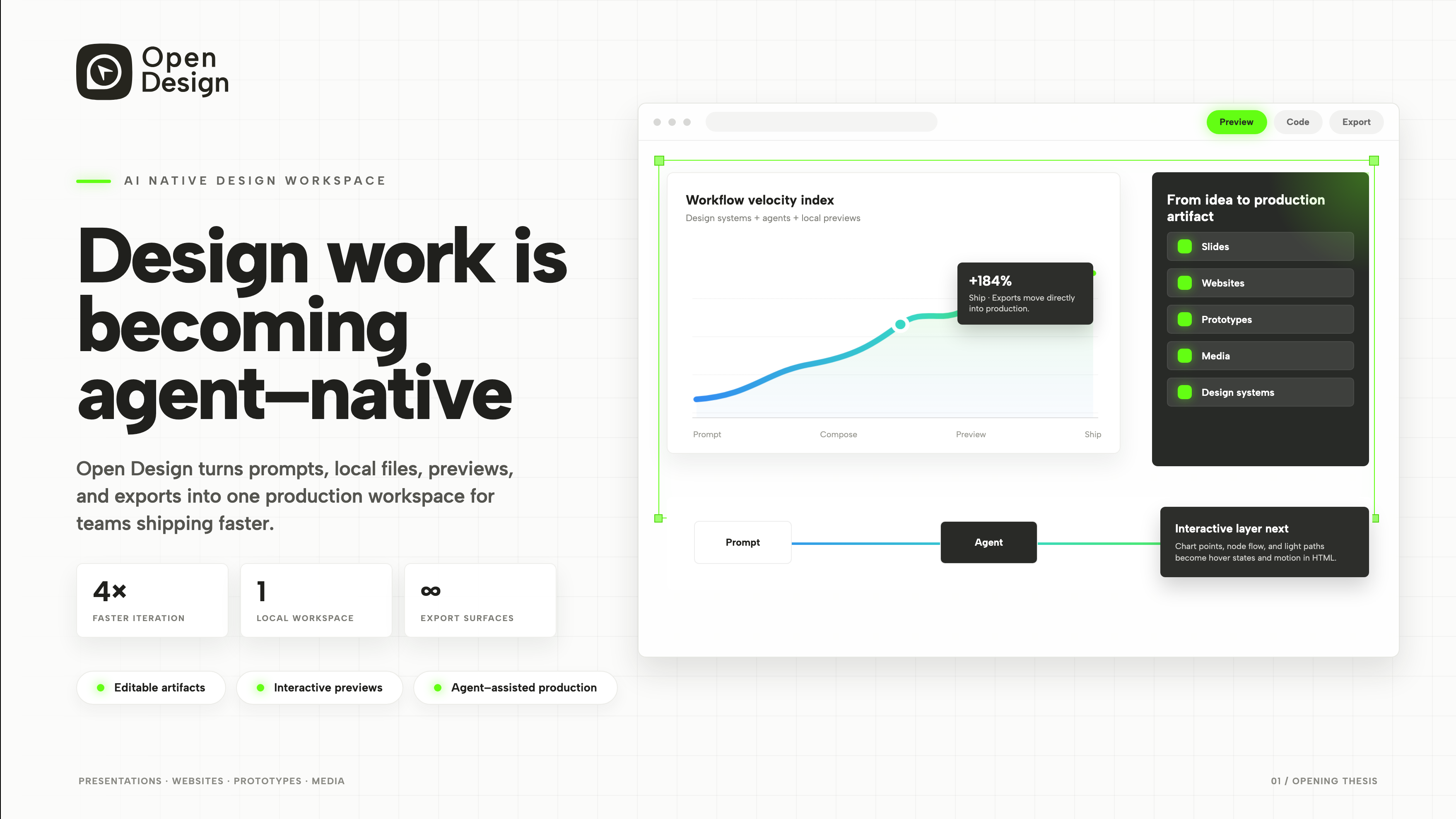
Product Presentation Design
An agent-native workspace pitch in 3 slides.
Slides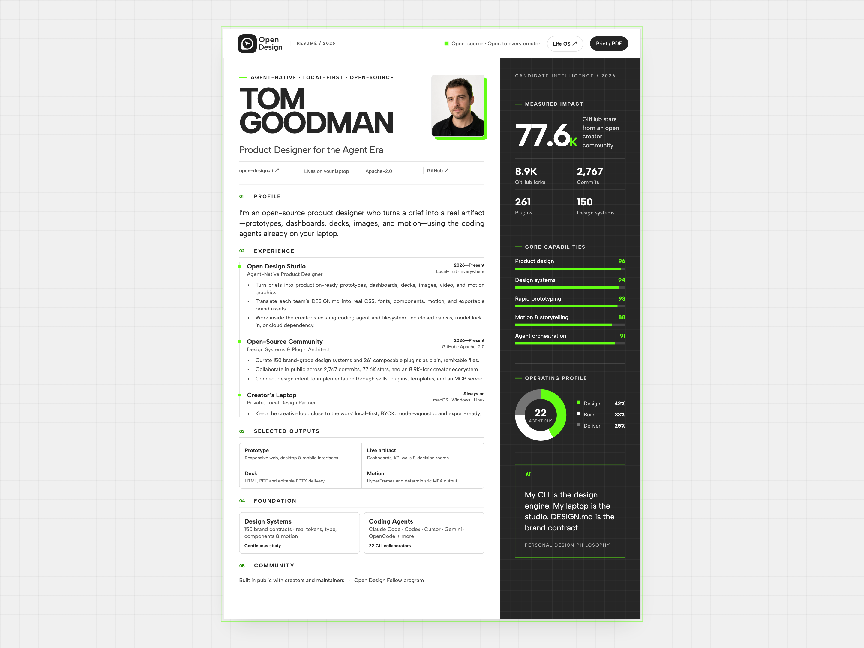
Resume Website Design
Tom Goodman’s fictional resume pairs experience with capability charts and selected outputs. Explore its two-column reading order, compact work cards, and separate print layout.
Website