
Website
Resume Website Design
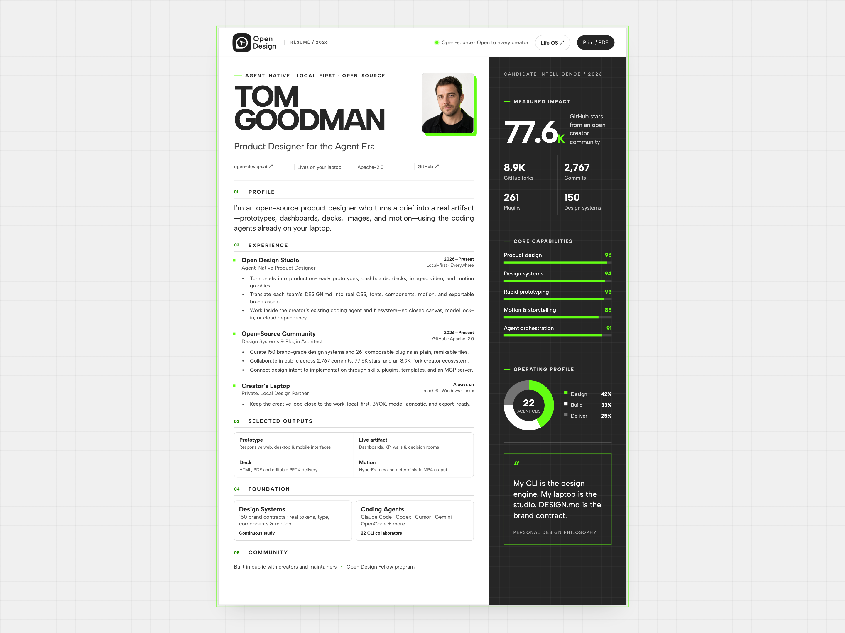
Tom Goodman’s fictional resume pairs experience with capability charts and selected outputs. Explore its two-column reading order, compact work cards, and separate print layout.

Design Ideas for
- Designer Resume WebsitesPut experience and selected work on one readable page.
- Professional Profile PagesSupport a short introduction with specific evidence.
- Web and Print ResumesConsider browser reading and paper output together.
Resume Highlights
- Two Parallel Reading PathsExperience runs beside a compact candidate overview.
- Five Numbered SectionsProfile, experience, outputs, foundation, and community form the main column.
- A Print Entry PointThe original page includes a Print / PDF control.
Resume Website Design Preview
1 / 4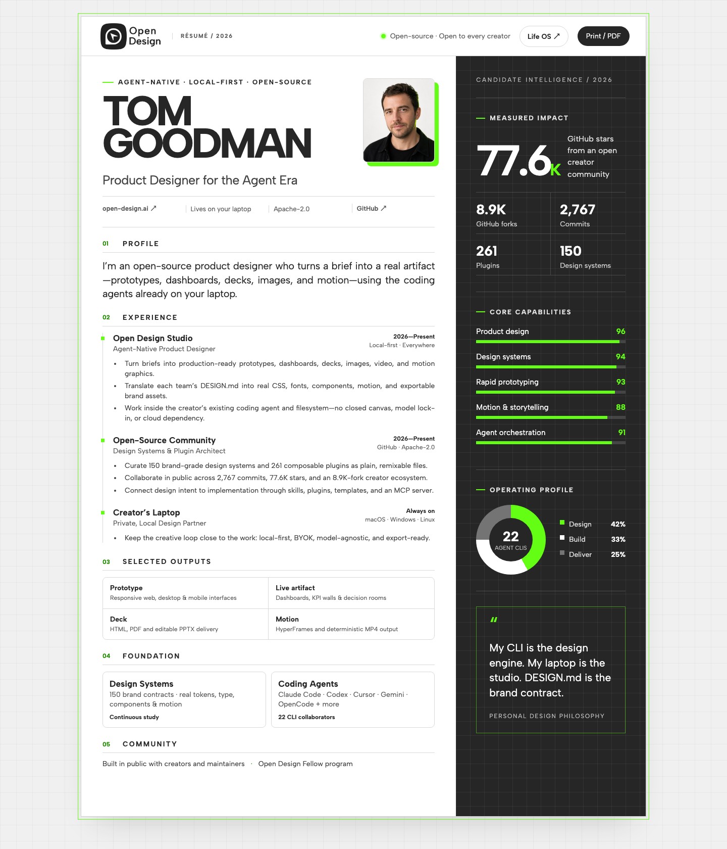
Two Reading Paths in One Resume Website
Tom Goodman’s resume website treats a professional profile as two linked documents: a conventional account of work on the left and a candidate dashboard on the right. Five numbered sections organize the main column. The dark sidebar uses bars, counts, and a work-allocation chart instead of more employment prose.
The contrast changes how the resume can be scanned. Role names and dates provide chronology; the sidebar provides a quick, quantitative-looking overview. The useful question is not whether a dashboard looks more impressive than a resume. It is whether each display communicates something that the adjoining text does not.
| Area | What It Contains | How to Adapt It |
|---|---|---|
| Profile and Experience | An introduction followed by roles with dates and locations. | Keep role, organization, and period easy to compare before expanding the description. |
| Selected Outputs | Prototype, Live Artifact, Deck, and Motion categories. | Link an output category to an actual work sample rather than relying on the category alone. |
| Candidate Overview | Impact counts, capability bars, and an operating-profile chart. | Use this area for evidence that can be explained briefly and traced to a source. |
What Five Capability Bars Actually Communicate
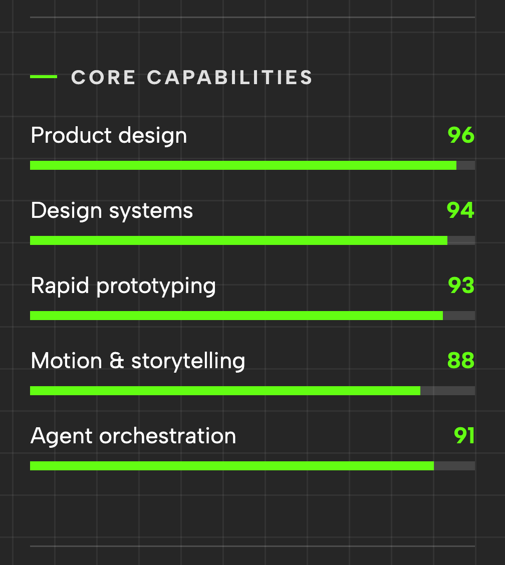
The capability panel contains five labelled bars, with scores ranging from 88 to 96. The labels sit on the left, the values on the right, and the filled bars run below them. Bright green links each value to its fill, while the dark grid supplies a common background.
The Values Cluster Within Eight Points
Product Design is 96, Design Systems 94, Rapid Prototyping 93, Motion & Storytelling 88, and Agent Orchestration 91. On a 100-point bar, even the shortest is nearly full. The visual result emphasizes breadth and consistently high ratings; it does little to show a meaningful difference between the skills.
Ordering and Length Tell Different Stories
The bars are not sorted by score: Agent Orchestration at 91 follows Motion & Storytelling at 88. The order is therefore a list of capabilities, not a ranking. If a reader needs to compare strengths, choose an explicit ordering and explain what the values measure.
A Four-Cell Output Grid Beneath Experience
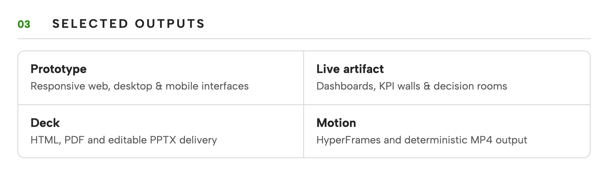
Selected Outputs compresses four artifact categories into a bordered two-by-two grid. Each cell uses a short bold category followed by a smaller description. This is a compact index of deliverables, not a gallery of individual projects: none of the four labels identifies a particular commissioned case.
| Cell | What the Description Names | What a Real Work Sample Would Add |
|---|---|---|
| Prototype | Responsive web, desktop, and mobile interfaces. | The specific task, screen, and personal contribution. |
| Live Artifact | Dashboards, KPI walls, and decision rooms. | Which decision the interface supports and a link to inspect it. |
| Deck | HTML, PDF, and editable PPTX delivery. | The presentation topic and the format actually available. |
| Motion | HyperFrames and deterministic MP4 output. | A playable example and the part of the production you handled. |
Reading the Resume on Screen and on Paper
This official OpenDesign hackathon example includes a distinct print treatment rather than only a Print button. The source switches several dimensions to millimeters, reduces the portrait to 27 × 32mm, hides the action controls, and removes the selection handles. Those changes show that the print view is intended to be a separate composition.
Mobile Changes the Reading Order
Below 880px, the resume becomes one main column and the candidate panel moves into the document flow. At smaller widths the sidebar also collapses to a single column. The professional narrative therefore comes before the quantitative overview, instead of squeezing both into narrow parallel strips.
A Print Button Is Only the Start
The original control invokes browser printing. Print-specific spacing can help, but a long role description may still move a heading or grid across a page boundary. Test with your real text and chosen paper size; do not assume that the fictional sample proves the finished resume fits one page.
What to Check Before Using This Resume Layout
Tom Goodman is a fictional profile, and the employment details, community counts, and skill ratings are sample content. The page demonstrates a resume layout and a print entry point, not verified personal achievements. Its useful pattern is separating chronology, deliverables, and supporting evidence; the credibility of a real version depends on replacing all three with accurate information.
How to Create a Resume Website Design in OpenDesign
Supply Real Experience Before Styling
Give OpenDesign your roles, dates, contributions, and work links. If you are exploring the layout before supplying that information, request explicit placeholders rather than an invented career.
Suggested PromptCreate a resume website design with a main column for profile, experience, selected work, skills, and community contributions. Add a compact dark sidebar for contact details and sourced highlights. Use a strong name heading and restrained green accents. Keep role, organization, and dates together. Use clearly marked placeholders for missing facts; do not invent employers, metrics, or skill percentages. Include a browser print action and print-friendly styles.
Link Roles to Work Samples
Ask for a selected-work entry that explains your contribution and points to a real artifact. Read the page once without the sidebar: the main column should still explain what you do and what you have made.
Check Narrow Screens and Print Preview
Confirm the sidebar follows the introduction in a sensible reading order on mobile. Open print preview and inspect page breaks, background contrast, and any links that become unclear on paper. Adjust the layout before treating the printed version as ready to send.
Export and Get a Share Link
Export your finished design, then use Share in OpenDesign to get a share link. Open the link in a separate browser window and check that the intended version and its assets are available before sending it.
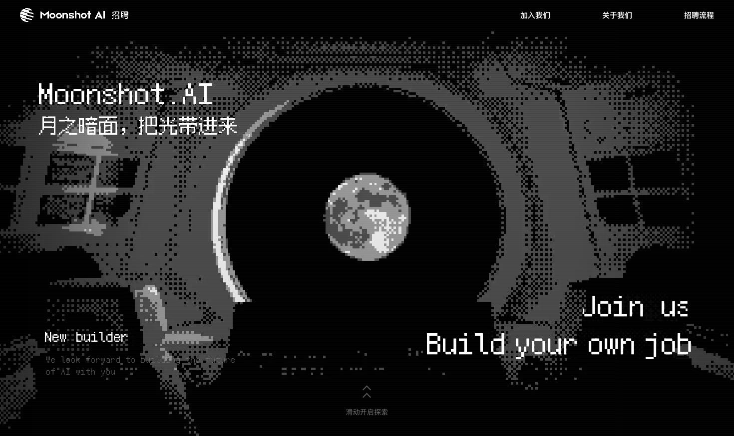
Careers Website Design
A Kimi careers study built from eight lunar scenes, with scroll-linked transitions and an illustrated application process.
Website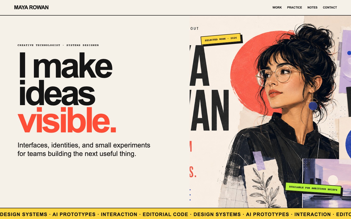
Creative Portfolio Website Design
Maya Rowan’s fictional portfolio connects project cards, practice, and notes.
Website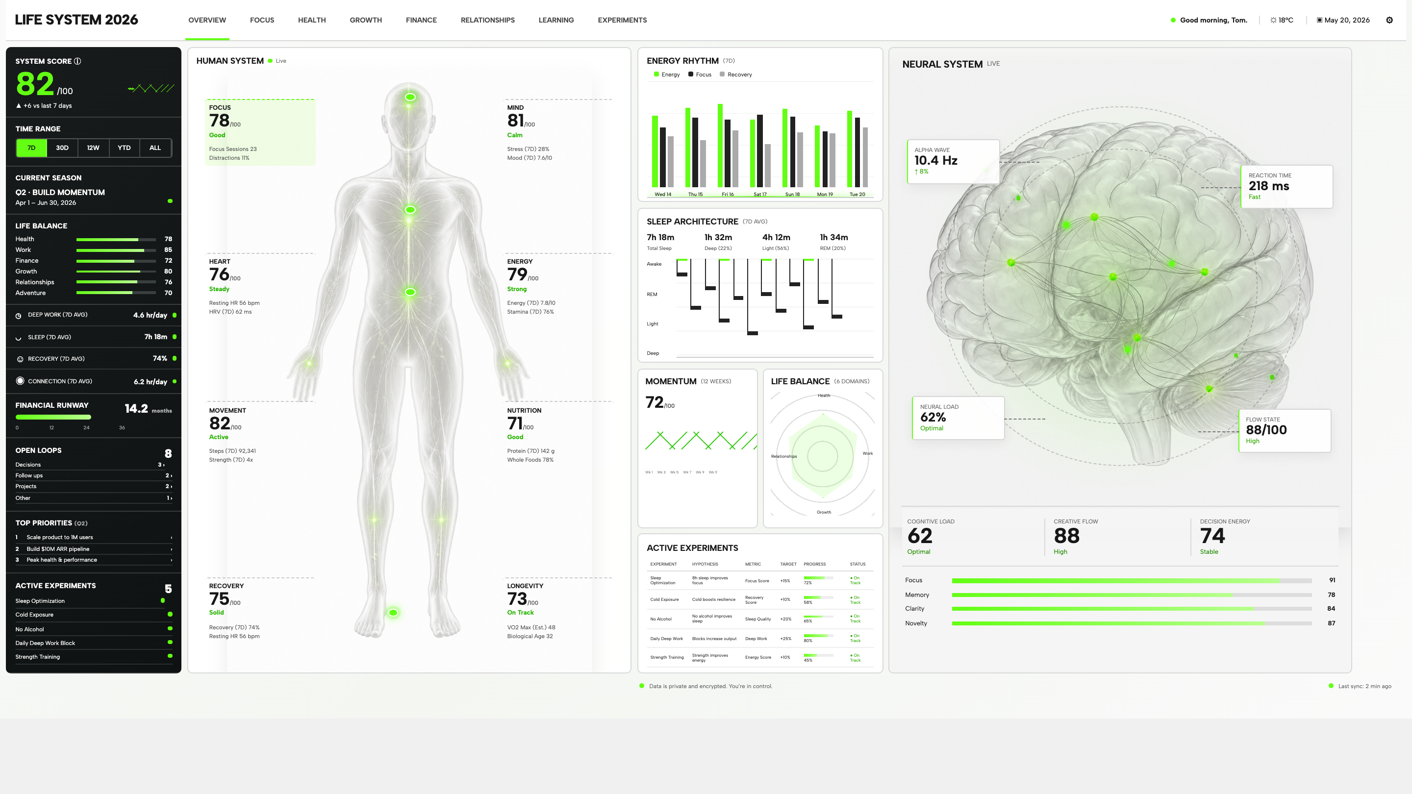
Personal Dashboard Design
Life System puts a weekly score, body-map metrics, daily rhythms, and five experiments on one desktop dashboard. Explore the layout in detail.
Desktop app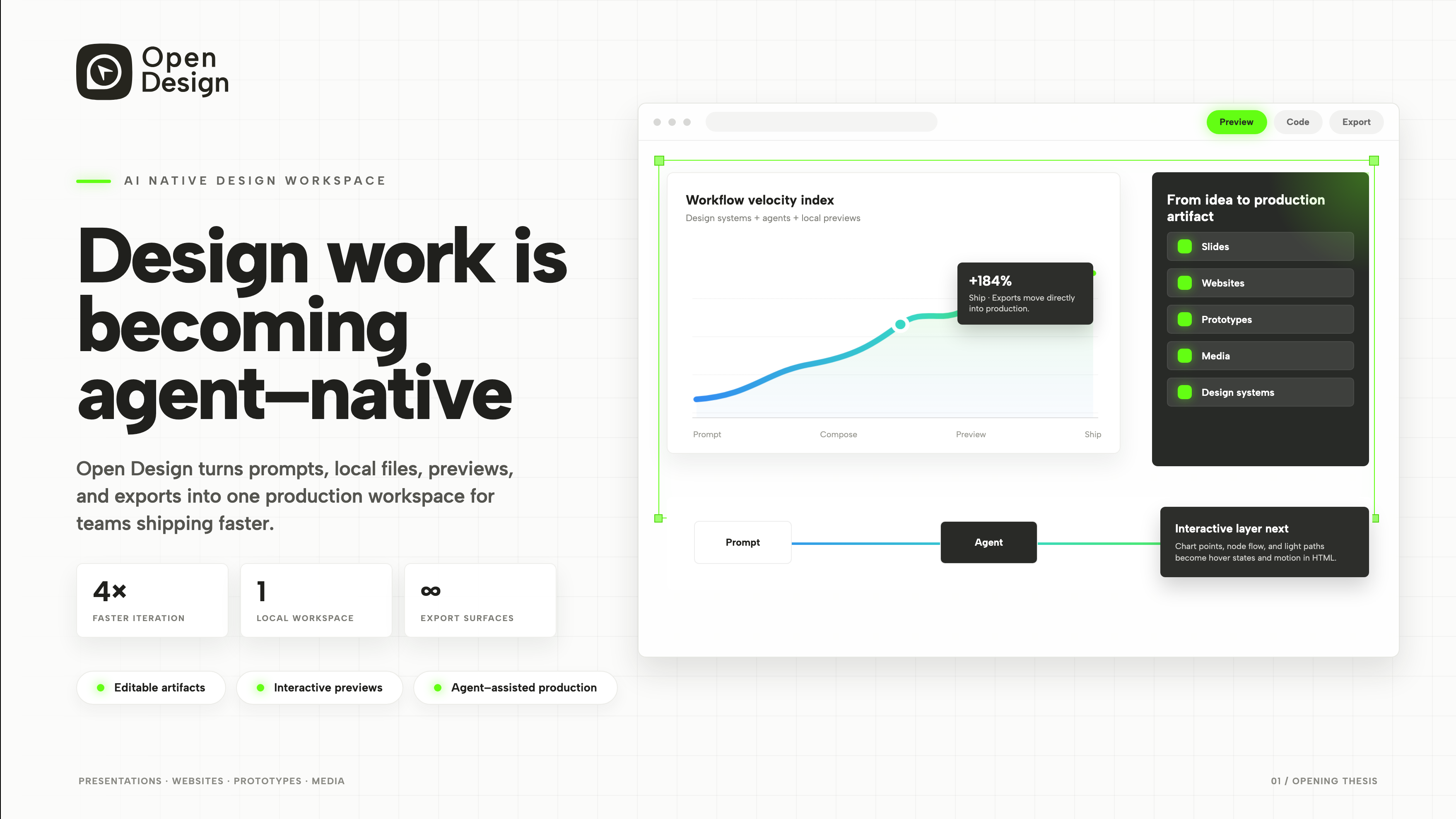
Product Presentation Design
An agent-native workspace pitch in 3 slides.
Slides