

Slides
Fundraising Memo Presentation Design
Quartz's ten-slide fundraising memo pairs quiet serif typography with product principles, sample traction, and a funding request for a small investor audience.

Fundraising Memo Use Cases
- Series A FundraisingPresent a focused funding case to a small investor audience.
- Product Thesis DecksExplain product principles through a deliberate slide-by-slide argument.
- Editorial Presentation DesignBuild investor materials with restrained typography and structured reading order.
- Technical Writing ProductsPosition documentation tools around writers, review, and publishing.
Editorial Deck Highlights
- Quiet Editorial TypographyInstrument Serif and Inter Tight create a restrained reading voice.
- Ten-Slide NarrativeThe sequence moves from thesis through evidence to funding request.
- Product PositioningContrasting Quartz is not with Quartz is clarifies the category.
- Structured EvidenceTraction, customers, ARR, team, and ask receive dedicated slides.
Quartz Series A Slides
1 / 10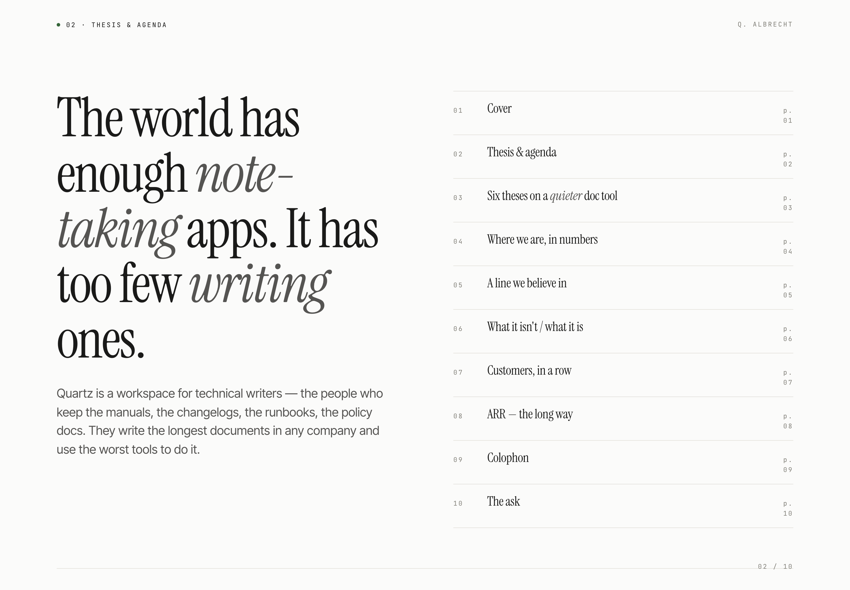
Quartz Series A Memo
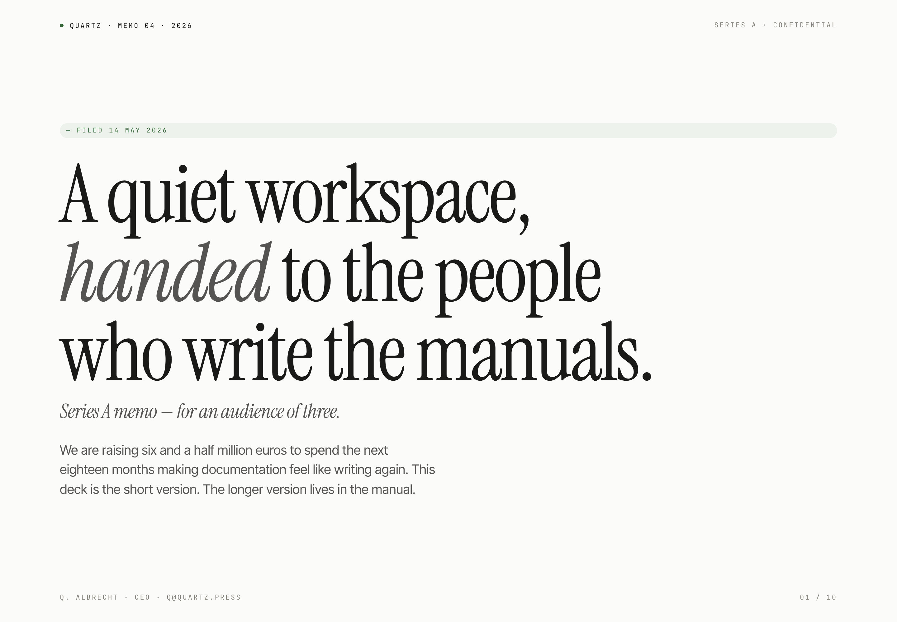
This ten-slide presentation frames Quartz as a writing workspace for technical writers. Its opening metadata reads “QUARTZ · MEMO 04 · 2026 SERIES A · CONFIDENTIAL,” followed by “Series A memo — for an audience of three.” That pairing establishes both the document’s private memo format and its deliberately narrow audience before the product argument begins.
The cover uses a large editorial headline, “A quiet workspace, handed to the people who write the manuals,” with a short funding premise beneath it. The oversized type creates a strong opening pause and makes the memo feel closer to a written publication than a conventional pitch deck. The tradeoff is that the first slide prioritizes tone and positioning over immediate numeric proof.
OpenDesign distributes this bundled design example. Its source documentation attributes design guidance to Taste Skill by Leonxlnx; that upstream attribution is part of the artifact record. Names, figures, product claims, and document contents shown in the memo are illustrative unless separately verified.
Audience And Presentation Tasks
The deck is suited to a founder or product team presenting a funding case that depends on a distinct product philosophy. Slide two names the audience more precisely: technical writers who maintain manuals, changelogs, runbooks, and policy documents. That concrete list gives the product thesis a working context instead of leaving “writing” as an abstract category.
Its agenda then previews the journey from “Six theses on a quieter doc tool” to “Where we are, in numbers,” “Customers, in a row,” “ARR — the long way,” and “The ask.” This ordering lets a reader encounter the product claim before the commercial evidence. It also creates a deliberate dependency: the later figures are presented as support for the stated thesis, not as an isolated dashboard.
Product Thesis
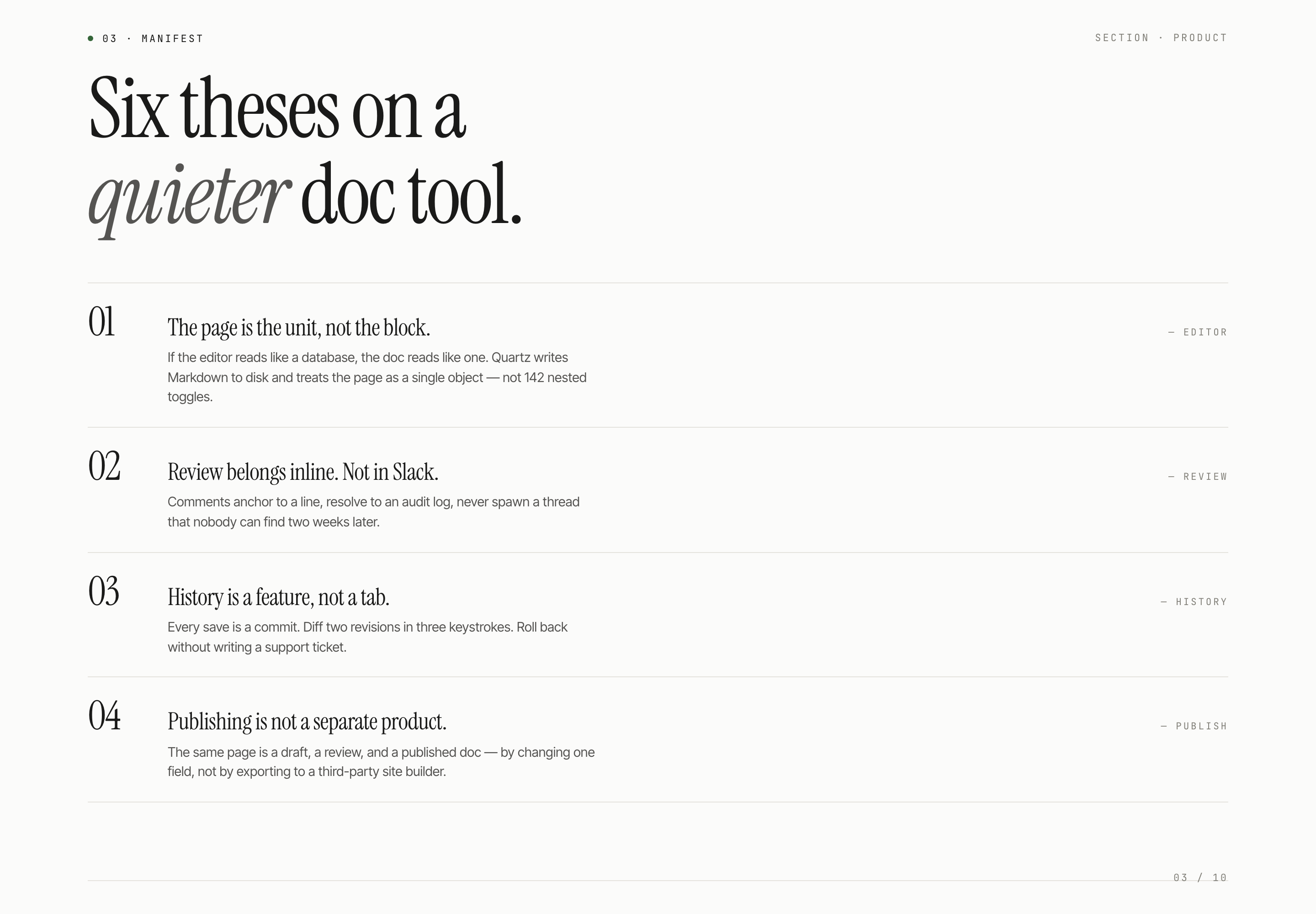
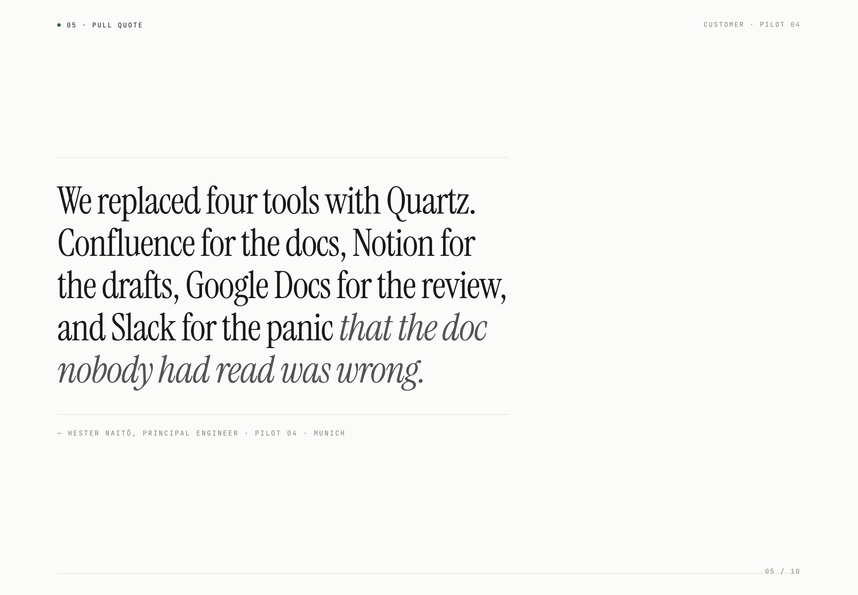
Slide three organizes the argument into labeled principles such as “The page is the unit, not the block” and “Review belongs inline. Not in Slack.” Each principle connects a product stance to a writing task, but the compact format leaves implementation detail outside the deck.
Commercial Evidence
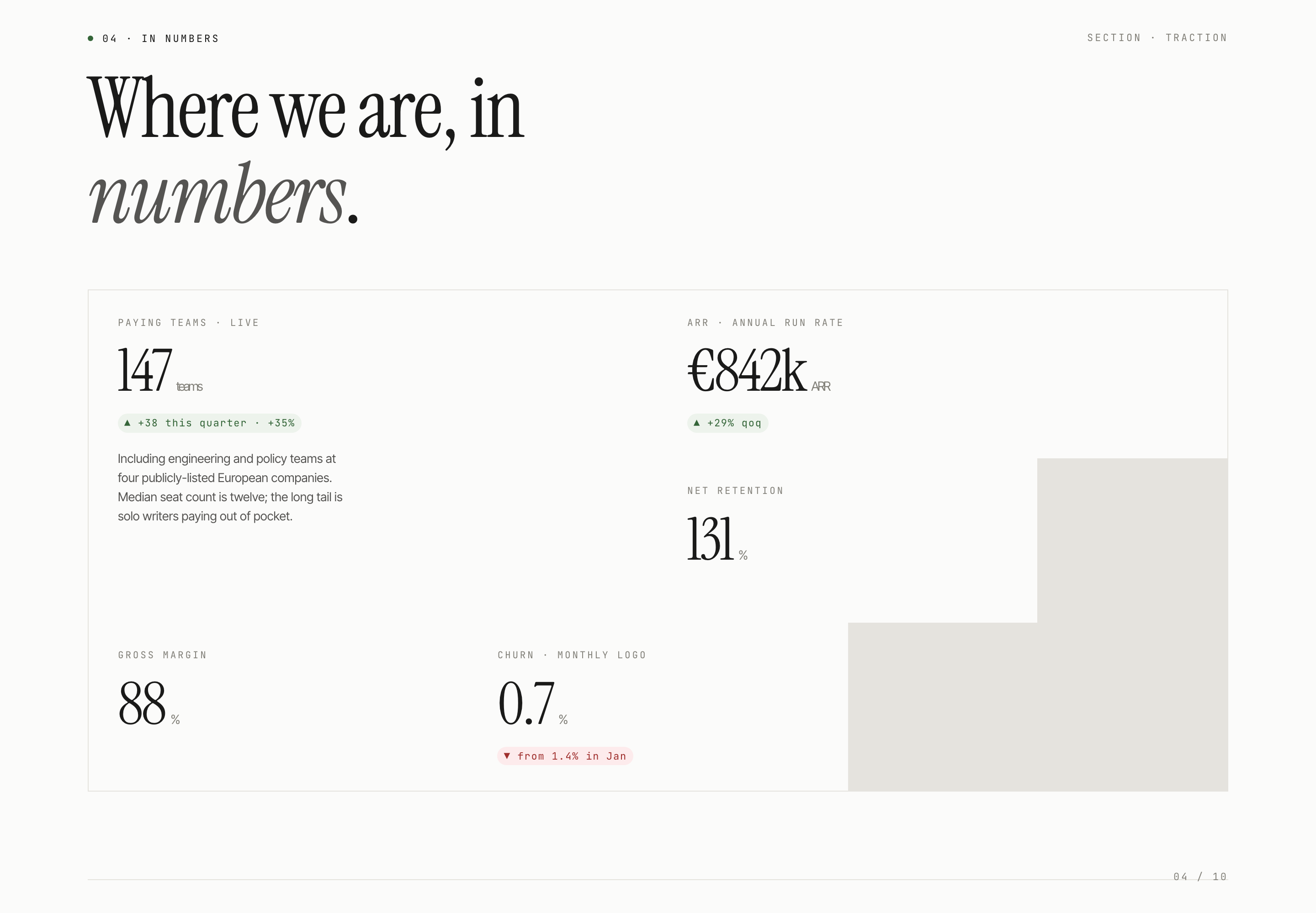
The traction slide groups paying teams, ARR, net retention, gross margin, and churn under “Where we are, in numbers.” The grouping supports fast scanning, while the memo itself does not independently verify those figures.
Funding Ask
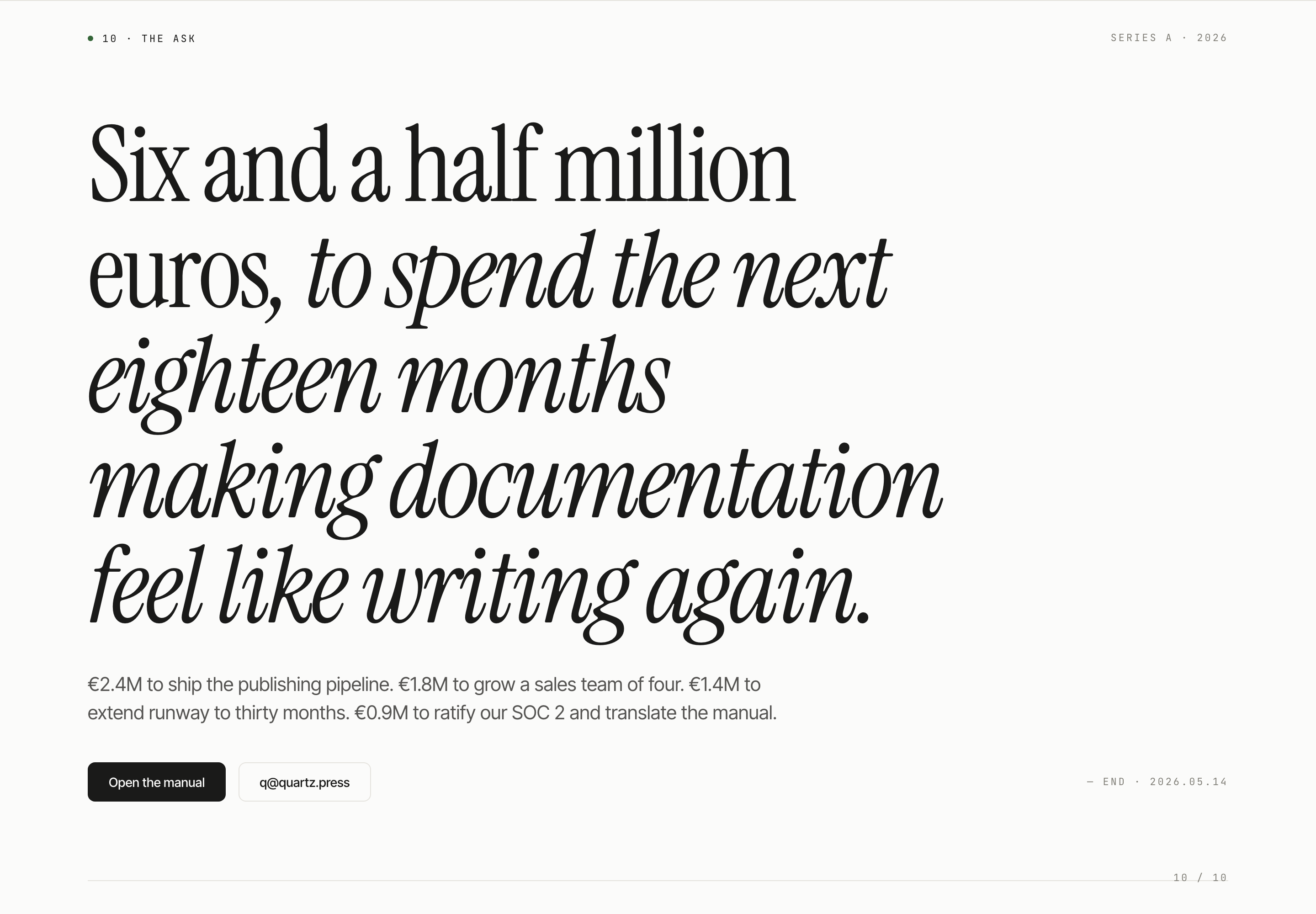
The final slide states a six-and-a-half-million-euro request and allocates it across publishing, sales, runway, SOC 2, and translation. The allocation gives the ask a use-of-funds structure rather than presenting one unexplained total.
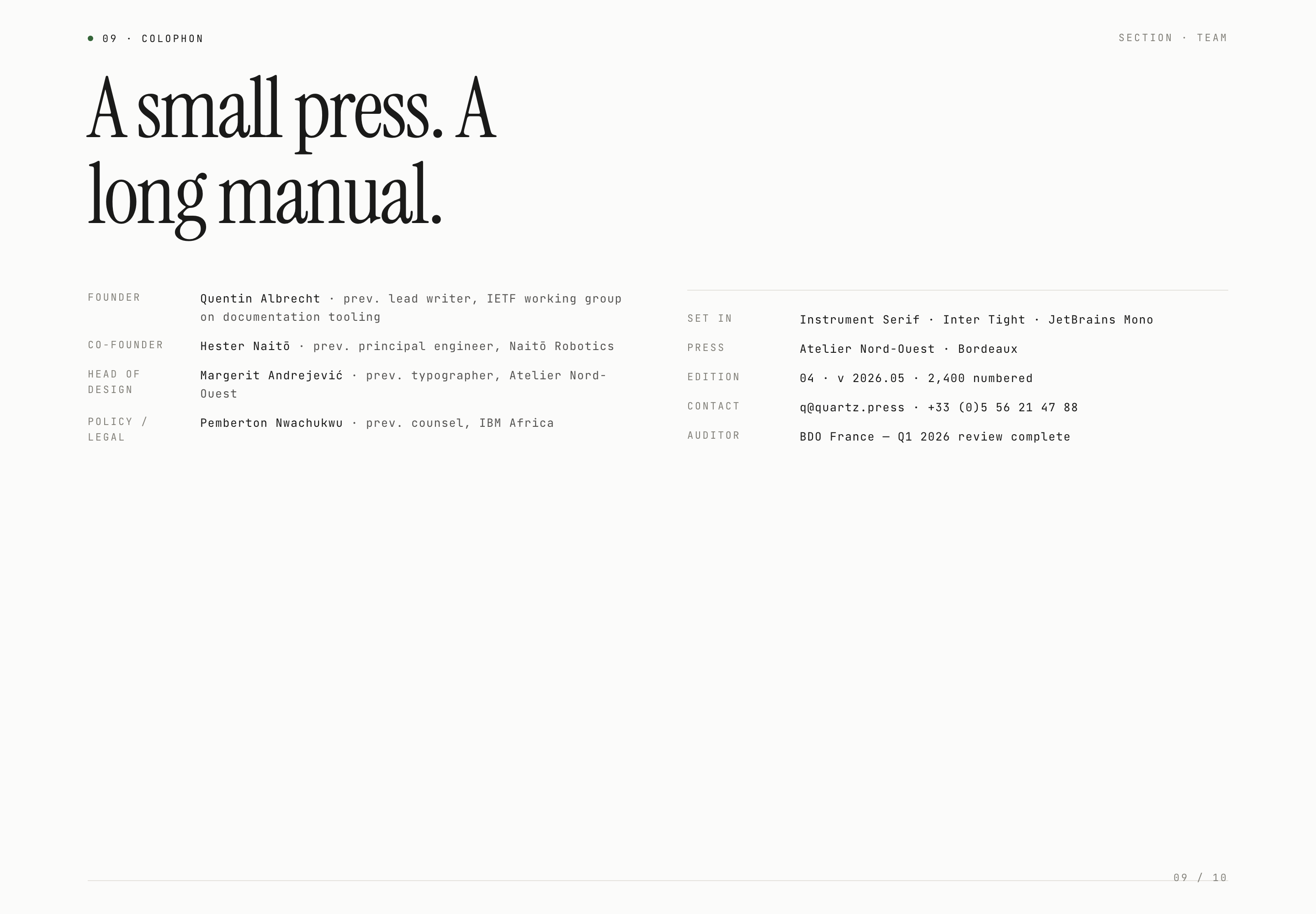
From Product Manifest To Funding Ask
The narrative moves from a category contrast to a more operational product account. Slide two contrasts note-taking with writing and identifies technical writers as the audience. Slide three then shows four visible principles: page-level structure, inline review, revision history, and publishing in the same page model. Its heading and agenda promise “Six theses,” but the source contains only those four numbered items. An adaptation should reconcile that mismatch instead of implying two additional principles are present.
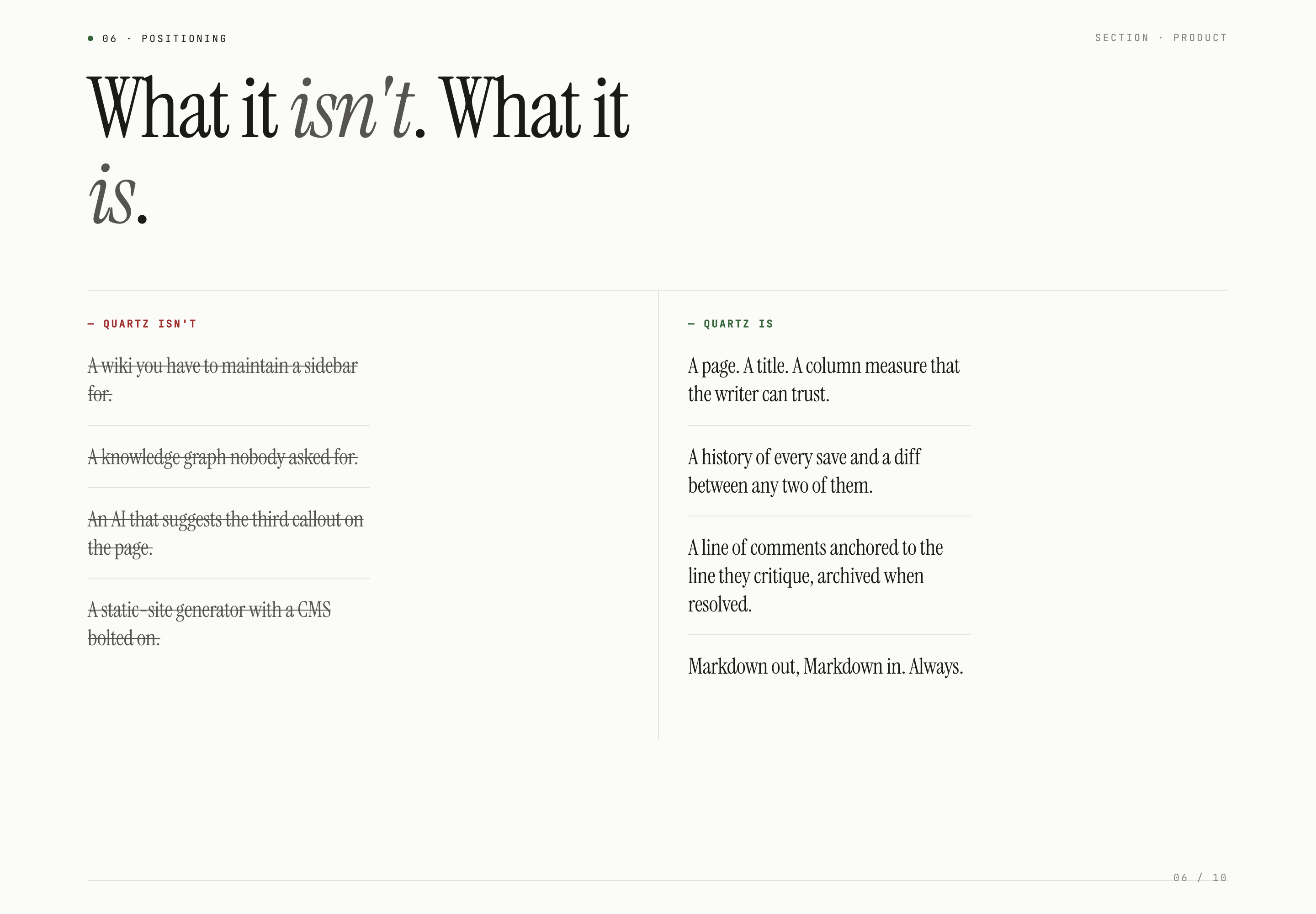
The product-positioning slide makes the contrast visual by splitting “QUARTZ ISN'T” from “QUARTZ IS.” The rejected side includes a sidebar-dependent wiki, an unwanted knowledge graph, an AI that suggests a callout, and a static-site generator with a CMS attached. The affirmative side answers with a page, a trusted column measure, revision diffs, line-anchored comments, and Markdown in and out. The two-column structure makes the category boundary easy to compare, but it also compresses nuanced product behavior into declarative copy.
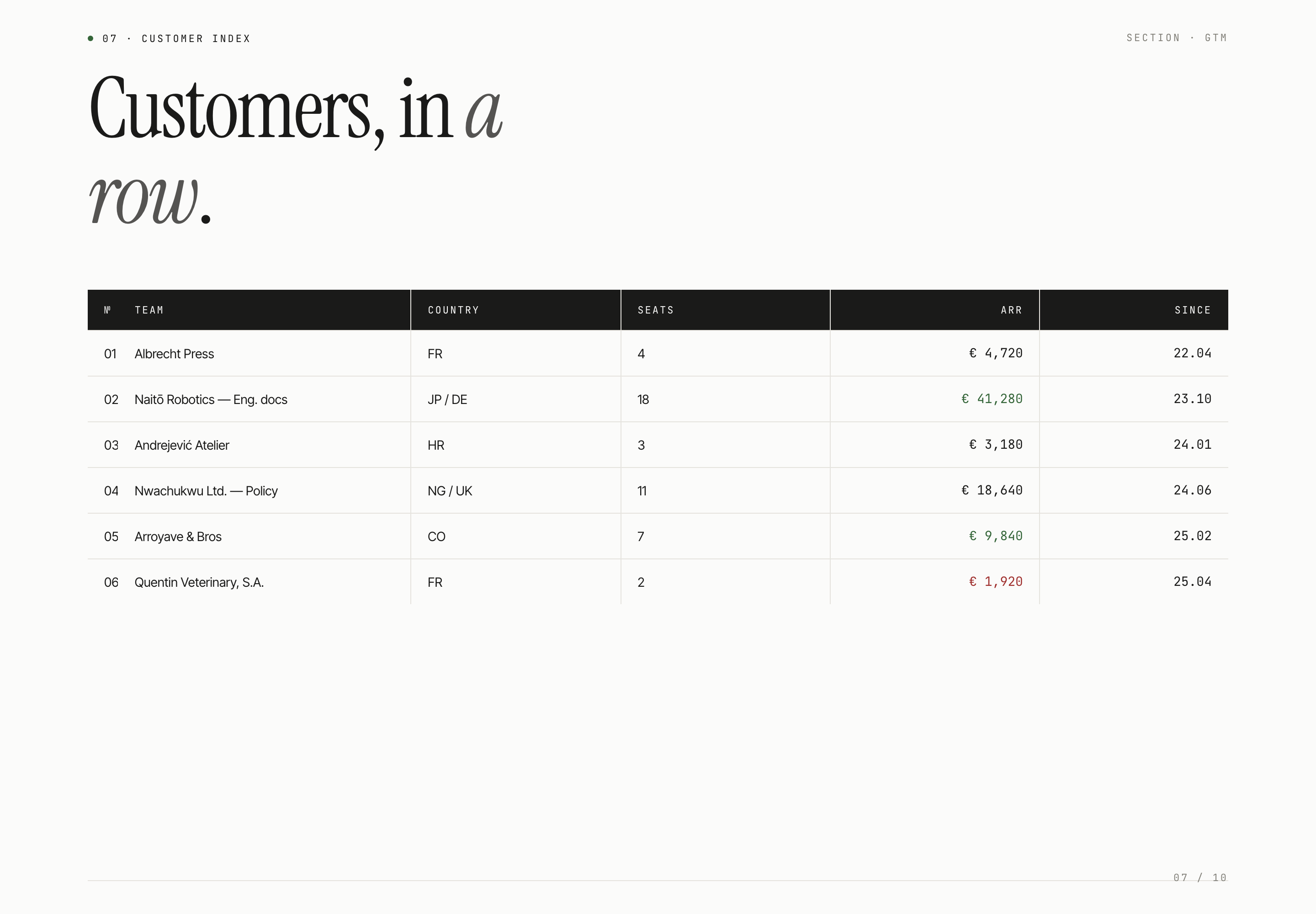
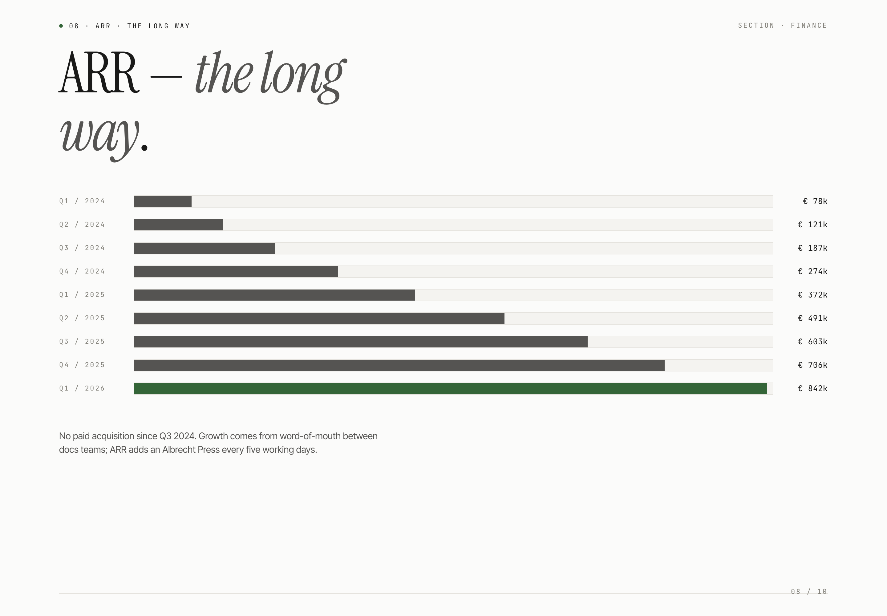
The commercial sequence changes the reading mode. “Customers, in a row” uses a table with team, country, seats, ARR, and since fields, while “ARR — the long way” lists quarterly values from Q1 2024 through Q1 2026. The table supports account-level scanning; the timeline supports trend reading. They answer different questions, so combining them into one chart would reduce the distinction between customer composition and revenue history.
Thesis Before Proof
The deck presents the writing problem and product principles before showing traction, so the audience has a lens for interpreting the later numbers.
Account-Level Context
The customer index places team, geography, seats, ARR, and start date in one row, allowing commercial examples to be read as structured records.
Longitudinal Growth
The ARR slide uses one value per quarter, making the time sequence visible without adding a second axis or a denser analytical chart.
Visible Design And Capability Boundaries
This is a ten-section HTML presentation read by vertical scrolling, not a working Quartz application. Its source has no slide-pagination script or click handlers. The closing “Open the manual” and “[email protected]” controls are buttons without implemented actions. Typography, metric grids, tables, and quarterly bars demonstrate composition; they do not establish a live product, document workflow, contact submission, or connected backend.
The deck’s 147 paying teams, €842k ARR, 131% net retention, and €6.5M funding request are sample business content. The customer quote, named team members, affiliations, and auditor statement are likewise illustrative, not verified testimonials or endorsements. OpenDesign distributes the example with design guidance credited to Taste Skill by Leonxlnx; the plugin manifest’s MIT declaration does not establish separate licensing for every depicted asset.
Separate Claims From Layout
Retain the visual roles of the traction, customer, ARR, and ask slides while replacing illustrative claims with verified evidence or clearly labeled examples.
Preserve The Reading Contract
Keep the sequence from product thesis to positioning, commercial context, team, and funding request when the audience needs to understand why the numbers matter.
Check Text At Presentation Size
Review long headings, table rows, and allocation copy at the intended slide size; the design depends on generous whitespace, but long content can change its balance.
How to Create Fundraising Memo Presentation Design in OpenDesign
Set The Audience And Thesis
Start with a small investor audience and a specific product category. Define the central tension in one sentence, then list the product users and documents that make the tension concrete.
Suggested PromptCreate a ten-slide Series A fundraising memo for a fictional technical-writing workspace and an audience of three. Use Instrument Serif display type, Inter Tight body text, JetBrains Mono metadata, white and light-gray backgrounds, thin rules, and restrained green accents. Sequence cover, thesis and agenda, four numbered principles, five-metric traction grid, customer quote, red-and-green positioning comparison, six-row customer table, quarterly ARR bars, team colophon, and funding request. Align the agenda’s principle count with the actual items. Label business figures and quotes as illustrative; do not imply live product or contact actions.
Build The Evidence Sequence
Give each evidence type its own role: compact metrics for traction, rows for customer context, and quarterly values for the ARR timeline. Preserve the distinction between account records and time-series reading.
Suggested PromptUse separate slides for a metrics snapshot, a customer table with team, country, seats, ARR, and since fields, and a quarterly ARR timeline. Keep the data explicitly illustrative and avoid inventing verified outcomes.
Refine The Positioning Contrast
Create a two-sided “is not” and “is” comparison using category language grounded in the product thesis. Check that each rejected description has a meaningful affirmative counterpart without adding unsupported capabilities.
Review The Funding Allocation
End with one funding request and a visible allocation of uses. Check that the total, categories, and time horizon are internally consistent in the supplied content before adapting the design to a real memo.
Export and Get a Share Link
Export your finished design, then use Share in OpenDesign to get a share link. Open the link in a separate browser window and check that the intended version and its assets are available before sending it.
Brand Story Presentation Design
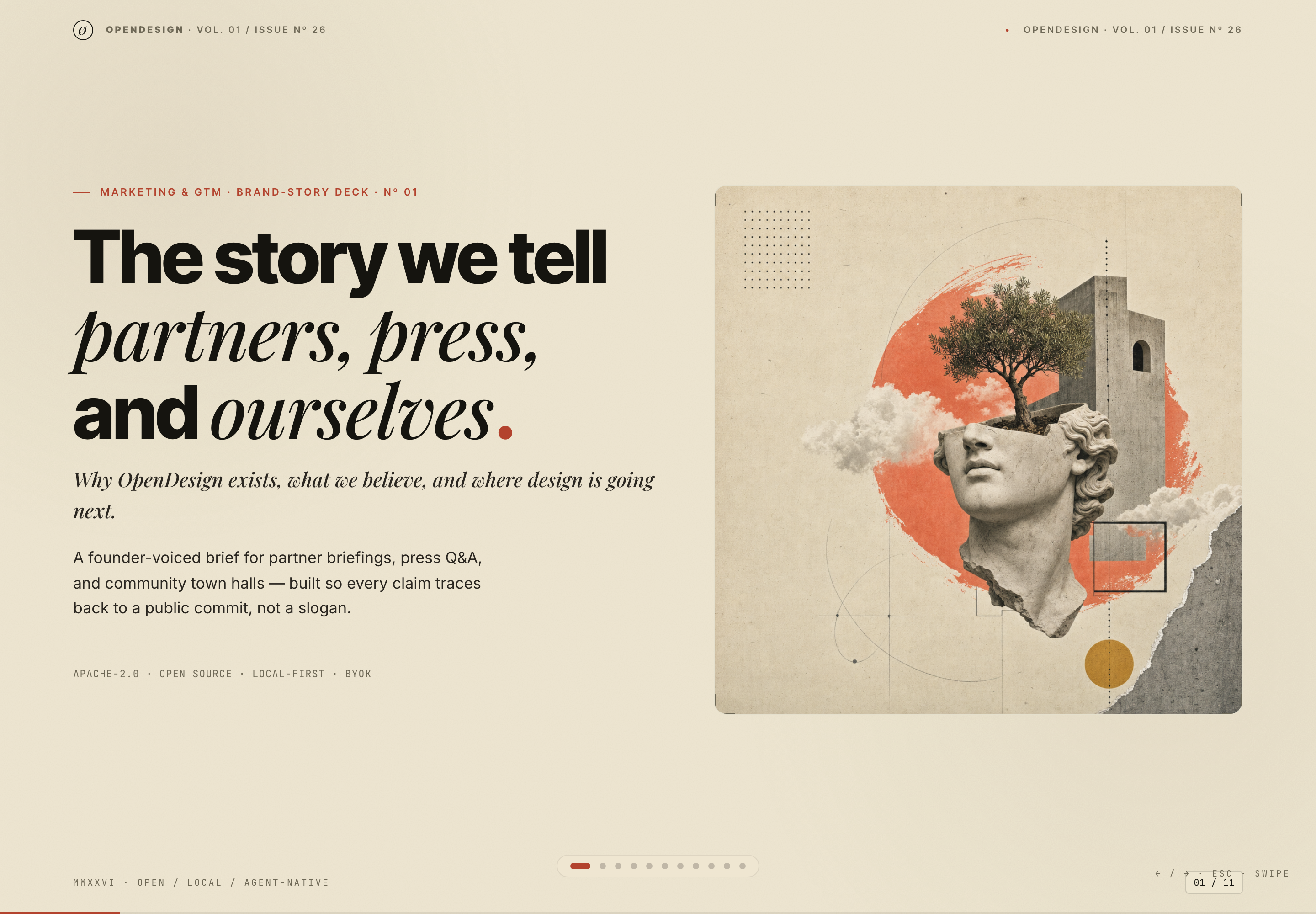
Brand Story Presentation Design gives partners, press, and community audiences one evidence-led narrative from belief to channels, calendar, and verification.
Slides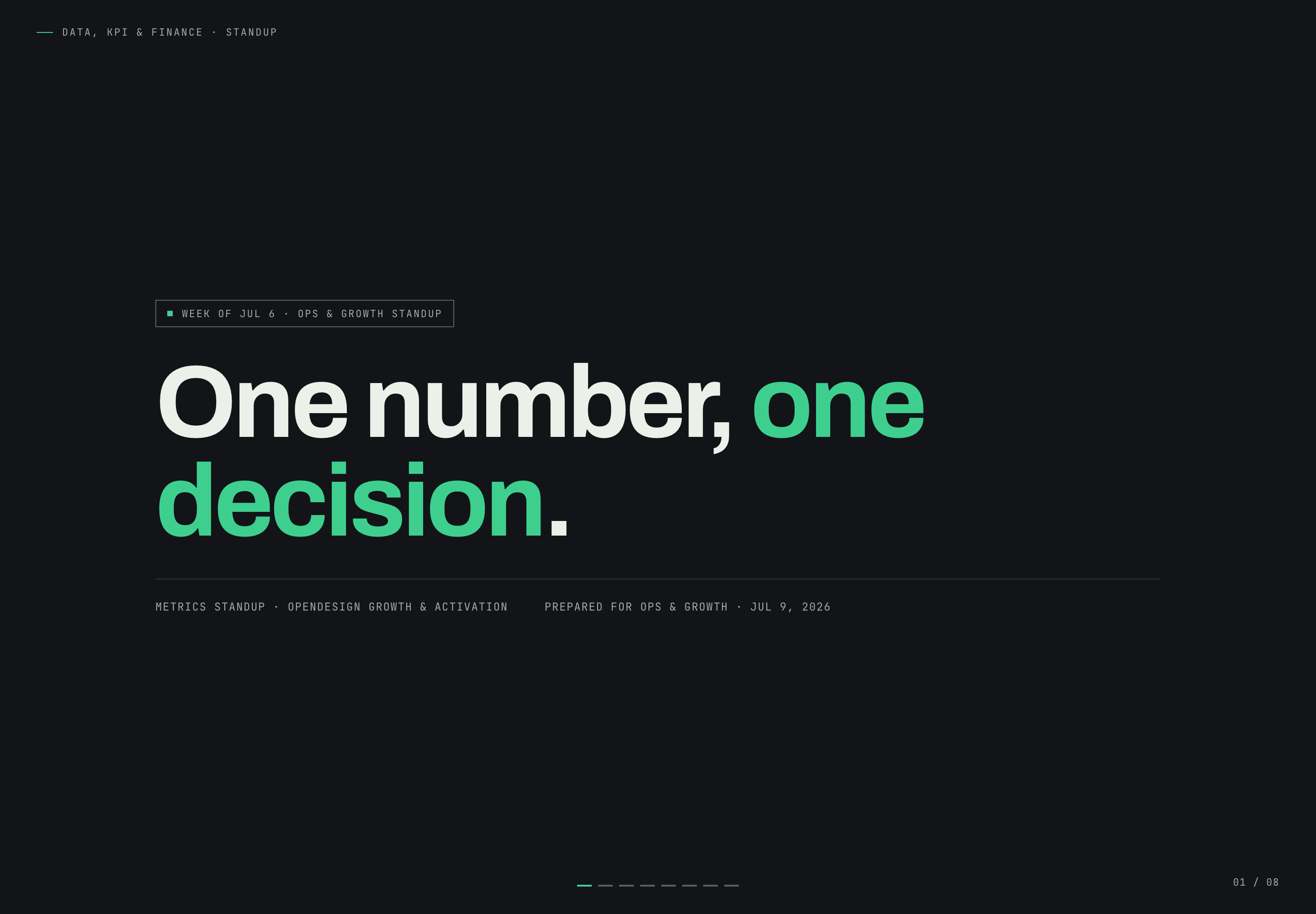
Growth Metrics Standup Design
Growth Metrics Standup Presentation Design turns a Safari conversion problem into a focused narrative that ends with one owned decision.
Slides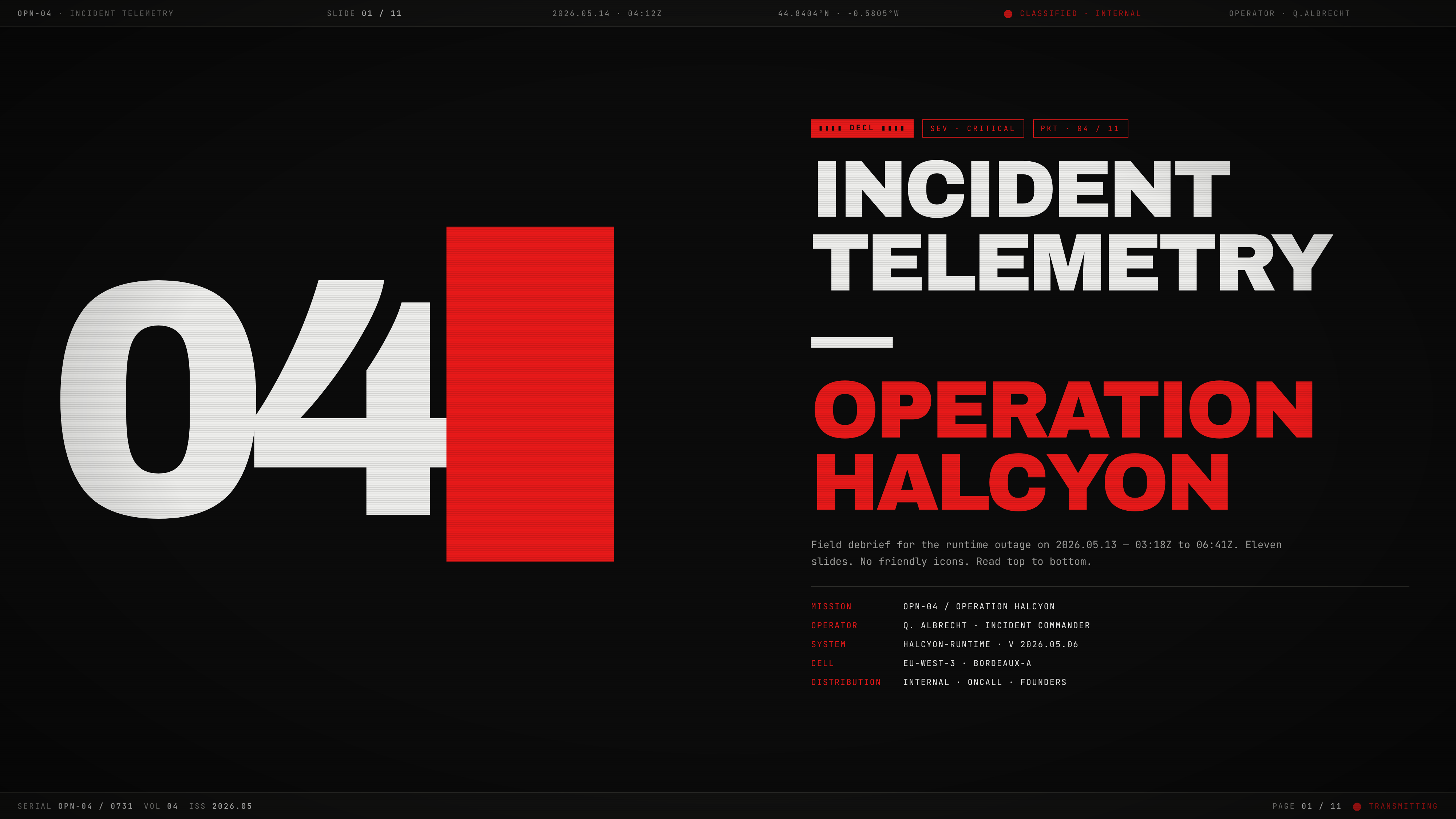
Incident Telemetry Presentation Design
Incident Telemetry — Operation Halcyon turns an illustrative runtime outage into an ordered briefing for tracing causes, risks, and decisions.
Slides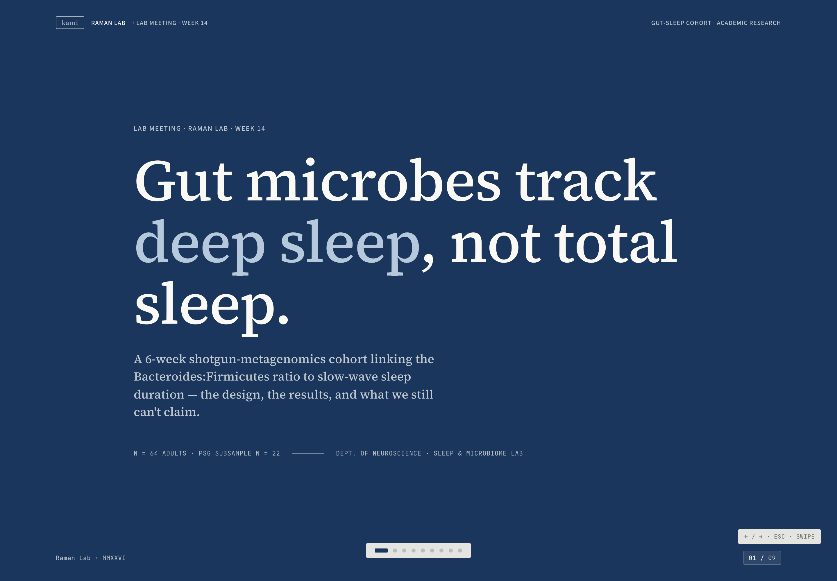
Microbiome Research Presentation Design
Raman Lab's nine-slide research example uses navy dividers, cream evidence slides, and a causal caveat to pace an illustrative gut-sleep argument.
Slides