
Website
Hotpot Restaurant Website Design
Yàn Huǒ introduces hotpot through a priced signature menu, a dining gallery and visit details before booking.

LLM Arena Sep 2026
Case notes- Model
- Qwen 3.8 Max
- Design task
- Local hotpot restaurant landing page with booking
- Output
- Website
Designed For
- Food Website DesignExplain a regional cuisine through specific dishes and imagery.
- Restaurant Menu LayoutsPresent names, preparation details and prices together.
- Hospitality Landing PagesMove from a first impression to practical visit planning.
Key Highlights
- An Anchor DishA larger broth card and Must Try label establish the starting point.
- Five Priced SignaturesIngredient descriptions help readers distinguish the menu selections.
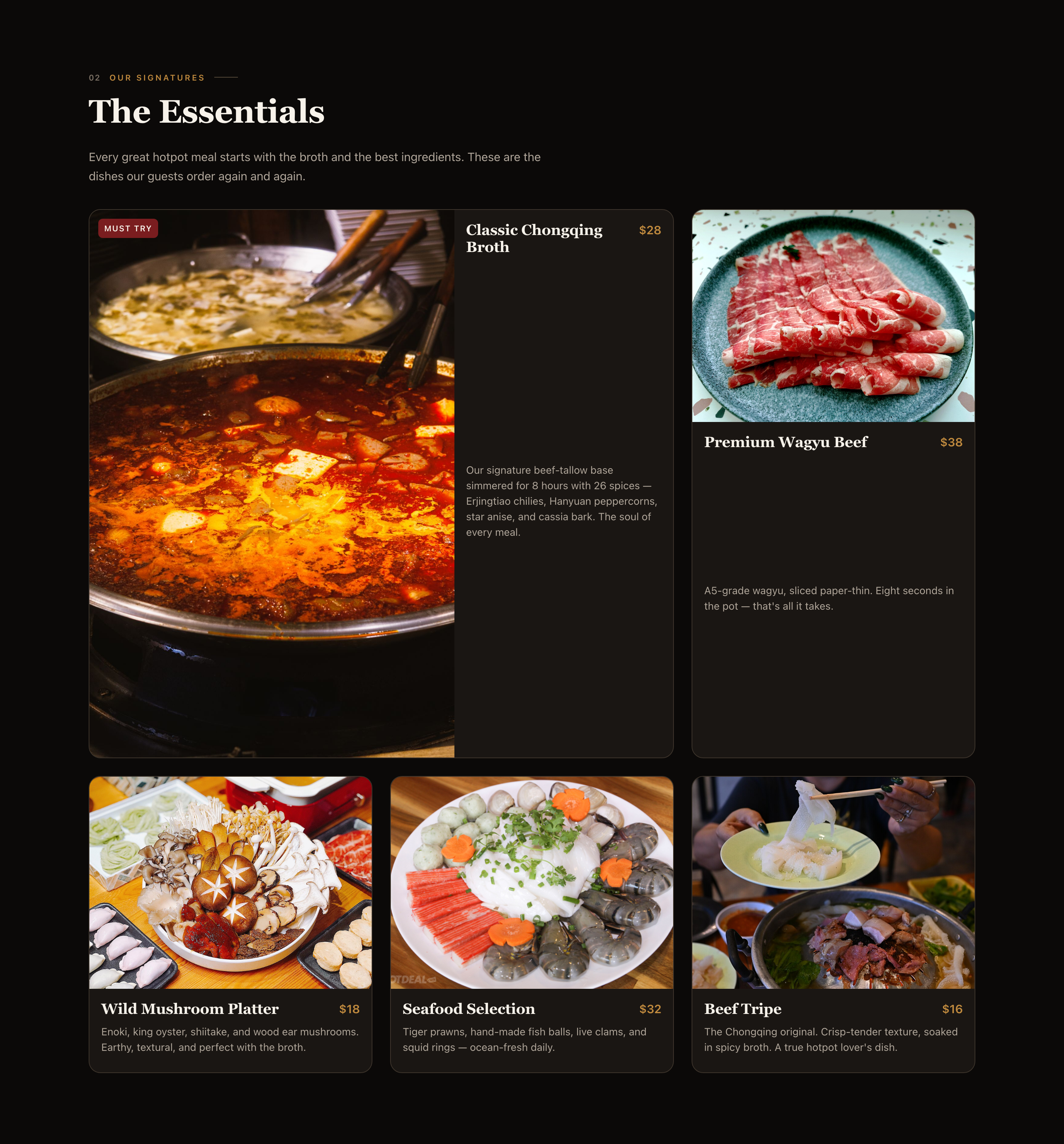
- An Asymmetric Photo GalleryThe room, shared meal and sauce counter have different visual roles.
- Grouped Visit InformationHours, transit context and contact details appear side by side.
Explore the Hotpot Website
1 / 4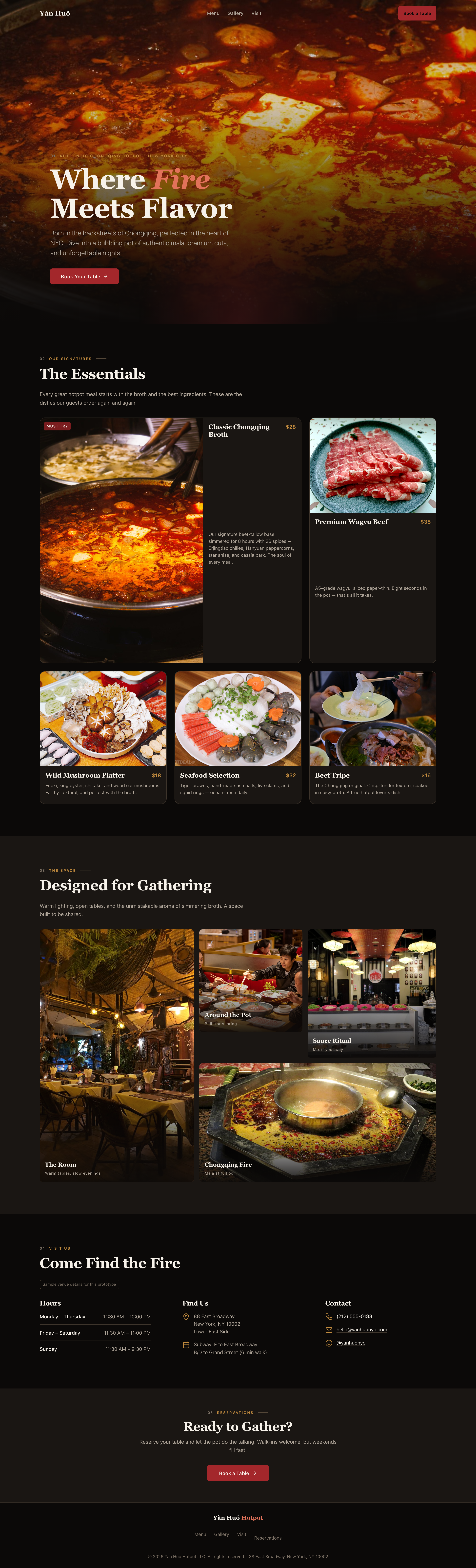
A Hotpot Website That Explains the Meal
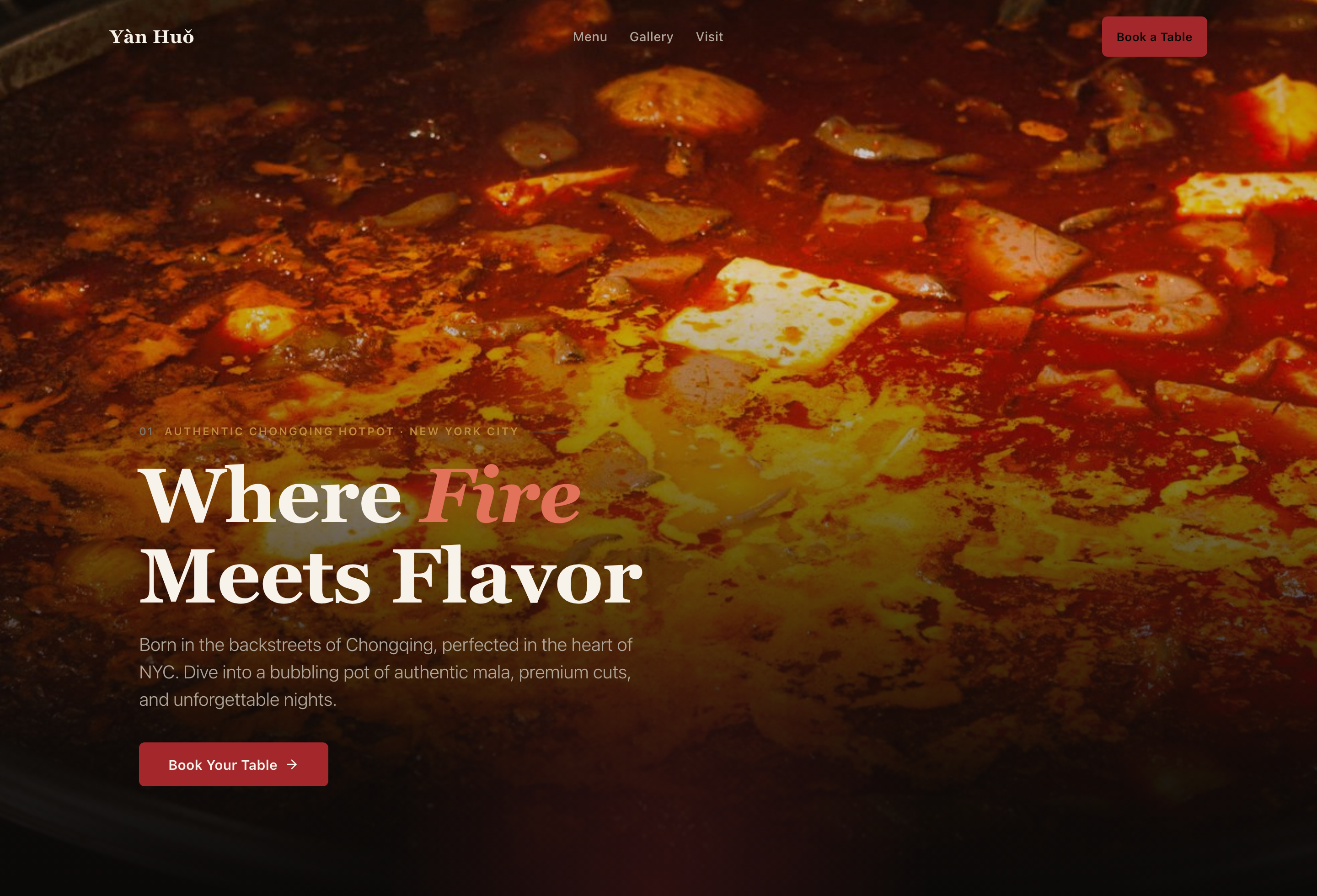
Yàn Huǒ introduces a fictional Chongqing hotpot restaurant through a sequence of increasingly practical information. Where Fire Meets Flavor gives the first impression. The cuisine-and-city label establishes the concept. The menu then answers a more useful question: what would someone actually put in the pot?
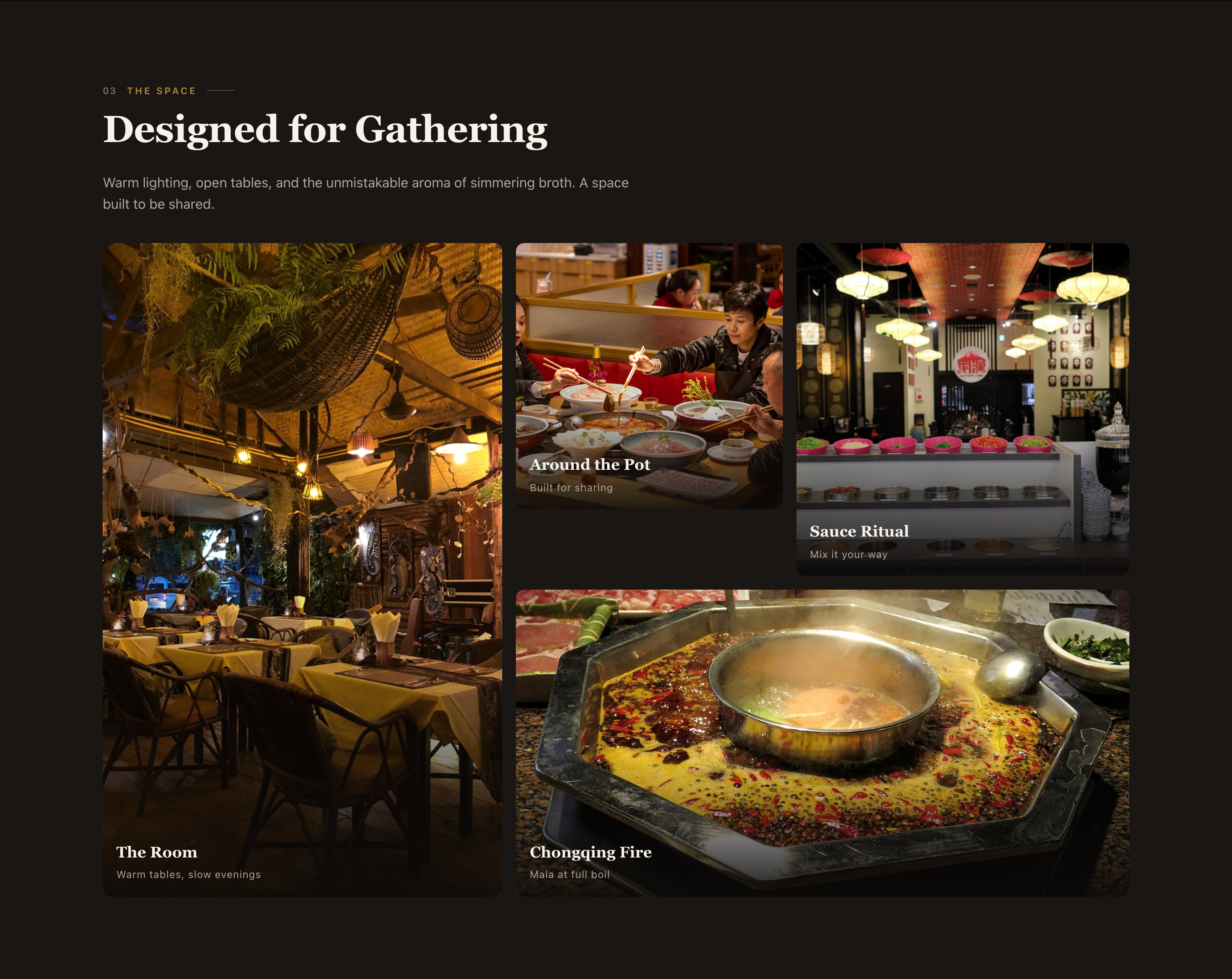
This hotpot restaurant website design works best when the copy names ingredients and preparation details. Beef tallow, named peppercorns and paper-thin beef communicate more than a generic promise of authentic food. They give the menu cards something to explain, while prices allow visitors to compare the five highlighted selections without opening another screen.
Make the Broth the Starting Point of the Menu
The Essentials is not a uniform grid of interchangeable dishes. Classic Chongqing Broth receives a larger card and the Must Try badge. The other four selections sit around that anchor. This reflects how the page introduces a shared hotpot meal: choose the base, then understand the ingredients that accompany it.
| Item | Visible Menu Detail | Why It Helps the Choice |
|---|---|---|
| Classic Chongqing Broth · $28 | Beef-tallow base, an eight-hour simmer and named spices. | Explains the character of the base instead of relying on the word spicy. |
| Premium Wagyu Beef · $38 | Paper-thin slices and an eight-second cooking suggestion. | Describes how the ingredient is prepared and used at the table. |
| Wild Mushroom Platter · $18 | Enoki, king oyster, shiitake and wood ear. | Makes a mixed platter more concrete than a category label alone. |
| Seafood Selection · $32 | Prawns, fish balls, clams and squid rings. | Shows what the selection contains before a guest asks. |
| Beef Tripe · $16 | A crisp-tender texture description. | Gives an unfamiliar ingredient a sensory point of reference. |
Connect the Menu, Dining Atmosphere and Visit Details
Menu, Gallery and Visit are direct navigation links; Book a Table opens the reservation entry. The page therefore supports both a full read and a shortcut. Someone who already knows the food can go straight to hours, while someone unfamiliar with the concept can follow the sections in order.
Use Gallery Size to Give Each Image a Job
The tall room image establishes the setting. Smaller images show people around the pot and a sauce counter, while the wider broth image returns attention to the meal. This is more informative than repeating four similar close-ups, provided a real restaurant uses photographs that actually represent its space.
Place Logistics in Parallel Groups
The visit section separates Hours, Find Us and Contact into three columns. Hours use different closing times for Monday–Thursday, Friday–Saturday and Sunday. The address includes transit context. These facts answer different planning questions and remain easier to scan when they are not buried in one paragraph.
Treat Booking as a Request With a Next Step
The reservation entry gathers visit and contact details. Its visible fields are a starting point, not evidence of live capacity. A production adaptation should distinguish sending a request from receiving a confirmed table, and should explain what happens when the requested time cannot be offered.
What the Larger Menu Card Trades Away
The oversized broth card gives the base a strong visual role, but also makes this section taller than a compact menu list. That tradeoff is visible in the complete screenshot. It suits a promotional introduction; it is less efficient for someone comparing many dishes quickly. A longer restaurant menu would need a denser pattern rather than repeating this card size for every item.
What This Restaurant Prototype Can Show
Yàn Huǒ is sample restaurant content, not a real venue listing. The menu claims, prices, address and operating details belong to the prototype and need verification before real-world use. The form does not create a booking or deliver an email. Qwen 3.8 Max is the owner-supplied model label; no generation count, benchmark score or measured business outcome is claimed here.
How to Create a Hotpot Restaurant Website Design in OpenDesign
Describe the Meal Before the Visual Style
Give OpenDesign a sample cuisine, an anchor dish and a small menu with distinct descriptions. The following new prompt uses this page’s information structure without claiming to reproduce its original generation history.
Suggested PromptCreate a hotpot restaurant website design for a fictional neighborhood venue. Use a dark, warm palette and a full-width food photograph behind a short serif headline. Place a cuisine-and-city label above it and a Book a Table action below. Build a five-item signature menu with prices and specific ingredient descriptions. Give the broth a larger card and a Must Try badge, with four smaller accompanying dishes. Add an asymmetric gallery: a tall room photo on the left, two smaller guest-experience photos at the upper right and a wide hotpot photo below them. Group Hours, Find Us and Contact in parallel columns. Include a reservation dialog with visit and contact fields. Keep the menu readable on phones and label all venue details and booking responses as fictional demonstration content, with no live restaurant integration.
Check the Menu at Full Size and Phone Width
Compare the prominent broth card with the four smaller dishes. Ask OpenDesign to preserve names, descriptions and prices without relying on cropped text. On phones, keep related information together and shorten the visual stack if the main card delays access to every other dish.
Connect Visit Information to a Clear Booking State
Review weekday and weekend hours next to the offered reservation times. Specify required-field errors, a dismissible dialog and an explicit demonstration confirmation. Before adapting for a real venue, confirm its address, prices, imagery and booking provider.
Export and Get a Share Link
Export your finished design, then use Share in OpenDesign to get a share link. Open the link in a separate browser window and check that the intended version and its assets are available before sending it.
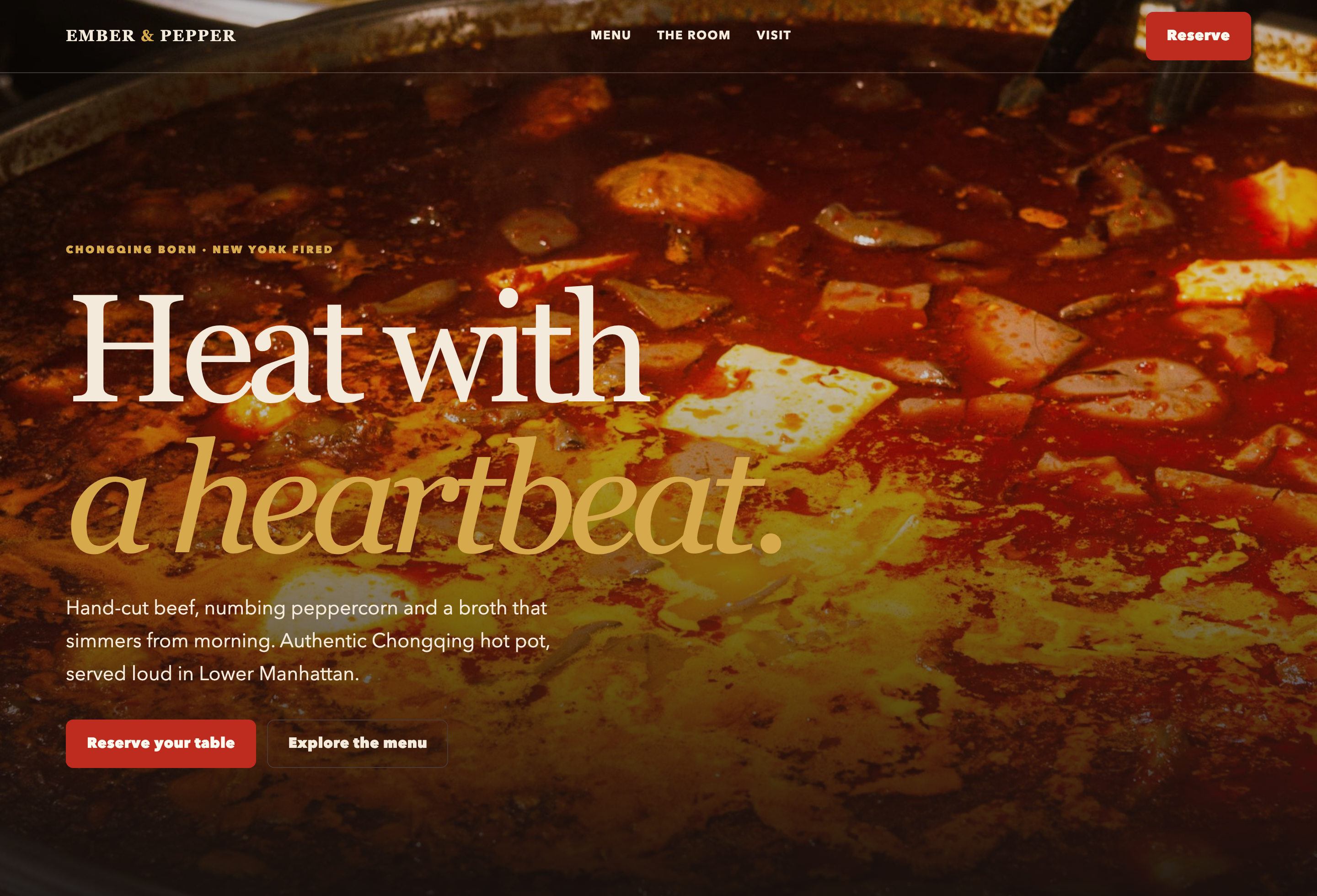
Restaurant Reservation Website Design
Ember & Pepper pairs signature dishes and visit details with a reservation dialog for guests ready to book.
Website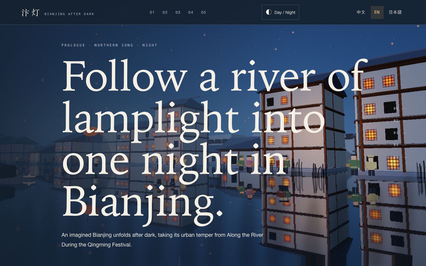
Bianjing Night Tour Website Design
An interactive night journey through an imagined Song-era Bianjing, combining a persistent river city, poetry, lanterns and multilingual chapter pacing.
Website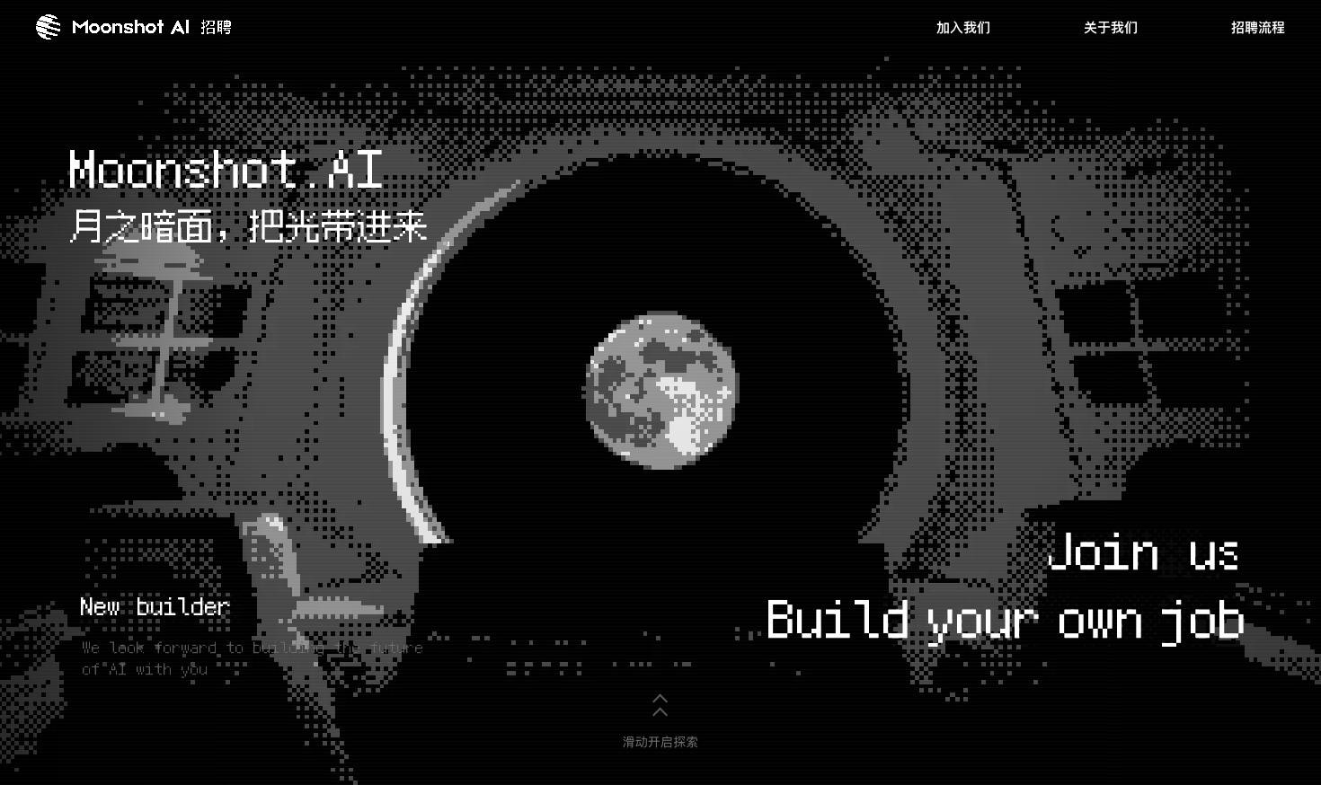
Careers Website Design
A Kimi careers study built from eight lunar scenes, with scroll-linked transitions and an illustrated application process.
Website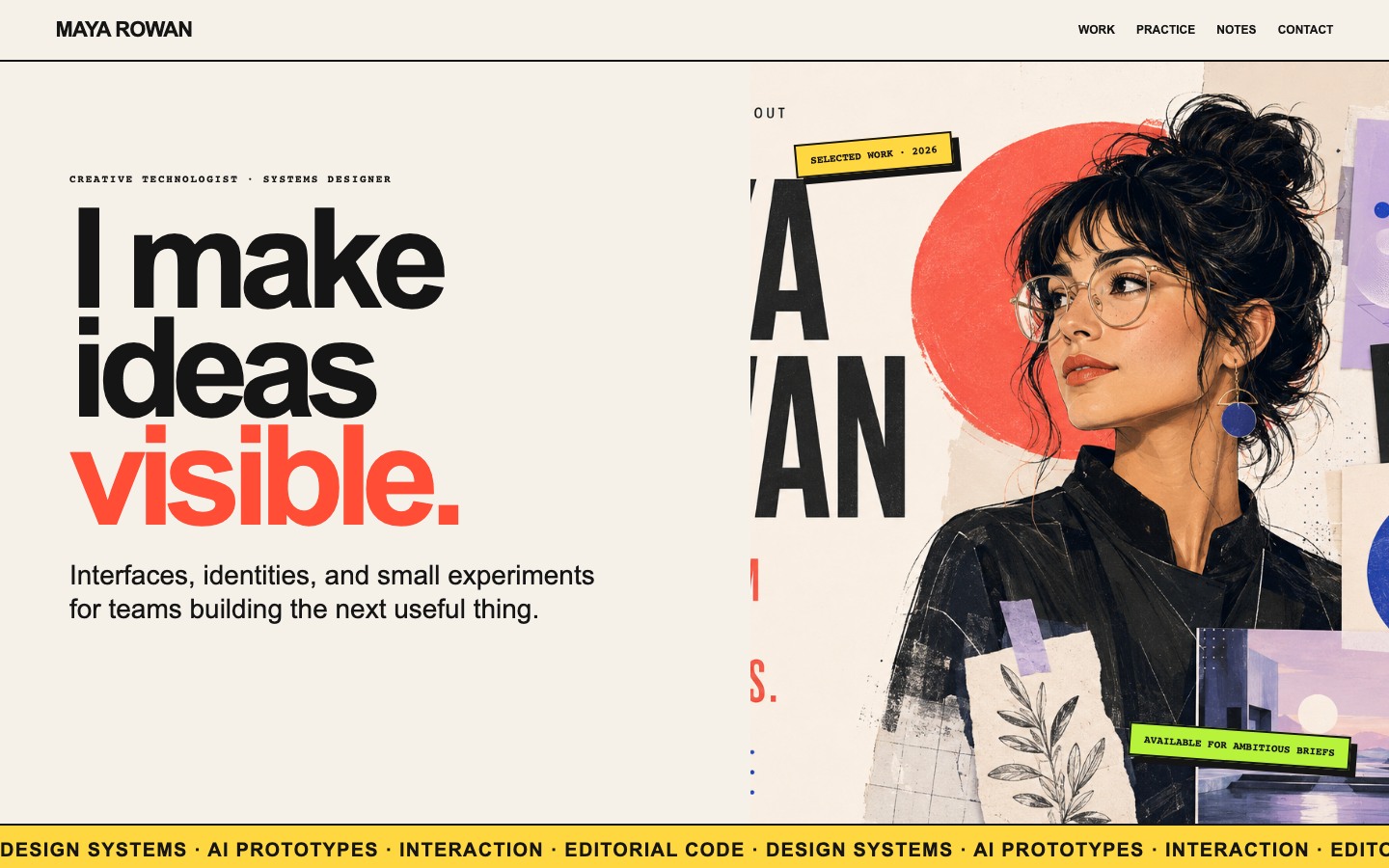
Creative Portfolio Website Design
Maya Rowan’s fictional portfolio connects project cards, practice, and notes.
Website