
Desktop app
Interactive Product Explainer Design
Explore a concept phone’s separated layers with camera presets, a slider and a panel of eight assembly groups.

LLM Arena Sep 2026
Case notes- Model
- Astra
- Design task
- Interactive iPhone anatomy explorer
- Output
- Desktop app
Designed For
- Interactive Product PagesExplain a complex object through controllable views.
- Component ExplorationConnect part groups to their position in a model.
- Hardware Concept StudiesPresent illustrative geometry with a clear accuracy boundary.
Key Highlights
- Three Concept DevicesA collection page offers separate entry points to each model.
- Two Separation ModesProgressive teardown and exploded view share a percentage control.
- Eight Assembly GroupsNamed groups connect the structural shell to smaller systems.
- Preset and Free ViewsStart at a familiar angle, then orbit to inspect depth.
Explore the Product Explainer
1 / 3A Product Explainer That Opens One Layer at a Time
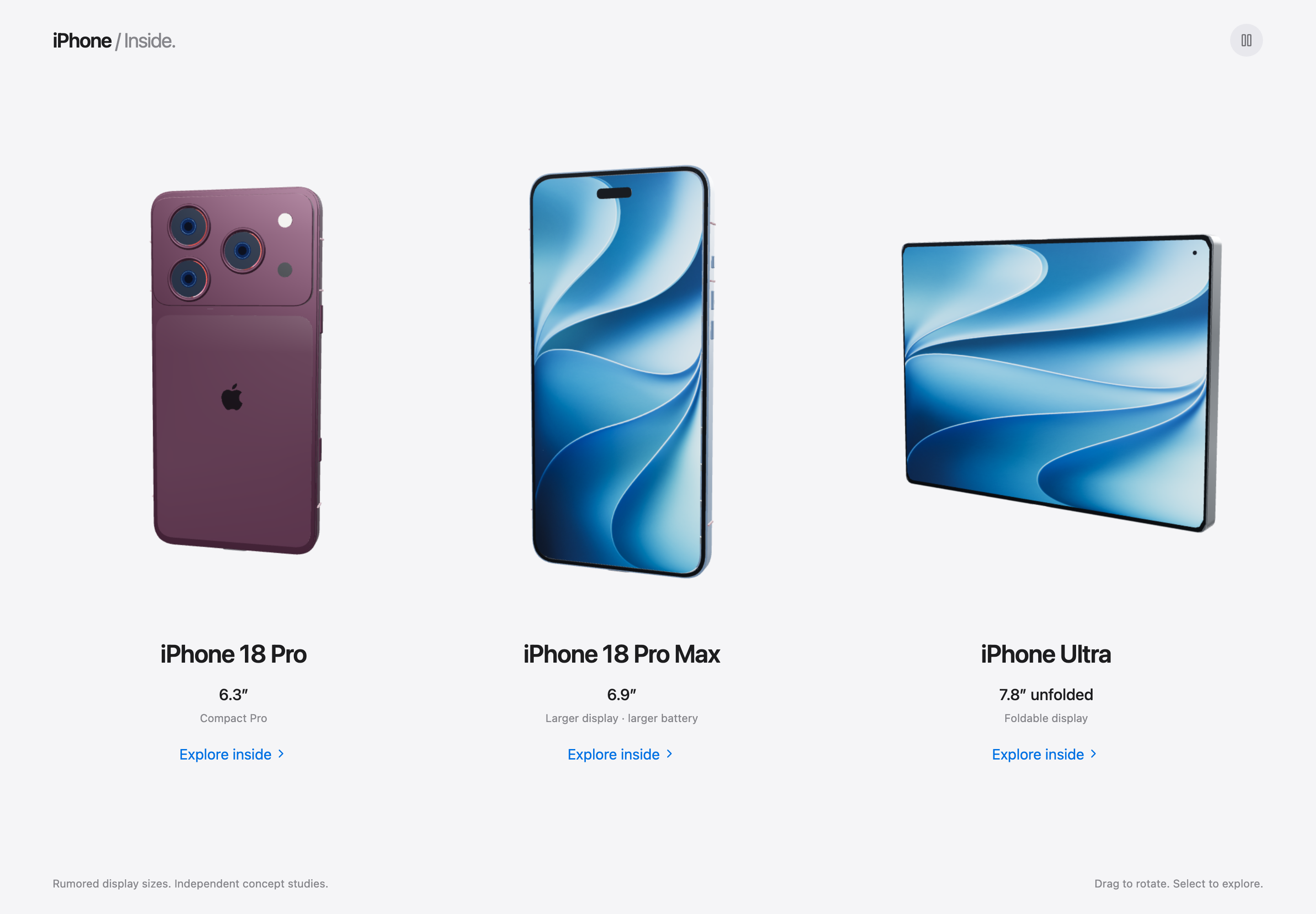
iPhone Inside presents three speculative device concepts as entries into an interactive anatomy study. The collection pairs each rendered device with a model label, display-size label and Explore inside link. A small Independent concept studies notice establishes that these are design concepts, not announced product specifications.
The detail workspace answers a different question from the collection: how do the parts relate to the whole? A separation slider, camera controls and optional assembly panel offer different ways into that question. The interface does not demand that someone recognize every part before they can begin exploring.
Choose the Right Control for Each Inspection Task
A useful product explainer does not ask one control to do everything. This workspace separates how far the model opens, how it is viewed and which assembly the visitor wants to understand. Those controls can cooperate without becoming a dense toolbar.
Control Separation Without Losing the Whole
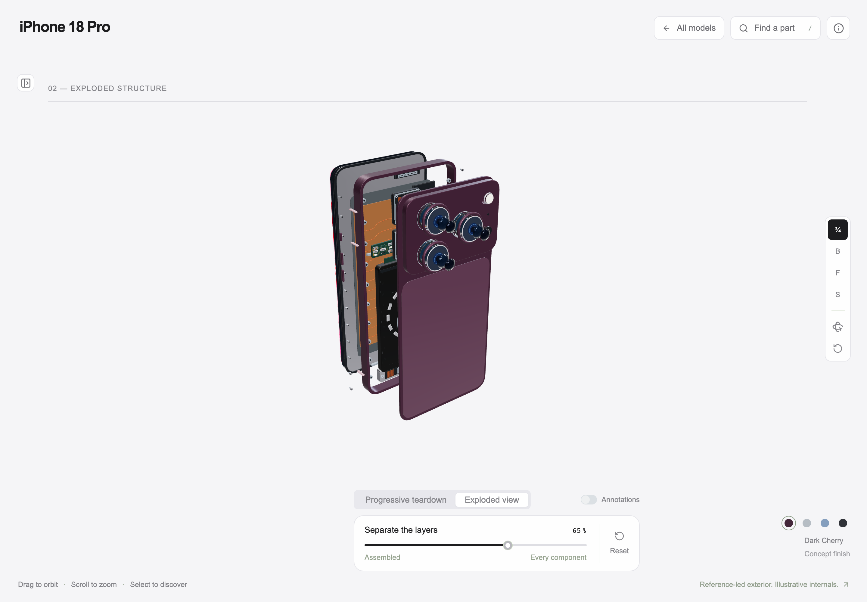
The slider runs from Assembled to Every component and exposes a percentage. The captured 65% exploded view still reads as one phone, while showing space between its major layers. This makes the relationship between exterior and interior more legible than a fully dispersed pile of parts.
Offer a Known Starting Angle
The camera rail includes 3/4, B, F and S presets. A visitor can begin from a recognizable front, back or side view, then orbit the object. Short labels save space, but an adaptation should keep their names available to keyboard and screen-reader users as well as pointer users.
Keep Annotation Optional
Annotations sit behind a separate toggle rather than permanently covering the model. This lets a visitor compare geometry first and ask for labels when needed. Hiding those labels by default only works if the toggle remains easy to find and the selected part has another clear indication.
Connect Assembly Names to the 3D Workspace
Opening the anatomy panel keeps the complete model and bottom control strip visible. Eight numbered assemblies have both a name and a plain-language subtitle: Display becomes Glass, pixels and touch; Logic board becomes Compute and connectivity. The subtitle translates a technical category into the role it plays in the product.
The panel footer reports 198 selectable components. That is a scope label in this procedural concept, not a verified inventory of a real phone. Grouping those selections into eight assemblies makes the starting choice manageable without suggesting that the underlying object contains only eight pieces.
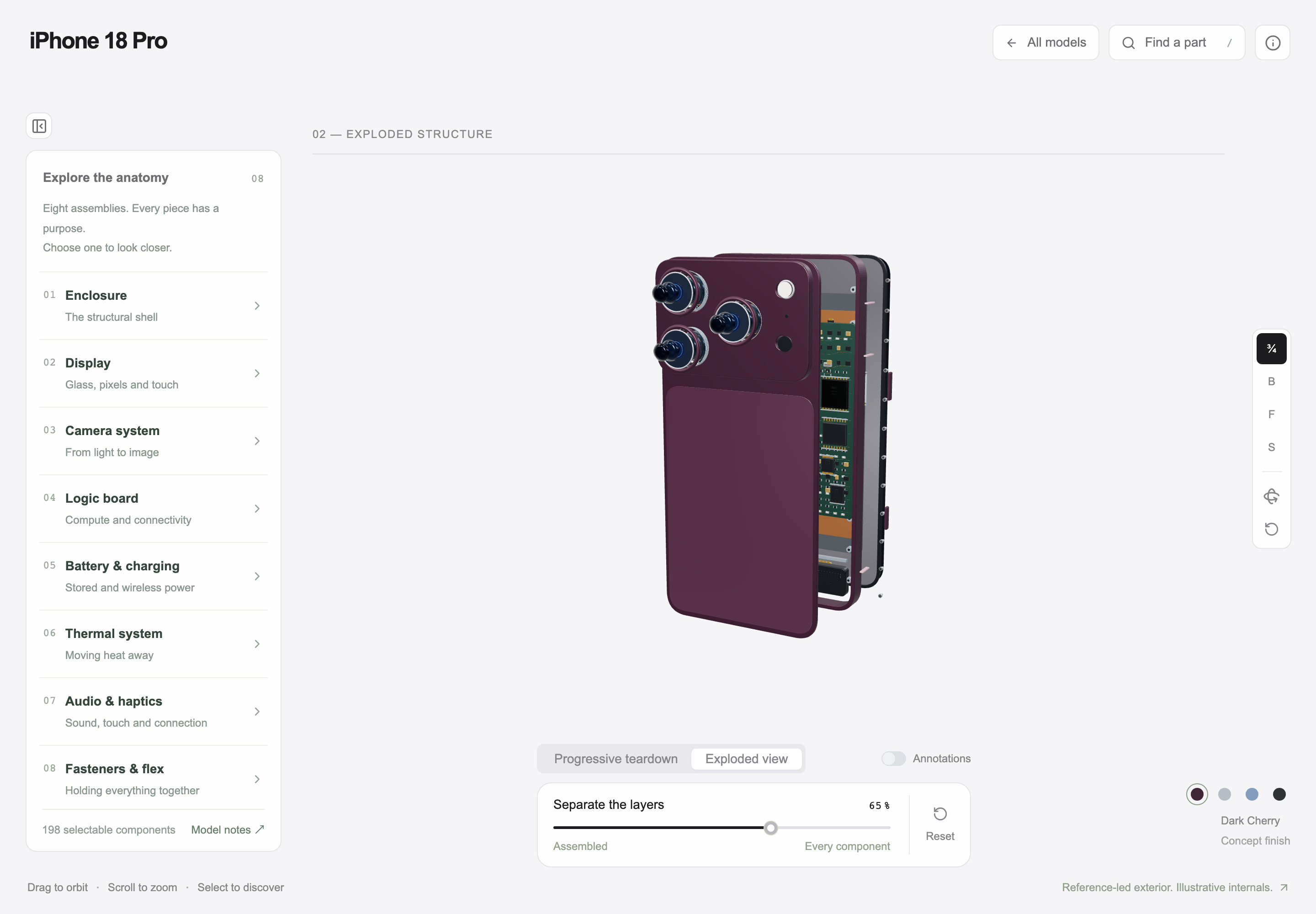
| Assembly | Visible Subtitle | Question It Helps Answer |
|---|---|---|
| Enclosure | The structural shell | What holds the overall form together? |
| Display | Glass, pixels and touch | Which layers carry the visual and touch surface? |
| Logic Board | Compute and connectivity | Where does the concept place its computing systems? |
| Fasteners and Flex | Holding everything together | How are small connecting elements grouped? |
An Illustrative Anatomy Study, Not a Repair Guide
The source describes itself as Reference-led exterior. Illustrative internals. Device names, sizes, geometry and component counts belong to an independent concept study and should not be treated as verified product specifications or repair instructions. This local preview demonstrates the visual controls; it does not establish the accuracy of part placement inside a real device.
How to Create an Interactive Product Explainer Design in OpenDesign
Define the Object and Its Assembly Groups
Start with a fictional or documented object and identify what the viewer should learn by opening it. This new design prompt borrows the interaction pattern, not an unverified device specification.
Suggested PromptCreate an interactive product explainer design for a fictional handheld device. Start with a collection page showing three variants and a clear concept-study notice. Each entry opens a light, uncluttered workspace with a complete 3D object at the center. Add a slider from Assembled to Separated with a visible percentage, and distinguish progressive teardown from an exploded-layer view. Keep the device recognizable at an intermediate setting. Include front, back, side and three-quarter camera presets alongside free orbit. A collapsible panel should list eight assembly groups, each with a name and a plain-language description of its role. Keep the panel, model and bottom controls visible together. Put annotations behind an obvious toggle. Label internal geometry as illustrative and provide a readable static fallback if 3D rendering is unavailable.
Compare the Assembled and Intermediate States
Ask OpenDesign to preserve the same orientation and component identity while the separation changes. Check an intermediate view before maximizing the effect: the viewer should still understand which layers belong together. Reset should return to a predictable starting state.
Test the Explanation Without Relying on the Canvas
Review the group names, subtitles and control labels independently of the 3D view. Make the controls keyboard reachable and retain the accuracy notice. On small screens, provide an explicit way to open the panel without leaving too little space to recognize the object.
Export and Get a Share Link
Export your finished design, then use Share in OpenDesign to get a share link. Open the link in a separate browser window and check that the intended version and its assets are available before sending it.
Day Trip Planner Design
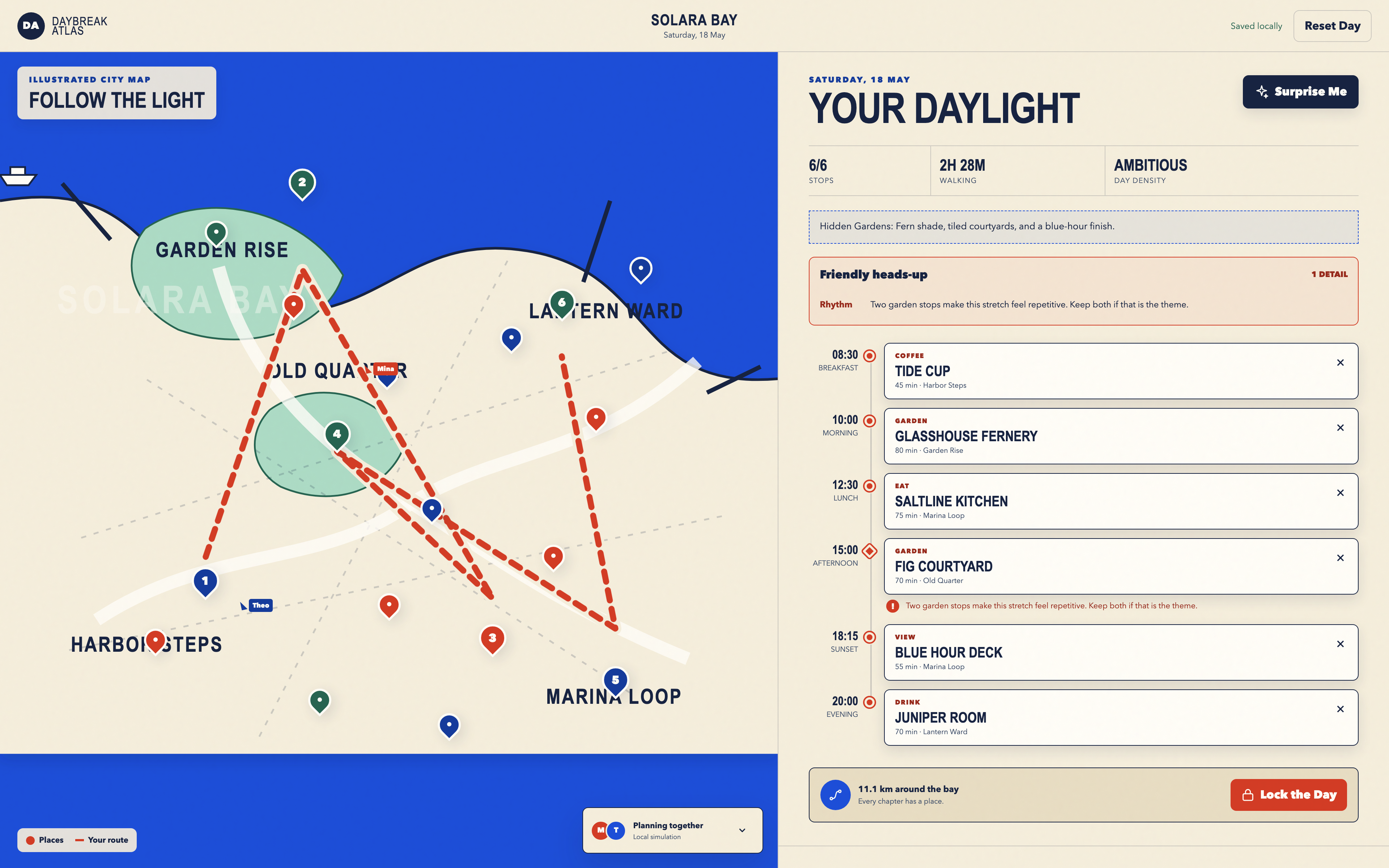
Plan six timed stops in fictional Solara Bay, with an illustrated map, walking estimates and useful route warnings.
Desktop app
Island Adventure Game Design
Explore Harbor Skirmish, a small seaside island with rooftop routes, three weapon slots and a playful first-person interface.
Desktop app
Island FPS Game Design
Step into Harbor Skirmish, where a bold island title screen leads to first-person play with boxed status panels and numbered weapon controls.
Desktop app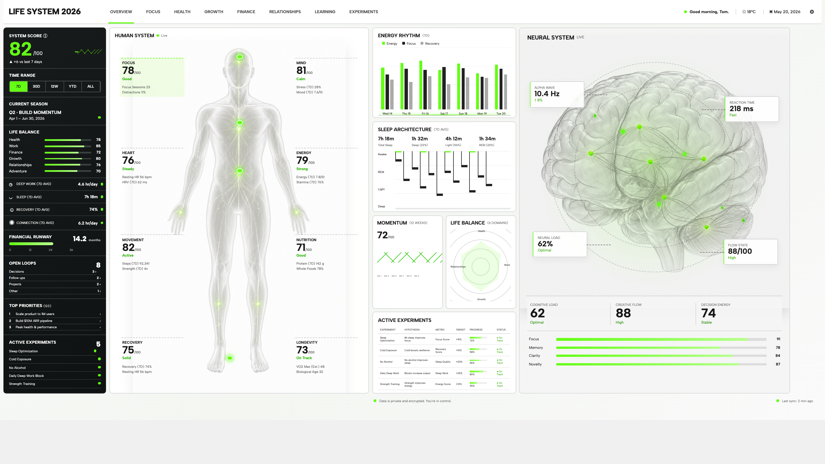
Personal Dashboard Design
Life System puts a weekly score, body-map metrics, daily rhythms, and five experiments on one desktop dashboard. Explore the layout in detail.
Desktop app