
Desktop app
Island Adventure Game Design
Explore Harbor Skirmish, a small seaside island with rooftop routes, three weapon slots and a playful first-person interface.

LLM Arena Sep 2026
Case notes- Model
- GPT 6 Astra
- Design task
- Create Harbor Skirmish, a playable island adventure with movement and wave combat.
- Output
- Desktop app
Designed For
- Browser Game PrototypesConnect a playable scene with its opening and pause states.
- First-Person InterfacesOrganize movement, health and weapon information around the view.
- Game Launch ScreensIntroduce the setting without listing every keyboard command.
Key Highlights
- An Island Before a BattleThe opening view establishes streets, rooftops and the surrounding sea.
- An Open-Center HUDStatus sits around the edges, leaving the viewfinder visible.
- A Playful Pause StateA tilted card turns interruption into part of the visual identity.
Explore the Island Game
1 / 4An Island Adventure Game Design With a Seaside Opening
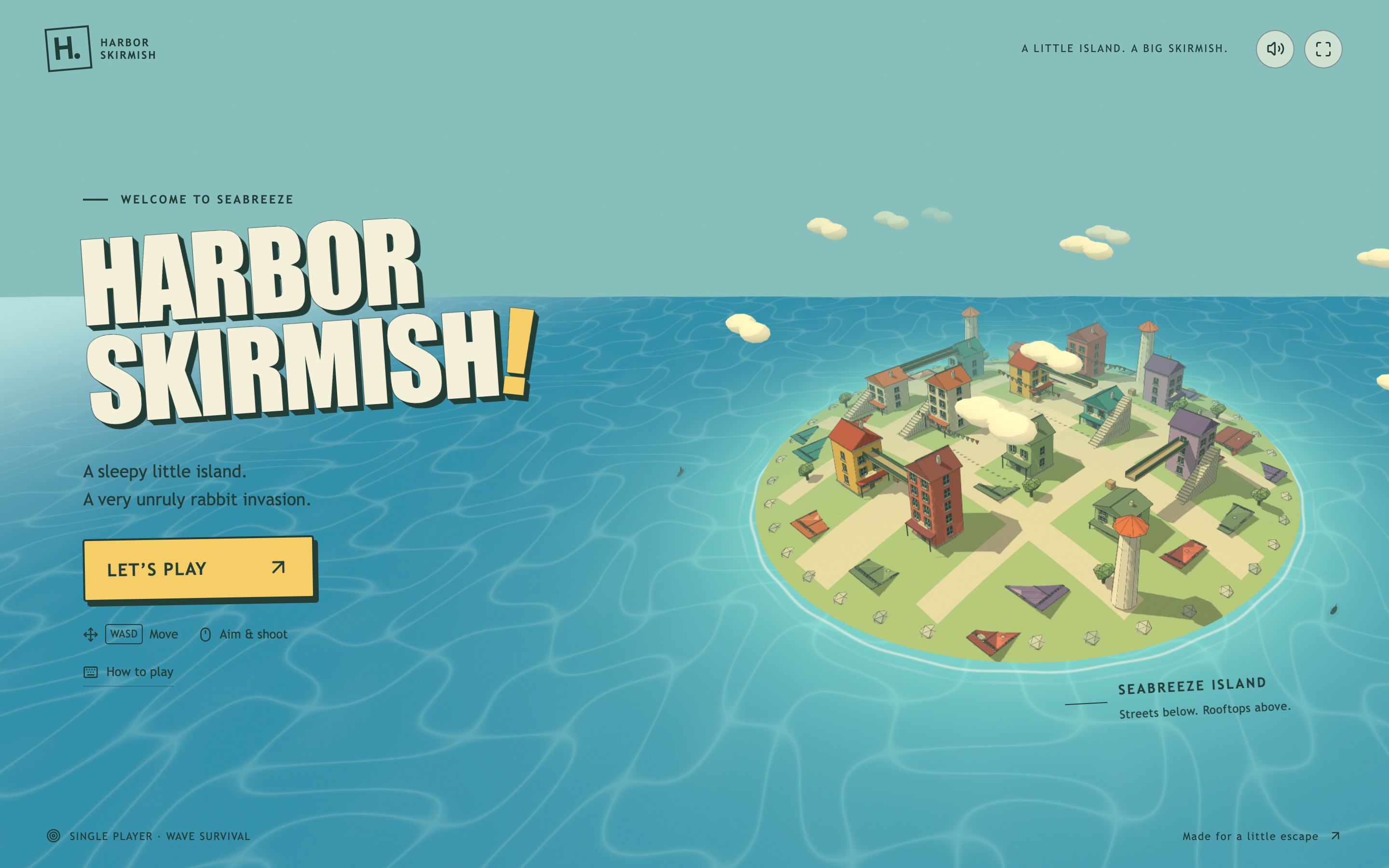
Harbor Skirmish introduces its setting from above before placing the player in a street. The title fills the left side of the opening screen, while the island occupies the right. Colored rooftops, a clock tower and the waterfront are visible together. This gives the player a picture of the place before the first-person camera removes that overview.
The cream, yellow and dark-green interface feels closer to a printed holiday poster than a military dashboard. The short premise describes an unruly rabbit invasion; the prominent Let’s Play button then gives one obvious next action. The opening shows basic movement and aiming hints, with further instruction separated from the main invitation.
A Map Without a Map Panel
The elevated island view explains the relationship between streets and rooftops without adding a separate diagram. The tower and clustered roofs provide recognizable shapes that can also be seen at ground level. This is a useful introduction to the setting, although it does not establish that every visible roof is reachable.
One Strong Starting Action
Let’s Play uses the same yellow that later marks the selected weapon. Its tilted shape and offset border make it stand out against the calmer sea. The surrounding text is brief enough that the button does not have to compete with a complete control manual.
A Graphic Language That Continues
The small Harbor Skirmish mark stays in the corner during play. Cream keycaps, green labels and the warm accent color also return in the HUD and pause card. The change from an aerial scene to a first-person scene therefore does not introduce an unrelated interface style.
Organizing a First-Person HUD Around the Island View
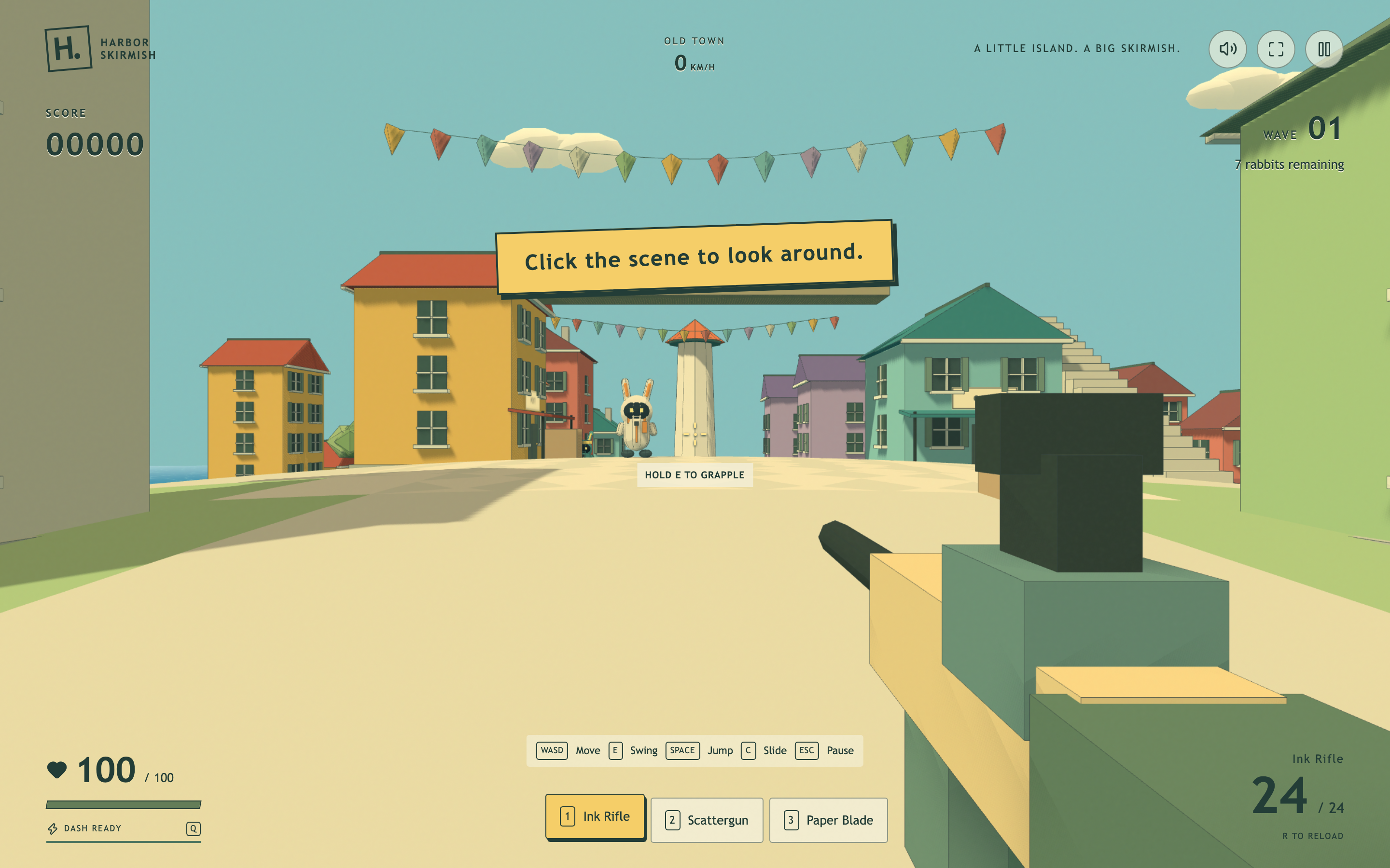
During play, the center is mainly reserved for the street and the aiming reference. Score appears toward the upper left, the wave and remaining enemies toward the upper right, and location and speed near the top center. Health and dash status occupy the lower left; weapon and ammunition occupy the lower right.
Much of this information sits directly over the scene rather than inside heavy panels. That keeps the island visible, but it makes contrast depend on the building, sky or ground behind each label. The cream control strip at the bottom takes the opposite approach: it gives the small key labels a consistent background where precise reading matters.
| Display | What It Communicates | Why the Distinction Matters |
|---|---|---|
| Score and Wave | Progress within the current local run | A session score is not a model evaluation score or a saved record. |
| Health and Dash Ready | Survival status and an available movement action | The dash label explains availability rather than an achievement. |
| Weapon Name and Ammunition | The selected tool and its displayed ammunition values | The name must change with the active slot, not only its highlight. |
Switching Weapons and Returning From Pause
The three numbered slots remain visible as Ink Rifle, Scattergun and Paper Blade. Selecting 2 changes the active slot and the weapon name to Scattergun. This double feedback is more informative than changing a border alone: it identifies the selection both at the shortcut and beside the ammunition display.
Learn Movement in Context
WASD, swing, jump and slide hints sit close to the bottom of the live scene. The separate Hold E to Grapple cue is nearer the center. That division keeps the general controls available while giving the movement mechanic a more local prompt, although several simultaneous hints can still compete with the view.
Pause Without Losing the Setting
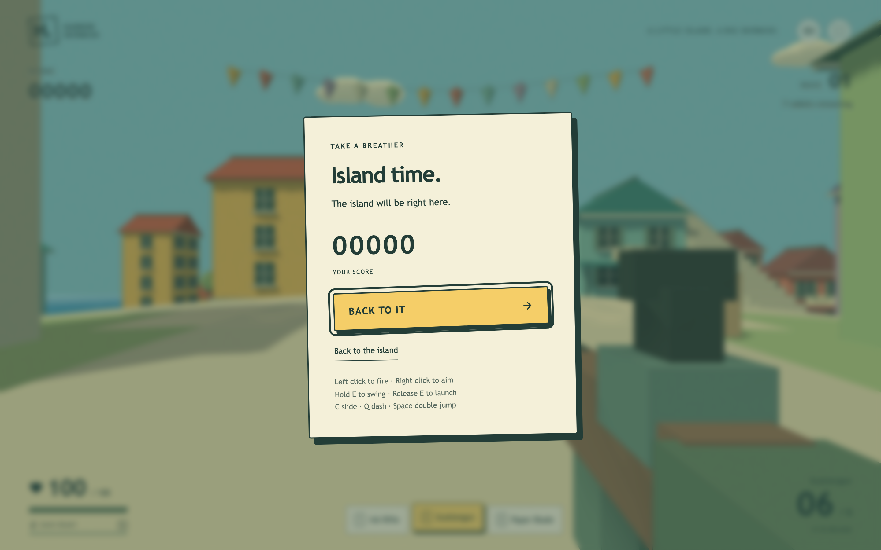
Escape opens Island time, a cream card over a blurred version of the street. The current score stays visible inside the card. Because the underlying scene remains recognizable, the interruption feels connected to the run rather than like navigation to a separate settings page.
Separate Resume From Leaving
Back to It is the large yellow action, while Back to the island is a smaller underlined alternative. The shared wording makes the difference worth checking carefully: the visual hierarchy helps identify continuation, but more literal labels would reduce ambiguity for someone unfamiliar with the experience.
What This Local Game Example Demonstrates
The supplied export contains a local single-player game and rendered 3D environment. Starting, changing weapon selection and opening the pause state were checked. The gallery is not a performance benchmark, a completed playthrough or proof that every traversal mechanic works on every device. No online multiplayer, account service or saved leaderboard was verified. The model label is retained from the supplied filename.
How to Create an Island Adventure Game Design in OpenDesign
Design the Opening and Playing Views Together
Start with one small island and two camera states. Keep the main landmark visible in both the overview and the street-level view. Define the persistent interface colors before adding extra weapons or environmental detail.
Suggested PromptCreate an island adventure game design for a fictional browser game called Harbor Skirmish. Show a colorful seaside island from above on the opening screen, with a large title on the left and one yellow Let’s Play button. Use cream surfaces, dark-green labels, offset borders and restrained tilted cards. Enter a first-person street scene with score and wave information at the top, health and dash status at the lower left, and weapon and ammunition at the lower right. Keep three numbered slots for Ink Rifle, Scattergun and Paper Blade. Add a pause card with the current score, a primary resume action and a separate return-to-start action. Use local session state only; do not imply multiplayer, saved scores or an account connection. Make keyboard controls visible and keep the scene center unobstructed.
Follow a Single Selection Across the HUD
Select each weapon and check its slot, name and ammunition display together. Then pause and resume from that selection. The useful test is whether the interface describes one consistent state, not whether each piece looks convincing in isolation.
Check Contrast Against More Than the Sky
Examine status labels against pale walls, dark roofs and the street surface. Keep the open feeling of the scene, but add a restrained backing where necessary for small text. Verify that the pause actions remain distinguishable without relying on color alone.
Export and Get a Share Link
Export your finished design, then use Share in OpenDesign to get a share link. Open the link in a separate browser window and check that the intended version and its assets are available before sending it.
Island FPS Game Design
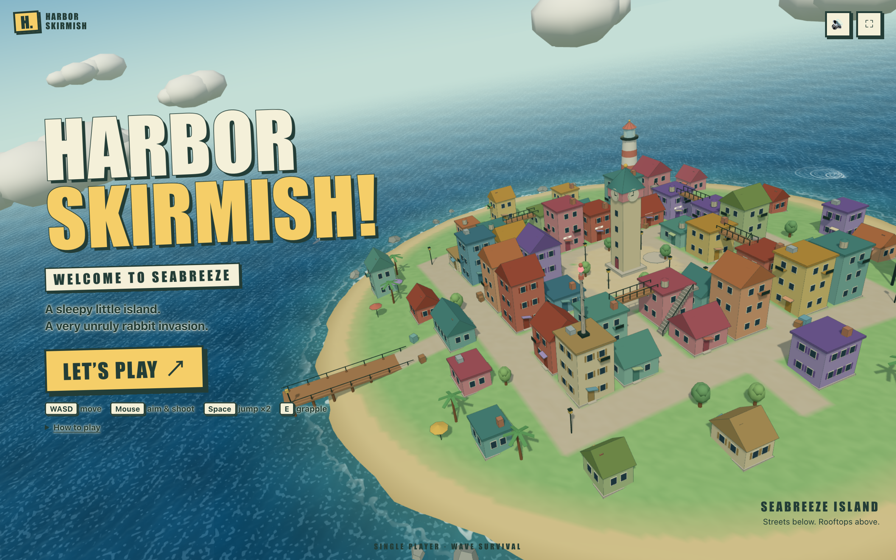
Step into Harbor Skirmish, where a bold island title screen leads to first-person play with boxed status panels and numbered weapon controls.
Desktop app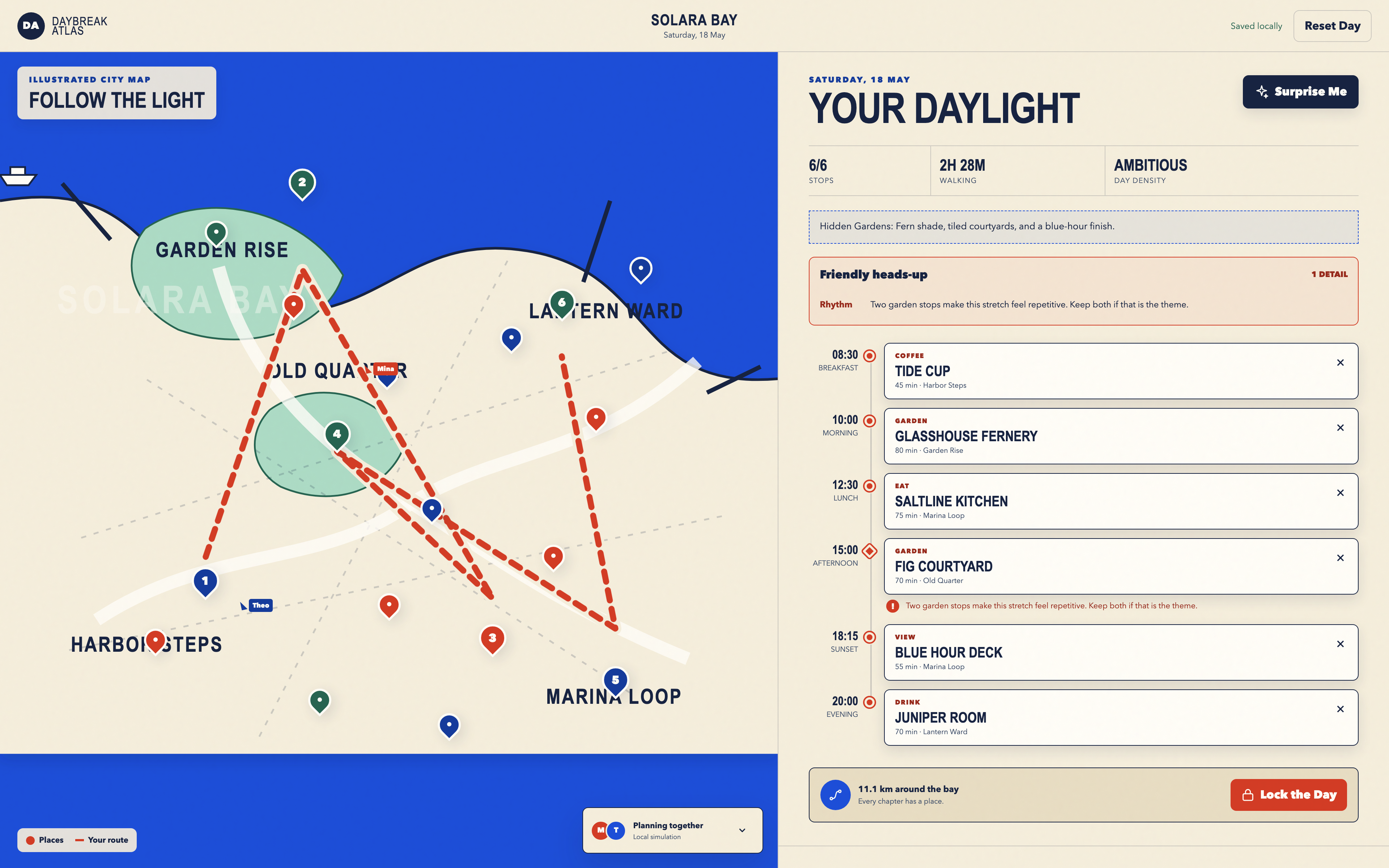
Day Trip Planner Design
Plan six timed stops in fictional Solara Bay, with an illustrated map, walking estimates and useful route warnings.
Desktop app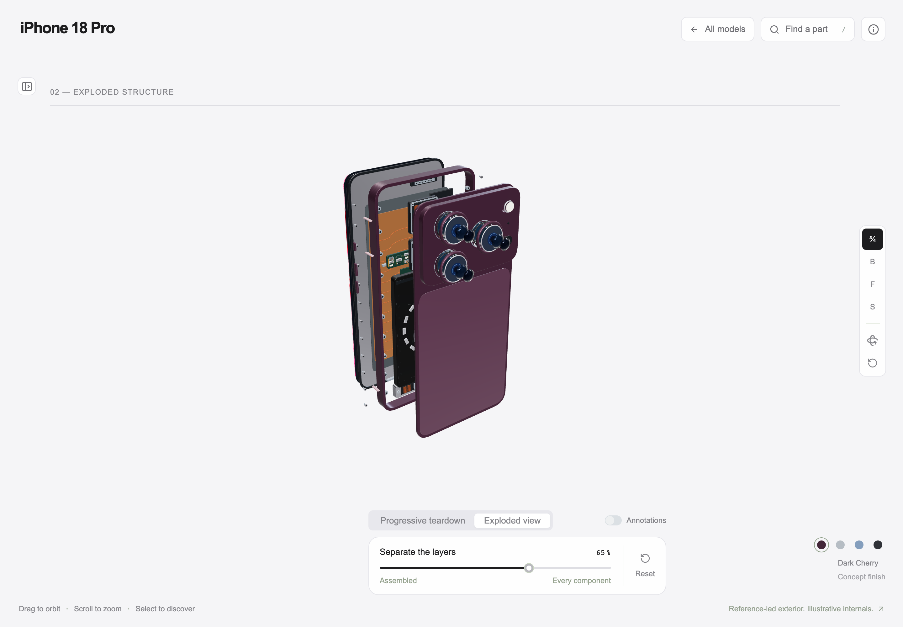
Interactive Product Explainer Design
Explore a concept phone’s separated layers with camera presets, a slider and a panel of eight assembly groups.
Desktop app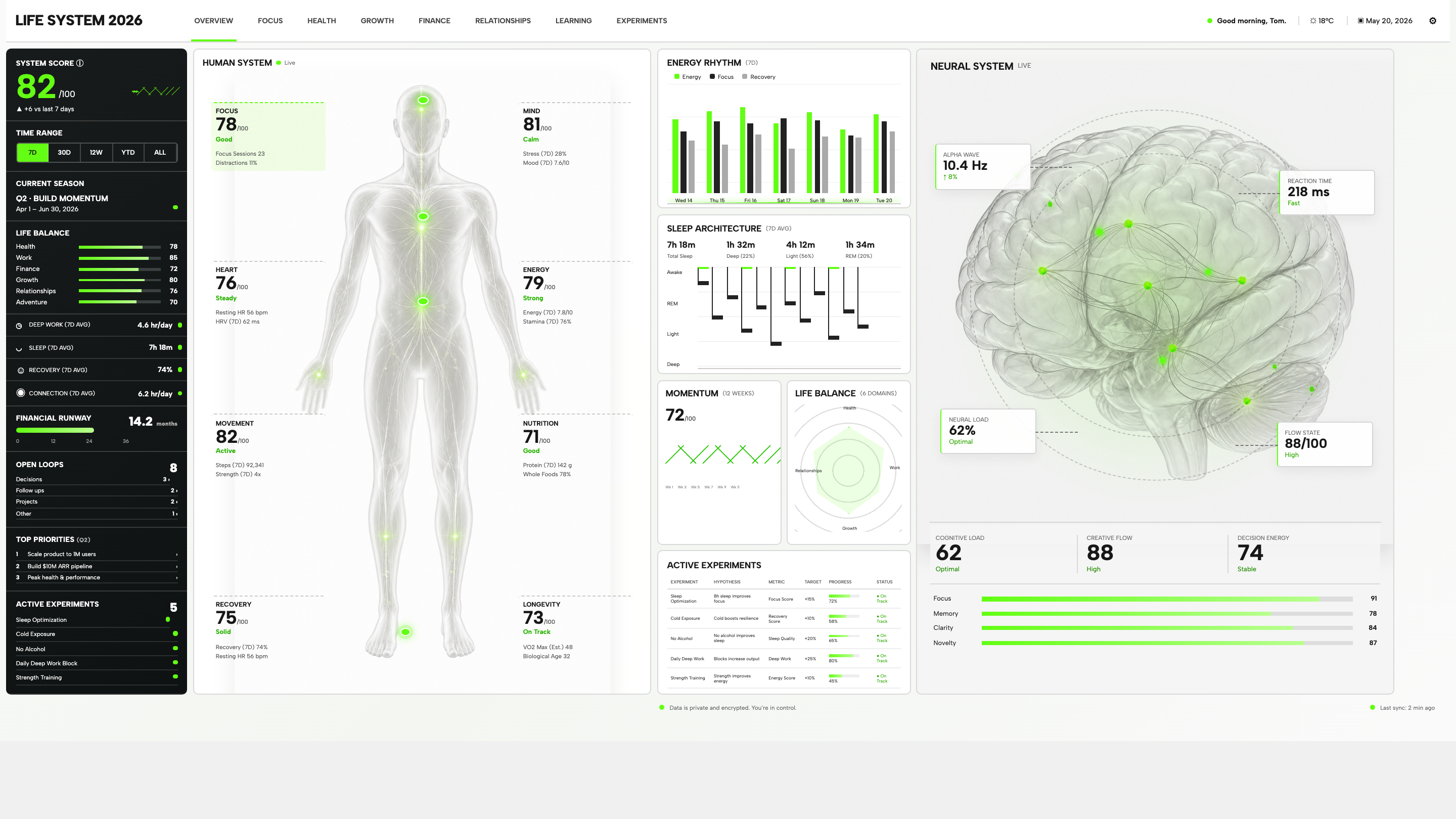
Personal Dashboard Design
Life System puts a weekly score, body-map metrics, daily rhythms, and five experiments on one desktop dashboard. Explore the layout in detail.
Desktop app