
Desktop app
Island FPS Game Design
Step into Harbor Skirmish, where a bold island title screen leads to first-person play with boxed status panels and numbered weapon controls.

LLM Arena Sep 2026
Case notes- Model
- DeepSeek V4.1 Flash
- Design task
- Create Harbor Skirmish, a playable island adventure with movement and wave combat.
- Output
- Desktop app
Designed For
- Browser FPS PrototypesPresent a small playable world and its combat states.
- Combat HUD DesignKeep health, ammunition and wave information separate and readable.
- Keyboard OnboardingExplain movement shortcuts before and during local play.
Key Highlights
- Poster-Style Title ScreenHeavy lettering and hard-edged buttons match the blocky island.
- Boxed Status PanelsCream backgrounds separate combat information from changing scenery.
- Explicit Look-Control FallbackThe interface offers dragging when pointer lock is unavailable.
Explore the FPS Game
1 / 4An Island FPS Game Design With Poster-Style Lettering
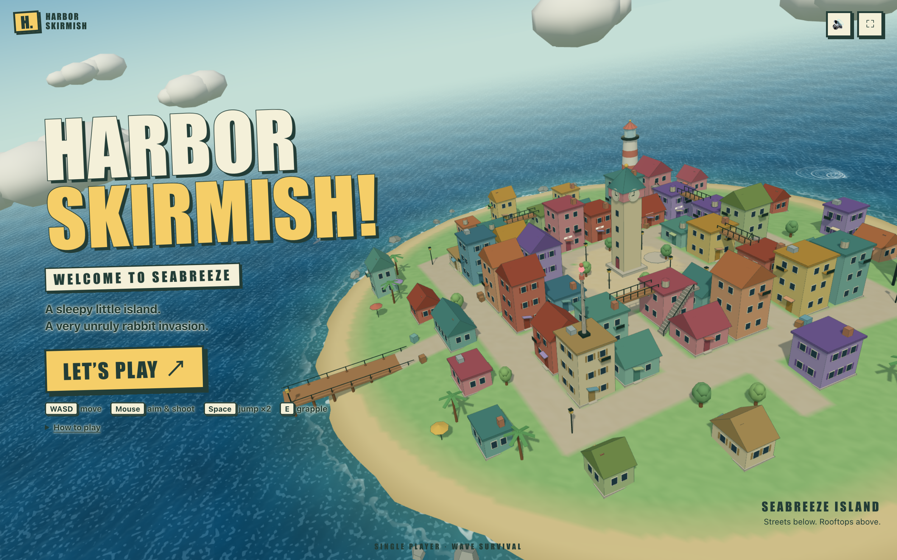
This Harbor Skirmish version uses tightly packed, outlined lettering over an aerial island view. The title, yellow Let’s Play button and small Welcome to Seabreeze strip form a strong left-hand stack. A clock tower, lighthouse, multicolored houses and stairs occupy the right. The hard-edged graphics fit the deliberately blocky architecture.
The first screen already names four kinds of input: WASD movement, mouse aiming and shooting, double jump and grappling. The How to play disclosure can carry the longer explanation without making the opening a full-page manual. Sound and fullscreen controls are kept in small square buttons away from the primary action.
A Title With Its Own Backing
Cream and yellow letter fills, dark outlines and offset shadows separate the title from the textured water. The treatment is assertive, but it serves a practical purpose: the words remain recognizable over a moving scene without placing the entire left column on a solid panel.
Architecture as an Invitation
Stairs, rooflines and the tall central tower make vertical movement part of the opening image. The nearby Streets below. Rooftops above. line points to the same relationship. A screenshot can show that invitation; verifying each roof as a playable destination requires a separate traversal check.
Keycaps Before Commitment
The short input row sits directly below the play button. It gives a keyboard user an immediate sense of the expected interaction before entering the scene. A touch-first adaptation would need a different primary control explanation rather than simply shrinking that row.
Reading Health, Ammunition and Wave State in Boxed Panels
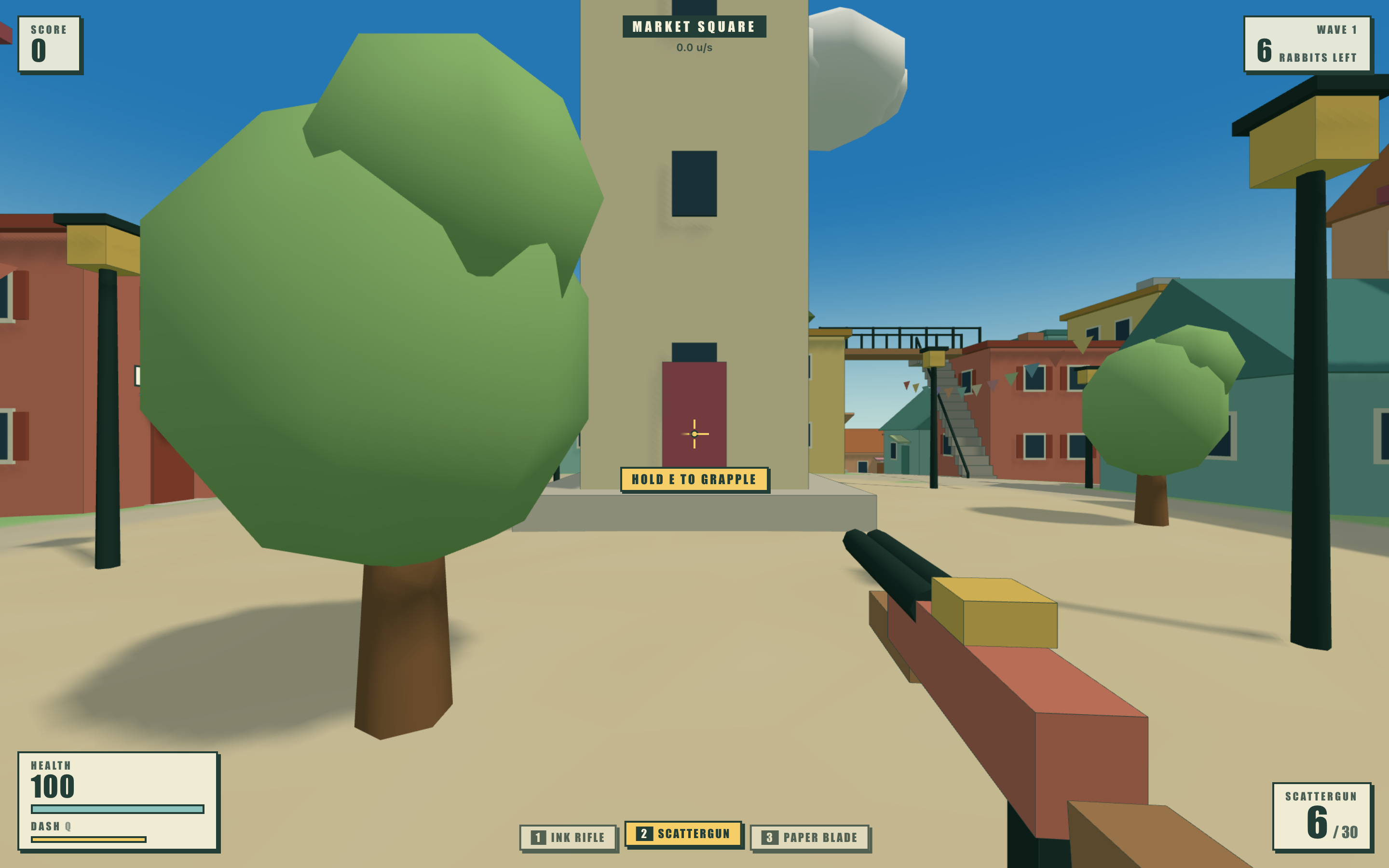
The playing interface distributes information around the perimeter. Cream panels with dark borders carry score, wave status, health and ammunition. A centered location label sits above the view. Unlike text drawn directly on the world, these boxes retain their own background when a wall or a cloud passes behind them.
The cost is a more pronounced frame around the game. Panel size and corner placement matter because each box removes some visible scene area. The numbered weapon row is kept near the bottom center, leaving a relatively open region above it for aiming and reading the environment.
| Element | Observed Relationship | Design Consequence |
|---|---|---|
| Location and Speed | The location changed from Seabreeze Streets to Market Square during the input check. | Naming an area adds orientation that a speed number cannot supply. |
| Weapon and Ammunition | The initial Ink Rifle display used 24 / 168; selecting Scattergun changed it to 6 / 30. | Selection affects both the tool name and its ammunition context. |
| Health and Dash | Separate bars accompany health and the Q dash action. | Survival and movement availability should not share an unexplained progress bar. |
Handling Keyboard Input, Look Controls and Pause
The source anticipates a browser-specific problem: pointer lock may not be available. In the inspected browser, the interface displayed a click-and-drag alternative. This is a concrete distinction between the page being loaded and the player being able to look around. The guidance belongs beside the active scene, not only in a hidden help panel.
Enter the Scene With a Usable Control Path
Let’s Play replaces the aerial title screen with a street-level camera and HUD. A brief wave notice introduces the run. If a look-control notice appears at the same time, their placement and duration need care so two useful messages do not obscure each other.
Keep the Selection Visible in Two Places
Number keys select the rifle, scattergun or blade. The row highlights the active slot while the ammunition panel repeats the selected weapon name. That repetition is purposeful: the shortcut group explains how to change tools, while the corner panel explains what is currently ready.
Use Pause to Explain Advanced Movement
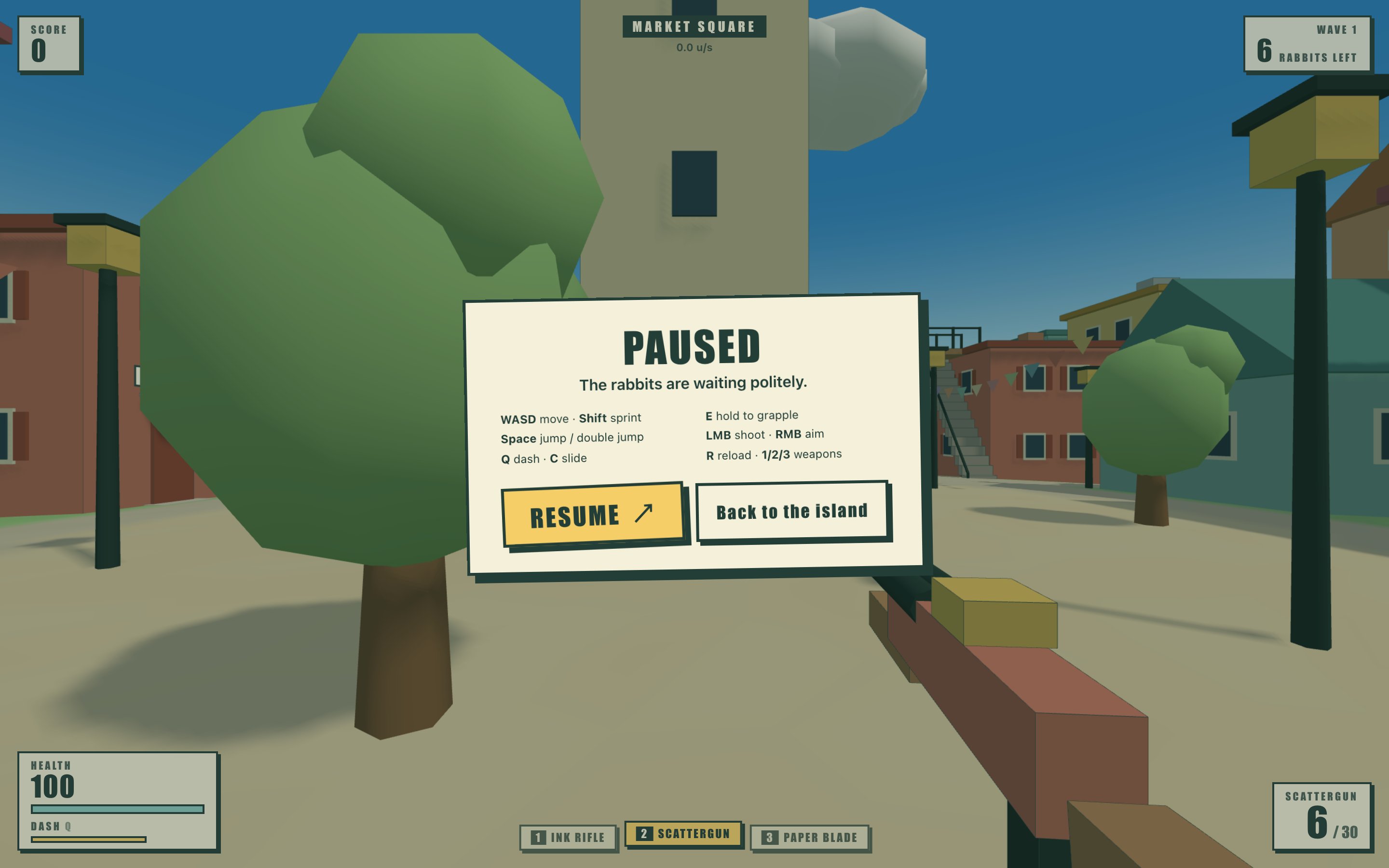
The pause screen lists sprinting, double jump, dash, slide, grapple, aim and reload alongside their keys. Resume is the primary button, with a smaller return-to-island action. Putting the expanded key list here gives the player a place to read it without continuing to navigate the scene.
The Boundary of This Browser FPS Example
Starting the local game, sending movement input, switching weapons and opening pause were inspected. The displayed numbers are temporary session values, not benchmark results. This review does not establish complete level reachability, combat balance or performance across devices. No multiplayer or persistent account system was verified; the evaluation model token comes from the supplied filename.
How to Create an Island FPS Game Design in OpenDesign
Specify the World and the Information Frame
Describe a compact island with recognizable landmarks, then define the HUD separately. Decide which values need stable panel backgrounds and which can remain directly over the scene. This prevents the opening poster style from overwhelming every combat label.
Suggested PromptCreate an island FPS game design for a fictional local browser game called Harbor Skirmish. Use a colorful low-poly seaside town with a clock tower, lighthouse, stairs and connected rooflines. Build an aerial start screen with heavy cream and yellow outlined lettering, a yellow play button and compact keyboard hints. During first-person play, place score and wave information in separate top-corner panels, health and dash status at the bottom left, and the current weapon with magazine and reserve ammunition at the bottom right. Use three numbered weapon slots along the lower center. Add a pause screen with a readable keyboard reference, Resume and a separate return-to-start action. Provide clear guidance if pointer lock is unavailable. Keep scores local to the session and do not invent multiplayer or account features.
Verify Related Values as One State
Switch from rifle to scattergun and inspect the highlight, weapon name and ammunition together. Move between two named areas and check the location label. Keep literal test observations separate from assumptions about the full map or combat system.
Give Temporary Notices Their Own Space
Test first entry with and without pointer lock. A wave announcement and a control fallback should not sit on top of each other. Then open pause and verify that its longer instructions are readable at the smallest supported desktop viewport.
Export and Get a Share Link
Export your finished design, then use Share in OpenDesign to get a share link. Open the link in a separate browser window and check that the intended version and its assets are available before sending it.
Island Adventure Game Design
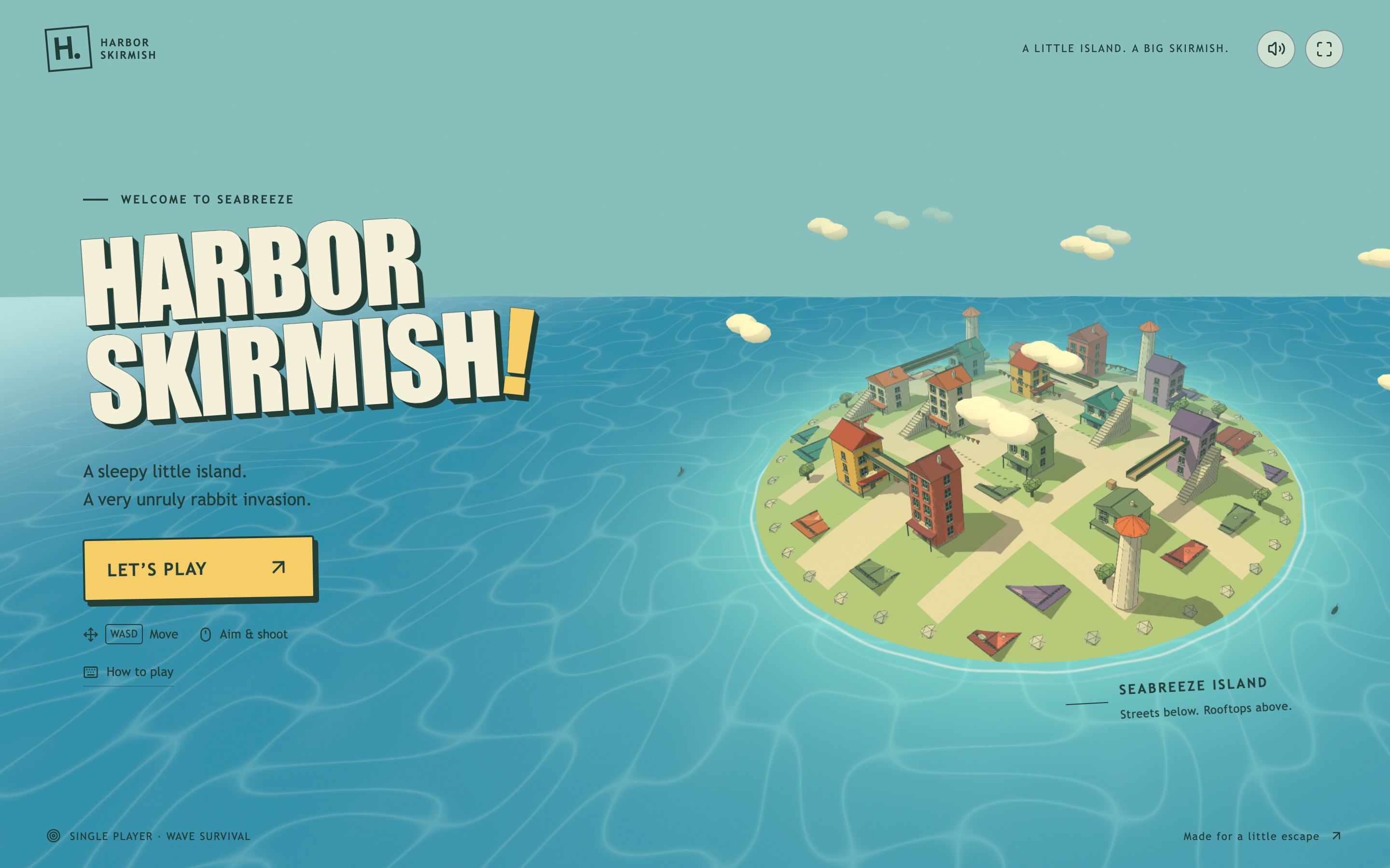
Explore Harbor Skirmish, a small seaside island with rooftop routes, three weapon slots and a playful first-person interface.
Desktop app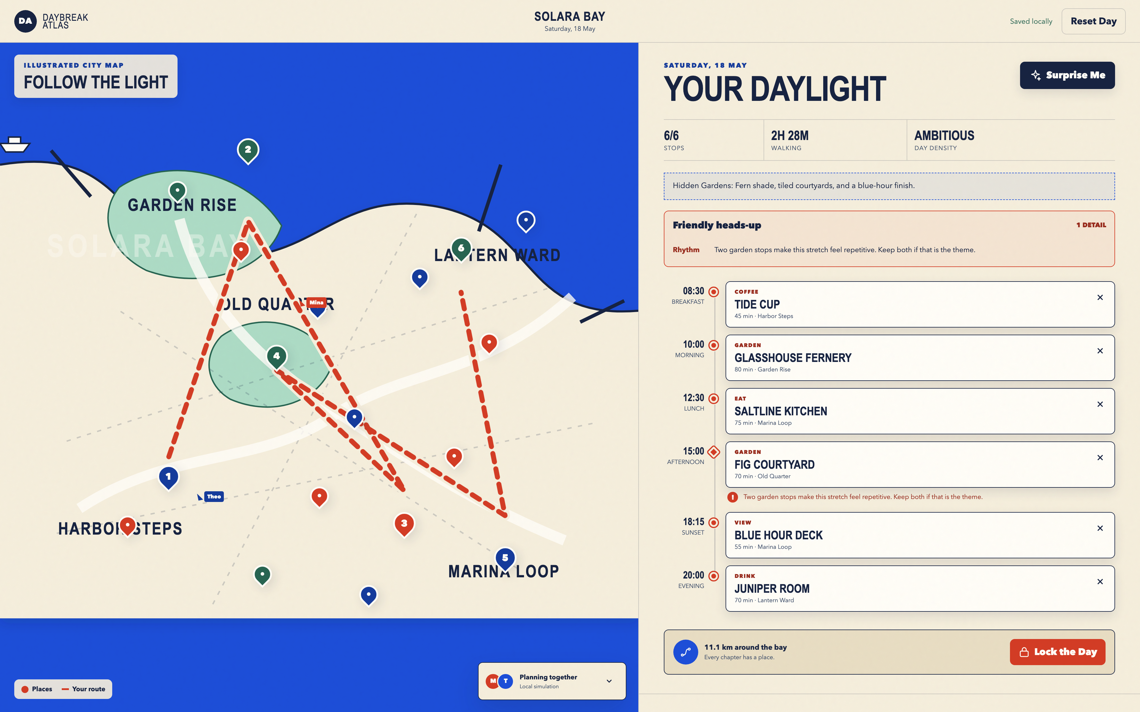
Day Trip Planner Design
Plan six timed stops in fictional Solara Bay, with an illustrated map, walking estimates and useful route warnings.
Desktop app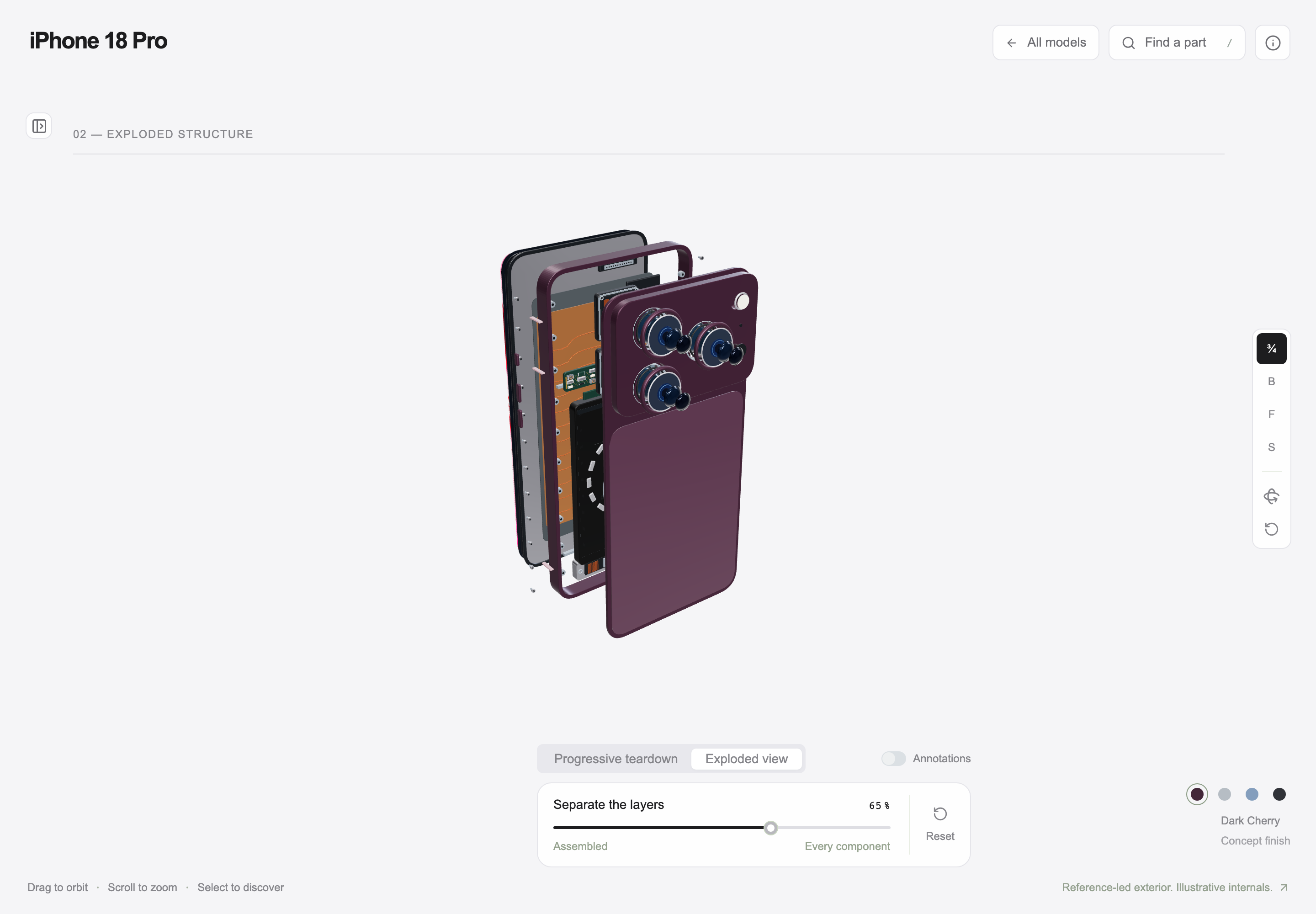
Interactive Product Explainer Design
Explore a concept phone’s separated layers with camera presets, a slider and a panel of eight assembly groups.
Desktop app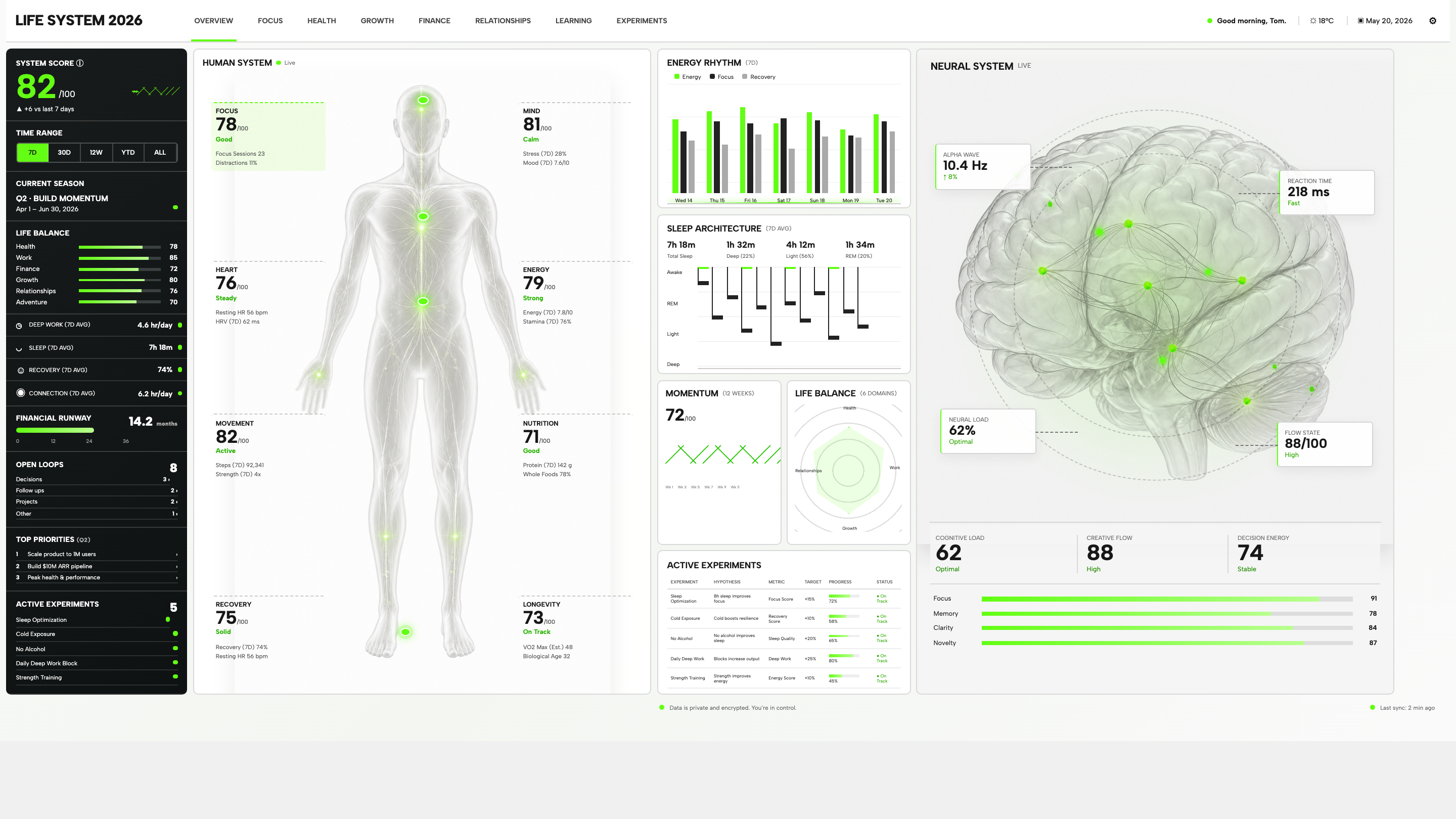
Personal Dashboard Design
Life System puts a weekly score, body-map metrics, daily rhythms, and five experiments on one desktop dashboard. Explore the layout in detail.
Desktop app